This is about Bulma.
Overview of the problem
This is about the Bulma CSS framework
I'm using Bulma version [0.6.2]
I didn't find any duplicate issues.
Description
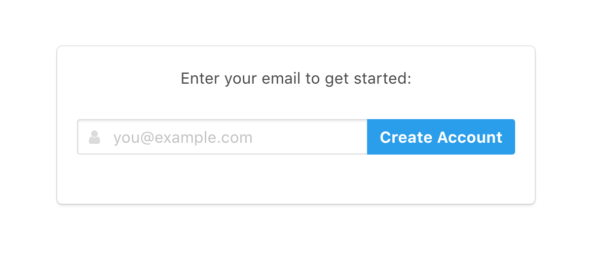
I have a text input with an addon submit button.
On a normal sized desktop screen it looks great:
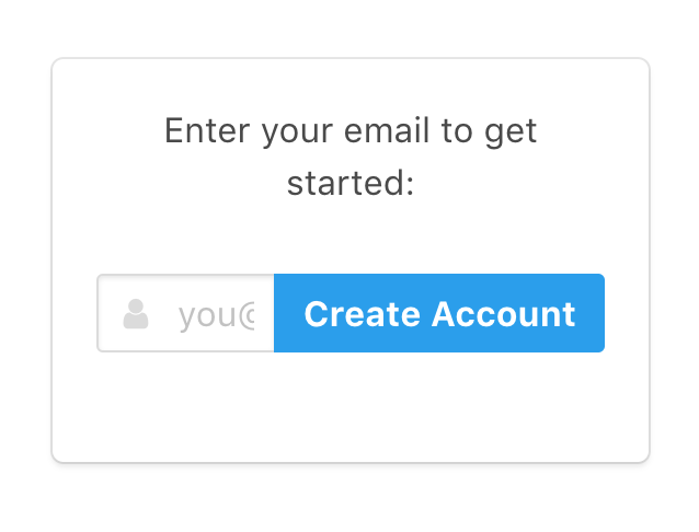
But on a smaller screen — here's an iPhone 5 (width 320px) — the addon button almost completely covers the input field:
Expected behavior
This is what I want it to look like for smaller screens:
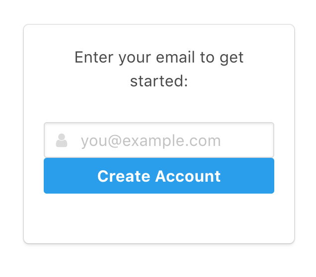
I manually did this for this screenshot by removing has-addons from the .field container, and adding .is-fullwidth to the button.
Some sort of responsive addons helper class, e.g. has-addons-desktop, would be great.
Actual behavior
I'll probably manually hack over it with media queries.
But I wanted to raise this issue in case Bulma already has a way to accomplish this that I'm missing, or if this is something you're willing to add.
 dsernst
All 6 comments
So I got this working in a hacky way by writing the appropriate bit twice:
<div class="is-hidden-touch">
<div class="field has-addons">
..old code..
</div>
</div>
<div class="is-hidden-desktop">
<div class="field">
..modified code..
</div>
</div>
This seems to be working, although it required a lot of duplicated code — there's a lot more logic than visible in the screenshots.
I'm going to close this issue since it's no longer pressing for me.
Writing it up helped me realize this solution. ¯\_(ツ)_/¯
dsernst
on 1 Mar 2018
Actually this isn't so great because now there are two <input>s, so if the page is resized the content is lost. And some other complications from the field name=. Maybe could hook up their data to be bound together.
But wish there was a simpler solution.
dsernst
on 2 Mar 2018
Eh, wasn't able to quickly achieve the effect I was going for without a ton of extra logic.
So I've settled on this simpler compromise for now:
<div class="control">
<div class="is-hidden-touch">
<button class="button is-info" type="submit"><strong>Create Account</strong></button>
</div>
<div class="is-hidden-desktop">
<button class="button is-info" type="submit"><strong>Join</strong></button>
</div>
</div>
Just shortening the button text when on small screens.
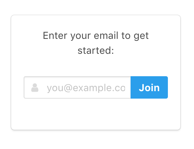
Not ideal, but it works.
dsernst
on 2 Mar 2018
You can do something like:
@include until($desktop) {
.field.has-addons.has-addons--desktop {
display: block;
.control {
&:not(:last-child) {
margin-bottom: 0.75rem;
}
button {
width: 100%;
}
}
}
}
 hostis912
on 16 Mar 2018
hostis912
on 16 Mar 2018
Thanks for the suggestions!
This was my solution:
@media screen and (max-width: $tablet) {

  .field.has-addons,
  .field.is-grouped {
    display: block;

    .control:not(:last-child) {
      margin-right: 0;
      margin-bottom: 1em;

      button {
        width: 100%;
      }
    }
  }
}
 FrancesCoronel
on 2 Sep 2018
FrancesCoronel
on 2 Sep 2018
@fvcproductions works like a charm 👍
 codeofsumit
on 6 Oct 2019
codeofsumit
on 6 Oct 2019
Related issues
 Cosbgn
·
3Comments
Cosbgn
·
3Comments
 DAreRodz
·
3Comments
DAreRodz
·
3Comments
 swthate
·
3Comments
swthate
·
3Comments
 Wikiki
·
3Comments
Wikiki
·
3Comments
 rogervila
·
3Comments
rogervila
·
3Comments
Most helpful comment
Thanks for the suggestions!
This was my solution: