I did need use select2 in my project, so fixed select2 following below code.
I worked with rails, e.g
<div class="column">
  <%= f.label :role_id, 'Perfil', class: 'label' %>
  <div class="field">
    <div class="control">
      <%= f.collection_select :role_id,
          Role.all,
          :id,
          :name,
          {selected: @resource.role_id, include_blank: true},
          {required: false, class: '' }
      %>
    </div>
  </div>
</div>
bulma.select2.custom.scss
.select2-container {
  .select2-selection--single {
    height: auto !important;
    padding: 3px 0 !important;
    border: 1px solid #dbdbdb !important;

    .select2-selection__arrow{
      top: 5px !important;
    }

    .select2-selection__placeholder {
      color: #dbdbdb !important;
    }
  }

  .select2-dropdown {
    border: 1px solid #dbdbdb !important;
    border-top: 0 !important;

    .select2-search {
      margin: 5px;

      .select2-search__field {
        padding: 10px !important;
        border-radius: 3px !important;
        font-size: 1rem;
        height: 2.25em;
        box-shadow: inset 0 1px 2px rgba(10,10,10,.1);
        max-width: 100%;
        width: 100%;
        border-radius: 3px !important;
      }
    }

    .select2-results__options {
      max-height: 200px !important;

      .select2-results__option {
        padding: 0.37em 0.75em !important;
        font-size: 1rem;

        &.select2-results__option--highlighted {
        }
      }
    }
  }
}
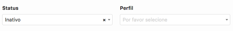
Actual Behavior
pinned
 thadeu
👍10
All 4 comments
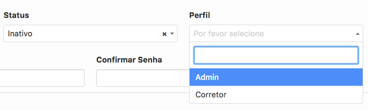
Any luck with more complicated selects? With icons and such?
 KerryJones
on 29 Nov 2018
KerryJones
on 29 Nov 2018
👍2
@KerryJones I think in order to the behavior initial expected to select an item, should be this
thadeu
on 6 Dec 2018
Any luck with more complicated selects? With icons and such?
@KerryJones this worked for me:
bulma-select2.scss
// Bulma
.select2-container {
  .select2-selection--single {
    height: auto !important;
    padding: 3px 0 !important;
    border: 1px solid #dbdbdb !important;

    .select2-selection__arrow{
      top: 5px !important;
    }

    .select2-selection__placeholder {
      color: #dbdbdb !important;
    }

    .select2-selection__rendered {
      margin-left: 2em;
    }
  }

  .select2-dropdown {
    border: 1px solid #dbdbdb !important;
    border-top: 0 !important;

    .select2-search {
      margin: 5px;

      .select2-search__field {
        padding: 10px !important;
        border-radius: 3px !important;
        font-size: 1rem;
        height: 2.25em;
        box-shadow: inset 0 1px 2px rgba(10,10,10,.1);
        max-width: 100%;
        width: 100%;
        border-radius: 3px !important;
      }
    }

    .select2-results__options {
      max-height: 200px !important;

      .select2-results__option {
        padding: 0.37em 0.75em !important;
        font-size: 1rem;

        &.select2-results__option--highlighted {
        }
      }
    }
  }
}
form.html.erb
<div class="field">
  <label class="label">Which project?</label>
  <div class="control has-icons-left">
    <%= collection_select(:project, :project_id, Project.all, :id, :name, {prompt: true}, required: true) %>
    <span class="icon is-small is-left">
      <i class="far fa-folder"></i>
    </span>
  </div>
</div>
 nicbet
on 29 Jan 2020
nicbet
on 29 Jan 2020
👍2
Very useful thanks all. Modified a bit to support --multiple, --above, and --below and added a box-shadow
.select2-container {
  .select2-selection--single, .select2-selection--multiple {
    height: auto !important;
    padding: 3px 0 !important;
    border: 1px solid #dbdbdb !important;

    .select2-selection__arrow{
      top: 5px !important;
    }

    .select2-selection__placeholder {
      color: #dbdbdb !important;
    }
  }


  .select2-dropdown {
    border: 1px solid #dbdbdb !important;

    &.select2-dropdown--below {
      border-top: 0!important;
      box-shadow: 0 0.5em 1em -0.125em rgba(10, 10, 10, 0.1), 0 0px 0 1px rgba(10, 10, 10, 0.02);
    }

    &.select2-dropdown--above {
      border-bottom: 0!important;
      box-shadow: 0 -0.5em 1em -0.125em rgba(10, 10, 10, 0.1), 0 0px 0 1px rgba(10, 10, 10, 0.02);
    }

    .select2-search {
      margin: 5px;

      .select2-search__field {
        padding: 10px !important;
        border-radius: 3px !important;
        font-size: 1rem;
        height: 2.25em;
        box-shadow: inset 0 1px 2px rgba(10,10,10,.1);
        max-width: 100%;
        width: 100%;
        border-radius: 3px !important;
      }
    }

    .select2-results__options {
      max-height: 200px !important;

      .select2-results__option {
        padding: 0.37em 0.75em !important;
        font-size: 1rem;

        &.select2-results__option--highlighted {
        }
      }
    }
  }
}
 paulmwatson
on 22 May 2020
paulmwatson
on 22 May 2020
🚀1
Was this page helpful?
0 / 5 - 0 ratings
Related issues
 Antrikshy
·
3Comments
Antrikshy
·
3Comments
 Laraveldeep
·
3Comments
Laraveldeep
·
3Comments
 JenCant
·
3Comments
JenCant
·
3Comments
 rogervila
·
3Comments
rogervila
·
3Comments
 Cosbgn
·
3Comments
Cosbgn
·
3Comments
Most helpful comment
@KerryJones this worked for me:
bulma-select2.scss
form.html.erb