Bulma: IE11 , Can't have siblings 'is-vertical' tiles.
Overview of the problem
This is about the Bulma CSS framework
I'm using Bulma version [0.5.3]
My browser is: IE11
I am sure this issue is not a duplicate?
Description
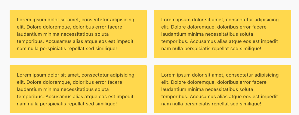
Tiles seem to work well in IE 11.
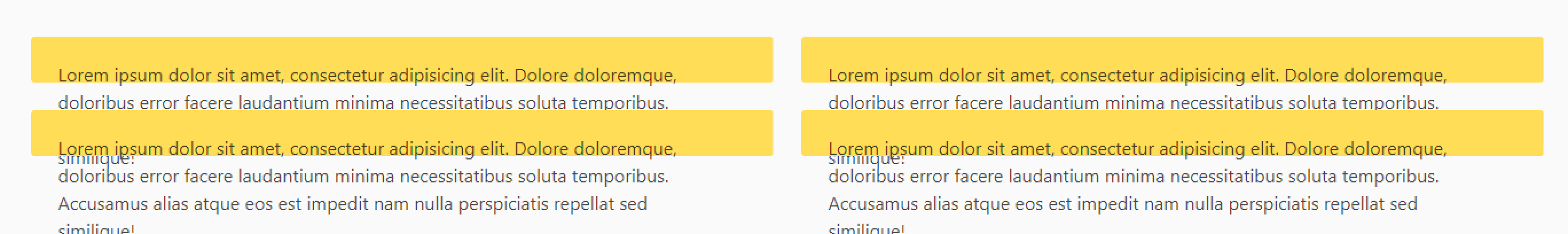
however, in the case where you want 2 "is-vertical" tiles next to each other
it all breaks. ( the provided snippet doesnt not have all the is-child , is-parent classes, but please take my word that is has nothing to do with it )
Steps to Reproduce
<div class="tile">
                <!-- left section : has 2 vertically aligned tiles -->
                <div class="tile is-vertical is-parent">
                    <div class="tile notification is-warning">
                        <p class="content">
                            {{--assume content--}}
                        </p>
                    </div>
                    <div class="tile notification is-warning">
                        <p class="content">
                            {{--assume content--}}
                        </p>
                    </div>
                </div>
                <!-- right section : has 2 vertically aligned tiles -->
                <div class="tile is-vertical is-parent">
                    <div class="tile notification is-warning">
                        <p class="content">
                            {{--assume content--}}
                        </p>
                    </div>
                    <div class="tile notification is-warning">
                        <p class="content">
                            {{--assume content--}}
                        </p>
                    </div>
                </div>
            </div>
Expected behavior
Actual behavior
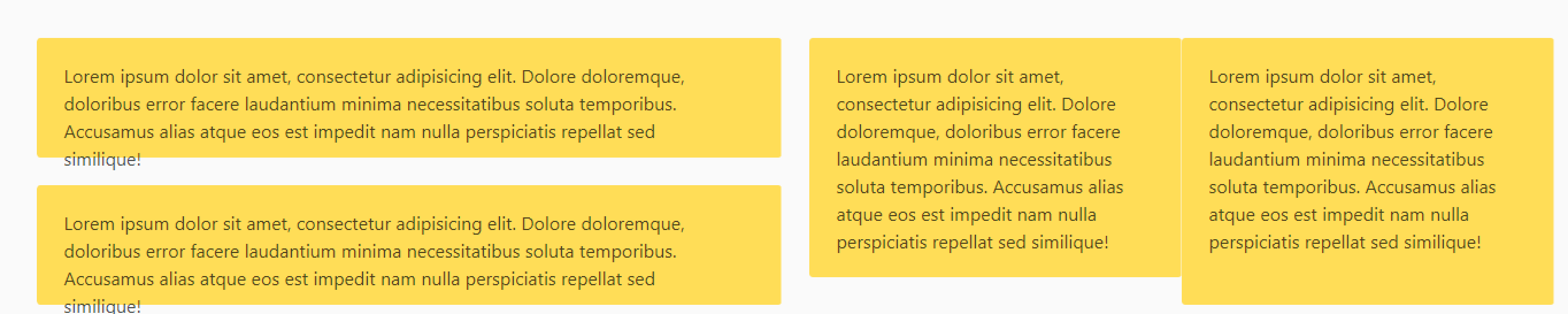
Might be worth pointing out that if you remove the second 'is-vertical' class
the tiles a lot closer to what you would expect.
 martinlanglois
All 7 comments
Was playing around with this in IE 11 today and noticed the .tile class under .is-vertical gets -ms-flex-preferred-size: 0px instead of the normal tile's -ms-flex-preferred-size: auto. Not sure if that helps but just wanted to note this observation.
Adding this CSS to my stylesheet fixed the problem on my page:
.is-vertical > .tile {
  -ms-flex-preferred-size: auto; /* IE 11 fix */
}
 thecristen
on 4 Dec 2018
thecristen
on 4 Dec 2018
Thanks @thecristen. Works for IE10 too.
 librien
on 10 Jan 2019
librien
on 10 Jan 2019
The suggestion above worked for me in IE but not in Firefox or Edge. The code below worked for me in all browsers:
.tile {
    flex-basis: auto;
}
 joeyhage
on 3 Feb 2019
joeyhage
on 3 Feb 2019
In some cases this causes also trouble (with mixed tiles like a fullwidth one and three tile-columns below it does not center the three columns)
I fixed this with:
@media all and (-ms-high-contrast: none), (-ms-high-contrast: active) {
  .tile {
    flex-basis: auto;
    width: 100%;
  }
}
that is not my preferred solution but works.
 digifa
on 5 Mar 2019
digifa
on 5 Mar 2019
thanks @digifa your solution has solved my issue
 geejay81
on 19 Mar 2019
geejay81
on 19 Mar 2019
This issue has been automatically marked as stale because it has not had recent activity. It will be closed if no further activity occurs. Thank you for your contributions.
![stale[bot] picture](https://avatars3.githubusercontent.com/in/1724?v=4&s=40) stale[bot]
on 15 Sep 2019
stale[bot]
on 15 Sep 2019
The suggestion above worked for me in IE but not in Firefox or Edge. The code below worked for me in all browsers:
.tile {
    flex-basis: auto;
}
For my use case to support IE 11, I had to modify as shown here:
.tile {
    flex-basis: auto;
    width: 100%;
    max-width: 100%;

    @media only screen and (min-width: $tablet) {
        @for $i from 1 through 12 {
            &.is-#{$i} {
                width: ($i / 12) * 100%;
            }
        }
    }
}
 adamdehaven
on 24 Oct 2019
adamdehaven
on 24 Oct 2019
Related issues
 Yard8
·
3Comments
Yard8
·
3Comments
 NurdinDev
·
3Comments
NurdinDev
·
3Comments
 swamikevala
·
3Comments
swamikevala
·
3Comments
 Cosbgn
·
3Comments
Cosbgn
·
3Comments
 Antrikshy
·
3Comments
Antrikshy
·
3Comments
Most helpful comment
Was playing around with this in IE 11 today and noticed the
.tileclass under.is-verticalgets-ms-flex-preferred-size: 0pxinstead of the normal tile's-ms-flex-preferred-size: auto. Not sure if that helps but just wanted to note this observation.Adding this CSS to my stylesheet fixed the problem on my page: