Overview of the problem
This is about the Bulma CSS framework
Description
.columns and .column is great but I really need the equivalent for flex-direction: column as opposed to flex-direction: row.
 em
em
All 10 comments
Do you have a use case?
 jgthms
on 4 Oct 2017
jgthms
on 4 Oct 2017

In this layout, there is a left sidebar containing a bottom-aligned panel and a scrollable list that flexes to expand any remaining vertical space.
This could be achieved with:
<div class='rows'>
<div class='row is-scrollable'> Layers list </div>
<div class='row is-narrow'> Dimensions panel </div>
</div>
Side note: is-scrollable would be nice to have as well.
em
on 4 Oct 2017
Here's another usecase on the same site:

This is a number-only input with up/down arrows on the right side. These up/down arrows are each 50% the available height. This would be easily modeled as such:
<div class='columns'>
<div class='column'>
<input />
</div>
<div class='column is-narrow'>
<div class='rows'>
<div class='row'> up </div>
<div class='row'> down </div>
</div>
</div>
</div>
any news on this one?
 goranGG
on 15 Feb 2018
goranGG
on 15 Feb 2018
@jgthms it would be very useful for corporate applications who wants to use something more lightweight than Bootstrap
 blacksoulgem95
on 7 Jun 2018
blacksoulgem95
on 7 Jun 2018
I think you can use the existing .columns class as a 'row' class---it behaves the same way that the Bootstrap .row class works.
For Example I have (simplified):
`
<div class ='columns'>
       <div class="column">Content</div>
       <div class="column">Content</div>
</div>

<div class ='columns'>
       <div class="column">Content</div>
       <div class="column">Content</div>
</div>
`
It behaves identically to the Bootstrap row/column that looks like this:
`
<div class ='row'>
       <div class="col-md-6 col-xs-12">Content</div>
       <div class="col-md-6 col-xs-12">Content</div>
</div>

<div class ='row'>
       <div class="col-md-6 col-xs-12">Content</div>
       <div class="col-md-6 col-xs-12">Content</div>
</div>
`
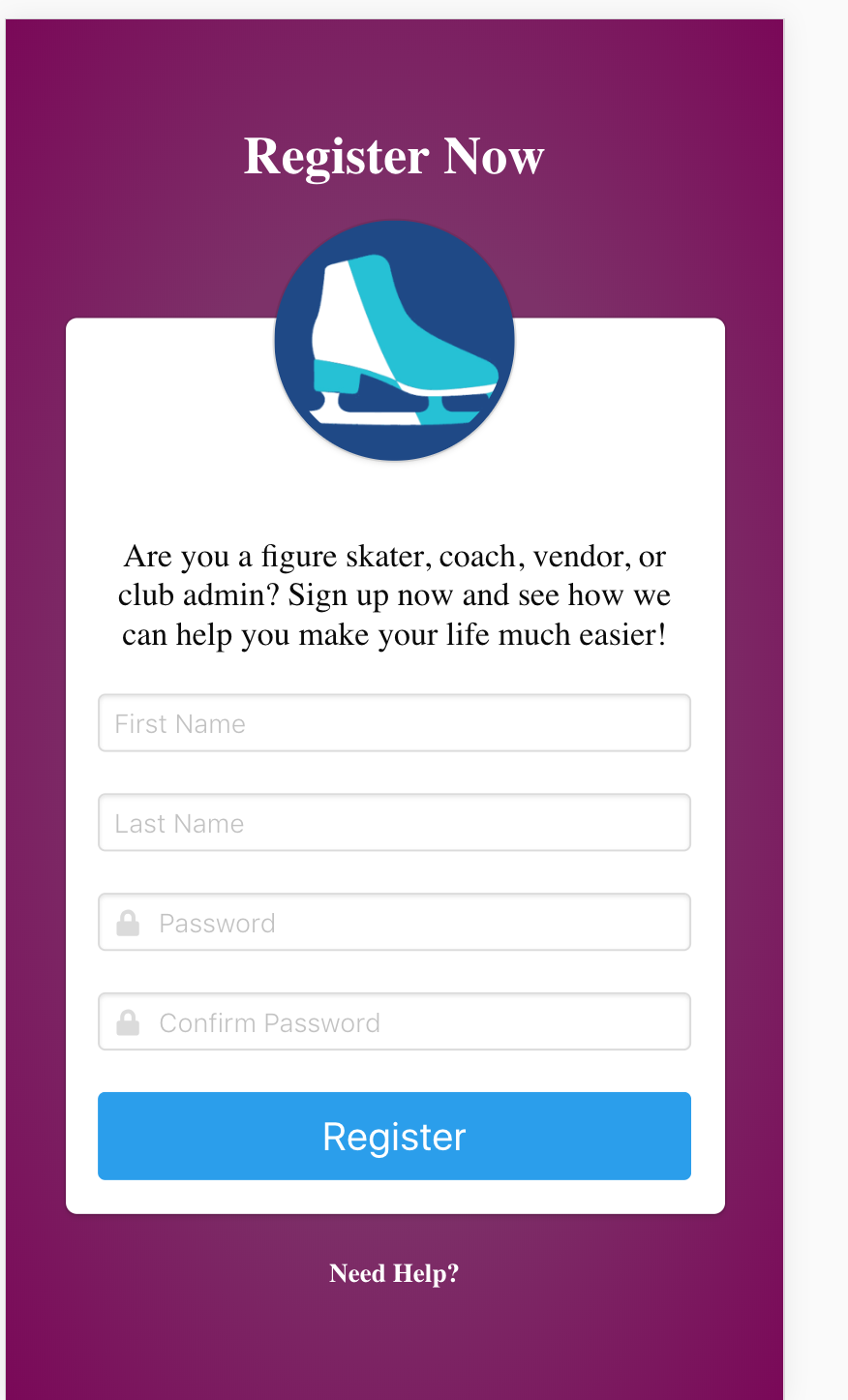
Example image is here, note the alignment of the form inputs in the desktop and mobile views:

 veloace
on 28 Jun 2018
veloace
on 28 Jun 2018
I think is best to add a is-vertical class, with the equivalent breakpoints, there shouldn't be any difference from a regular columns to have its own separate main class.
And the is-vertical class would literally only change flex-direction to column
 mojimi
on 13 Feb 2019
mojimi
on 13 Feb 2019
I think you can use the existing .columns class as a 'row' class---it behaves the same way that the Bootstrap .row class works.
it does not, in the mobile view if something is arranged as columns and wraps, the semantics of that will be preserved. so even if something is visually organized as rows, when it wraps it will be sorted from top to bottom by column. this is undesirable imo
 goolord
on 18 Feb 2019
goolord
on 18 Feb 2019
Straight up, just added
.columns.is-vertical {
  flex-direction: column;
}
Not just for columns. I just used it on a .navbar-item, for an nav item that had 2 labels (label + status underneath).
 jontroncoso
on 21 Aug 2019
jontroncoso
on 21 Aug 2019
This framework seems to be lacking so much.
 SimonFricker
on 31 Oct 2019
SimonFricker
on 31 Oct 2019
Related issues
 swthate
·
3Comments
swthate
·
3Comments
 Antrikshy
·
3Comments
Antrikshy
·
3Comments
 jaredreich
·
3Comments
jaredreich
·
3Comments
 Cosbgn
·
3Comments
Cosbgn
·
3Comments
 guillecro
·
3Comments
guillecro
·
3Comments
Most helpful comment
I think you can use the existing .columns class as a 'row' class---it behaves the same way that the Bootstrap .row class works.
For Example I have (simplified):
`
`
It behaves identically to the Bootstrap row/column that looks like this:
`
`
Example image is here, note the alignment of the form inputs in the desktop and mobile views: