Bulma: Wrapped `columns` overlap next element
This is about Bulma, and it appears to be a bug. Or it could be about the doc if I am missing something.
Overview of the problem
This is about the Bulma CSS framework
I'm using Bulma version [0.5.0]
My browser is: chrome
I am (fairly) sure this issue is not a duplicate? I searched, couldn't immediately find something similar
Description
When columns are in their own element, a columns:last-child is added which adds a negative bottom padding.
This causes the following elements to overlap the columns.
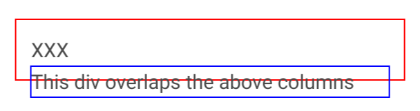
Steps to Reproduce
<div>
  <div class="columns" style="border: 1px solid red">
    <div class="column col">XXX</div>
  </div>
</div>
<div style="border: 1px solid blue">
  This div overlaps the above columns
</div>
Expected behavior
Whatever is after the columns should not overlap them.
Actual behavior
See https://codepen.io/yohcop/pen/VzbvER
The only thing I can think of, is that I would be supposed to add some class name to the wrapper div for columns, but I did not see this.
 yohcop
All 15 comments
Yes, I have the same issue, also the .columns class breaks out of the sides of the parent element. These issues are caused by the negative margins applied to the .columns class.
I've had to override the margins, but I don't see why they are even there to begin with.
 JAW-Dev
on 11 Aug 2017
JAW-Dev
on 11 Aug 2017
The .column items have a padding of .75rem. This space needs to be reverted by the parent .columns. Otherwise, there would be a gap between the .column content and the .columns following siblings.
You're supposed to only have .column items as a .columns container direct children. Your actual content should be inside a .column item.
 jgthms
on 11 Aug 2017
jgthms
on 11 Aug 2017
But that's the case in my example, I only have .column items as .columns children, and the content is inside .column.
The thing I find odd, is that .columns has a :last-child (and :first-child) that adds margin-bottom: 0.75em (and margin-top).
Why this on the last child specifically? Removing it actually makes the problem go away.
Since multiple .columns (as rows) would always be together in the same parent, that shouldn't affect much else. (and the same thing happens with first-child.)
https://codepen.io/yohcop/pen/gxxbwV
yohcop
on 11 Aug 2017
FWIW, this makes it harder to compose UI elements. For example, (using react syntax), I want to render something like:
<div>
  <ElementOne/>
  <ElementTwo/>
</div>
As it happens, ElementOne renders
<div>
  <div class="columns">
    <div class="column">
      ....
    </div>
  </div>
</div>
And now ElementTwo overlaps ElementOne.
The "contract" should be that ElementOne shouldn't render anything outside of it's DOM bounding box. In my case, the border is outside of it essentially. And note that the .columns is wrapped in a div with a single child.
Of course I can fix it myself, and that's what I'll do if you think the way it is now is correct. Feel free to close.
Thanks!
yohcop
on 11 Aug 2017
From @jgthms's example styling for backgrounds, borders etc are not on the column div. Your component's wrapper would then be inside the column with all of it's own padding, backgrounds etc. So for example if you had a card you would do.
<div>
    <div class="columns">
        <div class="column">
            <div class="card"></div>
        </div>
    </div>
</div>
<div> other content </div>
Your other content will not overlap the card.
Edit From your example your applying your own styles to the columns class, which is why it looks like they are overlapping.
 VizuaaLOG
on 11 Aug 2017
VizuaaLOG
on 11 Aug 2017
Yes of course. Maybe I'm abusing columns :)
I'm using columns to render a calendar (each .columns is a week, with a .column for each day). This has the nice property that the days stack up when the screen size gets smaller. And that's why I have the border too, which makes the problem visible.
And then I have some content under the calendar...
yohcop
on 11 Aug 2017
That sounds like a good use. But any styling you apply for each day should be placed inside another div inside the column. Not directly on each column.
Btw there is a calendar extension now its on the extensions page
_Sent from my Htc HTC 10 using FastHub_
VizuaaLOG
on 11 Aug 2017
It's more a calendar like google calendar (with a list of events in each day). The styling I'm talking about is mostly borders for each day, and a background color for say "today" and "past vs future days". I can't place the styling inside the column, or there would be space between each cell.
That being said, I'm still not sure it's a good idea for me to do it this way. To have nice borders, I need to do apply the right style to each individual day so I don't double up the borders between days. (e.g. Monday have a border on the left and right, but Tuesday doesn't have one on the left).
yohcop
on 11 Aug 2017
Ah I see. You could get around this by removing the negative margin on the columns for each row of your week. Although I'm unsure if there would be any side effects of doing that.
VizuaaLOG
on 11 Aug 2017
Yeah, I can try that too. Will do!
Thanks
yohcop
on 11 Aug 2017
was only able to make this work by adding the helper class is-marginless on the columns element, pretty frustrating
 zyzski
on 28 Jun 2018
zyzski
on 28 Jun 2018
This issue has been automatically marked as stale because it has not had recent activity. It will be closed if no further activity occurs. Thank you for your contributions.
![stale[bot] picture](https://avatars3.githubusercontent.com/in/1724?v=4&s=40) stale[bot]
on 21 Jan 2019
stale[bot]
on 21 Jan 2019
Having same issue, not sure why this happens
 Tech-Ecomerciar
on 18 Jun 2019
Tech-Ecomerciar
on 18 Jun 2019
Having the same issue with bulma on last version
 arayariquelmes
on 15 Mar 2020
arayariquelmes
on 15 Mar 2020
Still no official documentation about this weird behavior. FTM @zyzski's answer is the only that worked for me. :metal:
 maximelafarie
on 5 Aug 2020
maximelafarie
on 5 Aug 2020
Related issues
 Antrikshy
·
3Comments
Antrikshy
·
3Comments
 leofontes
·
3Comments
leofontes
·
3Comments
 choonggg
·
3Comments
choonggg
·
3Comments
 Qard
·
3Comments
Qard
·
3Comments
 guillecro
·
3Comments
guillecro
·
3Comments
Most helpful comment
was only able to make this work by adding the helper class
is-marginlesson thecolumnselement, pretty frustrating