Bulma: Container as direct child of navbar moves navbar-menu below navbar-brand
Overview of the problem
This is about the Bulma CSS framework
I'm using Bulma version [0.4.3]
My browser is: Chrome Version 59.0.3071.115 (Official Build) (64-bit), Firefox 54.0.1 (64-bit)
I am sure this issue is not a duplicate
Description
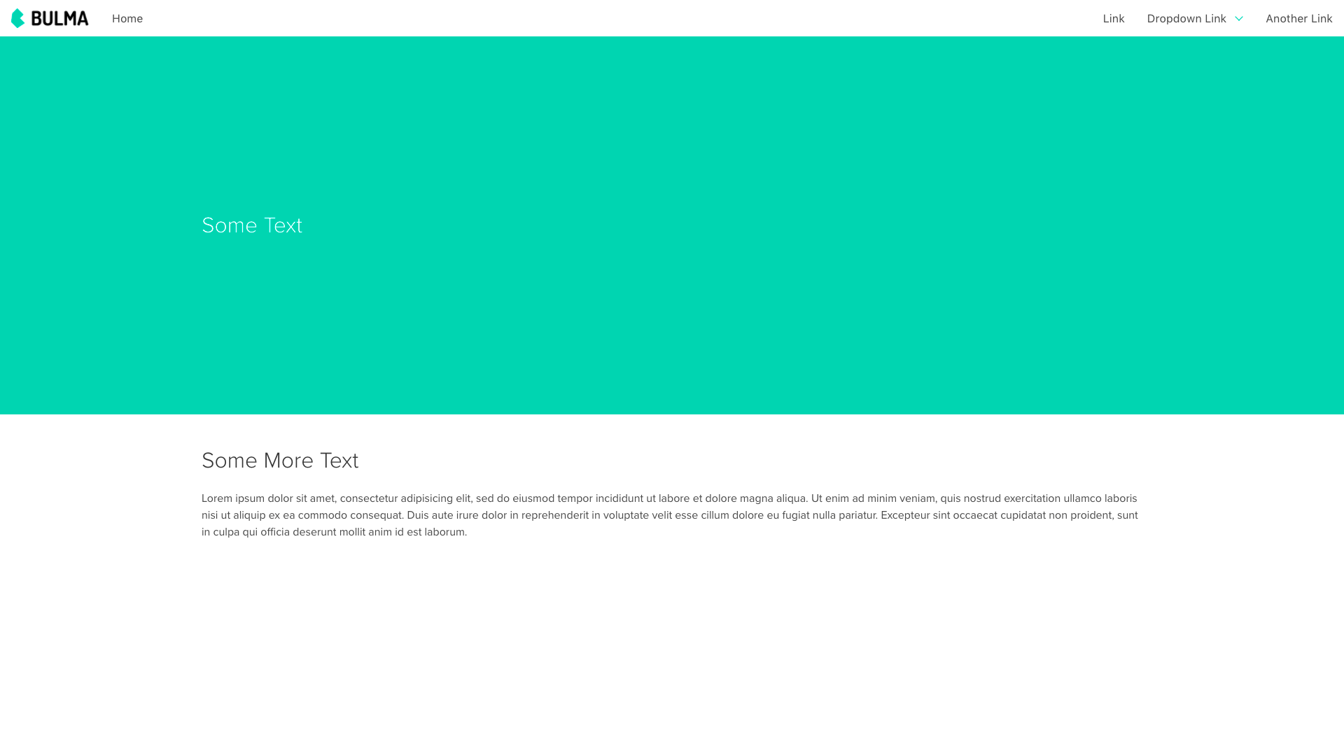
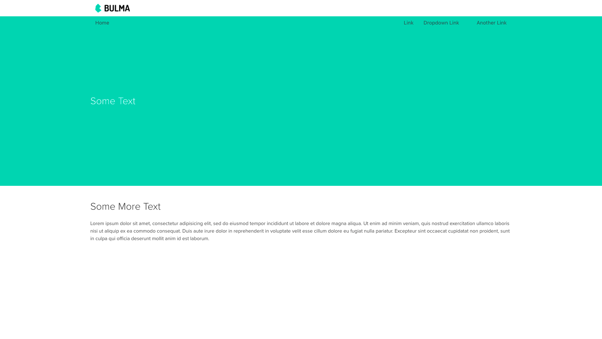
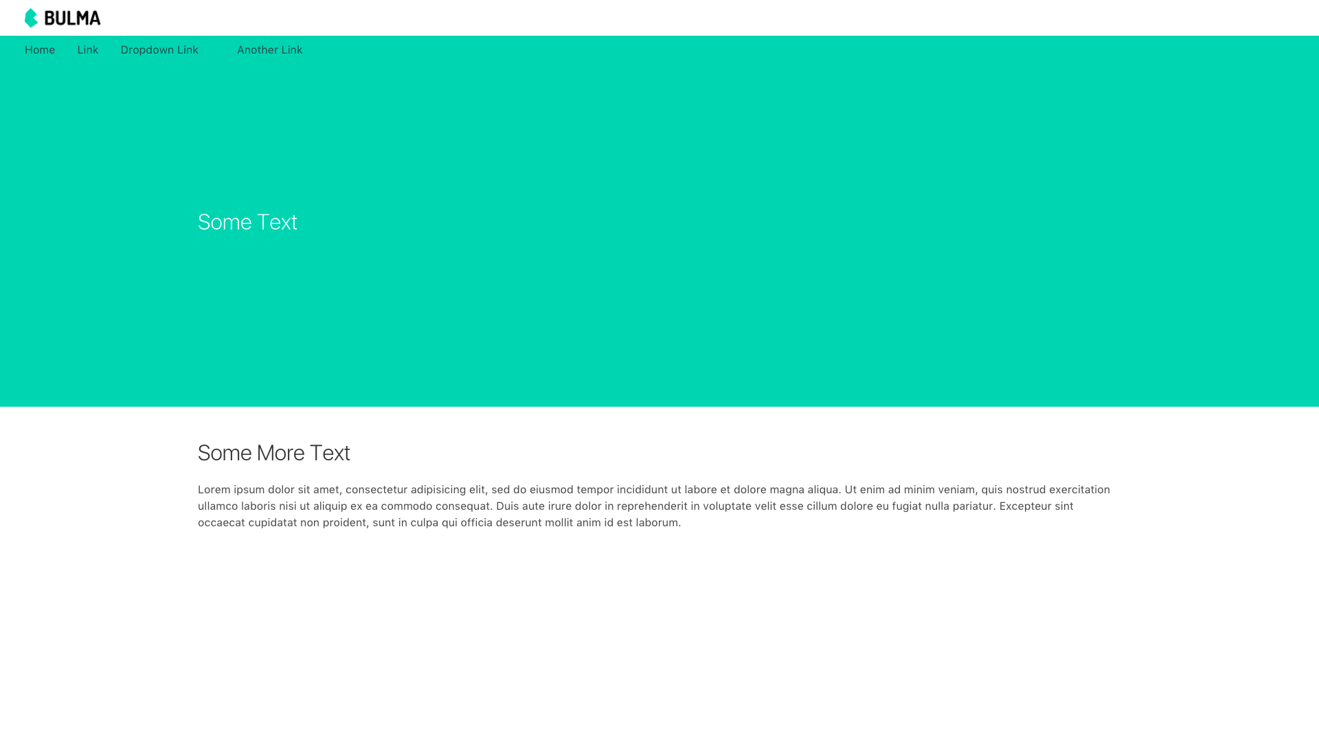
Placing container as a direct child of navbar and the parent of navbar-brand and navbar-menu causes navbar-menu to appear below navbar-brand.
Steps to Reproduce
No Container
<nav class="navbar">
    <div class="navbar-brand">
        ...
    </div>
    <div class="navbar-menu">
        ...
    </div>
</nav>
Container
<nav class="navbar">
    <div class="container">
        <div class="navbar-brand">
            ...
        </div>
        <div class="navbar-menu">
          ...
        </div>
    </div>
</nav>
Container is-fluid
<nav class="navbar">
    <div class="container is-fluid">
        <div class="navbar-brand">
            ...
        </div>
        <div class="navbar-menu">
          ...
        </div>
    </div>
</nav>
Expected behavior
navbar-brand and navbar-menu are displayed left to right in a container
Actual behavior
navbar-menu is displayed below navbar-brand in a container
 czamp
czamp
All 5 comments
+1 after update bulma to 0.4.3 version .container in <nav> behaves strangely.
 koddr
on 8 Jul 2017
koddr
on 8 Jul 2017
maybe nav.navbar>.container needs another display: flex?
 lent
on 9 Jul 2017
lent
on 9 Jul 2017
The navbar on the docs puts the container on the outside. Maybe the navbar no longer supports a container inside?
<div class="container">
    <nav class="navbar">
        ...
    </nav>
</div>
 VizuaaLOG
on 9 Jul 2017
VizuaaLOG
on 9 Jul 2017
Using display: flex on the .container will have the mobile menu button to keep on the left side.
Adding the .container to the .navbar itself works good apparently:
<header class="navbar container"></header>
 rafaelpimpa
on 10 Jul 2017
rafaelpimpa
on 10 Jul 2017
Not the ideal solution but it works if you are using sass:
html
<nav class="navbar">
  <div class="container">
     <!-- reset of navbar here -->
  </div>
</nav>
scss
@import "node_modules/bulma/bulma"
.navbar > .container { @extends .navabr }
There is probably a simpler and more eloquent solution but I'll wait on the maintainers to support .container before I write too many unnecessary lines.
Great framework by the way! Love it <3
Thanks!
 almasaeed2010
on 11 Jul 2017
almasaeed2010
on 11 Jul 2017
Related issues
 scottgrayson
·
3Comments
scottgrayson
·
3Comments
 swthate
·
3Comments
swthate
·
3Comments
 jaredreich
·
3Comments
jaredreich
·
3Comments
 Wikiki
·
3Comments
Wikiki
·
3Comments
 swamikevala
·
3Comments
swamikevala
·
3Comments
Most helpful comment
The navbar on the docs puts the container on the outside. Maybe the navbar no longer supports a container inside?