- [ ] This is about the Bulma CSS framework
- [ ] I'm using Bulma version [0.2.3]
- [ ] My browser is: Google Chrome
- [ ] This is a Sass issue: I'm using version [3.4.9]
On mobile, the element with class "columns" is wider than the actual viewport, making the website slightly horizontally scrolling.
The element is given a negative margin on all sides except the bottom side, and the child element (class="column")
 larsvansche
All 16 comments
What do you have wrapped around your .columns container?
Bulma's containers are in 'sections' .. If you were to do something like:
    <div class="container">
        <div class="columns">
            <div class="column">
                Lorem ipsum dolor sit amet, consectetur adipisicing elit. Accusamus dolor doloribus esse ex expedita minus officiis voluptas. At consequuntur debitis dignissimos eum sed voluptas. Amet assumenda cupiditate earum molestias placeat.
            </div>
        </div>
    </div>
It would create a horizontal scroll bar. However if you were to do:
<div class="section">
    <div class="container">
        <div class="columns">
            <div class="column">
                Lorem ipsum dolor sit amet, consectetur adipisicing elit. Accusamus dolor doloribus esse ex expedita minus officiis voluptas. At consequuntur debitis dignissimos eum sed voluptas. Amet assumenda cupiditate earum molestias placeat.
            </div>
        </div>
    </div>
</div>
Then the horizontal scrollbar would be fixed.
See documentation: http://bulma.io/documentation/layout/section/
Bonus: use <div class="section"> rather than <section class="section"> as sections are not supposed to be styled and have a specific use case.
 mforcer
on 16 Jan 2017
mforcer
on 16 Jan 2017
I'm getting a similar issue. Using a .section div solves the overlap but adds unwanted padding. If I use CSS to set the .section padding back to zero then the overlap comes back. So having a padding of zero on the .columns' parent div clashes with the negative margins of the .columns div.
I got around this by overriding the padding on mobile columns like so:
.columns {
    margin: 0;
}

@media screen and (min-width: 768px) {

    .columns {
        margin-left: -2rem;
        margin-right: -2rem;
        margin-top: -2rem;
    }

}
Update 2019: seems to be 2rem horizontal padding for columns on the latest version of Bulma (0.7.5).
There is an alternative way to fix this problem. Add these to your variables.scss, overriding Bulma's variables:
$section-padding: 3rem 2rem;
$footer-padding: 3rem 2rem 6rem;
This way section and footer horizontal padding matches column horizontal padding. You must wrap all columns in a section or a footer for this to work, and there may be other layout elements that this affects... In my case I even have to add the 'is-clipped' class to the html body in order to stop horizontal scrolling on mobile.
Seems to be mismatched spacing in Bulma's defaults. I'm sure they will be fixed someday.
 stuartcusackie
on 26 Feb 2017
stuartcusackie
on 26 Feb 2017
Thanks @stuartcusackie, work like a charm.
 tudoanh
on 31 Jul 2017
tudoanh
on 31 Jul 2017
Any news on this?
And using this code instead?
@media screen and (max-width: 1024px) {
  .columns {
    margin-left: 0;
    margin-right: 0;
  }
}
 frederikhors
on 20 Jul 2018
frederikhors
on 20 Jul 2018
Thank you so much @stuartcusackie, it really works. You made my day.
 ataul443
on 8 Nov 2018
ataul443
on 8 Nov 2018
This bug still exists and should be re-opened @jgthms
 dagumak
on 5 Dec 2018
dagumak
on 5 Dec 2018
Thanks @stuartcusackie, I love you 🥇 👍 💯
 andre94
on 18 Aug 2019
andre94
on 18 Aug 2019
I'm basically fixing it using @frederikhors's logic, but on the all.sass:
+mobile
  // to fix 'too wide' bug on mobile
  .columns
    margin-left: 0
    margin-right: 0
 pincheira
on 21 Sep 2019
pincheira
on 21 Sep 2019
This worked fine to me:
body {
    overflow-x: hidden;
}
 lublot
on 10 Oct 2019
lublot
on 10 Oct 2019
@stuartcusackie The variables didn't work for me unfortunately, any ideas?
Your original suggestion does work, but not the desired effect for me, I want the container to touch the edge of the viewport... I don't want spacing down either side.
I'm still confused by this issue... it's almost a deal-breaker using Bulma for anyone that cares about their mobile site, is it not? or is it a specific use case?
[edit] Doesn't appear to be a specific use case, I just checked Bulma's Expo page and all of the showcased websites have the same problem.
mforcer
on 11 Oct 2019
I had the same problem today.
Check if your .section does not have .is-paddingless.
In my case, that was the problem.
 jvitorfrancisco
on 23 Oct 2019
jvitorfrancisco
on 23 Oct 2019
I just ran into the same issue and after trying the suggestions above I ended up structuring my page like this:
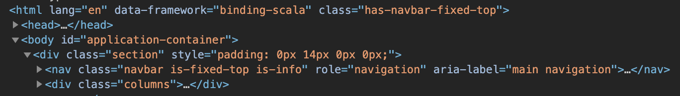
I added style="padding:0 14px 0 0;" to the root section div, this seems to work in safari and chrome so I'm going to move forward and circle back if I have to.
Some notes:
- adding .is-paddingless to the section reintroduced the issue
- including the content in a container div limited the width of the page on a widescreen monitor
body { overflow-x: hidden; }and .is-clipped left content butted against the screen edge- modifying the .columns margins also left the page too wide, that might be because I have nested columns...
 babyman
on 9 Jan 2020
babyman
on 9 Jan 2020
Same issue. FWIW the commit that closed this issue was reverted the same day by a subsequent commit so I believe it's no surprise it's not working: https://github.com/jgthms/bulma/commit/f04209dda008f2da058b5f269792facfcb807639
Removing the negative left and right margins in the dev tools fixes the page. I'm going to open another issue since this is getting no attention.
 rendaw
on 14 Jan 2020
rendaw
on 14 Jan 2020
This worked fine to me:
body { overflow-x: hidden; }
Works like a charm here! Not a very beautiful workaround, but a smart play, indeed!
 joaopedromattos
on 22 Jan 2020
joaopedromattos
on 22 Jan 2020
I also have the issue! It is still there!
 Lukasiniho
on 31 Mar 2020
Lukasiniho
on 31 Mar 2020
jsfiddle showing the issue:
https://jsfiddle.net/1nfmw0h7/
 danstewart
on 22 May 2020
danstewart
on 22 May 2020
Related issues
 scottgrayson
·
3Comments
scottgrayson
·
3Comments
 swthate
·
3Comments
swthate
·
3Comments
 leofontes
·
3Comments
leofontes
·
3Comments
 Yard8
·
3Comments
Yard8
·
3Comments
 guillecro
·
3Comments
guillecro
·
3Comments
Most helpful comment
This bug still exists and should be re-opened @jgthms