Buefy: Issue with error message when input has inlined button
This is probably duplicate of #506 but I'm getting no response there so I'll open a new issue to get some visibility:
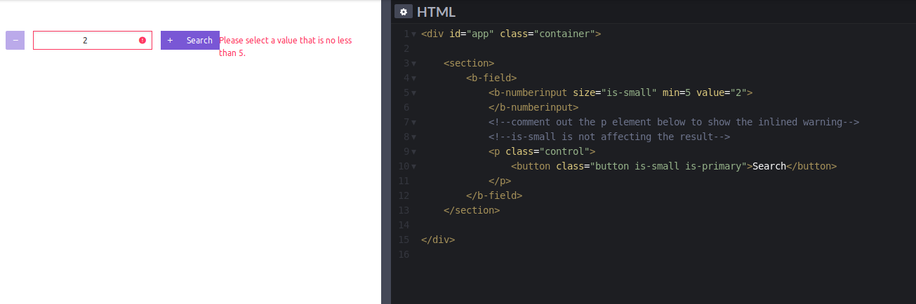
c/p from my last comment there:
To reproduce use the fiddle from this example:
https://buefy.org/documentation/field#addons
and replace <section>...</section> with
    <section>
        <b-field>
            <b-numberinput size="is-small" min=5 value="2">
            </b-numberinput>
            <!--comment out the p element below to show the inlined warning-->
            <!--is-small is not affecting the result-->
            <p class="control">
                <button class="button is-small is-primary">Search</button>
            </p>
        </b-field>
    </section>
Then click on the input, and then outside of it to trigger the error message.
Sorry, I don't have an account with code pen, and I have no clue how to link directly to it.
Here's how it looks when you remove the search button.

 dmcbrn
All 3 comments
Similar to #226 and #1226
 service-paradis
on 31 Oct 2019
service-paradis
on 31 Oct 2019
Looks like the addons feature is not designed to take into account .help messages yet.
The hack described in other issues consists of having another field arround the one with addons to display the message. This does not work here because the validation message will be in the field with addons anyway.
It's possible to make it look okayish with some custom CSS, the border-radius are not valid but that can be fixed as well.
.field.has-addons {
  flex-wrap: wrap;
}
.field.has-addons .help {
  width: 100%;
}
 fungiboletus
on 8 Nov 2019
fungiboletus
on 8 Nov 2019
The solution from @fungiboletus works. Thank you!
Still hadn't test on my app but I don't think there will be any conflicts.
In the meantime, I need to spend some time on flex again :(
dmcbrn
on 9 Nov 2019
Related issues
 dangminhtruong
·
3Comments
dangminhtruong
·
3Comments
 ravenvn
·
3Comments
ravenvn
·
3Comments
 sempixel
·
3Comments
sempixel
·
3Comments
 daltonrooney
·
3Comments
daltonrooney
·
3Comments
 teryngull
·
3Comments
teryngull
·
3Comments
Most helpful comment
Looks like the addons feature is not designed to take into account
.helpmessages yet.The hack described in other issues consists of having another field arround the one with addons to display the message. This does not work here because the validation message will be in the field with addons anyway.
It's possible to make it look okayish with some custom CSS, the
border-radiusare not valid but that can be fixed as well.