Btcpayserver: Jumpy transition when refreshing wallet transaction page when there are labels
Describe the problem/bug
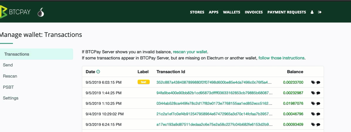
If you assign a label(s) to your transactions and refresh or just visit the page, the transition will be awkward and the screen will "jump" (see gif at the bottom).
While it's a minor UX annoyance, it can look pretty awkward on slower servers (that take a bit more to load)
This is possibly introduced with .128
Your environment
- Version of BTCPay Server: v1.0.3.130
- Deployment method: Docker
- Other relevant environment details: Tested on Chrome and Firefox
To Reproduce
Steps to reproduce the behavior:
- Assign a label to a transaction (one or more).
- Visit wallet and you'll notice jumping
- Refresh to see again
Screenshots/Links
 pavlenex
All 4 comments
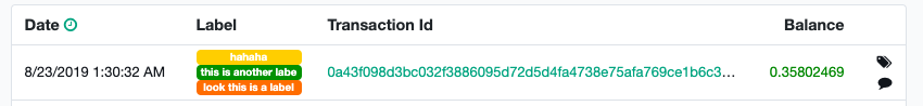
A small related issue: if you have more than one label they butt up agains each other without any space in-between. It would be nice to have some space between each label.
 bolatovumar
on 6 Sep 2019
bolatovumar
on 6 Sep 2019
Also would be nice to be able to remove a label by clicking some sort of "x" icon in the label.
bolatovumar
on 6 Sep 2019
@bolatovumar That was quick. Both of your suggestions are good ideas. I agree. Will test the jumpy transition in a few hours and comment on the PR.
pavlenex
on 6 Sep 2019
@pavlenex I will probably open two separate issues for the two suggestions.
bolatovumar
on 6 Sep 2019
Related issues
 britttttk
·
3Comments
britttttk
·
3Comments
 ghost
·
3Comments
ghost
·
3Comments
 astupidmoose
·
3Comments
astupidmoose
·
3Comments
 beetlevw
·
3Comments
beetlevw
·
3Comments
 NicolasDorier
·
3Comments
NicolasDorier
·
3Comments