Bromite needs a new logo. The current logo is a derivation of Chromium logo and it makes sense since Bromite is 99% Chromium, but for the sake of the project it is better to have an original one.
I am thinking to create a submission window and reference it from the official website to give it visibility, and/or create a Reddit post for this. Suggestions welcome.
Edit: I added the official news post here: https://www.bromite.org/news/2018-09-05-submissions-for-new-logo
it will be edited and act as the reference for the submissions for the time being
 csagan5
All 32 comments
What about these icons?
All suggestions should be posted here.
 Primokorn
on 5 Sep 2018
Primokorn
on 5 Sep 2018
It could be me but I don't understand what the icons are trying to express.
I checked Wikipedia for the chemical formula of Bromite (I thought this is the background for the name), but it's too complex for an icon :sweat_smile:
 ouzowtf
on 5 Sep 2018
ouzowtf
on 5 Sep 2018
What about these icons?
All suggestions should be posted here.
I remember those, nothing worth using IMO, they are a quick job. There was even an user that setup a steemit page claiming he did some work for this open source project; we are not using any of those.
csagan5
on 5 Sep 2018
I added the official news post here: https://www.bromite.org/news/2018-09-05-submissions-for-new-logo
it will be edited and act as the reference for the submissions for the time being
csagan5
on 5 Sep 2018
they are a quick job
Material Design is quick job lol
This may interest you.
Primokorn
on 6 Sep 2018
Material Design is quick job lol
First of all, who said material design? I know Chromium is getting a new material design UI with release 69, but it does not mean that everything must be done in material design for Bromite as well. I personally would prefer a minimalist design.
Second, those are quick jobs. They were posted a day from the moment I said Play Store does not like Bromite's logo (note: I never asked for a logo submission back then). None of them cater the idea of a browser in my opinion. Also I would stay away from trying to visualize the idea of privacy, it is difficult and ambiguous.
The only one which was probably done decently is this: https://steemit.com/utopian-io/@iamfo/sngt-version-and-my-version-new-proposed-logo-design-for-bromite
I have great respect for the work of designers, but the donations are not enough to pay one properly. Any work done for the logo of Bromite will be obviously a donation itself, since 100$ are probably an indecent amount for most professionals (depends from the part of the world, I know).
This may interest you.
I will give a look. There is also 99talent, but I am not sure I want to register to some platform that will send me endless spam for life if I want to use the service once.
csagan5
on 6 Sep 2018
@subh98 thanks, it would be too similar to the Chromium logo though. That is an exclusion criteria as described here.
csagan5
on 6 Sep 2018

 ghost
on 6 Sep 2018
ghost
on 6 Sep 2018
why you named it bromite?
 rohitjuyal5
on 8 Sep 2018
rohitjuyal5
on 8 Sep 2018
why you named it bromite?
See https://www.bromite.org/news/2018-09-05-submissions-for-new-logo#inspiration-material-for-this-logo
csagan5
on 9 Sep 2018
Hi, I have a new icon suggestion for bromite!
png format:

svg format:
MyBromiteIcon.zip
The chemical formula of bromite ion is hidden in this icon😎
I do not know what it looks like, a green Doraemon maybe, with red (bromine is a red liquid) hairs and eyes😅
ghost
on 9 Sep 2018
Hello, I will make my proposal :smiley:
 ggabogarcia
on 10 Sep 2018
ggabogarcia
on 10 Sep 2018
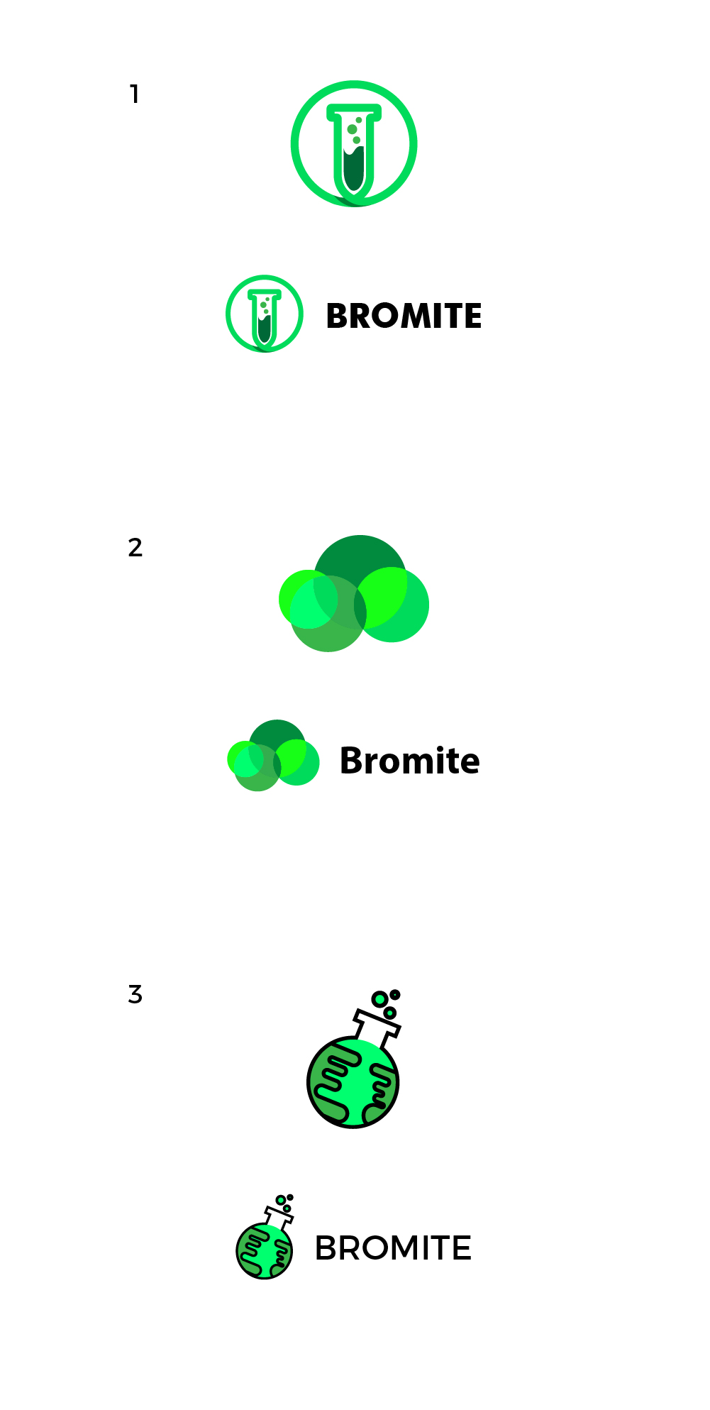
Hello here are my proposals, I made 3.
#
The first proposal is a test tube inside a circle which represents the world.
In the second proposal I made an extraction of the image of the chemical component, in which I superimposed circles according to the pattern.
The third one I focus on when you say:
For example the logo - in its most basic design - could be a greenish world with a test tube overlayed.
ggabogarcia
on 11 Sep 2018
@ggabogarcia thanks! They look really nice. Some feedback, which is entirely up to you to consider or not:
- on (1), have you considered having a contour?
- same for (2), and perhaps one of the atoms could be the world, and/or the rightmost sport a "B"?
- for (3) I think most people would want to see the outline of continents there? my preference being Antarctica to be neutral :laughing:
@Primokorn you meant that Android icons must necessarily be done in material design? are there special requirements that I should mention in the logo submission news post?
csagan5
on 11 Sep 2018
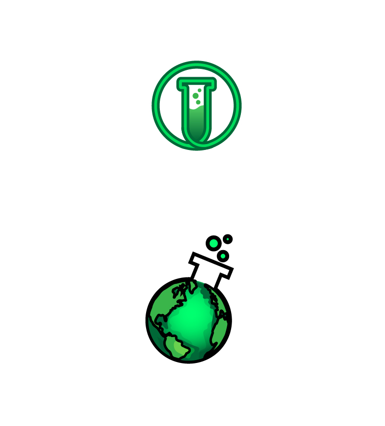
@csagan5 I followed your advice, but only modify the first and third proposals
ggabogarcia
on 11 Sep 2018
@Primokorn you meant that Android icons must necessarily be done in material design? are there special requirements that I should mention in the logo submission news post?
Dimensions: 192 x 192 since you don't need a specific file for Google Play (512px)
The icon should be adaptive: https://developer.android.com/guide/practices/ui_guidelines/icon_design_adaptive
Here are the MD guidelines: https://material.io/design/iconography/#icons-product-icons
Primokorn
on 12 Sep 2018
@ggabogarcia that is a bit too heavy contour, if I may say :blush:
@Primokorn thanks, I will update the logo submission post
@0x264f I am afraid that is still too similar to Chromium logo
csagan5
on 14 Sep 2018
Hi, guys!
My name is Vadim, I’m a designer, and while exploring android guidelines, I decided to make an icon for your project.
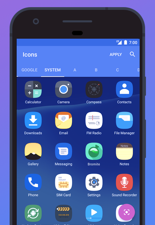
Here is my suggestion. It's a test flask, so I keep allusion to chemistry, but it's also represents the window to the world, which I think is also nice for the browser.

Icon matches nicely with other adaptive android icons:
...and takes advantage of its layered structure with nice periscope effect:

Flask itself can be used as a logo on site or social media:

Let me know if you decided to use my version, and I'll provide you files.
Thanks!
 vdmp
on 15 Sep 2018
vdmp
on 15 Sep 2018
Wow, @vdmp, this looks amazing already.
 Abacate123
on 16 Sep 2018
Abacate123
on 16 Sep 2018
@vdmp thanks for your work and your submission! Really nice :blush: I will have to pick one on the deadline of 5 October 23:59 UTC, as published here: https://www.bromite.org/news/2018-09-05-submissions-for-new-logo
csagan5
on 17 Sep 2018
Hello, I read your comment, here is my last entry. :smiley_cat:

ggabogarcia
on 25 Sep 2018
Thanks to all participants, I have closed the submission window a bit earlier; the selected logo is the submission of @vdmp here
I really appreciate the works you guys submitted!
The logo will be changed as soon as I receive the material and there is a new release.
csagan5
on 28 Sep 2018
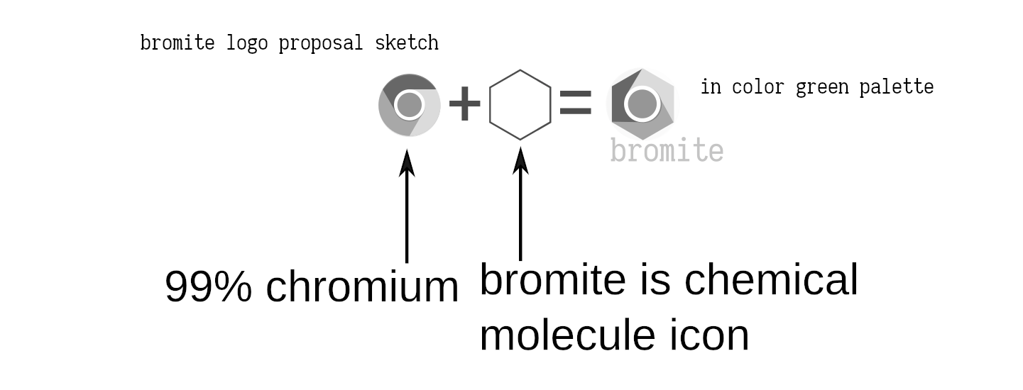
Hi! A bit late.
 illucent
on 29 Sep 2018
illucent
on 29 Sep 2018
You forgot to update the favicons.
 Madis0
on 17 Oct 2018
Madis0
on 17 Oct 2018
Hi, guys!
My name is Vadim, I’m a designer, and while exploring android guidelines, I decided to make an icon for your project.
Here is my suggestion. It's a test flask, so I keep allusion to chemistry, but it's also represents the window to the world, which I think is also nice for the browser.
Icon matches nicely with other adaptive android icons:
...and takes advantage of its layered structure with nice periscope effect:
Flask itself can be used as a logo on site or social media:
Let me know if you decided to use my version, and I'll provide you files.
Thanks!
I'm not getting adaptive icon on Oreo.
 nicd23
on 17 Oct 2018
nicd23
on 17 Oct 2018
You forgot to update the favicons.
Yes, I am not finished with updating the logo everywhere.
I'm not getting adaptive icon on Oreo.
@nicd23 unfortunately I am not capable of adding adaptive icons. Does the regular Chromium have them?
csagan5
on 19 Oct 2018
@csagan5 I'm not using regular Chromium, just Bromite. Designer of the new icon @vdmp provided all shapes, nicely done shadow but official icon doesn't look nearly as good. Why is that the case?
nicd23
on 4 Nov 2018
@nicd23 I believe it has to configured as an adaptive icon within Bromite; sadly I am not that good and have not found how to do it so far.
csagan5
on 9 Nov 2018
https://developer.android.com/guide/practices/ui_guidelines/icon_design_adaptive
Pretty much just one more XML file.
Madis0
on 9 Nov 2018
@Madis0 well then please submit a patch! :smile:
csagan5
on 9 Nov 2018
Since you have the build setup already, maybe you can do it by my instructions.
Here's how I did it:
Create a new file: .../Resources/mipmap-anydpi/icon.xml
<?xml version="1.0" encoding="UTF-8" ?>
<adaptive-icon xmlns:android="http://schemas.android.com/apk/res/android">
    <background android:drawable="@color/ic_background"/>
    <foreground android:drawable="@mipmap/ic_foreground"/>
</adaptive-icon>
Move/rename the original icon to .../Resources/mipmap/ic_foreground.png
Append a color in .../Resources/values/Colors.xml
<color name="ic_background">#77ebcc</color>
Madis0
on 12 Nov 2018
@Madis0 let's continue this on #181
csagan5
on 13 Nov 2018
Related issues
Abacate123
·
4Comments
 drygdryg
·
3Comments
drygdryg
·
3Comments
 Wilker-a
·
4Comments
csagan5
·
6Comments
Wilker-a
·
4Comments
csagan5
·
6Comments
 nerrixDE
·
5Comments
nerrixDE
·
5Comments
Most helpful comment
Hi, guys!
My name is Vadim, I’m a designer, and while exploring android guidelines, I decided to make an icon for your project.
Here is my suggestion. It's a test flask, so I keep allusion to chemistry, but it's also represents the window to the world, which I think is also nice for the browser.
Icon matches nicely with other adaptive android icons:

...and takes advantage of its layered structure with nice periscope effect:

Flask itself can be used as a logo on site or social media:

Let me know if you decided to use my version, and I'll provide you files.
Thanks!