Botframework-emulator: [MAS2.1.1] [Keyboard Navigation-Welcome] Tooltip is not available through the keyboard for “Presentation, Split editor “mode controls
Actual Result:
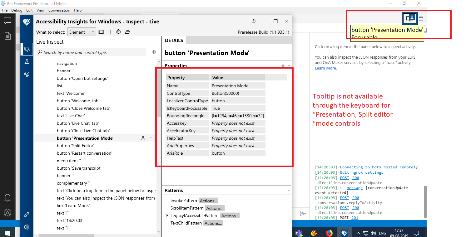
Tooltip is not available through the keyboard for “Presentation, Split editor “mode controls
Expected Result:
Tooltip should be available through the keyboard for “Presentation, Split editor “mode controls
Tooltip information also is not narrating the NVDA
Note: Same issue exits throughout the application wherever tooltip controls present.
Note 1: Same issue repro for below path
Navigate to the Open bot ->Select the Open bot control->Open bot dialog
1.Browse
Navigate to the Open bot ->Select the Open bot control->Open bot dialog ->Connect the bot
1.File upload button 2.Send button
Bot Explorer->Endpoint->+symbol:
1.End point url, 2.Name. ...etc
Welcome Bot Framework Emulator ->Create new bot configuration
1.Bot Name 2.End Point URL.
Bot Explorer->Services->+symbol->Add Dispatch->Connect to a dispatch model manually
1.Name 2. LUISAPP ID 3.Authoring key 4.Version,Region"
Bot Explorer->Services->+symbol->Add other service
1.Name 2.URL
Bot Explorer->Services->+symbol->Add language understanding-> add a LUIS app manually
1.Name 2. LUISAPP ID 3.Authoring key 4.Version,Region"
Repro Steps:
1.Open the Bot Framework V4 Emulator.
2.Navigate to the Live chart tab and select it
3.Navigate to the Presentation ,Split editor mode controls using keyboard
4.Observe the issue
User Impact:
Test Environment:
OS Build: Version 1903(OS Build 18362.239)
Browser: Edge
Application: Bot Framework V4 Emulator
MAS Reference Link:
Sharepoint Link
MAS2.1.1_Welcome.zip
 awalia13
All 11 comments
~This issue reproduces with Narrator but not NVDA. In Web Chat, we were told not to test Narrator and Chrome since they're not supported, and this scenario is essentially testing NVDA with Chrome due to it being an electron app. Should we be testing on both Narrator and NVDA despite the conflicts between browser and AT?~
~If yes, my solution is to add aria-label to both buttons that says "Toggle Presentation mode" and "Toggle split editor", so that on NVDA the narrator will read "Toggle Presentation mode Presentation mode button" instead of "Presentation Mode Presentation Mode button"~
~I will push up my branch for reference, but wait until discussed before making a PR. :)~
Please see below
 corinagum
on 22 Aug 2019
corinagum
on 22 Aug 2019
Branch can be found on this repo at corinagum/fix-1715
corinagum
on 23 Aug 2019
@corinagum I believe the issue here is not that the buttons aren't being narrated, but that the tooltips do not show when the controls are focused.
This is a fault built into the title HTML attribute.
 tonyanziano
on 27 Aug 2019
tonyanziano
on 27 Aug 2019
facepalm Thanks @tonyanziano. I'll take this one, haha.
corinagum
on 27 Aug 2019
agree with @tonyanziano
awalia13
on 27 Aug 2019
Thanks for the help. @awalia13, could you help us reach a conclusion on the best way to fix this?
I see now that title is actively discouraged in the a11y community. My initial reaction was to add aria-label to these buttons, but that would only speak the text when using AT. It would not solve the problem of tooltip not showing on keyboard focus.
When other teams have come across this in their app, how do they generally resolve it? I think creating a tooltip component that behaves as you describe would be out of scope.
Is removing the tooltip a viable option? I can also add the aria-label to the button, but I don't know that there is a simple, HTML-native way to replace title.
Your advice is greatly appreciated! Thank you!
corinagum
on 28 Aug 2019
@corinagum - We can create the custom tool tip via ARIA using role="tooltip".
Refer Link:
1) http://pauljadam.com/demos/aria-role-tooltip.html
2) http://accessibility.athena-ict.com/aria/examples/tooltip.shtml
Hope it will help.
awalia13
on 29 Aug 2019
@awalia13, thank you for the samples. Implementing a custom tooltip is a pretty big undertaking that I don't think is represented in the links you sent above.
Using Windows OS as an example, I took a look at the behavior of the title bar in File Explorer. The following gif is an example of hover state on buttons and icons, which shows the tooltip, and then keyboard focus on several of the icons showing that tooltip does not appear.

Although I like the idea of implementing a custom tooltip, there are UX considerations that aren't mentioned or handled in the samples above. For example,
- clipping text/autoflow of the tooltip in a nested container,
- how to ensure only one tooltip is shown at a time,
- how to elegantly keep the tooltip above all other components
The overwhelming recommendation in designing an inclusive app seems to be to NOT use tooltips in the first place, and instead add text next to the icons in questions to add clarity.
https://inclusive-components.design/tooltips-toggletips/
Would it be possible to discuss this further? Thank you!
corinagum
on 29 Aug 2019
We probably need to chat about this as a group, we are going to have this same issue in Composer and other apps. I can see both sides of the argument.
 DesignPolice
on 4 Sep 2019
DesignPolice
on 4 Sep 2019
Marking as "by design" because tooltips natively behave this way in HTML / on the web.
tonyanziano
on 6 Sep 2019
As per dev comments we are closing this bug
 Kumar2608
on 12 Sep 2019
Kumar2608
on 12 Sep 2019
Related issues
 Revolyze
·
4Comments
Revolyze
·
4Comments
 mark-szabo
·
6Comments
mark-szabo
·
6Comments
 wlopez-enkoding
·
5Comments
wlopez-enkoding
·
5Comments
 cwhitten
·
5Comments
cwhitten
·
5Comments
 giorgobiani
·
3Comments
giorgobiani
·
3Comments