Bootstrap: Select: Uneven padding in Chrome 83
OS: Mac OS X Catalina
Chrome 83 (Chrome 81 in BrowserStack)
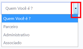
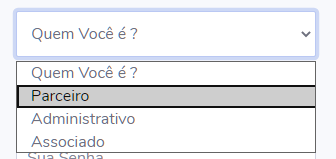
The padding on the select form control looks really asymmetrical. Specifically, the dropdown arrow is butting up against the right side of the component, whereas there's a decent amount of padding on the left side. This is Chrome 83. Looking at Chrome 81 (via browserstack), the select menu has a different drop arrow. Though the right-side padding is marginally, if at all, greater in 81, the left padding is much greater in 83, giving a very jarring asymmetrical look.
This is almost certainly related to the updated form control UI in Chrome 83.
You can see it in the example in the Bootstrap docs.
I've uploaded screenshots to imgur. This should be reproducible in browserstack.
 ranneyd
All 5 comments
Will have to look to see what we can do for v4 since we only have custom forms in v5.
 mdo
on 17 Jun 2020
mdo
on 17 Jun 2020
@mdo upon further investigation in browserstack, this appears to be an ironic anti-bug, because the select in Chrome 81 actually does not respect padding (which comes from .form-control). select in Chrome 83 does, but it doesn't apply to the little dropdown. That's why the old one had scant padding, but was still symmetrical, and the new one isn't.
ranneyd
on 17 Jun 2020
@ranneyd @mdo Just adding to this
On Chrome 83 (plus 84 beta, 85 dev) a selected option in the select dropdown box now has a black border and a slightly uneven vertical alignment in the selected element. Pretty fugly...

I can't control this by CSS to my knowledge so I guess it's something that can't be fixed perhaps.
 altescape
on 19 Jun 2020
altescape
on 19 Jun 2020
The black outline is likely due to the recent improvements to Chrome's focus ring https://blog.chromium.org/2020/03/updates-to-form-controls-and-focus.html - and yes, I believe currently it can't be overridden via CSS (though focus indication can be modified for form controls themselves...just not the actual select's dropdown which is pretty much under the sole control of the browser and offers little to no styling hooks) [edit: ah i see the thread starter already mentioned the UI changes in Ch83 ... sorry for restating the obvious]
 patrickhlauke
on 19 Jun 2020
patrickhlauke
on 19 Jun 2020
Firefox
Edge
 ROGERIO-RIOS
on 8 Jul 2020
ROGERIO-RIOS
on 8 Jul 2020
Related issues
 MrCsabaToth
·
3Comments
MrCsabaToth
·
3Comments
 steve-32a
·
3Comments
steve-32a
·
3Comments
 ghost
·
3Comments
ghost
·
3Comments
 cvrebert
·
3Comments
cvrebert
·
3Comments
 athimannil
·
3Comments
athimannil
·
3Comments
Most helpful comment
The black outline is likely due to the recent improvements to Chrome's focus ring https://blog.chromium.org/2020/03/updates-to-form-controls-and-focus.html - and yes, I believe currently it can't be overridden via CSS (though focus indication can be modified for form controls themselves...just not the actual select's dropdown which is pretty much under the sole control of the browser and offers little to no styling hooks) [edit: ah i see the thread starter already mentioned the UI changes in Ch83 ... sorry for restating the obvious]