Bootstrap: Dropdown inside Table Responsive in Safari of iOS 12.4
When using dropdowns inside scrollable elements, such as table-responsive, there is an option to set the dropdown's boundary to the viewport, this way the dropdown is not clipped by the scrollable parent overflow.
It works great, I use it and works fine in many browser. However it is not working on Safari for iPhone. Even with the boundary set to the viewport, the dropdown gets clipped inside the table-responsive element.
The iPhone I tested against is an IPhone 8 using iOS 12.4.
I also tested against an iPad Pro (10") using iPadOS 13 Beta. In this device everything works as expected.
I do not have access to a machine with macOS, therefore I cannot tell if this problem happens in the desktop version of Safari. I tried with Gnome/Web (Epiphany) which uses WebKit and it works as expected on desktop. In all other browsers I tested it worked as expected (Firefox, Chrome, both on Desktop)
The reduced test case is the following:
~~~html
<title>Demonstration</title>

<link rel="stylesheet" href="https://stackpath.bootstrapcdn.com/bootstrap/4.3.1/css/bootstrap.min.css">
<script src="https://code.jquery.com/jquery-3.3.1.slim.min.js"></script>
<script src="https://cdnjs.cloudflare.com/ajax/libs/popper.js/1.14.7/umd/popper.min.js"></script>
<script src="https://stackpath.bootstrapcdn.com/bootstrap/4.3.1/js/bootstrap.min.js"></script>
| Lorem ipsum dolor. | Laboriosam, optio, ratione. | Consequatur dolorum, quisquam. | Accusamus in, quaerat! | Ducimus excepturi, inventore. |
|
~~~
I also created a Code Pen with the same code, the error only happens on Safari for iPhone:
https://codepen.io/rodrigopedra/pen/gOYWQPZ
As it is difficult to me to debug this code on Safari for iOS (because there is no Mac around) I could not dive into the problem to make a suggested fix.
I searched for previous issues regarding this same problem and I found these closed issues:
11037 / #15288 / #15374 / #24251
In any of them there were mentions to this behavior happening only on Safari for iPhone.
It was not very clear (to me at least, not a native English speaker) in the issue template if I should have added a comment on a closed issue or open a new one. As I think it is a different problem I opened a new one. Sorry if I misunderstood something.
EDIT Just tested on my son's iPad Air 2 which is also running iOS 12.4 and it also does not work as expected. I updated he issue's title to reflect that
 rodrigopedra
All 8 comments
It seems it's a positioning issue so maybe @FezVrasta can help us here
 Johann-S
on 28 Aug 2019
Johann-S
on 28 Aug 2019
If you could please prepare an example using only Popper.js and not any of the Bootstrap code I'll be happy to give it a look next week after I come back from my vacation 🌴
 FezVrasta
on 28 Aug 2019
FezVrasta
on 28 Aug 2019
Hi @Johann-S and @FezVrasta
I created a new code pen using only Popper.js JavaScript:
https://codepen.io/rodrigopedra/pen/RwbVzmz
I kept the bootstrap's CSS.
I took a look on the bootstrap's dropdown plugin implementation to see which would be the default config for this popper.
Both pens also fail on iPadOS 13 Beta. I guess it is because they run inside an iframe, while searching for previous issues I saw something related to it. Note that the page renders fine and only the dropdown inside the table-responsive fails to "escape" its parent.
If you run the code outside of the iframe it works fine on iPadOS 13 Beta but fails on iOS 12.4
EDIT (adding screenshot for the pen running on debug mode, which runs outside of the iframe):
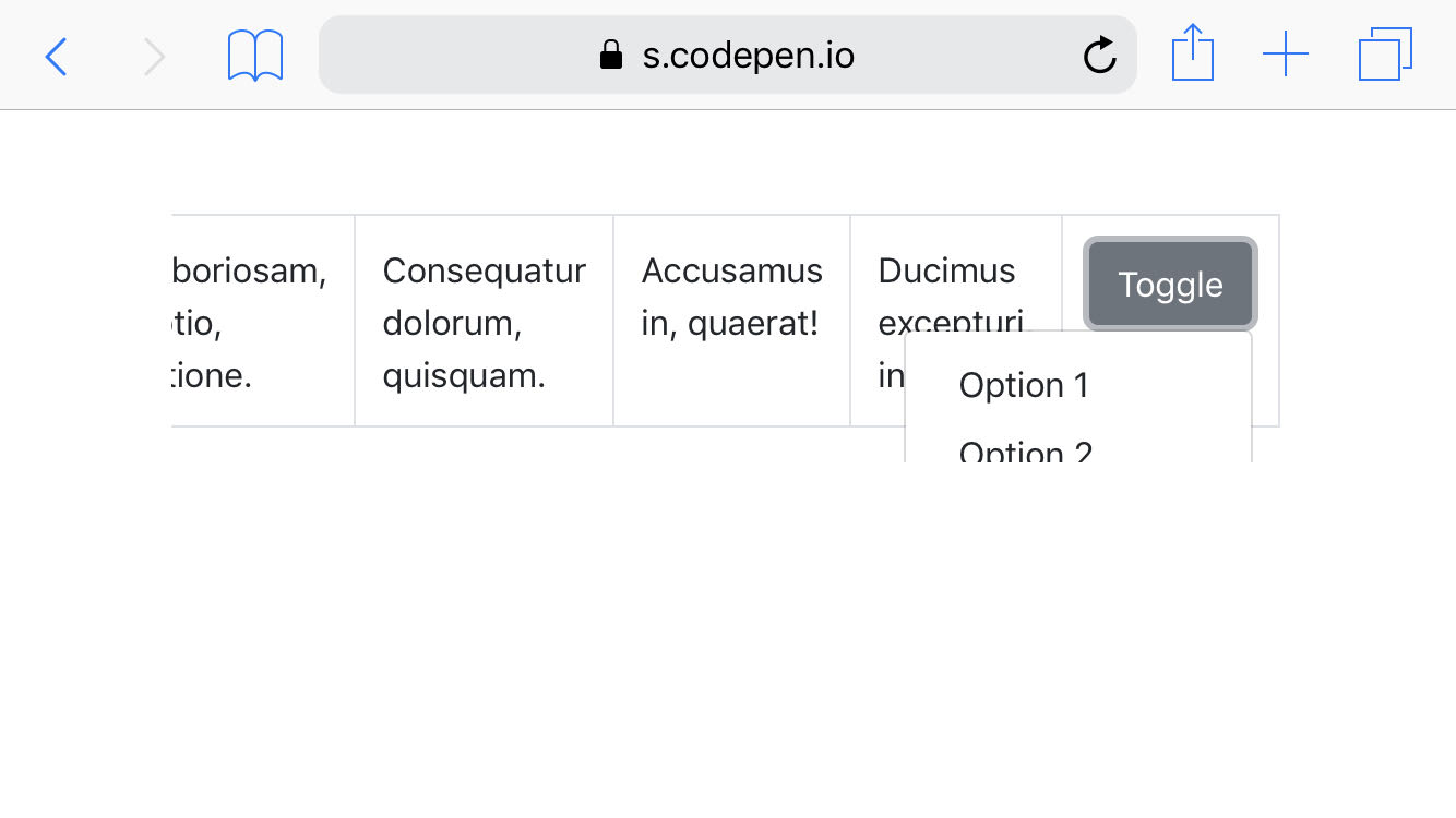
For reference, this screenshot was taken on an iPhone 8 running iOS 12.4
rodrigopedra
on 28 Aug 2019
I don't think this is limited to Safari since I am seeing something similar in Chrome.
Check out: https://codepen.io/TheSharpieOne/pen/WNNjjvb (the first table is not responsive (for comparison), the second is responsive.)

 TheSharpieOne
on 24 Oct 2019
TheSharpieOne
on 24 Oct 2019
Try adding position-static class to the table-responsive element.
 tmorehouse
on 12 Feb 2020
tmorehouse
on 12 Feb 2020
I had the same issue. Only on iOS/iPadOS any dropdown or other Popper.js element got clipped by .table-responsive
The reason is _not_ overflow-x: auto;
The real reason is -webkit-overflow-scrolling: touch; which enforces smooth touch scrolling. This property is iOS-specific only, no other browser supports it.
Quick fix for dropdowns:
.table-responsive { -webkit-overflow-scrolling: auto; }
The downside is that horizontal scrolling of table is not smooth. It may have sense to override this property only when some dropdown is shown. But it doesn't seem possible via pure CSS, only JS solution.
Works on latest iOS 12 and 13.3 for me. iPhone 5S and 11.
 dmitry-rychkov
on 22 Feb 2020
dmitry-rychkov
on 22 Feb 2020
I had the same issue. Only on iOS/iPadOS any dropdown or other Popper.js element got clipped by
.table-responsiveThe reason is _not_
overflow-x: auto;
The real reason is-webkit-overflow-scrolling: touch;which enforces smooth touch scrolling. This property is iOS-specific only, no other browser supports it.Quick fix for dropdowns:
.table-responsive { -webkit-overflow-scrolling: auto; }The downside is that horizontal scrolling of table is not smooth. It may have sense to override this property only when some dropdown is shown. But it doesn't seem possible via pure CSS, only JS solution.
Works on latest iOS 12 and 13.3 for me. iPhone 5S and 11.
You're a lifesaver!! THANK YOU!!
 linlovefon
on 16 Apr 2020
linlovefon
on 16 Apr 2020
@twbs/css-review is this something we can fix in core?
 XhmikosR
on 15 Nov 2020
XhmikosR
on 15 Nov 2020
Related issues
 fohlsom
·
3Comments
fohlsom
·
3Comments
 eddywashere
·
3Comments
eddywashere
·
3Comments
 athimannil
·
3Comments
athimannil
·
3Comments
 vinorodrigues
·
3Comments
vinorodrigues
·
3Comments
 matsava
·
3Comments
matsava
·
3Comments
Most helpful comment
I had the same issue. Only on iOS/iPadOS any dropdown or other Popper.js element got clipped by
.table-responsiveThe reason is _not_
overflow-x: auto;The real reason is
-webkit-overflow-scrolling: touch;which enforces smooth touch scrolling. This property is iOS-specific only, no other browser supports it.Quick fix for dropdowns:
.table-responsive { -webkit-overflow-scrolling: auto; }The downside is that horizontal scrolling of table is not smooth. It may have sense to override this property only when some dropdown is shown. But it doesn't seem possible via pure CSS, only JS solution.
Works on latest iOS 12 and 13.3 for me. iPhone 5S and 11.