Bootstrap: Focus styling of custom check/radio inconsistent based on validation method
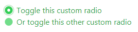
When using native browser validation, and the .was-validated class, the focused radio/checkbox indicator fill is correctly colored:
<div class="was-validated">
  <div class="custom-control custom-radio">
    <input type="radio" class="custom-control-input" id="customControlValidation2" name="radio-stacked" required>
    <label class="custom-control-label" for="customControlValidation2">Toggle this custom radio</label>
  </div>
  <div class="custom-control custom-radio mb-3">
    <input type="radio" class="custom-control-input" id="customControlValidation3" name="radio-stacked" required>
    <label class="custom-control-label" for="customControlValidation3">Or toggle this other custom radio</label>
  </div>
</div>
But if using the is-invalid or is-valid classes on the input, the focused indicator has the default "blue" background fill:
<div>
  <div class="custom-control custom-radio">
    <input type="radio" class="custom-control-input is-valid" id="customControlValidation2" name="radio-stacked">
    <label class="custom-control-label" for="customControlValidation2">Toggle this custom radio</label>
  </div>
  <div class="custom-control custom-radio mb-3">
    <input type="radio" class="custom-control-input is-valid" id="customControlValidation3" name="radio-stacked">
    <label class="custom-control-label" for="customControlValidation3">Or toggle this other custom radio</label>
  </div>
</div>
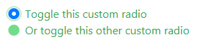
This issue happens on both custom-radio and custom-checkbox.
Expected behaviour: Both validation methods provide the same focus styling for the indicator (fill should match validation state).
(Using 4.1.3 CSS, on Chrome 60.0.3112.101)
 tmorehouse
>All comments
This was fixed with the re-theming by @MartijnCuppens that will be shipping with v4.2: https://codepen.io/anon/pen/QzEdVE.
(Took me far too long to realize that lol).
 mdo
on 17 Dec 2018
mdo
on 17 Dec 2018
😄2
👍1
Was this page helpful?
0 / 5 - 0 ratings
Related issues
 devfrey
·
3Comments
devfrey
·
3Comments
 knownasilya
·
3Comments
knownasilya
·
3Comments
 devdelimited
·
3Comments
devdelimited
·
3Comments
 matsava
·
3Comments
matsava
·
3Comments
 MrCsabaToth
·
3Comments
MrCsabaToth
·
3Comments
Most helpful comment
This was fixed with the re-theming by @MartijnCuppens that will be shipping with v4.2: https://codepen.io/anon/pen/QzEdVE.
(Took me far too long to realize that lol).