Bootstrap: Restyle close icon's focus style
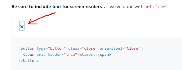
This button shouldn't be styled that way when focused (clicked) :(
 raqibjs
All 10 comments
If it's focused, it should have a focus style, no?
 mdo
on 1 Sep 2018
mdo
on 1 Sep 2018
until browsers have more consistent support for :focus-visible (and we also supplement it with a polyfill https://github.com/WICG/focus-visible), i'm afraid that yes there's no way around this. (on :focus-visible, see also https://developer.paciellogroup.com/blog/2018/03/focus-visible-and-backwards-compatibility/)
 patrickhlauke
on 1 Sep 2018
patrickhlauke
on 1 Sep 2018
@mdo Yes of course. But shouldn't we make a better style on focus?
raqibjs
on 2 Sep 2018
PRs / suggestions welcome
patrickhlauke
on 2 Sep 2018
Hi @patrickhlauke ,
I went through your blog https://developer.paciellogroup.com/blog/2018/03/focus-visible-and-backwards-compatibility/ .
Can we use the negation pseudo class approach that you have mentioned in the blog for solving this issue?
Thanks.
 TruptiM18
on 26 Sep 2018
TruptiM18
on 26 Sep 2018
[edit] oh i see, you mean the
button:focus { /* some exciting button focus styles */ }
button:focus:not(:focus-visible) {
    /* undo all the above focused button styles
       if the button has focus but the browser wouldn't normally
       show default focus styles */
}
it's possible, but it's more of an ugly illogical hack than anything else. also, until browsers do actually support :focus-visible, the end result will still be that focus styles are applied regardless of whether it's keyboard or mouse/touch/stylus that set the focus, so you wouldn't actually see anything different happening right now until browser support for :focus-visible is better https://caniuse.com/#search=focus-visible
patrickhlauke
on 26 Sep 2018
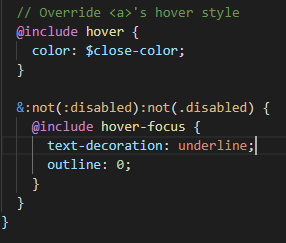
Hi, I can suggest 2 solutions.
- Font-weight
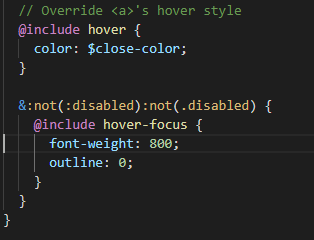
- Underline
 flammea
on 25 Apr 2019
flammea
on 25 Apr 2019
Unfortunately I don’t think a color change is enough for focus states. Neither is underline, which is synonymous with hover states. Perhaps we could at least revisit the width and height so it’s a perfect square, and then maybe make use of border/box-shadow like we use on inputs and buttons?
mdo
on 30 Apr 2019
why you set outline none?
 HERBOD7
on 17 Sep 2019
HERBOD7
on 17 Sep 2019
Hello, I would like to have a look at it together with a colleague from university. If its still open, updates and suggestion will follow
 Demactus
on 9 May 2020
Demactus
on 9 May 2020
Related issues
 alvarotrigo
·
3Comments
alvarotrigo
·
3Comments
 eddywashere
·
3Comments
eddywashere
·
3Comments
 knownasilya
·
3Comments
knownasilya
·
3Comments
 matsava
·
3Comments
matsava
·
3Comments
 athimannil
·
3Comments
athimannil
·
3Comments
Most helpful comment
Unfortunately I don’t think a color change is enough for focus states. Neither is underline, which is synonymous with hover states. Perhaps we could at least revisit the
widthandheightso it’s a perfect square, and then maybe make use ofborder/box-shadowlike we use on inputs and buttons?