Bootstrap: 'Close Icon' utility in Bootstrap 4
I'm just wondering whether we actually need this utility in the documentation? (https://getbootstrap.com/docs/4.1/utilities/close-icon/).
It seems a little redundant as it's mentioned in the intro text of this page that it can be used on Modals and Alerts, but you'll find on those components, in the examples, there's actually the <button> to close the modal:
Use a generic close icon for dismissing content like modals and alerts.
 sts-ryan-holton
All 11 comments
Maybe you want to make a closeable card.
 MicroDroid
on 23 Jun 2018
MicroDroid
on 23 Jun 2018
@MicroDroid True, but to my knowledge, I don't think cards come with the ability to be closed. It's something you'd have to build yourself, and in that situation, you'd probably end up implementing your own jQuery/Javascript, and whilst the close icon utility would still make a bit of sense, I'm not sure it needs to be in a section on it's own. We could simply add it to the cards component
sts-ryan-holton
on 23 Jun 2018
That's right, but if you use something like React/Vue/whatever you have to make your own JS anyways for even Modals because those frameworks don't like things that manipulate the DOM without their supervision.
Though I agree, it doesn't need a separate section/page
MicroDroid
on 23 Jun 2018
In addition to my comment, I'm also wondering why there's such a small text shadow on the .close <button> as well?
.close {
    text-shadow: 0 1px 0 #fff;
}
Do we really need a test shadow on a the .close <button>, other <buttons>s don't seem to have a text shadow? _(e.g: https://getbootstrap.com/docs/4.1/components/buttons/#examples)_
What's your thoughts on this?
@MicroDroid
sts-ryan-holton
on 23 Jun 2018
I am not a Bootstrap developer but let me guess: Typical buttons don't need the text-shadow because generally there's enough contrast between the button background and the color of the text.
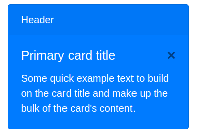
However for a .close button, the background is transparent and thus basically the parent's background, and thus this may cause color contrast issues in some cases. Here's an example of a dismissible but colored card without text-shadow:
and here's with:
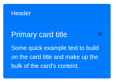
It's really just a very subtle effect to make it easier to see the button.
MicroDroid
on 23 Jun 2018
Black isn't an appropriate font color for that blue background anyway. Why not use a normal button with a bright background?
 asyncdesign
on 24 Jun 2018
asyncdesign
on 24 Jun 2018
Using white there sounds bad for me, as it makes the button blend with the text. But anyways that's just me probably, and I only guessed the reason behind the text-shadow earlier, no that I am sure why.
MicroDroid
on 24 Jun 2018
@MicroDroid Fair comment, but typically you'd use the .close icon within a lighter element, like a modal with a white background, and with this it could look a bit blurred with the white background
sts-ryan-holton
on 24 Jun 2018
I used it but since it's the only thing on that page it could probably be moved.
 kogden
on 26 Jun 2018
kogden
on 26 Jun 2018
Hi @sts-ryan-holton I don't see any problem in keeping the close utility in the docs. As @MicroDroid not all implementations are done with jquery and an author would want to use it in other places.
The shadow and colors are variables that an author can customize.
 andresgalante
on 26 Jun 2018
andresgalante
on 26 Jun 2018
No plans to remove the component—it's used in our modal headers and provides expected functionality (e.g., many native windows and dialogs include this). Not everyone needs to include a close/cancel button in their footer either fwiw. We can probably nix the shadow though if someone feels strongly about it, but I don't see value in leaving this open just to track that :).
 mdo
on 9 Jul 2018
mdo
on 9 Jul 2018
Related issues
 matsava
·
3Comments
matsava
·
3Comments
 athimannil
·
3Comments
athimannil
·
3Comments
 eddywashere
·
3Comments
eddywashere
·
3Comments
 MrCsabaToth
·
3Comments
MrCsabaToth
·
3Comments
 devfrey
·
3Comments
devfrey
·
3Comments