Bootstrap: Grid columns not working on tables in some browsers
Environment
Operating System: Mac OS Sierra 10.12.6
Bootstrap Version: 4 (using https://github.com/twbs/bootstrap-rubygem)
Browsers:
- Chrome v64
- Firefox v58
- Safari v11
Description
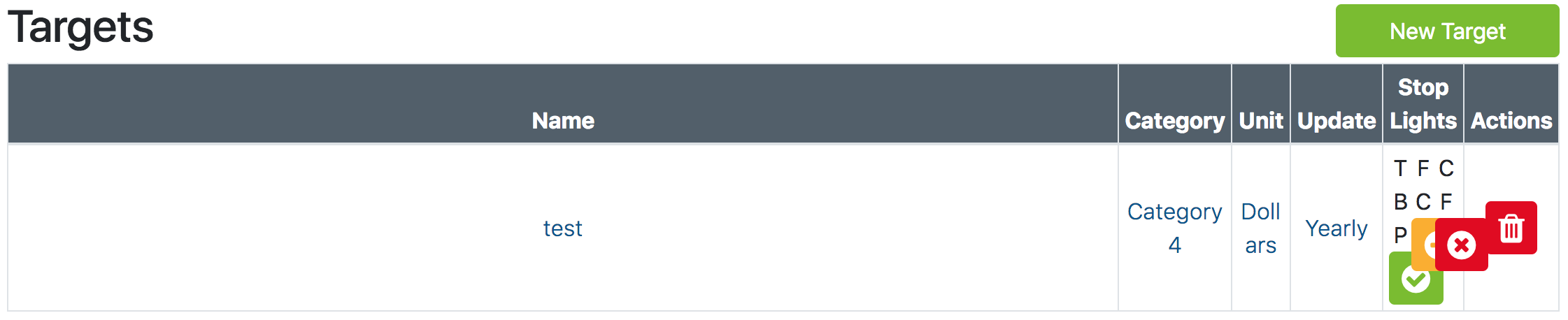
Using grid columns on Bootstrap tables works in Firefox but not in Google Chrome or Safari (IE, Edge, Opera not tested). Chrome and Safari don't respect the max-widths applied by the column styles. This happened on all viewport sizes too. It seems to be an issue of how Chrome and Safari handle max-width vs width versus how Firefox does. This might be considered a browser issue but since this is an issue in at least 2 major browsers it's probably something worth addressing here.
Ex: Firefox

Firefox Styles:

Ex: Chrome (Safari looks the same)
Chrome Styles:

Ruby HAML Code:
%table.table.table-bordered.table-sm#targetsTable
  %thead.bg-secondary.text-white.text-center
    %tr
      %th.col-3.col-md-2
        = t(:targets)[:table][:name]
      %th.col-3.col-md-2
        = t(:targets)[:table][:category]
      %th.col-md-2.d-none.d-md-table-cell
        = t(:targets)[:table][:unit]
      %th.col-md-1.d-none.d-md-table-cell
        = t(:targets)[:table][:update_frequency]
      %th.col-3.col-md-3
        = t(:targets)[:table][:indicators]
      %th.col-3.col-md-2.d-none.d-md-table-cell
        = t(:targets)[:table][:actions]
  %body
    - department.targets.eager_load(:category).each do |target|
      %tr
        %td.text-center.align-middle
          = link_to ...
        %td.text-center.align-middle.d-none.d-md-table-cell
          = link_to ...
        %td.text-center.align-middle.d-none.d-md-table-cell
          = link_to ...
        %td.text-center.align-middle
          = link_to ...
        %td.text-center.align-middle
          .container
            .row
              = ...
              = ...
              = ...
          %td.text-center.align-middle.d-none.d-md-table-cell
            = delete_target_button(target)
Solution?
I found that in order to fix this problem, I had to manually specify the widths for the various column classes as so:
.col-1 {
  width: 100%*(1/12) !important;
}

.col-2 {
  width: 100%*(2/12) !important;
}

.col-3 {
  width: 100%*(3/12) !important;
}

.col-4 {
  width: 100%*(4/12) !important;
}

.col-5 {
  width: 100%*(5/12) !important;
}

.col-6 {
  width: 100%*(6/12) !important;
}

.col-7 {
  width: 100%*(7/12) !important;
}

.col-8 {
  width: 100%*(8/12) !important;
}

.col-9 {
  width: 100%*(9/12) !important;
}

.col-10 {
  width: 100%*(10/12) !important;
}

.col-11 {
  width: 100%*(11/12) !important;
}

.col-12 {
  width: 100%*(12/12) !important;
}

@media(min-width:768px) {
  .col-lg-1, .col-md-1, .col-sm-1 {
    width: 100%*(1/12) !important;
  }

  .col-lg-2, .col-md-2, .col-sm-2 {
    width: 100%*(2/12) !important;
  }

  .col-lg-3, .col-md-3, .col-sm-3 {
    width: 100%*(3/12) !important;
  }

  .col-lg-4, .col-md-4, .col-sm-4 {
    width: 100%*(4/12) !important;
  }

  .col-lg-5, .col-md-5, .col-sm-5 {
    width: 100%*(5/12) !important;
  }

  .col-lg-6, .col-md-6, .col-sm-6 {
    width: 100%*(6/12) !important;
  }

  .col-lg-7, .col-md-7, .col-sm-7 {
    width: 100%*(7/12) !important;
  }

  .col-lg-8, .col-md-8, .col-sm-8 {
    width: 100%*(8/12) !important;
  }

  .col-lg-9, .col-md-9, .col-sm-9 {
    width: 100%*(9/12) !important;
  }

  .col-lg-10, .col-md-10, .col-sm-10 {
    width: 100%*(10/12) !important;
  }

  .col-lg-11, .col-md-11, .col-sm-11 {
    width: 100%*(11/12) !important;
  }

  .col-lg-12, .col-md-12, .col-sm-12 {
    width: 100%*(12/12) !important;
  }
}
 kayla-glick
All 2 comments
This is intentional—grid is flex-based, a completely different display and layout method than tables.
 mdo
on 3 Mar 2018
mdo
on 3 Mar 2018
@mdo Thank you for the reply. I looked up the issue and found some stuff on Stack Overflow that helps me. If I may make a recommendation, it would be helpful if there was some documentation on adding fixed-width columns to tables in the Docs. I followed this question myself https://stackoverflow.com/questions/37924104/bootstrap-4-table-column-sizing
kayla-glick
on 5 Mar 2018
Related issues
 tiendq
·
3Comments
tiendq
·
3Comments
 eddywashere
·
3Comments
eddywashere
·
3Comments
 ghost
·
3Comments
ghost
·
3Comments
 iklementiev
·
3Comments
iklementiev
·
3Comments
 MrCsabaToth
·
3Comments
MrCsabaToth
·
3Comments
Most helpful comment
@mdo Thank you for the reply. I looked up the issue and found some stuff on Stack Overflow that helps me. If I may make a recommendation, it would be helpful if there was some documentation on adding fixed-width columns to tables in the Docs. I followed this question myself https://stackoverflow.com/questions/37924104/bootstrap-4-table-column-sizing