Bootstrap: Modal input-field Cursor positioning Bug on mobile
The problem is, that when entering some text into an input-field in a opened-modal, the text-cursor does not stay in field but shifts down under the input-field :(
Tested on iPhone 5s, iOS11 at
https://getbootstrap.com/docs/4.0/components/modal/#varying-modal-content
 rrarrarra
All 22 comments

rrarrarra
on 21 Nov 2017
The cursor appears to be offset by the amount of scroll that has happened on the modal (as it is pushed up by the virtual keyboard)
 tmorehouse
on 21 Nov 2017
tmorehouse
on 21 Nov 2017
There is currently some suggestion to solve this problem?
 andrefedev
on 24 Nov 2017
andrefedev
on 24 Nov 2017
One suggestion (based on these stack overflow answers):
- https://stackoverflow.com/questions/46339063/ios-11-safari-bootstrap-modal-text-area-outside-of-cursor
- https://stackoverflow.com/questions/46382183/how-can-i-properly-position-a-cursor-on-ios11-safari-in-popup-forms
Is to add style position: fixed to the document body while modal is opened.
body.modal-open {
position: fixed;
}
Duplicate of #24352.
 mdo
on 24 Nov 2017
mdo
on 24 Nov 2017
I had the same issue. According to this link:
https://www.igorkromin.net/index.php/2016/05/20/mobile-safari-scrolling-problem-with-an-input-field-inside-a-fixed-div/
By putting the following rules in CSS, the problem has been resolved.
html,body{
    -webkit-overflow-scrolling : touch !important;
    overflow: auto !important;
    height: 100% !important;
}
 keyhangholami
on 21 Feb 2018
keyhangholami
on 21 Feb 2018
@keyhangholami this will scroll site to top if you open modal ex. in the footer. Solution for a now is to use JS and scroll back however you will see that page posiiton is changing .
 kimek
on 28 Feb 2018
kimek
on 28 Feb 2018
this will scroll site to top if you open modal ex. in the footer. Solution for a now is to use JS and scroll back however you will see that page posiiton is changing .
@kimek can you elaborate on this? How can it be done?
 horaceleung
on 2 Mar 2018
horaceleung
on 2 Mar 2018
Try to add this meta tag:
meta name="viewport" content="user-scalable=no,initial-scale=1,maximum-scale=1"
 edsongti
on 5 Mar 2018
edsongti
on 5 Mar 2018
Best solution is use different style for modal (no opacity) on IOS 11 onwards. Best answers is here https://stackoverflow.com/questions/46339063/ios-11-safari-bootstrap-modal-text-area-outside-of-cursor @horaceleung
Position fixed + form elements are bad idea on IPhones.
Position fixed itself is fine.
More about updated IOS11 version here https://hackernoon.com/how-to-fix-the-ios-11-input-element-in-fixed-modals-bug-aaf66c7ba3f8
My idea is to fix this issue is to use web components instead of form elements.. maybe IOS11 won't 'fixed' that.
kimek
on 5 Mar 2018
meta name="viewport" content="user-scalable=no,initial-scale=1,maximum-scale=1"
you can save yourself the user-scalable=no and maximum-scale=1, because iOS now (quite rightly) ignores them (as they prevent users from being able to zoom when they may need to)
 patrickhlauke
on 5 Mar 2018
patrickhlauke
on 5 Mar 2018
@patrickhlauke IOS not ignoring "user-scalable=no and maximum-scale=1", it's adding on top of it zoom option which is not same as ignoring. Page with and without "user-scalable=no and maximum-scale=1" will zoom differently.
kimek
on 5 Mar 2018
@kimek do you have an example of this in action? initial-scale does have an effect, but my understanding was indeed that the other two directives were ignored (see https://webkit.org/blog/7367/new-interaction-behaviors-in-ios-10/)
patrickhlauke
on 5 Mar 2018
@patrickhlauke from my dev team experience ex. If you add " content="user-scalable=no,initial-scale=1,maximum-scale=1" it will stop auto zooming on input focus, zooming the page with one/two taps are 'less' possible. Still you can zoom however in a slightly harder. I will check that if it's true again and leave comment about that does this effect or not.
kimek
on 5 Mar 2018
@kimek check if just content="initial-scale=1" has the same effect (removing the ignored bits)
patrickhlauke
on 5 Mar 2018
I know 100% that only "maximum-scale=1.0, user-scalable=no " was added as I see diff now and that change iphone behave @patrickhlauke
kimek
on 5 Mar 2018
Hi kimek, Your solution 'worked' however it broke all other scrolling on the site in terms of my 'fullpage' implementation.
user-scalable=no, initial-scale=1, maximum-scale=1 made no difference to the carat positioning bug.
Are there any other suggestions? Otherwise I'm going to have to go with a static form page.
Thanks all.
 Eurymachus
on 7 Mar 2018
Eurymachus
on 7 Mar 2018
I have faced the same problem when I was working for my website. Hence I started to fetch details from all the websites possibly arranged from the big dad “Google”. However, I could not find a proper solution to fix the issue. So with disappointment I turned to my own self and started to work on probability and solutions. But dramatically, I found a permanent solution to the addressed issue. So first of all, kudos to myself and my trial and error capabilities.
I share the same solution for all of your to refer and kindly let me know in my email if this helped.
Solution:
- Identify the parent class and remove position: fixed to absolute.
- Use the below code:
$('.getStartButton-login').on('click', function (){
$('body').addClass('get_hide')
})
$(document).on('click', '.log_form__close', function (){
$('body').removeClass('get_hide')
})
Thank you so much and find me in Facebook : sarath lal.em
Good Luck!!!
 sarathlalem
on 10 Mar 2018
sarathlalem
on 10 Mar 2018
For us, saving window scroll position then scrolling it to the top, display:none-ing other content, and applying the following to the modal worked:
$(this.$el).css({
'overflow-y': 'auto!important',
'position': 'absolute',
'left': '0',
'top': '0',
});
(and of course, you have to undo all that when the modal closes)

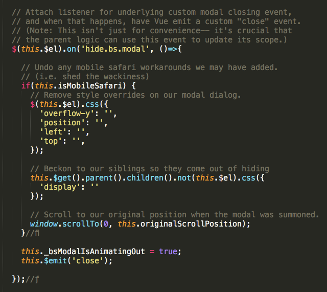
These adjustments will be included by default in the modal Vue component provided by default in the "Web app" template in Sails v1.0
 mikermcneil
on 14 Mar 2018
mikermcneil
on 14 Mar 2018
FYI; This webkit bug is fixed in iOS 11.3 which should be released to public very soon. I've tested this myself (public beta) and confirmed by others.
REF: https://bugs.webkit.org/show_bug.cgi?id=176896
 coliff
on 23 Mar 2018
coliff
on 23 Mar 2018
finally ios 11.3 is out and this issue is fixed! :)
 aaroniker
on 29 Mar 2018
aaroniker
on 29 Mar 2018
I had the same issue.
I used the following code and the issue got resolved
html,body{
    -webkit-overflow-scrolling : touch !important;
    overflow: auto !important;
    height: 100% !important;
}
 MohammedMzml
on 31 Jan 2019
MohammedMzml
on 31 Jan 2019
Related issues
 kamov
·
3Comments
kamov
·
3Comments
 iklementiev
·
3Comments
iklementiev
·
3Comments
 tiendq
·
3Comments
tiendq
·
3Comments
 eddywashere
·
3Comments
eddywashere
·
3Comments
 bellwood
·
3Comments
bellwood
·
3Comments
Most helpful comment
I had the same issue. According to this link:
https://www.igorkromin.net/index.php/2016/05/20/mobile-safari-scrolling-problem-with-an-input-field-inside-a-fixed-div/
By putting the following rules in CSS, the problem has been resolved.
html,body{ -webkit-overflow-scrolling : touch !important; overflow: auto !important; height: 100% !important; }