Bootstrap: Secondary Elements and Colors in V4 Beta
Congrats on the v4 beta!
With the new color theme and mapping a lot of secondary UI elements started to look visually heavier and active for no good reason - secondary buttons, button groups (especially used with pagers), dropdowns etc.
Could you please share what was the intention behind this update of the default color theme? I am aware that the previous v4 theme was in Alpha stage, yet I’d consider this a major visual breaking change and would be happy to have a valid reasoning and explanation what led to this update. Was it an accessibility (color contrast) issue, was it because it looks modern/trendy, or anything else?
As an example here is a preview of a dropdown button placed in a form (the old one is much more visually consistent and non-distracting):
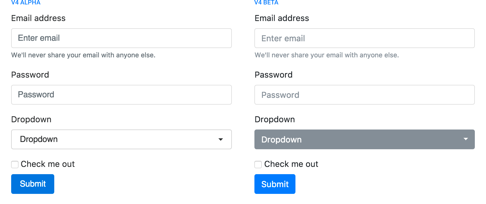
I agree this might not be the best example, as one could use a simple <select> instead of a dropdown, but I hope it depicts the issue with the visually active secondary elements.
 yordanov
>All comments
Use an outline secondary button instead of a solid secondary button.
As to the color scheme changes, it's meant to provide more options to folks and easier customization. Color contrast has been factored in, but there's still room for improvement.
 mdo
on 29 Aug 2017
mdo
on 29 Aug 2017
Related issues
 MrCsabaToth
·
3Comments
MrCsabaToth
·
3Comments
 athimannil
·
3Comments
athimannil
·
3Comments
 steve-32a
·
3Comments
steve-32a
·
3Comments
 bellwood
·
3Comments
bellwood
·
3Comments
 matsava
·
3Comments
matsava
·
3Comments