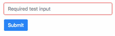
Bootstrap: Red border for required input fields on Firefox
Hi, currently a red border is displayed for required fields when using Firefox.
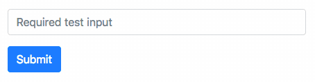
This doesn't occur in Bootstrap v3 because that version adds _box-shadow: inset 0 1px 1px rgba(0,0,0,.075)_ to _.form-control_ elements.
How to reproduce?
- Go to the official documentation: https://v4-alpha.getbootstrap.com/components/forms/
- Add required to any text input field.
- You might need to change/enter text into it and then remove it.
Code example:
<form>
  <div class="form-group">
    <label for="exampleInputEmail1">Email address</label>
    <input required type="email" class="form-control" id="exampleInputEmail1" aria-describedby="emailHelp" placeholder="Enter email">
    <small id="emailHelp" class="form-text text-muted">We'll never share your email with anyone else.</small>
  </div>
  <button type="submit" class="btn btn-primary">Submit</button>
</form>
Bootstrap: v4.0.0-alpha.5
OS: Linux
Browser: Firefox 50.0.2
 RodrigoQuesadaDev
All 12 comments
Apparently this is part of Firefox's UA stylesheet (view-source:resource://gre-resources/forms.css):
/**
* Set default style for invalid elements.
*/
:not(output):-moz-ui-invalid {
box-shadow: 0 0 1.5px 1px red;
}
:not(output):-moz-ui-invalid:-moz-focusring {
box-shadow: 0 0 2px 2px rgba(255,0,0,0.4);
}
 cvrebert
on 10 Dec 2016
cvrebert
on 10 Dec 2016
@RodrigoQuesadaDev And you find this problematic because...?
cvrebert
on 10 Dec 2016
Hi cvrebert. So, I was wondering, do you guys (Bootstrap developers team) consider it to be an issue that should be fixed as part of the style normalization the framework—to a certain extend—applies to UA styles of most popular browsers? Am I wrongly assuming things that your framework should not be concern about (like allowing you to easily keep UI consistency across different popular browsers)? Have your design decisions changed regarding this specific matter (https://github.com/twbs/bootstrap/issues/1675)? I thank you in advance for your informational and helpful replies. Thank you.
RodrigoQuesadaDev
on 10 Dec 2016
Some context on that pseudo-class: https://developer.mozilla.org/en-US/docs/Web/CSS/:-moz-ui-invalid
This pseudo-class is applied according to the following rules:
- If the control does not have focus, and the value is invalid, apply this pseudo-class.
- If the control has focus, and the value was valid (including empty) when it gained focus, do not apply the pseudo-class.
- If the control has focus, and the value was invalid when it gained focus, re-validate on every keystroke.
- If the element is required, the preceding rules apply only if the user has changed the value or attempted to submit the form.
 barraponto
on 10 Dec 2016
barraponto
on 10 Dec 2016
I see, this kind of issues belong to that project, they don't directly concern to this framework. My mistake...
RodrigoQuesadaDev
on 10 Dec 2016
Closing per Normalize's issue.
 mdo
on 27 Feb 2017
mdo
on 27 Feb 2017
Imo this makes the native validation methods in Bootstrap unusable because they will always render a red border even without the was-validated class. This is extremely confusing for developers, as the Firefox dev tools don't even show where the outline comes from. Maybe this could be considered as a reset as part of reboot?
 felixfbecker
on 12 Apr 2018
felixfbecker
on 12 Apr 2018
doesn't appear to be an issue (anymore?) in Firefox? at least from looking at https://getbootstrap.com/docs/4.0/components/forms/#validation in Firefox 59. or am i missing something @felixfbecker ?
 patrickhlauke
on 12 Apr 2018
patrickhlauke
on 12 Apr 2018
Firefox applies :-moz-ui-invalid as soon as it considers an input field "dirty" (i.e. changed at least once). The problem is, any assignment to the value property of the input field triggers this (even if it is a noop or the empty string). So if you use any frontend framework like React to sync the value with State in the component (i.e. you have a binding for the value value={this.state.fooValue}) the style will be triggered as soon as the component renders, because React will always assign the empty string initially.
Here's a JSFiddle showing the issue: https://jsfiddle.net/69z2wepo/173476/

and when trying to use Bootstrap's form feedback styles, the styles overlay each other in an ugly way:
https://jsfiddle.net/7avbL29j/4/
This can be worked around by adding
:not(output):-moz-ui-invalid:not(:focus) {
  box-shadow: none;
}

:not(output):-moz-ui-invalid:-moz-focusring:not(:focus) {
  box-shadow: none;
}
https://jsfiddle.net/bsx2mcyy/3/
but it feels like a hack because you need to exclude the Bootstrap focus states to make sure those don't get overridden.
Given that frameworks like React (I would guess this affects Angular, Vue etc just as much) are widely used I think this is a pretty bad pitfall, especially considering that most devs might never catch this because it is only happening in Firefox. I believe Bootstrap should consider adding the above override to make the styles work as expected across browsers.
felixfbecker
on 12 Apr 2018
this feels like a problem with React rather than Bootstrap in principle, as the same styling will then happen (if you inject empty string) even without Bootstrap being present at all, in vanilla pages? Probably something more suited to tackle at React's end rather than adding a hacky workaround in BS?
patrickhlauke
on 13 Apr 2018
The usage of a view engine like React is just the reason why you don't see it initially on the docs page - I would argue that when using Bootstrap (and therefor Bootstrap's :valid and :invalid styles), I want only those styles to show and not overlay weirdly as shown in my second example (which you can reproduce with static HTML too, without React). The same way that Bootstrap disables the native browser focus outline because it implements its own custom focus style through box-shadow, it should disable the native browser invalid-input box-shadow because it implements its own invalid-input style through border.
felixfbecker
on 13 Apr 2018
@felixfbecker, great explanation in your previous post.
This problem is not exclusive to React, as you mention. Basic common example... <select /> is populated asynchronously and not provided a default value, the red shadow will appear.
This can be reproduce without Bootstrap, so as discussed earlier, is it Bootstrap's responsibility to normalize experiences across browsers?
Thanks for your solution @felixfbecker
Edit: To be honest I don't think there is much Bootstrap team can do for this.
 NathanCH
on 9 May 2018
NathanCH
on 9 May 2018
Related issues
 devfrey
·
3Comments
devfrey
·
3Comments
 vinorodrigues
·
3Comments
vinorodrigues
·
3Comments
 kamov
·
3Comments
kamov
·
3Comments
 iklementiev
·
3Comments
cvrebert
·
3Comments
iklementiev
·
3Comments
cvrebert
·
3Comments
Most helpful comment
Firefox applies
:-moz-ui-invalidas soon as it considers an input field "dirty" (i.e. changed at least once). The problem is, any assignment to thevalueproperty of the input field triggers this (even if it is a noop or the empty string). So if you use any frontend framework like React to sync the value with State in the component (i.e. you have a binding for the valuevalue={this.state.fooValue}) the style will be triggered as soon as the component renders, because React will always assign the empty string initially.Here's a JSFiddle showing the issue: https://jsfiddle.net/69z2wepo/173476/
and when trying to use Bootstrap's form feedback styles, the styles overlay each other in an ugly way:
https://jsfiddle.net/7avbL29j/4/
This can be worked around by adding
https://jsfiddle.net/bsx2mcyy/3/
but it feels like a hack because you need to exclude the Bootstrap focus states to make sure those don't get overridden.
Given that frameworks like React (I would guess this affects Angular, Vue etc just as much) are widely used I think this is a pretty bad pitfall, especially considering that most devs might never catch this because it is only happening in Firefox. I believe Bootstrap should consider adding the above override to make the styles work as expected across browsers.