Bootstrap: figure img-fluid doesn't work in IE and Firefox
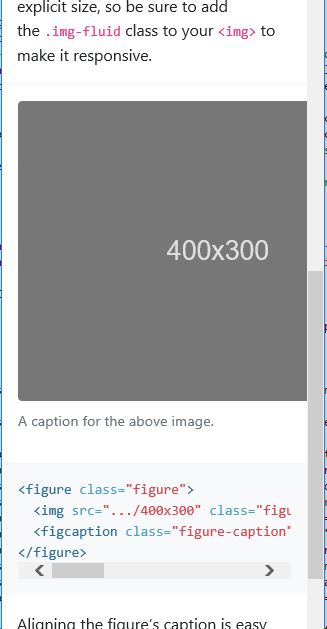
http://v4-alpha.getbootstrap.com/content/figures/
The diplay:inline-block on the .figure creates a bug in IE11 and Firefox lt 49.0.2
The image doesn't listen to the max-width: 100% and get's bigger than the available space.
see the demo http://codepen.io/jvanderkroon/pen/PGXKWJ
 jvanderkroon
All 7 comments
img-responsive from bootstrap 3.3.7 seems to improve it in ie9, it may be possible to import just that portion of 3.3.7 to a custom bootstrap config? http://codepen.io/jd_1/pen/amPyrk
 jdpunk1
on 21 Oct 2016
jdpunk1
on 21 Oct 2016
@jvanderkroon, looks totally fine here in FF49.0.2
 xcartmods
on 21 Oct 2016
xcartmods
on 21 Oct 2016
@xcartmods LT (lower than) i don't know the exact version because my firefox did an auto update.
@jdpunk1 Bootstrap 3 don't use inline-block on the .figure but this is needed in version 4 for the caption alignment.
I did a quick fix by adding max-width: 100% tot the .figure.
jvanderkroon
on 21 Oct 2016
Got sidetracked by the weekend! cool, glad it worked out..
jdpunk1
on 24 Oct 2016
Closing without any changes here for now. Happy to revisit if needed though.
 mdo
on 29 Nov 2016
mdo
on 29 Nov 2016
Is there a reason why this issue is closed? I just stumbled over this issue while testing my page in IE11.
 Findus23
on 2 Aug 2017
Findus23
on 2 Aug 2017
Just came across this issue in V4.1.1. Even the figure demos in the documentation don't respect img-fluid in Internet Explorer 11. @jvanderkroon 's fix does solve the problem but would be nice if this was fixed in BS.
 johnaau
on 7 Jun 2018
johnaau
on 7 Jun 2018
Related issues
 ziyi2
·
3Comments
ziyi2
·
3Comments
 knownasilya
·
3Comments
knownasilya
·
3Comments
 tiendq
·
3Comments
tiendq
·
3Comments
 alvarotrigo
·
3Comments
alvarotrigo
·
3Comments
 devdelimited
·
3Comments
devdelimited
·
3Comments
Most helpful comment
@xcartmods LT (lower than) i don't know the exact version because my firefox did an auto update.
@jdpunk1 Bootstrap 3 don't use inline-block on the .figure but this is needed in version 4 for the caption alignment.
I did a quick fix by adding max-width: 100% tot the .figure.