Bootstrap: Extra white space on the right side on Base CSS page

 tech163
All 6 comments
While on the page, you'll notice there is a horizontal scrollbar. If you swipe to the left, you'll see that weird empty space on the right. I was able to get this both on my iPhone 5 and the 3GS emulator on my mac.
tech163
on 20 Jan 2013
Probably the tables or code snippets. Not much we can do about those unfortunately.
 mdo
on 28 Jan 2013
mdo
on 28 Jan 2013
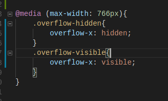
I know this is kind of late, but I had the same issue. it was solved with an overflow-x: hidden.
 danielleschechter
on 4 May 2013
danielleschechter
on 4 May 2013
You should ensure that every .row div is inside a .container div
and
you should't have nested container .. row .. container structure
 akshayrvnkr
on 17 Jun 2016
akshayrvnkr
on 17 Jun 2016
It worked for me:
HTML

CSS:
 GeorgeVepo
on 13 Nov 2017
GeorgeVepo
on 13 Nov 2017
In my case in bootstrap.css I find a problem here...
.col-lg-1, .col-lg-10, .col-lg-11, .col-lg-12, .col-lg-2, .col-lg-3, .col-lg-4, .col-lg-5, .col-lg-6, .col-lg-7, .col-lg-8, .col-lg-9, .col-md-1, .col-md-10, .col-md-11, .col-md-12, .col-md-2, .col-md-3, .col-md-4, .col-md-5, .col-md-6, .col-md-7, .col-md-8, .col-md-9, .col-sm-1, .col-sm-10, .col-sm-11, .col-sm-12, .col-sm-2, .col-sm-3, .col-sm-4, .col-sm-5, .col-sm-6, .col-sm-7, .col-sm-8, .col-sm-9, .col-xs-1, .col-xs-10, .col-xs-11, .col-xs-12, .col-xs-2, .col-xs-3, .col-xs-4, .col-xs-5, .col-xs-6, .col-xs-7, .col-xs-8, .col-xs-9 {
    position: relative;
    min-height: 1px; /* comment this one or set min-height: 0px; */
    padding-right: 15px;
    padding-left: 15px;
}
Note: you cannot change the CDN file so, add this into you head tag. if you are using different bootstrap version then choose accordingly:) also something its a min-height issue or sometimes padding-right/left
 navjot789
on 4 Sep 2020
navjot789
on 4 Sep 2020
Related issues
 tiendq
·
3Comments
tiendq
·
3Comments
 athimannil
·
3Comments
athimannil
·
3Comments
 IamManchanda
·
3Comments
IamManchanda
·
3Comments
 eddywashere
·
3Comments
eddywashere
·
3Comments
 ghost
·
3Comments
ghost
·
3Comments
Most helpful comment
I know this is kind of late, but I had the same issue. it was solved with an overflow-x: hidden.