Bootstrap-datepicker: How to show hover on week and Post Monday of week

All 9 comments
For the hover part, this css piece of code should do the trick:
.datepicker table tbody tr:hover td {
  background-color: #eee;
}
If I get correctly what you want to do, you want select a week rather than a specific day ?
I dont think that the component can do such thing on it own.
What you'll have to do is catch the change event, then change the date at that moment.
But to be honest I don't feel like it would be the more qualitative way for you.
What you should do it select the whole week, so it will be nicer visually.
Here some implementation: https://jsfiddle.net/g52aa07L/15/
 Azaret
on 9 Mar 2017
Azaret
on 9 Mar 2017
I had the same issue.
Is there an option to make the calendar with Hide/Collapse/Open/Close/Sticky pin, where user can select if he wants to see the mini calendar all the time, or hide/open like you have it? - maybe a toggle switch Open/Close
For me I am struggling with the AJAX Post for the **date** value or Week Number to a Controller-Action, when the Input date-value (date only, or the week number) has changed.
 papyr
on 9 Mar 2017
papyr
on 9 Mar 2017
I tried this but it was not sending the data for me
container.on('changeDate', function () {
    setDates(datepicker.getDate());
            var date =    datepicker.getDate();   // $("#dateBox").val();
               $("#belowContainer").load('@(Url.Action("Getcourses","Home",null, Request.Url.Scheme))?dateVal=' + date );
 weedkiller
on 9 Mar 2017
weedkiller
on 9 Mar 2017
@weedkiller Replace date with dates[0].
The date from the datepicker will still be the selected one, not the first of the week.
Something like this: https://jsfiddle.net/g52aa07L/16/
@papyr I'm not sure to understand your issue.
Azaret
on 9 Mar 2017
your example works for me or the range option is fine too..
<div class="input-daterange input-group" id="datepicker">
    <input type="text" class="input-sm form-control" name="start" />
    <span class="input-group-addon">to</span>
    <input type="text" class="input-sm form-control" name="end" />
</div>

$('#BootstrapWeekRow .input-daterange').datepicker({
    todayBtn: "linked",
    clearBtn: true,
    orientation: "top auto",
    daysOfWeekHighlighted: "1,2,3,4,5",
    calendarWeeks: true,
    beforeShowDay: function (date){
                  if (date.getMonth() == (new Date()).getMonth())
                    switch (date.getDate()){
                      case 4:
                        return {
                          tooltip: 'Example tooltip',
                          classes: 'active'
                        };
                      case 8:
                        return false;
                      case 12:
                        return "green";
                  }
                },
    defaultViewDate: { year: 1977, month: 04, day: 25 }
});
@Azaret on the change/selection inside date picker.
- Some users want calendar open, others want it closed, is there a toggle/radio option to leave the calendar in open state showing the highlighted row?
- POST on datepicker change: I also want to trigger an AJAX post with the val of the date or week selected, weed killers sample did not work trigger for me.
papyr
on 10 Mar 2017
- I think you're looking for the
autoclose. - If you want to do a regular ajax call and you copy/pasted weedkiller code, it makes sense, he is using specific ASP.NET ajax call I think. You can learn on how make ajax call with jQuery on their website.
Azaret
on 10 Mar 2017
Do you have a toggle, it would be nice to let user select it via a push pin
papyr
on 11 Mar 2017
Azaret
on 27 Mar 2017
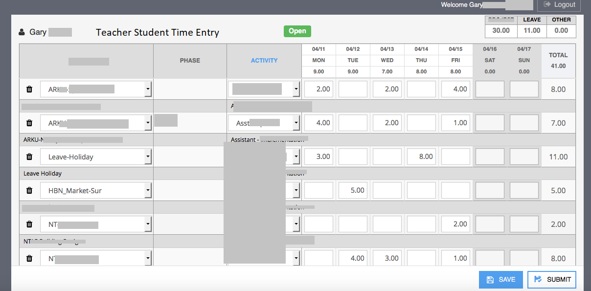
Hey just wanted to return back to this. I am trying to retro fit your component into a Teacher/Student Class weekly time card entry.
Is there a good example for just hours in a row and ensuring all the hours/total in the row dont exceed 24 hrs or 40 hrs
papyr
on 11 Mar 2021
Related issues
 DHeinrichs
·
5Comments
DHeinrichs
·
5Comments
 jneuhaus
·
3Comments
jneuhaus
·
3Comments
 McNetic
·
6Comments
McNetic
·
6Comments
 first-developer
·
6Comments
first-developer
·
6Comments
 tdm00
·
5Comments
tdm00
·
5Comments
Most helpful comment
For the hover part, this css piece of code should do the trick:
If I get correctly what you want to do, you want select a week rather than a specific day ?
I dont think that the component can do such thing on it own.
What you'll have to do is catch the
changeevent, then change the date at that moment.But to be honest I don't feel like it would be the more qualitative way for you.
What you should do it select the whole week, so it will be nicer visually.
Here some implementation: https://jsfiddle.net/g52aa07L/15/