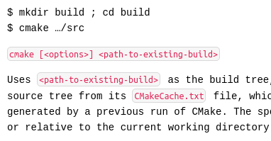
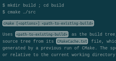
Boostnote: Inline code is hard to see. Better distinction is needed.
Current behavior
Inline code with backticks does not work for themes other than default and white. For monokai and solarized dark, it looks exactly like issue #208.


Expected behavior
That code is formatted correctly inline.
Steps to reproduce
- Start a markdown node
- Write This is an example of
inline code - Change theme
Environment
- Version : 10.12.6
- OS Version and name : OSx Sierra
All 12 comments
Thanks for reporting, we will fix this asap!
It seems that you already have a handle on this issue but I wanted to provide some additional information. I also feel that inline code and unformatted block code is difficult to see when using the dark theme. I tried to correct this with custom CSS and found that some elements are being overridden. Below is my custom CSS for testing:
/*
Dark interface theme overrides custom CSS for some elements.
The below custom CSS properly decorates both inline and block code
for all interface themes except for Dark. When Dark theme is selected:
    * inline code font color and background-color is overridden
    * block code font color is overridden
*/

body[data-theme] code {
 background-color: orange;
 color:white;
}

pre.codemirror {
 background-color: orange;
}
@randman1 is this issue still exists? if not can you close the issue?
Close due to inactivity.
The bug is still exist.
The background colour for inline code in dark themes is still too subtle - tested with the Dracula theme, and the bug is still present.
This issue should be re-opened.
Yeah, this is still an issue. The change for inline code is essentially invisible for dark themes and is very subtle for the default scheme.


I think even github's coloring is pretty weak.
Would it be possible to get something like slacks:

That would make it a lot more readable.
Thanks for your help!
Agreed that just changing the font is not enough with the default Dark settings. Something should be changed about the styling of inline code to make it more distinct.
Until there is an actual fix in place, I just wanted to mention that the styles can be manually overridden in Preferences > Markdown. Find the CSS for code then just adjust the background-color (and other styles) to something more to your liking.
@ZeroX-DG would custom CSS also be an accepted solution? Coincidentially I made a robust solution for this today for myself:


@arcturus140 wow that looks cool, yes I think we can put it as a default value for the custom CSS. It would be easier and user can customize it too.
ok, I'll add it to my task list for tomorrow.
Most helpful comment
ok, I'll add it to my task list for tomorrow.