We will improve the Dark Theme. Here are the 3 examples.
Which do you like among them? Tell us you guys feedback ;)
A

B
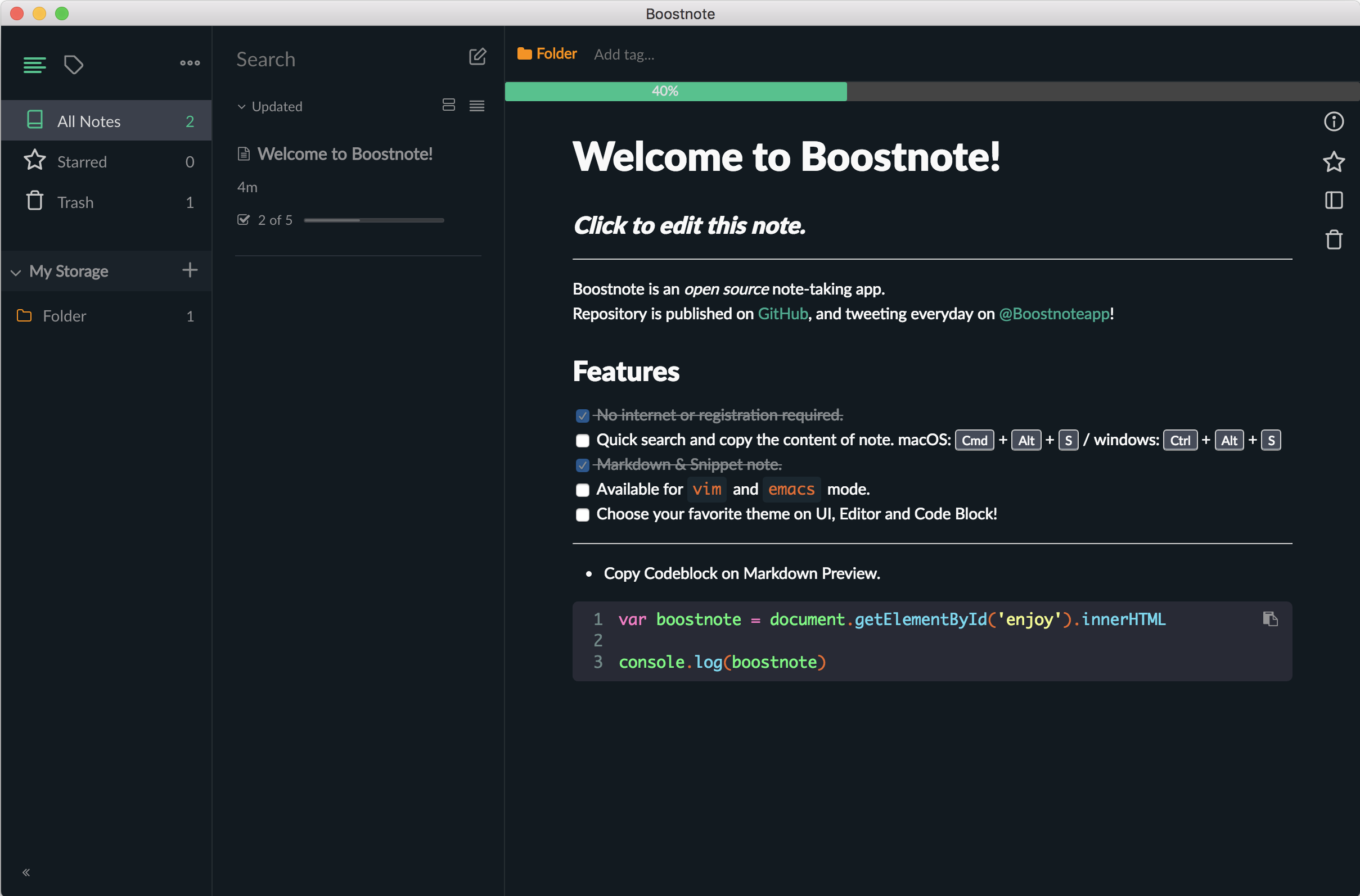
C
 kazup01
All 16 comments
@kazup01 Just to give some feedback and my opinion:)
I like Option B the most because its the darkest one. Option A seems to bright and Option C is more like a very dark green Theme rather then black. So i would go for Option B
 Futureglobe
on 8 Dec 2017
Futureglobe
on 8 Dec 2017
B seems great :)
@Nino9614
So i would go for Option A
Surely you mean B?
 Mindstormer619
on 8 Dec 2017
Mindstormer619
on 8 Dec 2017
A is good, I like medium because it's not too dark that it hurts my eyes. I don't like the color saturation though, just makes me want customizable settings for the theme.
 AnastasiaDunbar
on 8 Dec 2017
AnastasiaDunbar
on 8 Dec 2017
yes i like A to
 petKitsune
on 8 Dec 2017
petKitsune
on 8 Dec 2017
🤔
AnastasiaDunbar
on 8 Dec 2017
A and B, C is too dark.
Hard to pick one. I think A will win in the long run
 Alaev
on 8 Dec 2017
Alaev
on 8 Dec 2017
I'd pick A. B is too dark. The contrast does hurt the eyes in the long run. Not a huge fan of C either.
 karanrajpal14
on 9 Dec 2017
karanrajpal14
on 9 Dec 2017
A
 jmoniatte
on 9 Dec 2017
jmoniatte
on 9 Dec 2017
i love B ,it looks cool and badass~,or maybe provide more options or more customizable
 ultimatevegance
on 10 Dec 2017
ultimatevegance
on 10 Dec 2017
Hey all, thank you for you guys feedback!
We added the theme that flavored of "A" at #1268 .
And also, we will add the "B" flavored theme as a another one :)
Thanks again!
kazup01
on 11 Dec 2017
@Mindstormer619
Surely you mean B?
Yeah thank you for the hint :)
Futureglobe
on 11 Dec 2017
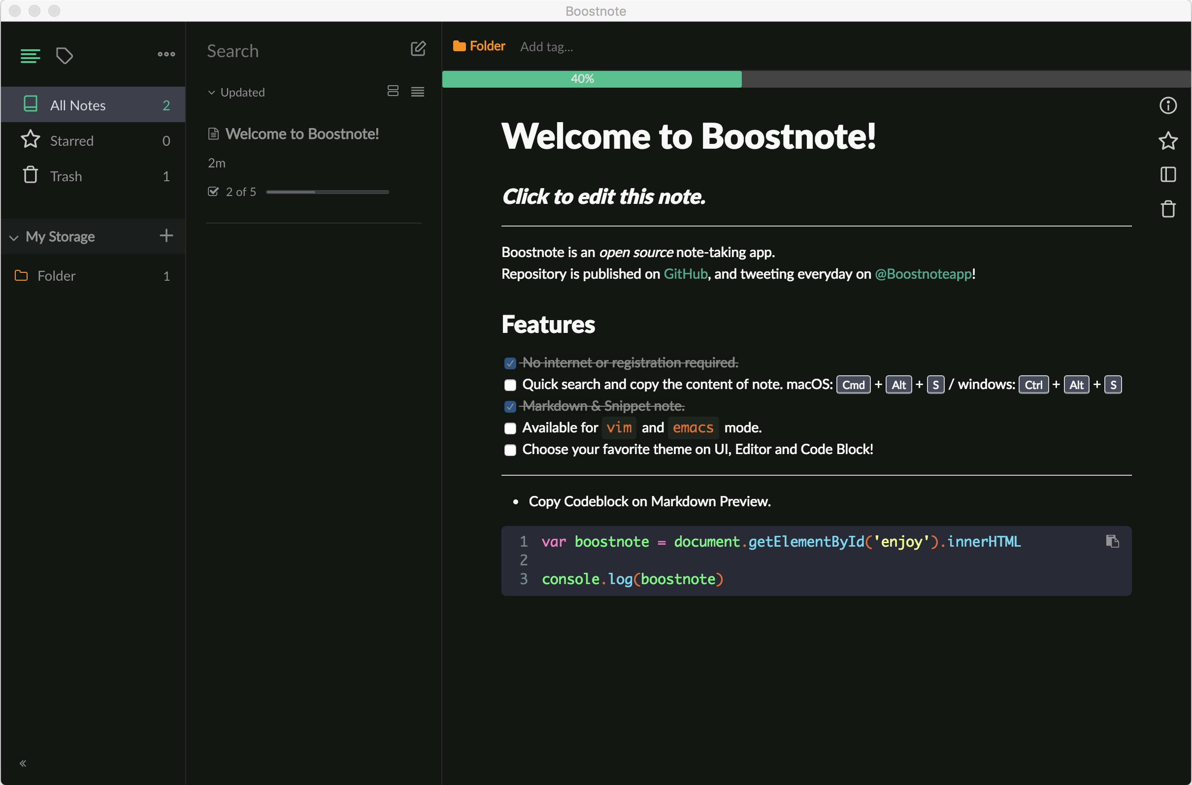
Why are the colors so flat though?
The navigator, note list and note details have the same background color. Which other themes built-in don't do.
AnastasiaDunbar
on 11 Dec 2017
cc @ytk141
kazup01
on 11 Dec 2017
I much prefer option A, because of it's materialistic colour theme. I would suggest it be slightly darker, but the other two options are too colour toned - B is too dark blue, and and C seems slight green.
This is the dark mode, after all. Not the colourful mode.
 timrossback
on 11 Dec 2017
timrossback
on 11 Dec 2017
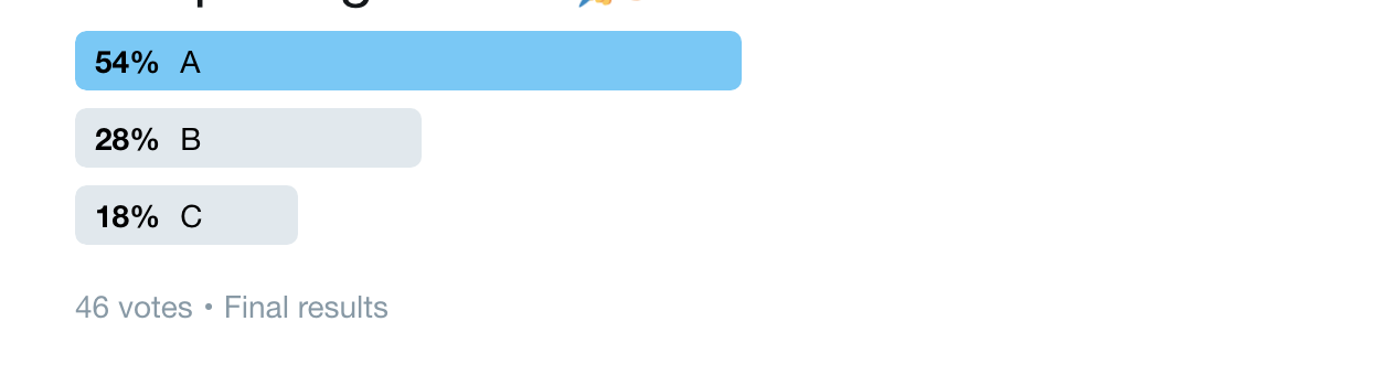
The result of twitter questionnaire is here 😄
https://twitter.com/boostnoteapp/status/939030381541470208
kazup01
on 11 Dec 2017
v0.8.19 will released in this week. Looking forward it;)
kazup01
on 20 Dec 2017
Related issues
 gavvvr
·
3Comments
gavvvr
·
3Comments
 Petroochio
·
3Comments
Petroochio
·
3Comments
 croulibri
·
3Comments
croulibri
·
3Comments
 ysshah
·
3Comments
ysshah
·
3Comments
 shunchuan
·
3Comments
shunchuan
·
3Comments
Most helpful comment
I much prefer option A, because of it's materialistic colour theme. I would suggest it be slightly darker, but the other two options are too colour toned - B is too dark blue, and and C seems slight green.
This is the dark mode, after all. Not the colourful mode.