I really like the new update, good job on the new look and fell.
But for some reason my sidebar looks like this when i collapse it.
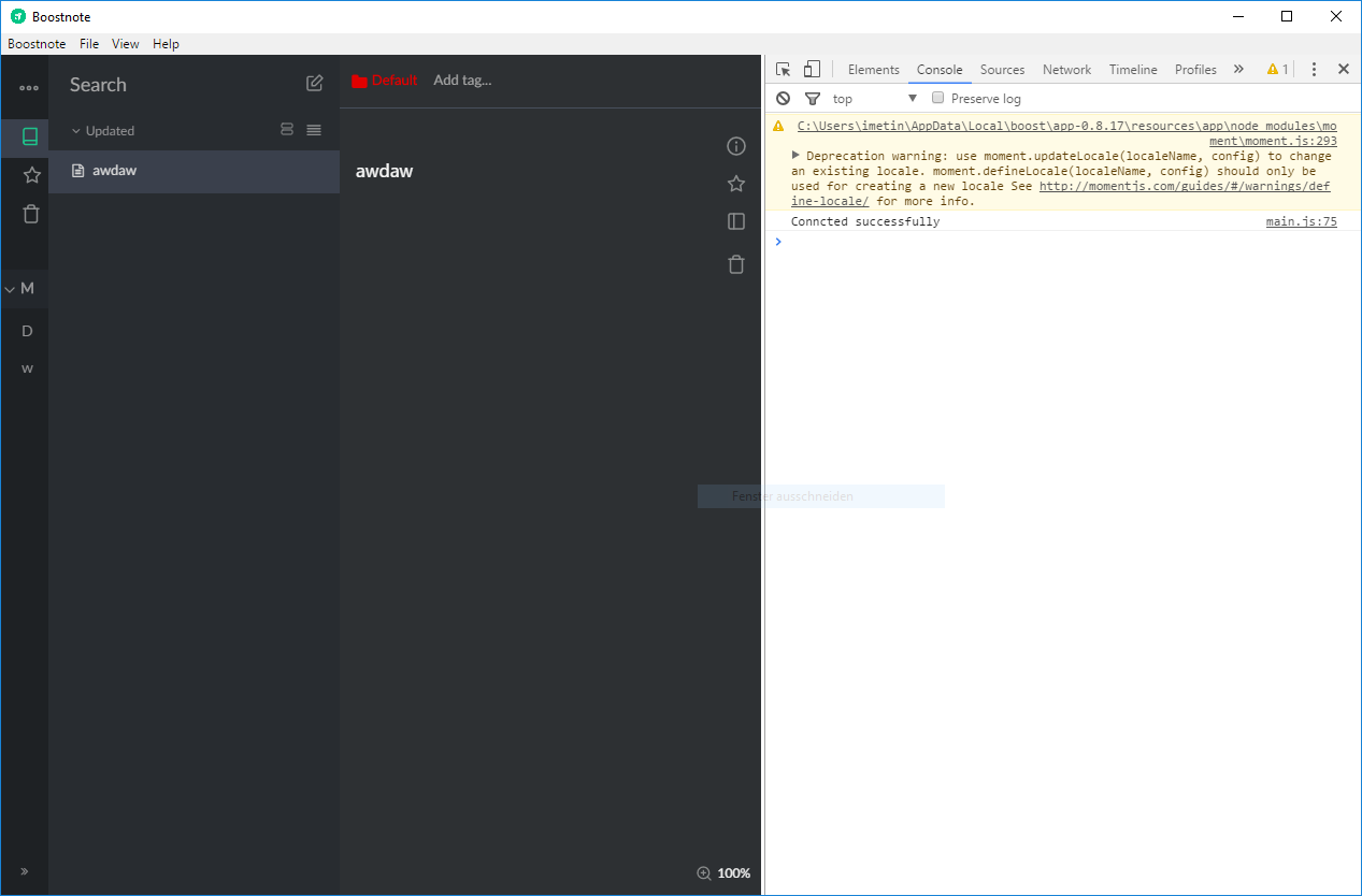
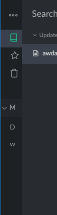
Is this something you aware of? As far as i can see on other issues the sidebar looks fine.
 Futureglobe
All 9 comments
I like this!
It seems like that's how it is supposed to work.
Out of curiosity, what do you think it should do?
The double arrow at the bottom left of the sidebar collapses it to a condensed version so you can still have your sidebar functionality, but with it taking up less room.
If you want to hide the sidebar completely you can use the button on the far right of the editor (third button down, below the star).
 wadjoh
on 28 Nov 2017
wadjoh
on 28 Nov 2017
Hi thank you for feedback. I tried to fix this layout at #1202. How about it?
 kazup01
on 29 Nov 2017
kazup01
on 29 Nov 2017
@hooskers
Out of curiosity, what do you think it should do?
Its not about hiding the sidebar. The icons should align to the center like.
The changes @kazup01 made in #1202 is what i meant.
@kazup01 thanks for the layout fix, looks good.
Futureglobe
on 29 Nov 2017
@Nino9614 Thanks for reply 😄
We will update to v0.8.18 in this week. Wait a moment.
kazup01
on 29 Nov 2017
Hi guys, v0.8.18 is out! Enjoy Boostnote ;)
Release Note
https://medium.com/boostnote/boostnote-v0-8-18-release-50e5c143778
kazup01
on 3 Dec 2017
@kazup01 The new Update fixed the styling for me. Looking fire again :)
You can close this issue if you want. Keep up the great work
Futureglobe
on 6 Dec 2017
@kazup01 just found another weird behavior. When i collapse the sidebar everything seems fine. But when i select a element the icon gets pushed to the right:
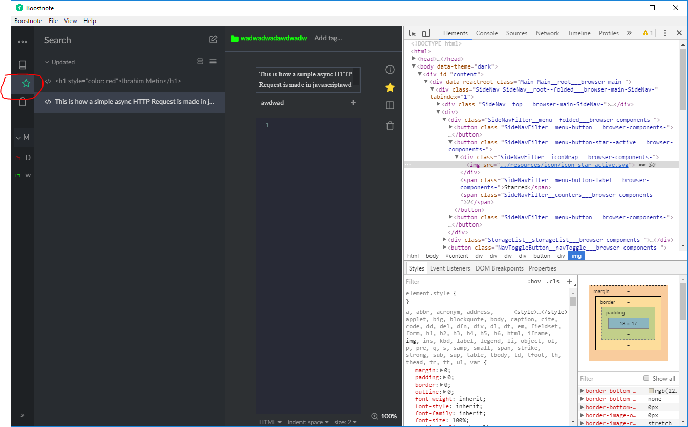
Is this something you wanted to do or is this a bug?
It doesn't happen when i click on the "All Notes" Element
Futureglobe
on 7 Dec 2017
@Nino9614 I could reproduce it.
I will fix it at tomorrow ;) Thanks for your report!
kazup01
on 7 Dec 2017
Fixed! Wait for the v0.8.19 ;)
kazup01
on 8 Dec 2017
Related issues
 dtgay
·
3Comments
dtgay
·
3Comments
 Petroochio
·
3Comments
Petroochio
·
3Comments
 gavvvr
·
3Comments
gavvvr
·
3Comments
 NourEldin275
·
3Comments
NourEldin275
·
3Comments
 ryochack
·
3Comments
ryochack
·
3Comments
Most helpful comment
@Nino9614 Thanks for reply 😄
We will update to v0.8.18 in this week. Wait a moment.