Bookstack: Navigation at the End of the Page
It is better if there is a prev-next button at the end of every page rather than to navigate from the left sidebar. Prev-next button is more mobile-friendly.
 blackshrub
All 13 comments
Thanks for the suggestion @blackshrub.
I'm surprised this has not been requested before tbh.
I guess the last page within a chapter should have a next button back to the chapter. Same for last chapter within a book, but returning to the book-level.
 ssddanbrown
on 9 Apr 2019
ssddanbrown
on 9 Apr 2019
Merged Matching Issue
Originally posted by @Wookbert:
Describe the feature you'd like
The name and UI concept clearly implies to organize your information in books with chapters and pages. Reading a book however comes with the experience and convenience of continuous reading through a simple page turn. This does not only apply for paper books, but also has been mimicked on any eBook reader.
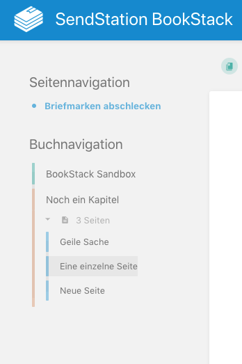
On BookStack I'm missing this convenience however so far. Yes, we do have the Book Navigation in the left side panel next to the current page (hereunder; which BTW only follows your scrolling and thus is always in instant reach, if the browser window is wide enough, so that there’s enough space for a right side panel as well), but that’s just not as convenient as a simple page turn.
I therefore suggest to additionally place four buttons between the end of the page and the comments section:
- Previous chapter (jumps to first page thereof)
- Previous page
- Next page
- Next chapter (jumps to first page thereof)
Here’s a quick mockup of how that could look:
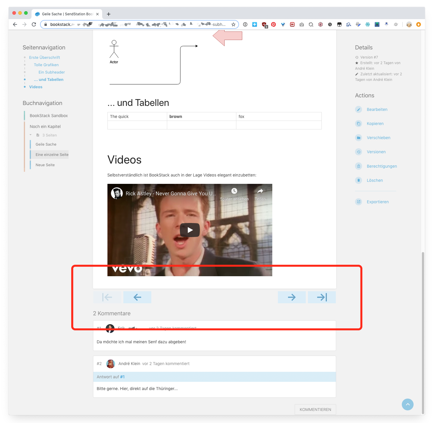
Further behaviour
- Buttons are ghosted if there is no previous/next chapter/page.
- Buttons could be hidden entirely if there is just a single page (UX consistency?). (Hide chapter buttons if there aren’t any chapters??)
Discussion: Floating navigation?
Another concept might be to have this navigation with its 4 buttons visible not only when reaching the end of the page, but instead visible and thus accessible at all times, so one can e.g. jump to the next page, even if one’s only half-way through a long page. The preferable place for such a floating navigation would be the bottom of the window IMO.
The problem I see in this approach however is the waste of screen real estate. A solution to this problem could be to make the navigation only appear (instantly) when a) the mouse pointer gets moved to the lower something pixels at the window or b) one scrolls to the very end of the screen.
ssddanbrown
on 1 Sep 2019
Thanks for the design ideas @Wookbert,
I'd prefer not have a floating nav. I've tried to limit floating or dynamically appearing elements as much as possible in BookStack, unless there's large benefit gain, to keep focus on the content.
In regards to your design, I'm not sure just using arrows alone in that manner will work. They'd be fine if the content within a book/chapter is always sequential, or has order to it, but that's a large assumption I'm not sure we can make about everyone's use.
I think that muted links, showing the page/chapter name, could be universally better since it'll provide instant context regarding where the user will be led.
ssddanbrown
on 1 Sep 2019
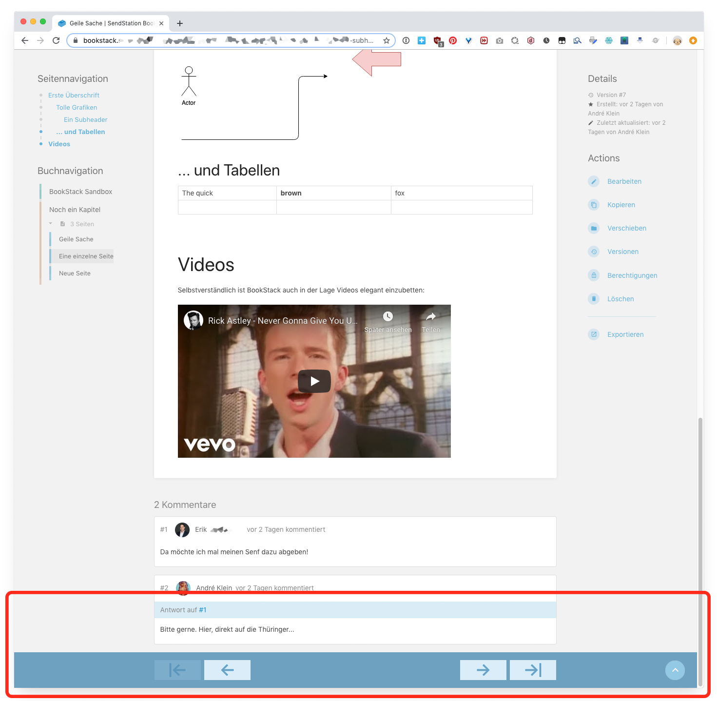
Here’s a mockup of how a „floating“ navigation bar could look like. The term floating is a bit misleading IMO, as it would sit at the bottom of the window. And again: I wouldn't have it present at all times, but only appear when needed/triggered. So again, that would be:
a) the mouse pointer gets moved to the lower something pixels of the window and
b) one scrolls to the very end of the page (not end of screen), so it should appear as soon as the end of the book page is reached, before the comments come into sight.
Note that while the bottom bar is full width, the chapter buttons align with the left/right edge of the actual, white book page. I also wouldn't probably use any fancy animation to make the bar appear/disappear (such as sliding in/out from the bottom) as it might become annoyingly interrupt the user’s „flow“. Rapid fading perhaps at best.
 Wookbert
on 1 Sep 2019
Wookbert
on 1 Sep 2019
I think that muted links, showing the page/chapter name, could be universally better since it'll provide instant context regarding where the user will be led.
@ssddanbrown Can you describe this in detail or with an example? (I don't understand what you mean). My arrows clearly follow the book concept, with its chapters and pages. Online book pages of course can be linked into any direction and order, but that’s what we IMO have a) optional inline links (on the book pages) and b) the book navigation in the left side panel for.
Wookbert
on 1 Sep 2019
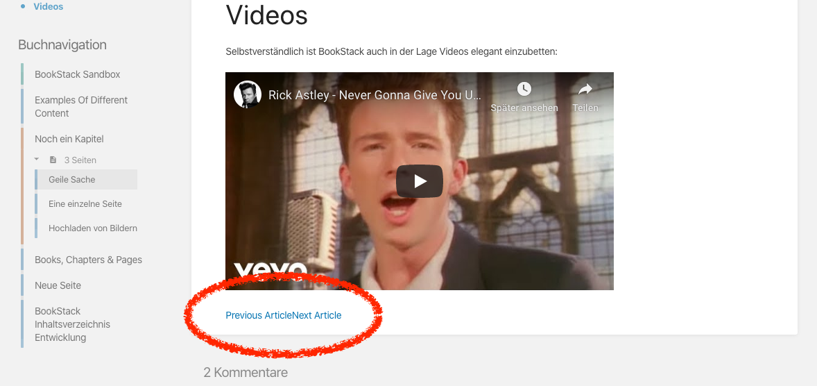
I've implemented something similar through a fairly hacky front end method to get basic previous/next article buttons at the end of each content page. However, this would obviously be more extensible if it was created in the view template with Blade.
I'm thinking @ssddanbrown would prefer that the links/buttons to navigate through the pages would, instead of just an icon or static text, include the chapter name and page name for the user in a contextual button, perhaps at the end of the page content.
<button>
    <span>Blue Chapter</span>
    <span>Navy Blue</span>
</button>
Hacky method:
<script>
    document.addEventListener("DOMContentLoaded", function() {
        if (window.location.pathname.indexOf("page")) {
            var pages = document.querySelectorAll("a.page"),
                current = document.querySelector("a.selected"),
                currentIndex = Array.prototype.indexOf.call(pages, current);

            if (pages.item(currentIndex - 1) != null) {
                var prevPageEl = document.createElement("a"),
                    prevPageText = document.createTextNode("Previous Article");
                prevPageEl.appendChild(prevPageText);
                prevPageEl.href = pages.item(currentIndex - 1);
                prevPageEl.classList.add("prev-page-button");
                document.querySelector(".page-content").appendChild(prevPageEl)
            }

            if (pages.item(currentIndex + 1) != null) {
                var nextPageEl = document.createElement("a"),
                    nextPageText = document.createTextNode("Next Article");

                nextPageEl.appendChild(nextPageText);
                nextPageEl.href = pages.item(currentIndex + 1)
                nextPageEl.classList.add("next-page-button")
                document.querySelector(".page-content").appendChild(nextPageEl)
            }
        }
    });
</script>
 james-geiger
on 9 Oct 2019
james-geiger
on 9 Oct 2019
Some CSS formatting to the hack would be nice. When Previous and Next are both shown, they touch each other. Or does this bit also belong to the HTML header!?
<button>
    <span>Blue Chapter</span>
    <span>Navy Blue</span>
</button>
Wookbert
on 10 Oct 2019
Hi @Wookbert,
I've applied some basic CSS to the buttons using the following:
.prev-page-button {
  display: inline-block;
  padding: 1em 0;
  width: calc(50% - 1em);
  margin-right: 1em
}

.next-page-button {
  display: inline-block;
  padding: 1em 0;
  width: calc(50% - 1em);
  margin-left: 1em;
  text-align: right
}
It's by no means perfect (for instance, the "next article" button appears in the wrong location when there is no previous article) and I will quite likely update these when I have more time to appear more like buttons instead of links.
The script above applies the .prev-page-button and .next-page-button classes to the links so you can change the styles however you'd like.
james-geiger
on 10 Oct 2019
@james-geiger
Works pretty well, previous page link now left aligned, next page link right aligned. Only problem: If you are on the first page and there is no previous page, the next page link isn't right aligned, but almost centered. Sorry, I have ZERO clues about CSS, else I'd fix it myself.

Wookbert
on 12 Oct 2019
Hi @Wookbert,
Following up on this as I had some time today to get this worked out.
Looks like this now:
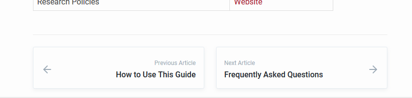
You'll have to replace the custom styles and javascript that I'd provided earlier with the contents of the attached file.
@ssddanbrown -- Happy to include this in a PR with more BookStack stylings.
james-geiger
on 18 Nov 2019
Any update on this ?
Will be added to a future release ?
 Sicklou
on 24 Dec 2019
Sicklou
on 24 Dec 2019
@james-geiger, thanks so much for this! Love it.
 over-soul
on 15 Apr 2020
over-soul
on 15 Apr 2020
+1 on this and I tried out the customization provided by @james-geiger and that does the trick pretty nicely so would be nice to have available as either a default and/or togglable option we can just enable in the Admin Settings area. (Had a coworker ask about it right away right after completing his first book, so definitely seems like it would be a useful feature for users).
 orware
on 29 Jul 2020
orware
on 29 Jul 2020
Related issues
 Abijeet
·
3Comments
Abijeet
·
3Comments
 tpetrauskas
·
4Comments
tpetrauskas
·
4Comments
 marcvef
·
3Comments
marcvef
·
3Comments
 stuartajd
·
4Comments
stuartajd
·
4Comments
 davidtessier
·
3Comments
davidtessier
·
3Comments
Most helpful comment
Hi @Wookbert,
Following up on this as I had some time today to get this worked out.
Looks like this now:
You'll have to replace the custom styles and javascript that I'd provided earlier with the contents of the attached file.
custom-head.txt
@ssddanbrown -- Happy to include this in a PR with more BookStack stylings.