Bookstack: Optimize white space on the main Notebook page
Describe the feature you'd like
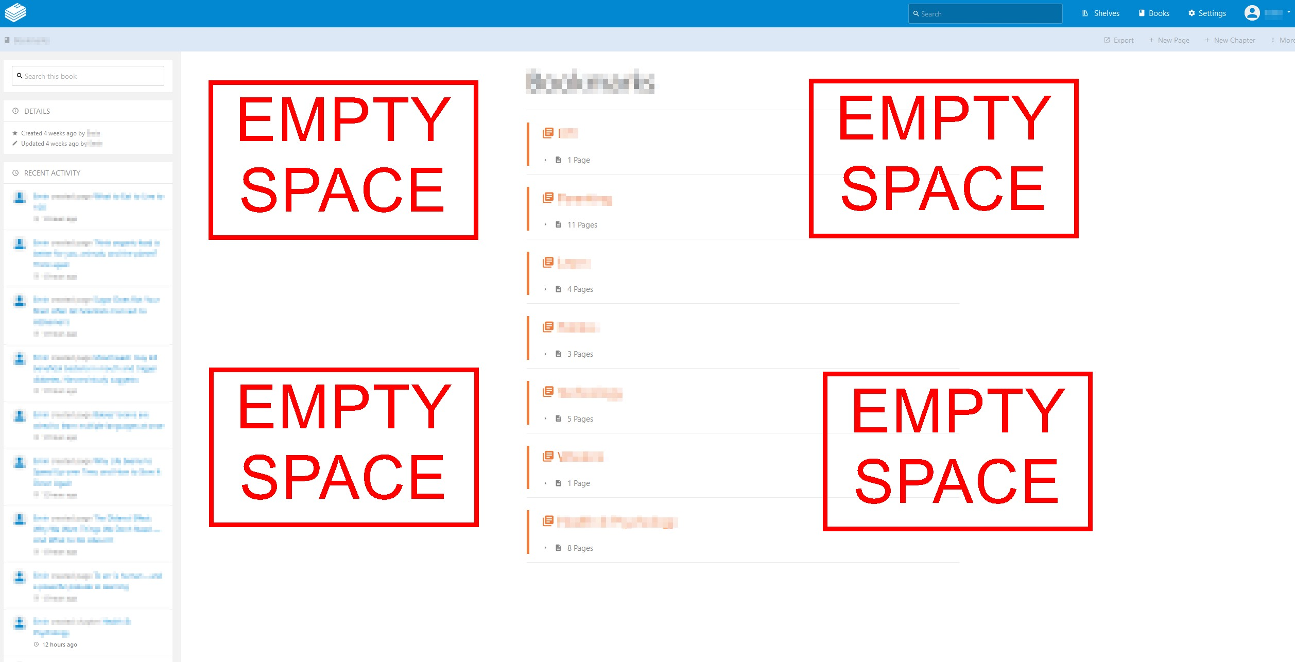
Better utilize the white space on the main Notebook page. For example, provide user option to add more rows and columns. If a notebook contains dozens of pages, it doesn't make sense to force user to scroll down on the page to reach the desired page link. Demonstrated in the screenshot below.
Describe the benefits this feature would bring to BookStack users
Prevent unnecessary scrolling
Optimize white space
Quickly locate the desired page link
Additional context
See above.
 haysebeyse
All 2 comments
Will be considered in the next design update. Perhaps a grid view brought down to the book and chapter listings.
 ssddanbrown
on 24 Nov 2018
ssddanbrown
on 24 Nov 2018
Since the design update has now been released many whitespace efficiency improvements have been made:
https://www.bookstackapp.com/blog/beta-release-v0-26-0/
I think the main thing remaining might be a different view option for the books listing which is already covered by #530, Therefore I'll close this.
ssddanbrown
on 18 May 2019
Related issues
 mackcoding
·
3Comments
mackcoding
·
3Comments
 Legoracers
·
3Comments
Legoracers
·
3Comments
 Zeigren
·
3Comments
Zeigren
·
3Comments
 mtnyaeger
·
3Comments
mtnyaeger
·
3Comments
 ensemblebd
·
3Comments
ensemblebd
·
3Comments
Most helpful comment
Will be considered in the next design update. Perhaps a grid view brought down to the book and chapter listings.