Bookplayer: Card based interface
Out with the new, in with the old in a new way.
After removing the card based UI which was used before 3.0, I thought it might be fun to bring it back in a different and hopefully more thoughtful way to make the player even better.
I plan to provide mockups and designs for this very very soon, but I'm down with the flu so I'm not quite up for the task right away. Anyway here is the idea, which takes a lot of inspiration by Apples Maps.app.
Consider a card view with three states. First the closed state (1), which has roughly the height of a toolbar. Then the second, open state (2) which covers about 1/3 of the screen. And last the third, full state (3) which covers the whole screen. Tapping outside this card would dismiss the card back into the closed state (1)
Apples Maps uses 1 for the inactive search state at the bottom, 2 to show a few things below the search and 3 when the bottom card is expanded to review history or when searching.
We can apply this to our player interface in two levels.
The mini player can be converted into the closed state (1) and can move straight to the full state (3). This would need a change of design in the mini player, but could leave the player screen untouched. Not much change, but it feels even more fluid now.
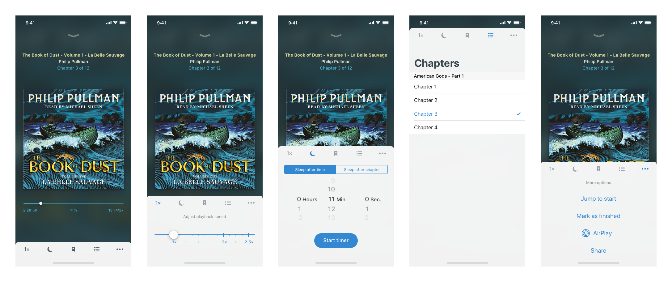
More importantly, we can convert the toolbar at the bottom of the player screen into a closed state as well. Having four or five buttons. Either puts the card in the open state (2) and display appropriate UI inside this card. So for the speed we can have proper custom controls and a simple barrel for the sleep timer as well. It also works for the more menu, removing the need for the clumsy action sheets we currently use. The chapter selection screen can be previewed as well, expanding upon scroll or when swiping/dragging up on the toolbar. This also allows us to switch between either of these options by swiping/dragging left and right (using a paginated scroll view I suppose), highlighting the appropriate icon. Tapping the icon again would send the card back in state 1.
This should make the UI even more fluid to use, does away with a few action sheets which, while useful always felt a bit sluggish and gives us room to improve the controls.
I'll provide screens as soon as I can, until then please check out Apple Maps on iOS 12. I hope you like the idea.
 pichfl
>All comments
A first rough mockup for the toolbar card inside the Player, also containing additional details for #224, #300 and a first icon for #127
pichfl
on 18 Jan 2019
Related issues
 halleygen
·
3Comments
halleygen
·
3Comments
 bensaufley
·
5Comments
bensaufley
·
5Comments
 patjolata
·
4Comments
patjolata
·
4Comments
 stemcc
·
3Comments
stemcc
·
3Comments
 Guy27
·
5Comments
Guy27
·
5Comments
Most helpful comment
A first rough mockup for the toolbar card inside the Player, also containing additional details for #224, #300 and a first icon for #127