Bookmarks: Design: Change app logo?
Hey @nextcloud/designers @nextcloud/designlearners @jancborchardt @skjnldsv

I was thinking about the current logo of the bookmarks app (the star) and how it's not really a good fit. It clashes with the normal "favorites" icon and is also a bit too generic for my taste. Some of the famous icon libraries offer some good alternatives and also there are some inspirational emojis:
:book: :bookmark: :bookmark_tabs:
Do you think we should change the logo? And if yes, would be able to suggest a new one?
 marcelklehr
All 7 comments
The bookmark label in the middle looks good but can also clash with the tags in Nextcloud...
 stefan-niedermann
on 20 Jun 2020
stefan-niedermann
on 20 Jun 2020
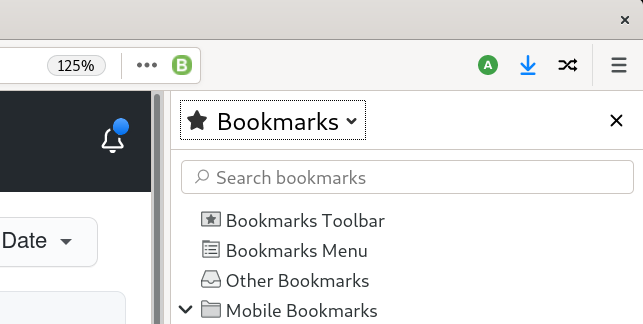
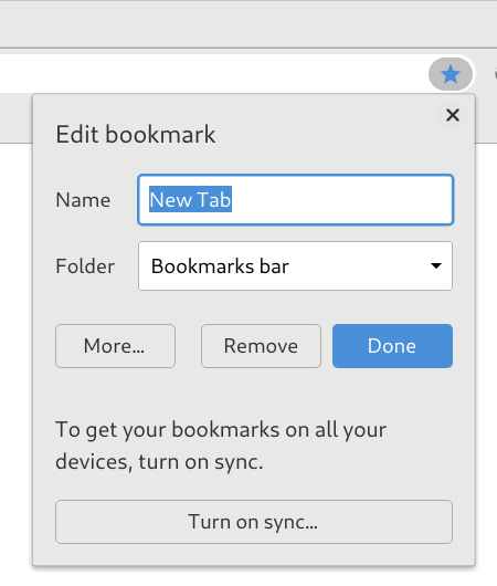
Let’s see what others use:
Firefox: star
Chrome: star
Safari: book

Since Chrome is the most-used browser by far on desktop as well as mobile, and Firefox is also using the same iconography, I’d say the star is a pretty good fit.
 jancborchardt
on 20 Jun 2020
jancborchardt
on 20 Jun 2020
@jancborchardt Thanks, I agree that it's a very intuitive logo. What's your take on possible confusion between "favorite X" and "bookmarks"?
marcelklehr
on 20 Jun 2020
I'd say that's fine, as they _are_ favorites – favorite websites, that is. ;)
Chrome and Firefox would face the same issue anyway, so I'd say in doubt it's better to stick with the convention.
jancborchardt
on 21 Jun 2020
I love the current logo though 👍
 dasbiswajit
on 21 Jun 2020
dasbiswajit
on 21 Jun 2020
Alright :) Thank you for your input! :blue_heart:
marcelklehr
on 21 Jun 2020
Might I suggest that yes, we keep the star, but just adjust the star to use straighter lines so it's not quite so round, similar to the Chrome star (and I say this as an avid Firefox user). I feel that it would look cleaner and more professional, especially at smaller icon sizes. The current star imo, looks a bit too "kids carnival" style for my tastes, although I do agree with @jancborchardt 's reasons for using a star per se. Happy to do a mockup if desired.
 Bugsbane
on 27 Jun 2020
Bugsbane
on 27 Jun 2020
Related issues
marcelklehr
·
4Comments
 GambaJo
·
5Comments
GambaJo
·
5Comments
 homelessgamer
·
6Comments
homelessgamer
·
6Comments
 aproposnix
·
6Comments
aproposnix
·
6Comments
 kc853
·
3Comments
kc853
·
3Comments
Most helpful comment
Alright :) Thank you for your input! :blue_heart: