Bluewallet: Coin control (Benchmark)
This issue is a benchmark dump of different Coin control (UTXO management) implementations in user facing wallets.
Bitbox
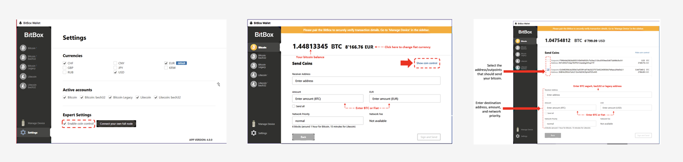
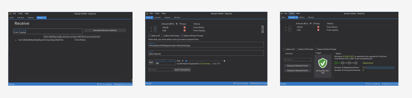
Wasabi
Bitcoin Core

Electrum

Samourai
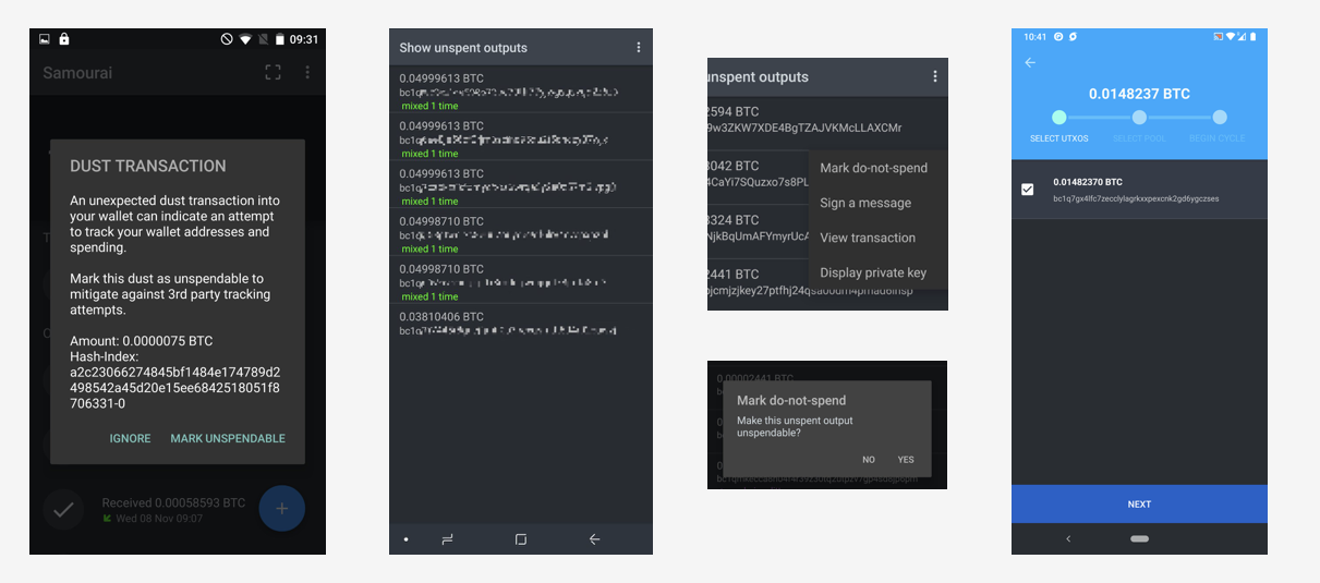
Casa
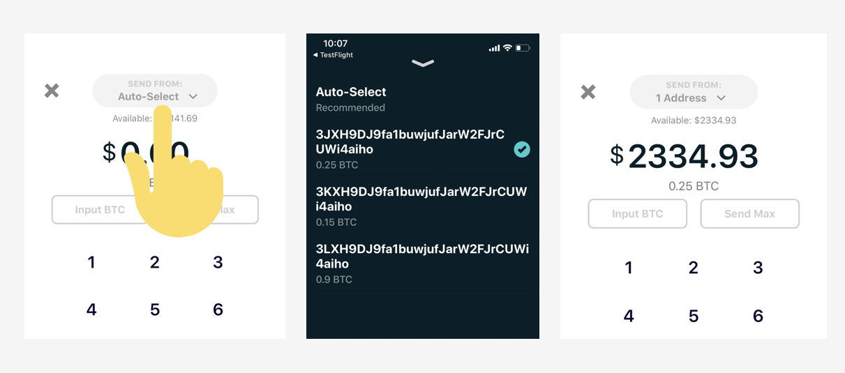
 ncoelho
All 8 comments
Features map
feature/wallet | electrum | wasabi | bitbox | samourai | casa | core
------------ | ------------- | ------------- | ------------- | ------------- | ------------- | -------------
Big picture | X | | | | | |
Label | X | X | | | | X |
Output | X | X | X | | | |
Address | X | X |X | X | X | X |
Amount | X | X | | X | | |
Spend | X | X | X | X | X | X |
Don't spend | X | X | | X | | |
More Details | X | X | | | | X |
Change Options | X | X | | | | X |
ncoelho
on 8 May 2020
Very good that you are thinking on how to get coin control into the wallet - it's a major privacy improvement, although might be a UX hurdle.
Good comparison between the different UX models too!
FYI, when you double click on any coin [or tx] in Wasabi, there will be a dedicated Details tab, and this will show the address, tx id and index, etc.
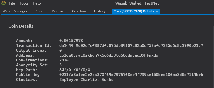
I believe that coin control is only really useful when you have a good address / transaction labeling system. I know that You have the note to self in the send field, so you might be able to use this info for the UX.
 MaxHillebrand
on 11 May 2020
MaxHillebrand
on 11 May 2020
Updated the wasabi info on the table, thanks.
Nice idea to use that field to start labelling UTXOs right away, wasn't thinking about that, but it does sound like a good approach
ncoelho
on 11 May 2020
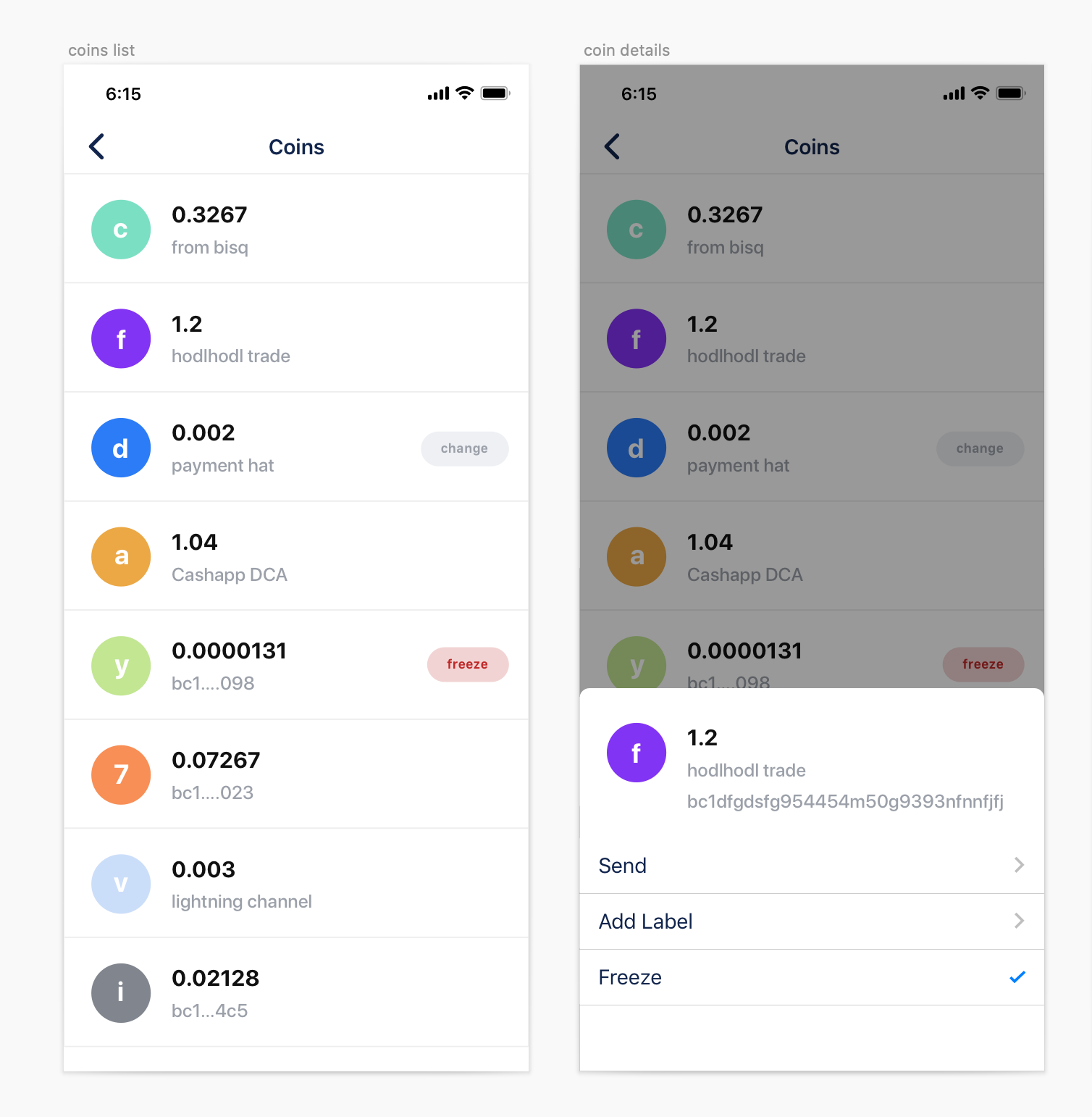
Adding a first idea. To be discussed and analyzed.
Twitter comments
https://twitter.com/nvcoelho/status/1258716253029650435
ncoelho
on 14 May 2020
I think color coding should be used for amounts. the largest amount is dark red, for example, and the smallest is light green.
 Overtorment
on 15 May 2020
Overtorment
on 15 May 2020
I am not convinced about the functional aspect of the colored circles yet. Visually they are pleasant, but they should also make it easier for users to pick the right coins in some manner. Tinting by amount is easy to understand. Tinting by somehow deriving a colorful from the transaction hash is possible to understand rationally, but not intuitively and also not really helpful to the task at hand. Why not remove them and make more room for tags? That's where the information is that helps me make good decisions, and they could be color-coded, too.
 GBKS
on 21 Sep 2020
GBKS
on 21 Sep 2020
yep, me neither, working on more concepts, feel free to suggest more as well. I am even not sure, if manual utxo selection is something the users should be doing, the algorithm will definitely do a better job if properly tagged or labelled by the user, maybe that's enough.
Personally I'm only interested in defined the do not spends (app should be clever enough to do the rest) and in the future consolidate the UTXOs. This will be something necessary, that will break users privacy for instance... So, a lot to improve over time once we have something usable.
Anyway the feedback from users on the concept was very good. So let's see as it goes.
ncoelho
on 21 Sep 2020
For anyone landing here, there's feedback on the figma file
https://www.figma.com/file/mPoRMRTBOvi61M8psIp4XY/Coin-Control?node-id=0%3A1
ncoelho
on 21 Sep 2020
Related issues
 marcosrdz
·
5Comments
marcosrdz
·
5Comments
 TheFuzzStone
·
3Comments
Overtorment
·
3Comments
TheFuzzStone
·
3Comments
Overtorment
·
3Comments
 wanxewoj
·
4Comments
ncoelho
·
6Comments
wanxewoj
·
4Comments
ncoelho
·
6Comments