Blueprint: [core] button, form control, search input focus styling changed in Chrome 83
Environment
- __Package version(s)__: 3.28.0
- __Operating System__: Ubuntu 16.04
- __Browser name and version__: Chrome 83.0.4103.61
Code Sandbox
https://codesandbox.io/s/blueprint-sandbox-uk6kk?file=/src/index.tsx
Actual behavior
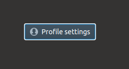
This just happened after I upgrade Chrome from version 81 to version 83.
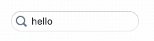
As you will see in the sandbox, there is a white border shown after you click on it.
Possible solution
I have no idea.
I am wondering if you have the same issue on Chrome with version 83.
 wisdomG
All 7 comments
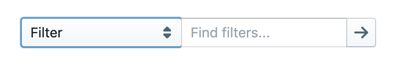
it looks like Chrome updated default form element styling in v83:
- https://developers.google.com/web/updates/2020/05/nic83#forms
- https://blog.chromium.org/2020/03/updates-to-form-controls-and-focus.html
and the new user agent styling can be overridden with the :focus-visible pseudo element: https://web.dev/style-focus/#use-:focus-visible-to-selectively-show-a-focus-indicator
 adidahiya
on 27 May 2020
adidahiya
on 27 May 2020
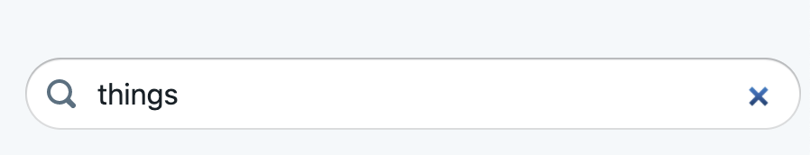
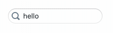
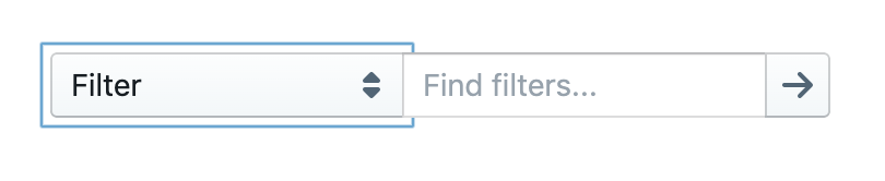
relatedly, styling of the "clear" button on search inputs has changed with Chrome 83:
(h/t @moorerc, thanks for reporting)
adidahiya
on 1 Jun 2020
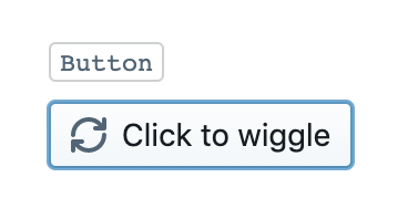
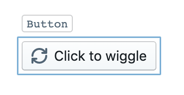
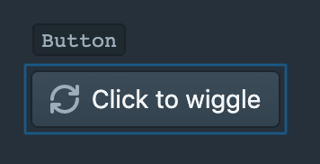
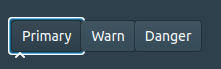
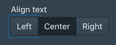
I downloaded an old version of Chromium to take a closer look at this. The change affects a few components:
- Button
- Form controls (Checkbox, Switch, HTMLSelect)
- Search inputs
Screenshots below, design analysis forthcoming
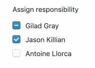
Chrome 83
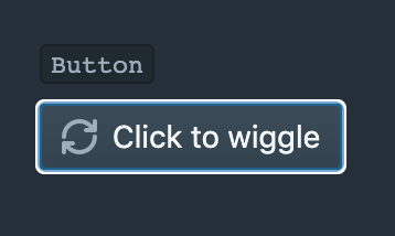


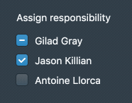

Chrome 81


adidahiya
on 3 Jun 2020
There doesn't seem to be a lot I can do about this visual change, as my efforts to style :focus-visible haven't worked. If anyone has a working example of custom :focus-visible styling for the focus ring please share it.
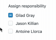
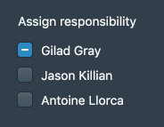
I actually think the new focus rings look better, especially in the dark theme, where there is much better (accessible) contrast with the background. I'm sure the old focus rings wouldn't pass WCAG 2.0 standards. So I'm inclined to keep the new styling. The one thing we might want to reconsider is the style for checkboxes in light theme, it's pretty subtle:
Regarding the search input "clear" icon change. I also don't see a way to add custom styles there, but I don't think the new visuals are a regression. The cross works just as well as the old icon. Note that Firefox doesn't even have a "clear" button / icon in that location.
adidahiya
on 3 Jun 2020
@adidahiya Sorry to ask again. Are you plan to solve this problem ? We still think these rings looks wired especially in the dark theme.
wisdomG
on 24 Sep 2020
@wisdomG how did you create that example? Note that this is not a regression; the old focus styles did sometimes have issues of z-index ordering of the focus rings too:
And, like I said:
I actually think the new focus rings look better, especially in the dark theme, where there is much better (accessible) contrast with the background. I'm sure the old focus rings wouldn't pass WCAG 2.0 standards.
adidahiya
on 28 Sep 2020
@adidahiya The example is here.
https://codesandbox.io/s/blueprint-sandbox-forked-8dx9o?file=/src/CoreExample.tsx
The example is runing on Chrome 85
wisdomG
on 29 Sep 2020
Related issues
adidahiya
·
3Comments
 brsanthu
·
3Comments
brsanthu
·
3Comments
 havesomeleeway
·
3Comments
havesomeleeway
·
3Comments
 giladgray
·
3Comments
havesomeleeway
·
3Comments
giladgray
·
3Comments
havesomeleeway
·
3Comments