Blueprint: Bug when rendering large buttons with large icons
Bug report
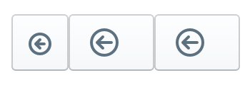
Including a large icon in a large button results in a rectangular icon with unwanted space to the right of the icon.
- __Package version(s)__: 1.35.1
- __Browser and OS versions__: Chromium 63, Mac OSX El Capitan 10.11.6
Steps to reproduce
const Toolbar = () => {
  return (
  <div>
    {/* 1st try */}
    <Button className="pt-large" iconName="circle-arrow-left"/>

    {/* 2nd try */}
    <Button className="pt-large">
      <Icon iconName="circle-arrow-left" iconSize={20}/>
    </Button>

    {/* 3rd try */}
    <Button className="pt-large">
      <span className="pt-icon-large pt-icon-circle-arrow-left" />
    </Button>
  </div>
  );
};
Actual behavior
- 1st try: the button is large, but the contained icon is small
- 2nd and 3rd tries: the button is not square and contains unwanted space to the right of the contained icon.

Expected behavior
The button should be square.
question
All 5 comments
"1st try" is the expected behavior and the intended design for large buttons.
I understand that, sorry if I didn't express myself clear enough. Is there no supported way to render large icons in buttons? If not, what is the intended purpose of large icons?
You can use large icons in other places in your UI... they just don't happen to be supported in this one specific composition use case (by design, we decided this icon size is appropriate for these buttons).
It's a pity. Thank you very much for your assistance though!
@marton78 this should be possible now with the 2.0 icon prop:
<Button icon={<Icon icon="arrow" iconSize={Icon.SIZE_LARGE} />} />
Was this page helpful?
0 / 5 - 0 ratings
Most helpful comment
@marton78 this should be possible now with the 2.0
iconprop: