Blueprint: Feature Request: DateTimeRangePicker
I'd like to use a DateRangePicker but will also need time controls. Existing workarounds involve either using two separate DateTimePickers for start/end date (not ideal), or using a DateRangePicker with separate start/end time controls (even less ideal). Would love either a dedicated DateTimeRangePicker component or support for time controls in the existing DateRangePicker.
 lucasray
All 6 comments
@cmslewis worth thinking about time in the input you're building in anticipation for this feature
 llorca
on 20 Jan 2017
llorca
on 20 Jan 2017
Noted.
 cmslewis
on 20 Jan 2017
cmslewis
on 20 Jan 2017
this suggests to me that we may want to reconsider the datetime components such that a (Date|Range|Time)+Picker is composed from a handful of other components to meet a user's exact needs.
 giladgray
on 21 Jan 2017
giladgray
on 21 Jan 2017
+1. Would also be great to be able to create a DateRangeInput again ideally with time controls, so if there's any work being put into the Date*Input component that'd be good to consider. Also maybe not the right ticket for this but chrome's type="date" input (http://www.w3schools.com/html/tryit.asp?filename=tryhtml_input_date) interactions are nice, having each day/month/year section act as separate inputs that auto-tab as you complete a section.
lucasray
on 23 Jan 2017
Currently, I just use the following code as a workaround for an incomplete and buggy DateTimeRangeInput component:
import React from 'react';
import addDays from 'date-fns/add_days';
import subDays from 'date-fns/sub_days';
import classNames from 'classnames';
import {Classes, Popover, Position, Boundary} from '@blueprintjs/core';
import {
  DateRangeInput,
  DateTimePicker,
  DateRangePicker
} from '@blueprintjs/datetime';
import * as DateClasses from '@blueprintjs/datetime/lib/esm/common/classes';
import * as DateUtils from '@blueprintjs/datetime/lib/esm/common/dateUtils';
import {combineModifiers} from '@blueprintjs/datetime/lib/esm/datePickerCore';

class DateTimeRangePicker extends DateRangePicker {
  onLeftDateTimePickerValueChange = date => {
    const {value} = this.state;
    const {onChange} = this.props;

    onChange([date, value[1] || addDays(date, 1)]);
  };

  onRightDateTimePickerValueChange = date => {
    const {value} = this.state;
    const {onChange} = this.props;

    onChange([value[0] || subDays(date, 1), date]);
  };

  render() {
    const modifiers = combineModifiers(this.modifiers, this.props.modifiers);
    const {
      locale,
      maxDate,
      minDate,
      className,
      localeUtils,
      dayPickerProps
    } = this.props;

    const {leftView, rightView} = this.state;
    const disabledDays = this.getDisabledDaysModifier();

    const dayPickerBaseProps = {
      locale,
      modifiers,
      localeUtils,
      showOutsideDays: true,
      ...dayPickerProps,
      onDayClick: this.handleDayClick,
      disabledDays,
      selectedDays: this.state.value,
      onDayMouseEnter: this.handleDayMouseEnter,
      onDayMouseLeave: this.handleDayMouseLeave
    };

    return (
      <div
        className={classNames(
          DateClasses.DATEPICKER,
          DateClasses.DATERANGEPICKER,
          className
        )}>
        {this.maybeRenderShortcuts()}

        <DateTimePicker
          value={this.state.value[0]}
          onChange={this.onLeftDateTimePickerValueChange}
          datePickerProps={{
            dayPickerProps: {
              ...dayPickerBaseProps,
              month: leftView.getFullDate(),
              toMonth: DateUtils.getDatePreviousMonth(maxDate),
              fromMonth: minDate,
              onMonthChange: this.handleLeftMonthChange,
              canChangeMonth: true,
              captionElement: this.renderLeftCaption
            }
          }}
        />

        <DateTimePicker
          value={this.state.value[1]}
          onChange={this.onRightDateTimePickerValueChange}
          datePickerProps={{
            dayPickerProps: {
              ...dayPickerBaseProps,
              month: rightView.getFullDate(),
              toMonth: DateUtils.getDatePreviousMonth(minDate),
              fromMonth: maxDate,
              onMonthChange: this.handleRightMonthChange,
              canChangeMonth: true,
              captionElement: this.renderRightCaption
            }
          }}
        />
      </div>
    );
  }
}

export default class DateTimeRangeInput extends DateRangeInput {
  render() {
    const {className, popoverProps = {}} = this.props;

    const popoverContent = (
      <DateTimeRangePicker
        {...this.props}
        value={this.getSelectedRange()}
        onChange={this.handleDateRangePickerChange}
        onHoverChange={this.handleDateRangePickerHoverChange}
        boundaryToModify={this.state.boundaryToModify}
      />
    );

    const popoverClassName = classNames(popoverProps.className, className);

    return (
      <Popover
        isOpen={this.state.isOpen}
        position={Position.BOTTOM_LEFT}
        {...popoverProps}
        content={popoverContent}
        onClose={this.handlePopoverClose}
        autoFocus={false}
        className={popoverClassName}
        enforceFocus={false}>
        <div className={Classes.CONTROL_GROUP}>
          {this.renderInputGroup(Boundary.START)}
          {this.renderInputGroup(Boundary.END)}
        </div>
      </Popover>
    );
  }
}
But a official <DateTimeRangeInput> component from you guys would be great.
 L42y
on 18 Jul 2018
L42y
on 18 Jul 2018
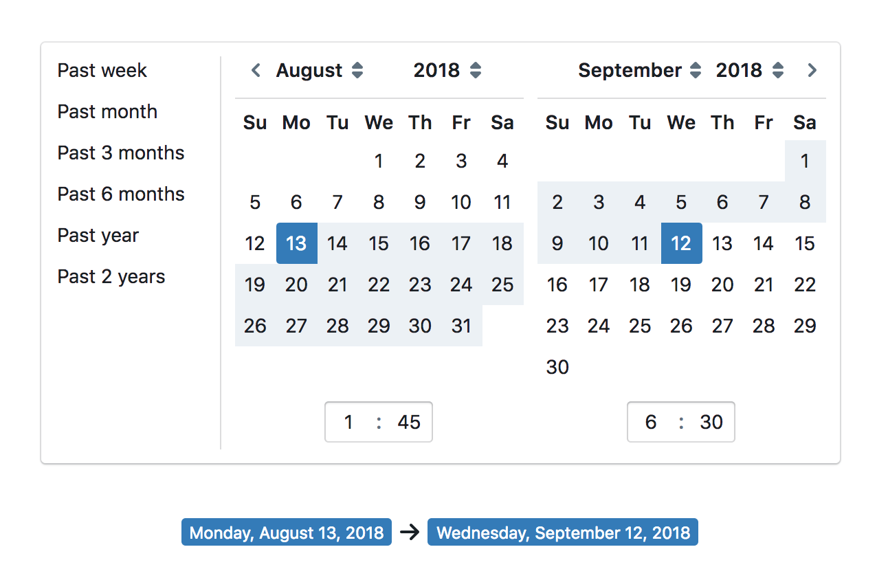
intended appearance:
giladgray
on 22 Aug 2018
Related issues
 sunabozu
·
3Comments
sunabozu
·
3Comments
 mdebeus
·
3Comments
mdebeus
·
3Comments
 havesomeleeway
·
3Comments
havesomeleeway
·
3Comments
 ernestofreyreg
·
3Comments
ernestofreyreg
·
3Comments
 adidahiya
·
3Comments
adidahiya
·
3Comments
Most helpful comment
this suggests to me that we may want to reconsider the
datetimecomponents such that a(Date|Range|Time)+Pickeris composed from a handful of other components to meet a user's exact needs.