I miss the old Blink icon. It was dark and fit in with the other dark icons I've used (Pythonista, Apollo, CARROT, Fiery Feeds, Overcast, etc.). The new icon is this strange turqouise that doesn't have any connection to what the app does (namely display grey text on a black screen). At the very least, a choice of icons would be good.
 anahata0108
All 22 comments
I definitely prefer the old icon, too. +1 for making the icon user-selectable.
 goerz
on 2 Nov 2018
goerz
on 2 Nov 2018
hehe, I was the first one who was against. But after couple days I really like it. It is very warm and stand out. Just give it some time :)
 yury
on 2 Nov 2018
yury
on 2 Nov 2018
I don't think that "giving it time" will help. I do not like the new icon and time won't change that.
anahata0108
on 2 Nov 2018
That turquoise is extremely jarring. Providing multiple icons should be relatively straightforward, no? You could even make it an in-app purchase, the way PCalc does ;-)
goerz
on 2 Nov 2018
The new icon is absolutely horrible.
 avysk
on 2 Nov 2018
avysk
on 2 Nov 2018
it is awesome. just give it a day.
yury
on 2 Nov 2018
It kinda fits the last completely broken update of the program but it doesn’t mean that this acidic color is awesome :)
avysk
on 2 Nov 2018
Why not just give the user the choice? :-)
If I did any iOS development I'd submit a PR that would give the user the choice.
 levex
on 3 Nov 2018
levex
on 3 Nov 2018
I've given it a day, I still hate it. Can we get it changed back, please? Or at least a choice? No one in this thread is in favour of the new icon except you, @yury. Did you design it? Is that why you're so attached to it?
anahata0108
on 3 Nov 2018
As a matter of fact, I don’t mind the icon, it fits nicely where it is on my iPad. I’m in favor of choice.
levex
on 3 Nov 2018
This one is on me, so let me explain where the change comes from. I designed the original and @yury has retouched it recently so it feels great that you all loved it (or at least like it more than the new one) through the years. For those of you who just want the short version: Yes, you will be able to choose an alternate icon soon. Small spoilers ahead ;)
We have a lot of great plans for Blink in the future. Bash is the shell to your local machine. We want Blink to become the shell that connects to your cloud machines, the services you develop, or the infrastructure for your research, wherever they are and from any device. This doesn't change our idea of the simple shell and terminal, but we have a lot of great ideas of how we see them evolving. We will start to contact some of you soon to get your feedback, so reach out if you are interested to know more!
As Blink evolves, we wanted the brand to reflect some of that too, beyond just the white letters on a black screen. Of course we will allow you to configure it, to the original and maybe even to other colors. But we are also taking into account how we want to play with it on a new web and on other platforms too!
So now that you have the whole story, let us know what you think!
 carloscabanero
on 3 Nov 2018
carloscabanero
on 3 Nov 2018
I have given it a day. It sucks as strongly as before.
avysk
on 3 Nov 2018
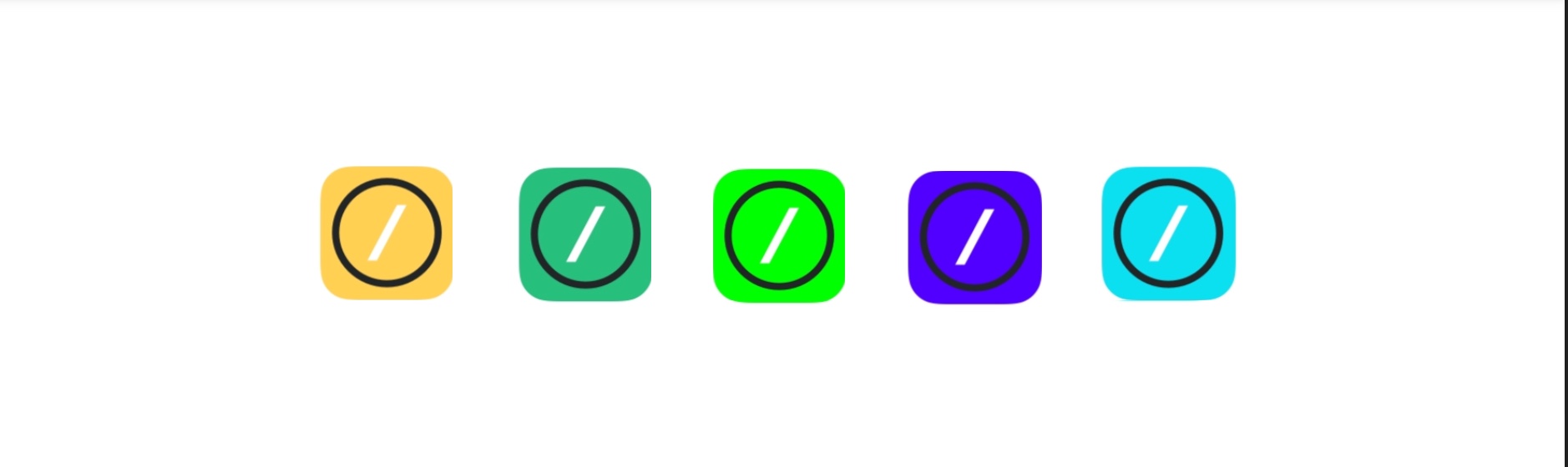
If that was a gallery of icon choices, I would definitely recommend adding "old-style" versions of these, too: black icon with colored circle/slash (which would include the old icon)
goerz
on 3 Nov 2018
I still love black, from proposed ones green also fine (the second one icon from the left)
 andrius
on 6 Nov 2018
andrius
on 6 Nov 2018
yury
on 6 Nov 2018
I, too, prefer the old icon (after several days even ;-)
B und able to choose from some option would of course be nice, but overall it's really a minor thing. First and foremost Blink is immensely useful to me, whichever color it's icon may show.
 plakat
on 11 Nov 2018
plakat
on 11 Nov 2018
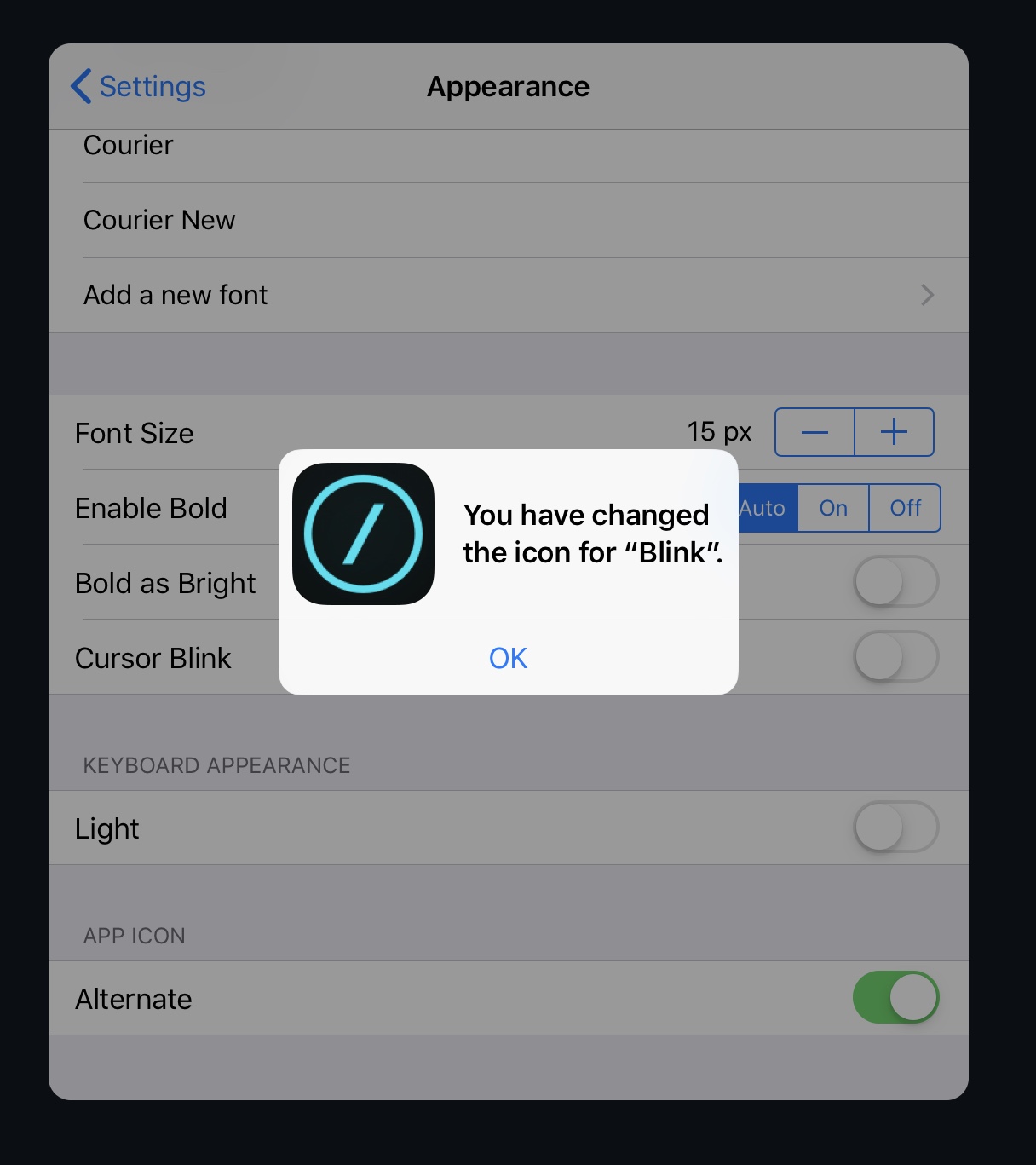
I love new icon, but we have added alternate (old one) under config-> appearance
yury
on 11 Nov 2018
Hi,
Thank you so much for listening to your users on this. Seriously. It shows that you value us, and in turn, we value you. ❤️
I do have a quick question, though. Can you explain what the RTT label means? :)
anahata0108
on 13 Nov 2018
Ready to test :)
carloscabanero
on 13 Nov 2018
Is there a link to join TF so that I can switch back to the old icon :) ?
 victoraugust
on 17 Nov 2018
victoraugust
on 17 Nov 2018
12.2 is on review in App Store. So it will be public in couple days. (I hope on Monday)
yury
on 17 Nov 2018
Closing the issue.
yury
on 11 Jan 2019
Related issues
 webdog
·
4Comments
webdog
·
4Comments
 zaptrem
·
4Comments
zaptrem
·
4Comments
 jra
·
5Comments
carloscabanero
·
4Comments
jra
·
5Comments
carloscabanero
·
4Comments
 proportional
·
3Comments
proportional
·
3Comments
Most helpful comment