Bisq: UI Bug tracking list for release-candidate-0.9.0
Although the release branch for 0.9.0 is still work in progress I start this issue to collect all open todos. Feel free to leave comments on UI glitches so we don't miss anything.
Views that are not done yet:
- Trade process
Views to adapt
- [x] Take Offer
- [x] Edit Offer
- [x] Create Offer
- [x] Trade Process
- [x] Trade Details Window
- [x] Contract Window
- [x] Dispute Summary Window
- [x] Arbitration
Open Tasks
- [ ] Check if rendering intensive views can be delayed not to conflict with ripple effect in e.g. tabs
- [x] Style interval buttons (TradeStatistics,...)
- [x] Replace all BusyAnimations with JFXSpinner
- [x] Improve styling of small notification popups
- [x] click on avatar opens small popup with user info
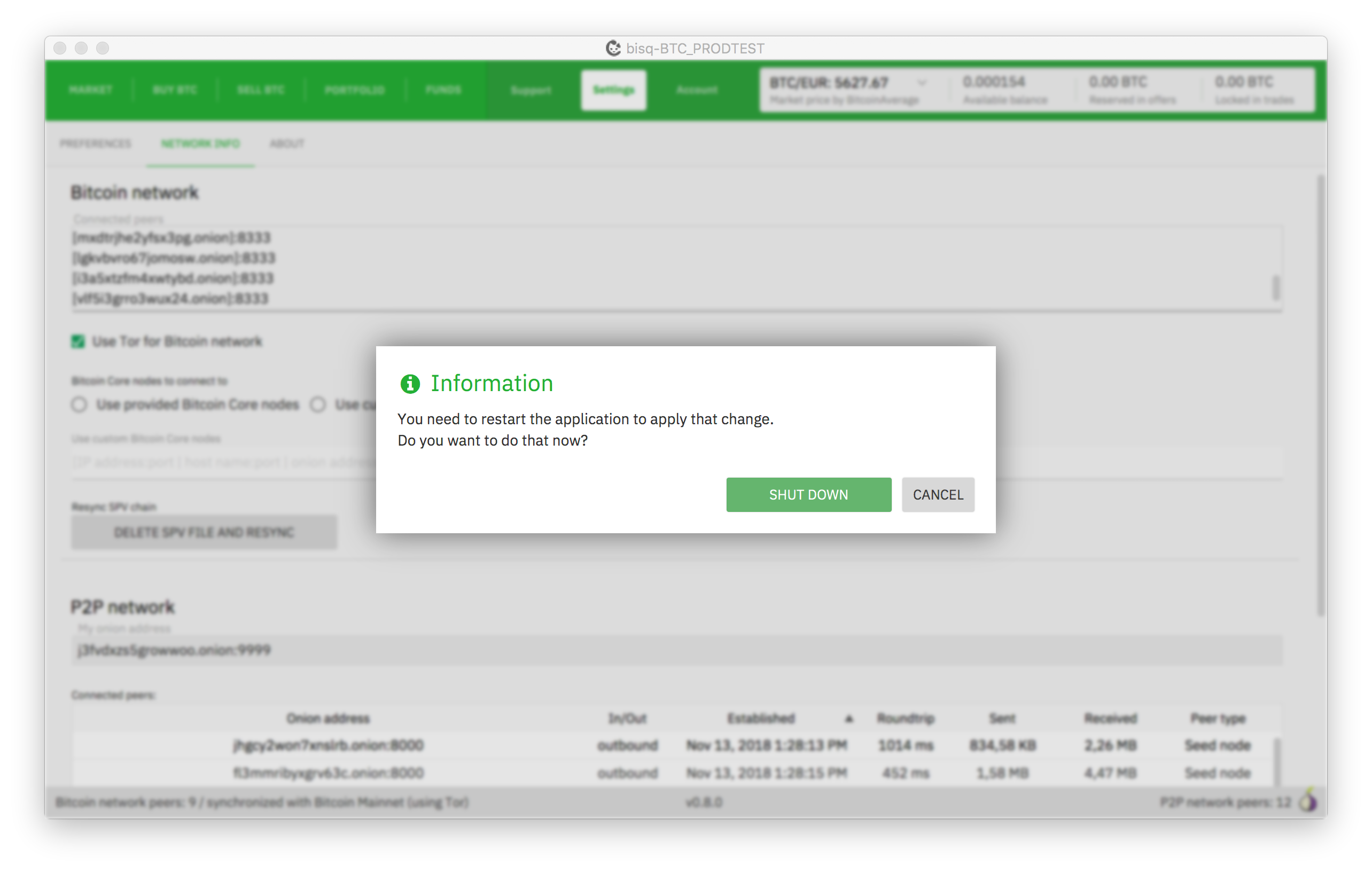
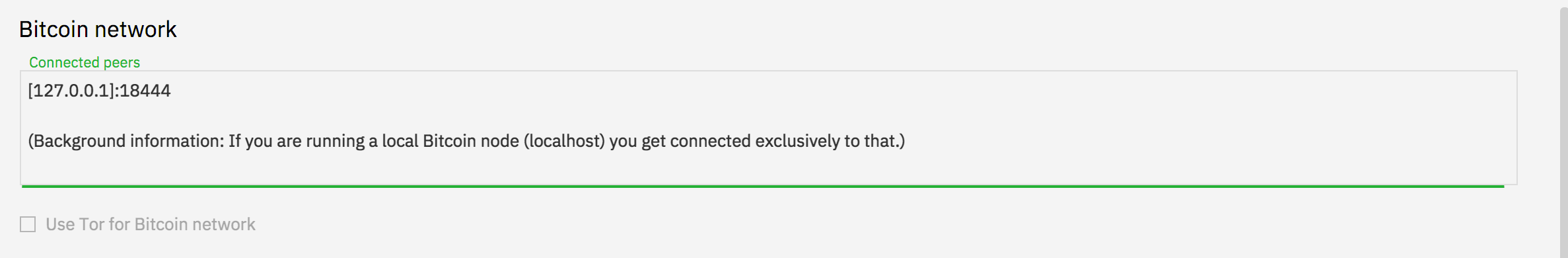
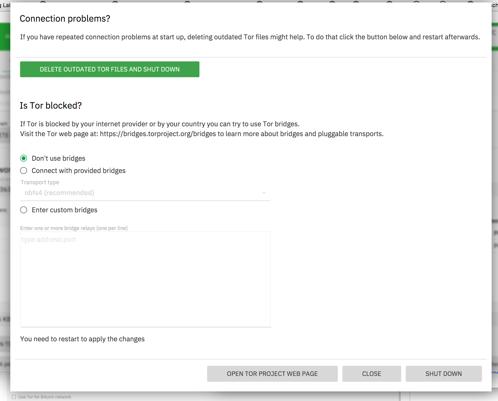
- [x] tor network settings popup (settings/network)
- [x] seed word restore at startup or in account view
- [x] testing all with password
- [x] testing bsq/btc trade fee with DaoEnabled= false in DevEnv -> BSQ must be hidden
- [x] DAO screens still have old style of left navigation
- [x] The market price display is too small for some altcoins with 8 digits. also balances can be truncates. availabel balance can have up to 8 digits after comma, others only 4.
- [x] Create offer buttons in buy/sell screens should be above table
- [x] fix Ripple position for RadioButtons
- [x] Adapt date picker
- [x] Adapt chart style in Trades view
- [x] Extend focus line in create offer view until the end of the box also increase length of fields to fit error text
- [x] Reduce line space in payment methods display
Optional
- [x] Focus colors of buttons should always be brighter/darker not lighter (e.g. buy/sell colors)
- [ ] Improve Spinner performance
- [ ] Remove code duplication between CreateOffer and TakeOffer views
- [ ] Use ButtonBar for all buttons to have consistent positioning
- [ ] Add ripple effect for main navigation
- [ ] Clean up css colors
- [ ] Clean up css classes
- [ ] btc node change triggers popups
- [ ] Improve design of notification popups (x close icon instead of cancel/close button,...)
- [ ] Define new colors for the message bubbles during dispute
 ripcurlx
All 64 comments
Disconnecting from (all?/only) btc node makes UI get stuck for several minutes: https://github.com/bisq-network/bisq/issues/1823
 iljah
on 5 Nov 2018
iljah
on 5 Nov 2018
A few small screens we must not forget:
- click on avatar opens small popup with user info
- tor network settings popup (settings/network)
- btc node change triggers popups
- seed word restore at startup or in account view
- testing all with password
- testing bsq/btc trade fee with DaoEnabled= false in DevEnv -> BSQ must be hidden
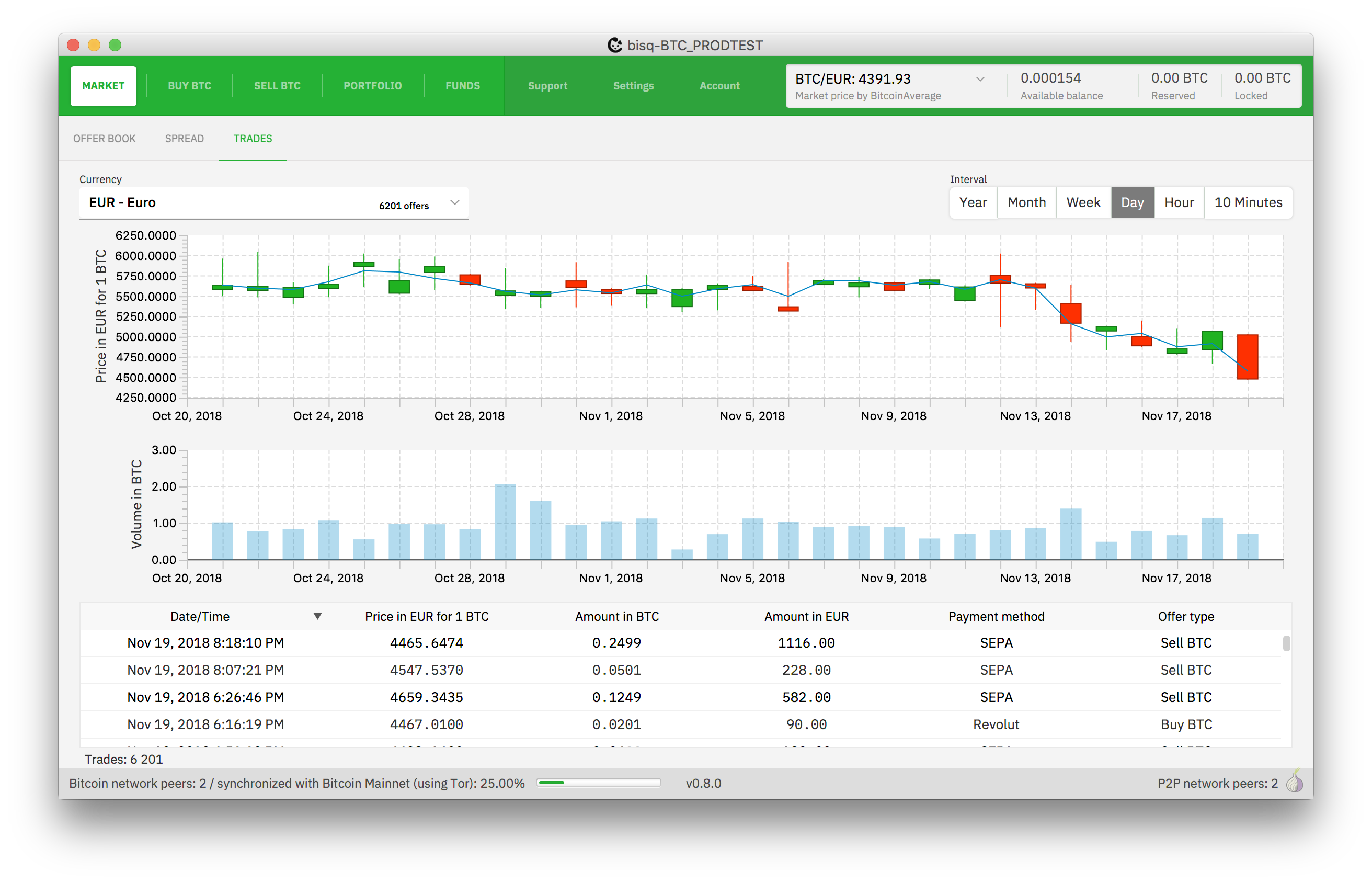
- interval button bar in market/trades is still old style
- DAO screens still have old style of left navigation
Other remarks:
- The market price display is too small for some altcoins with 8 digits. also balances can be truncates. availabel balance can have up to 8 digits after comma, others only 4.
- Create offer buttons in buy/sell screens should be above table
 ManfredKarrer
on 6 Nov 2018
ManfredKarrer
on 6 Nov 2018
@ManfredKarrer Thanks - I've updated the open tasks list.
ripcurlx
on 7 Nov 2018
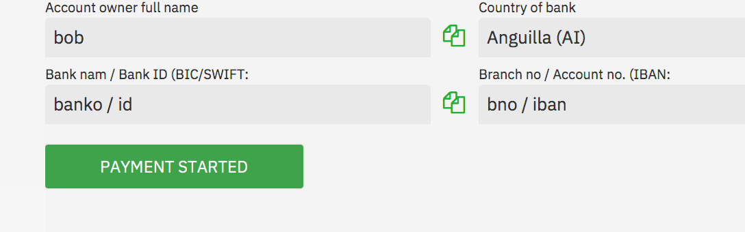
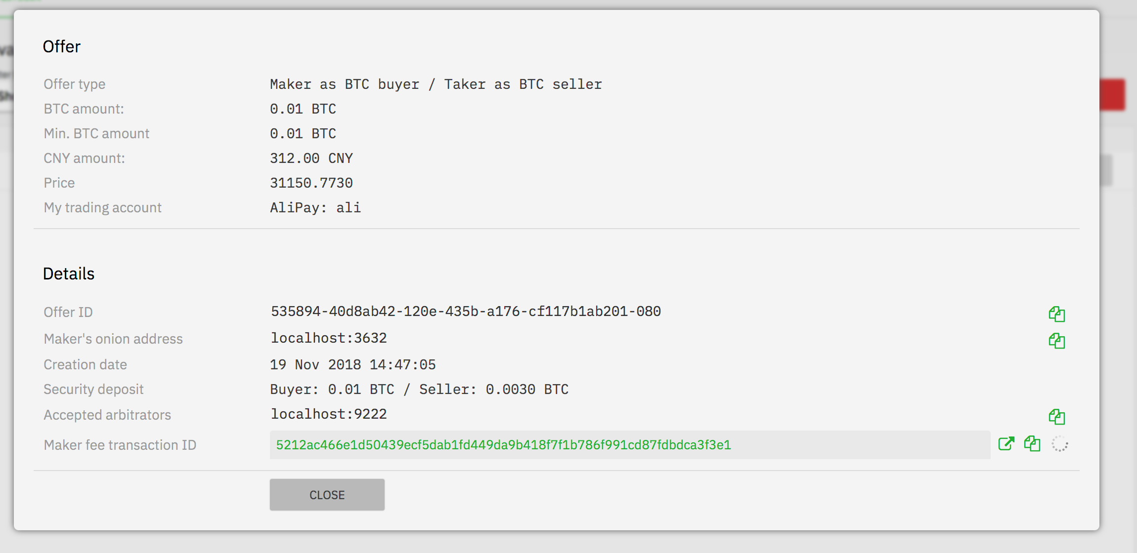
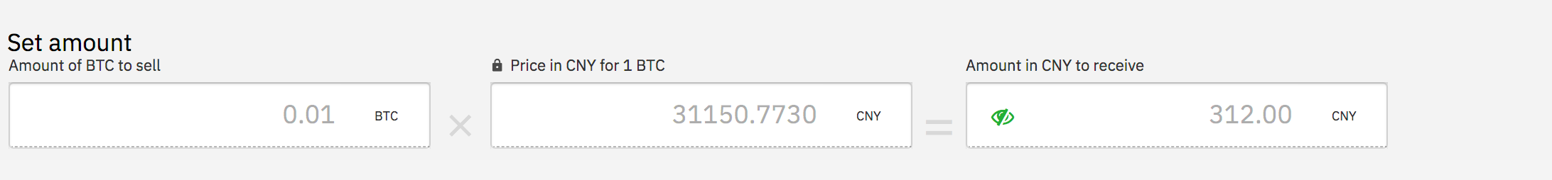
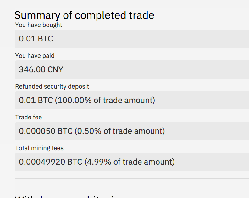
Small issues whith bracket and colon in titles (IBAN...). See
ManfredKarrer
on 7 Nov 2018
Ah - I only fixed this in CashDeposit and missed it in the BankForm. Will fix it tomorrow.
ripcurlx
on 7 Nov 2018
@ManfredKarrer What do you mean with
btc node change triggers popups
ripcurlx
on 8 Nov 2018
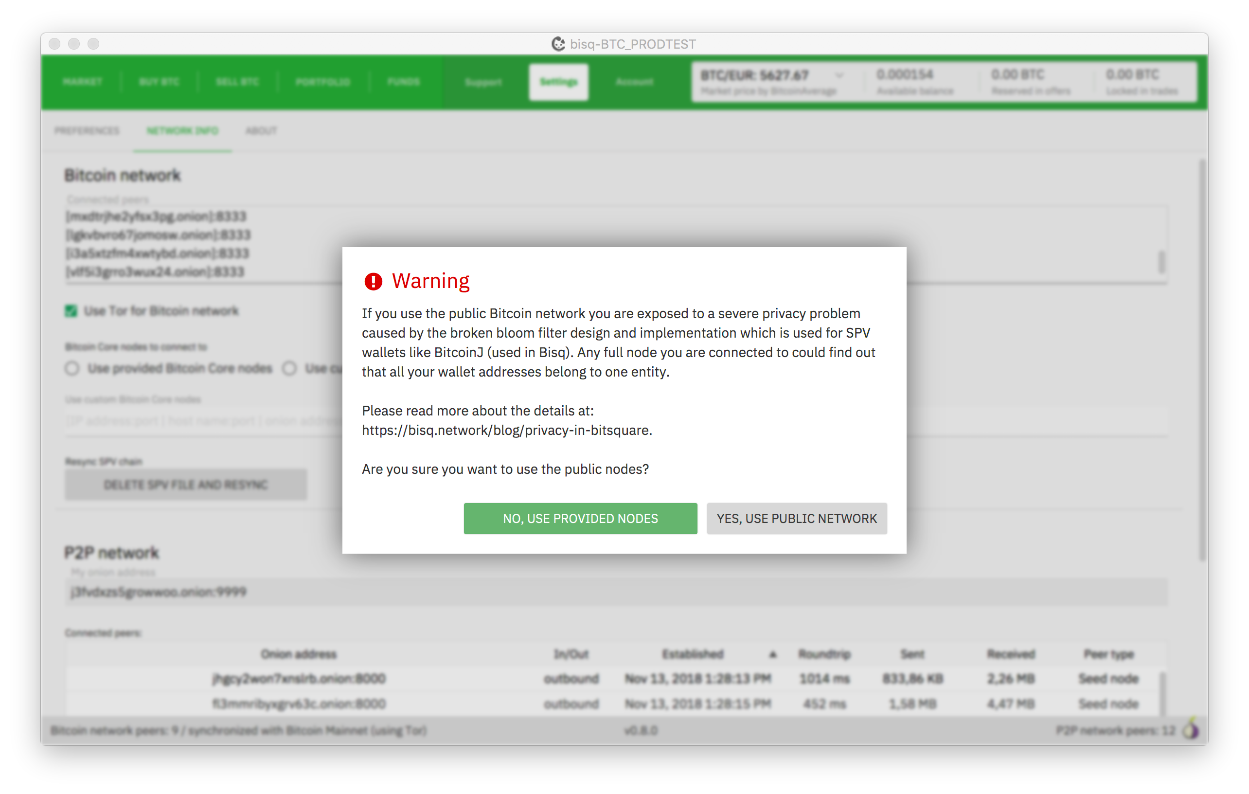
btc node change triggers popups
If you change from provided btc nodes to public nodes in settings/network. There are some popups there...
ManfredKarrer
on 8 Nov 2018
Small thing to not forget: The logo at splash screen is too small (prob 50% of the intended size)
ManfredKarrer
on 10 Nov 2018
We need also another tor icon, it hurts the eye as it is now ;-). maybe we just make an abstract green one. their purple will never fit (nowhere ;-)).
ManfredKarrer
on 10 Nov 2018
@ManfredKarrer These are the btc node popups. Do we really need a custom styling for them?
ripcurlx
on 13 Nov 2018
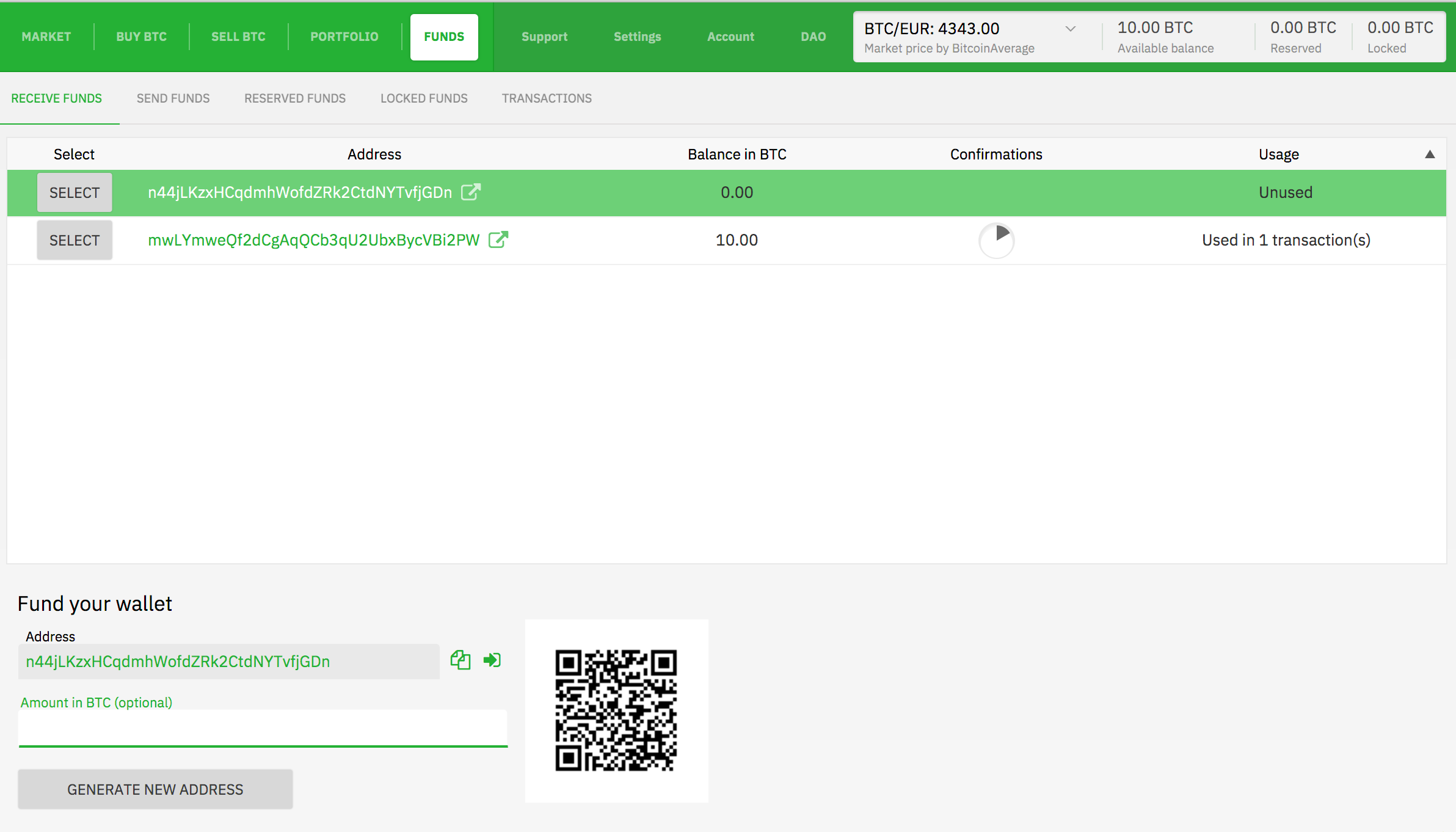
I think it would be better to have the fields in the bottom be full width and qr code right aligned
ManfredKarrer
on 19 Nov 2018
Similar on send funds screen
ManfredKarrer
on 19 Nov 2018
Fields in row are not centered.

ManfredKarrer
on 19 Nov 2018
At preferences screen the buttons have no hand cursor
ManfredKarrer
on 19 Nov 2018
Textarea has green line as well. I think here it better without line.
ManfredKarrer
on 19 Nov 2018
That popup exceeds height of app window. Should be more condensed.
Seperator lines have too high distance. Button no hand cursor and Textarea comes with line as well.
Default (green) button should be not delete tor files. Not sure whats now and whats best...
ManfredKarrer
on 19 Nov 2018
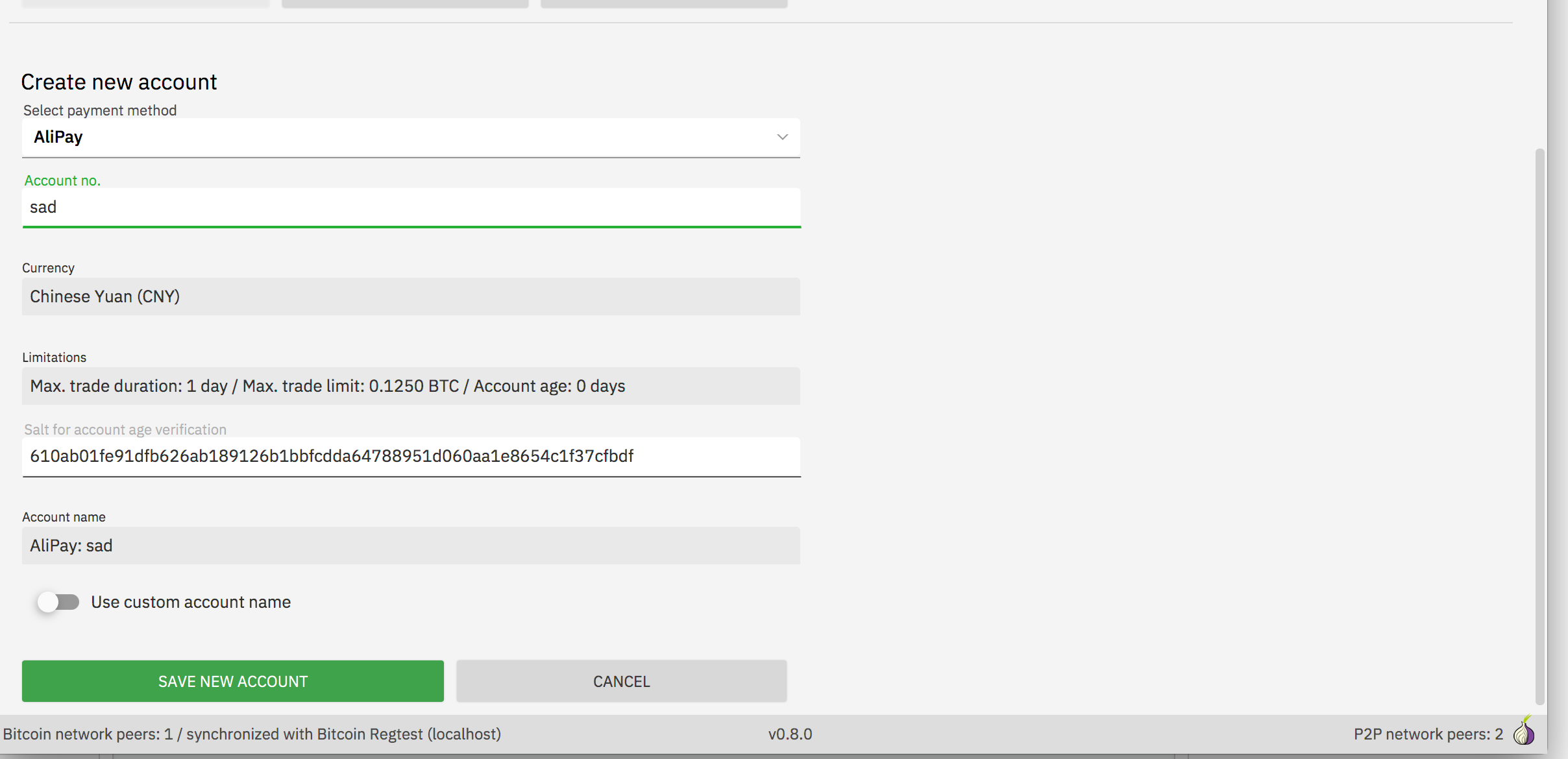
I think account should also fill whole width.
Distance between comboboxes is smaller as between text fields. Better to have it smaller to not lose so much space.
ManfredKarrer
on 19 Nov 2018
Font in some tables are monospace in otheres normal font. Here they are mixed.
ManfredKarrer
on 19 Nov 2018
For me it looks a bit strange that the label text left is grey and not black.
ManfredKarrer
on 19 Nov 2018
Not sure if dottel line is good here. Maybe just no line?
ManfredKarrer
on 19 Nov 2018
I think distance between header and first is to small but the sistance between the text fields is perfect IMO. We should use that at other non input fields as well.
ManfredKarrer
on 19 Nov 2018
Not sure if green as color for links is so good. It gets quite fulled up in some screens with green, losing the CI color weight IMO.

ManfredKarrer
on 19 Nov 2018
Yes, I'm also not so sure if we should switch the blue link color with the new green everywhere.
ripcurlx
on 19 Nov 2018
Yes, lets maybe ask @pedromvpg what he suggests. Looks not with screens filled with real data different than with blank screens...
ManfredKarrer
on 19 Nov 2018
I assume the blue here is not intended...

ManfredKarrer
on 19 Nov 2018
Atm it is, as it is the volume. Not sure if using green would be confusing regarding loss/win, especially if you have the other chart displayed above it.
ripcurlx
on 19 Nov 2018
With cmd+j the wallet info popup gets opened. It has column issues atm.
ManfredKarrer
on 19 Nov 2018
When sending a dispute msg and the peer is offline there is a spinner short time and that is not centered with % text in there
ManfredKarrer
on 19 Nov 2018
I assume the blue here is not intended...
Not sure what color would be best for volume bars instead.
 ripcurlx
on 19 Nov 2018
ripcurlx
on 19 Nov 2018
Maybe green is better here? But not sure either...
ManfredKarrer
on 19 Nov 2018
In disputes its system msg green and then blue/grey. maybe better green/grey and diff. color for system msg?
ManfredKarrer
on 19 Nov 2018
I could use the blue for the system message 😉
ripcurlx
on 19 Nov 2018
Some colons still
ManfredKarrer
on 19 Nov 2018
Avatar icon tags (circle with num trades, info msg) are still blue.
ManfredKarrer
on 19 Nov 2018
Some tables have lines between rows others not (market vs trades).
ManfredKarrer
on 19 Nov 2018
Some tables have lines between rows others not (market vs trades).
Yes, I took it from the design templates right now, which have it different. Maybe we should make them more consistent.
ripcurlx
on 19 Nov 2018
Currency list exceed my screen. Prob. max entries need to be lower as rows are higher now.
ManfredKarrer
on 19 Nov 2018
Sepa account has last 2 entries too much space when viewing account (prob not when creating it)
ManfredKarrer
on 19 Nov 2018
Green border prob not intended
ManfredKarrer
on 19 Nov 2018
Sepa account has last 2 entries too much space
I gave the limitation and salt extra space and only compressed the payment account specific fields. But I guess it didn't help readability. I'll decrease the line space there as well.
ripcurlx
on 19 Nov 2018
Textarea has green line as well. I think here it better without line.
I fixed the positioning of the textarea focus line, but I think it should stay to be consistent with other input fields.
ripcurlx
on 20 Nov 2018
Avatar icon tags (circle with num trades, info msg) are still blue.
@pedromvpg I think we would need an alternative color or keep the blue.
Having both circles green makes it harder to grasp.

ripcurlx
on 21 Nov 2018
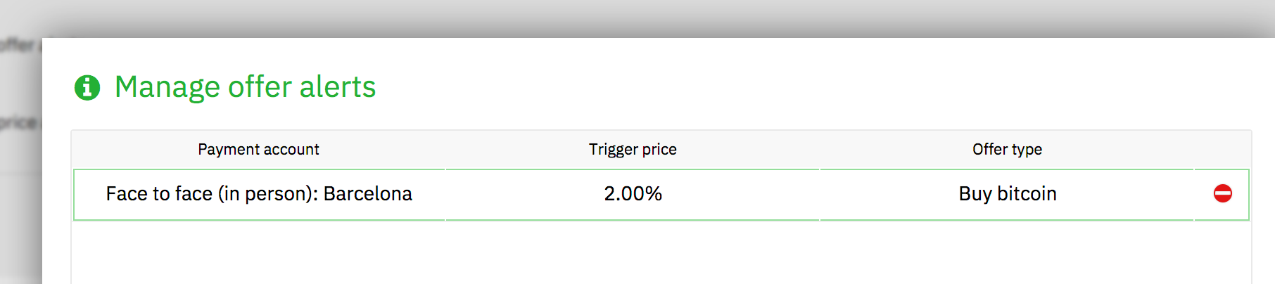
Hi, I have installed Bisq-0.9.0-2018-11-21.dmg from dropbox and tried set up notification by pairing with my iPhone.
- The pairing worked, but took unusually long (about 40 seconds). I'll try again later.
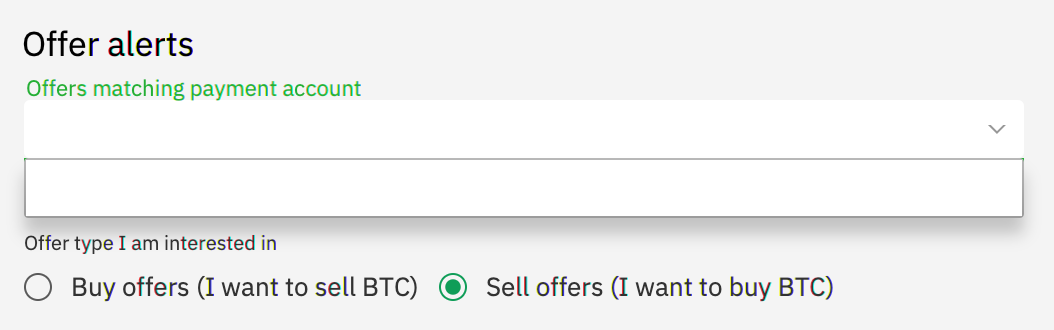
- Adding offer alerts did not show my SEPA account in the drop down list, see screenshot.
I love the new design, it looks more modern and professional.
 joachimneumann
on 22 Nov 2018
joachimneumann
on 22 Nov 2018
@joachimneumann I think the content for this combobox wasn't bound to the "live" data. It is populated when you open it for the first time after an app start. I'll fix it.
ripcurlx
on 22 Nov 2018
@joachimneumann Fixed it - the pairing worked for me instantly.
ripcurlx
on 22 Nov 2018
The notification popups are right aligned but not top aligned (5-10 px distance). I think would be better to have both without space or with the same space.
ManfredKarrer
on 23 Nov 2018
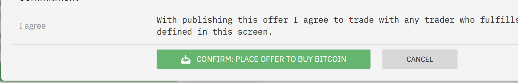
Buttons are sometimes not in the full color. I think its an artefact fromt he animations that the color/alpha animation does not continue to the end. It happens for instance at create offer at the confirm popup at the end. when canceling that the main screen button is also not full color.
Seems if you click somewhere the animation finishes. Maybe some focus issue?
ManfredKarrer
on 23 Nov 2018
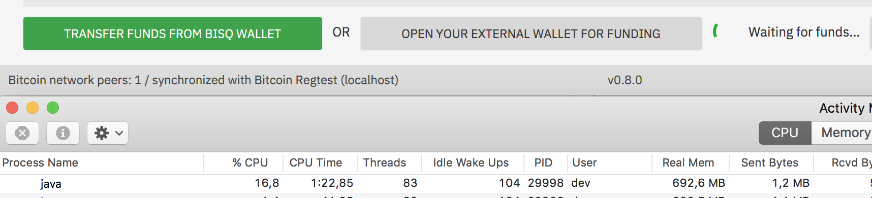
Spinner use a lot of CPU. When spinner is animated CPU is about 20% otherwise its 1-3 %.
Thats the old problem with the JavaFX progress indicator. I optimized in the old version those classes to use less CPU (is about 10%). No need to fix it for that release but we should either try to find an alternative or fix the CPU issue in follow up releases. Shame on Oracle that they are unable to build such a simple animation with performacne in mind.
ManfredKarrer
on 23 Nov 2018
At create offer there is short time something visible when next button is clicked. I cannot see it what it is as it is too short, but you can see that the layout of the funding screen gets re-layouted after 200 ms or so...
ManfredKarrer
on 23 Nov 2018
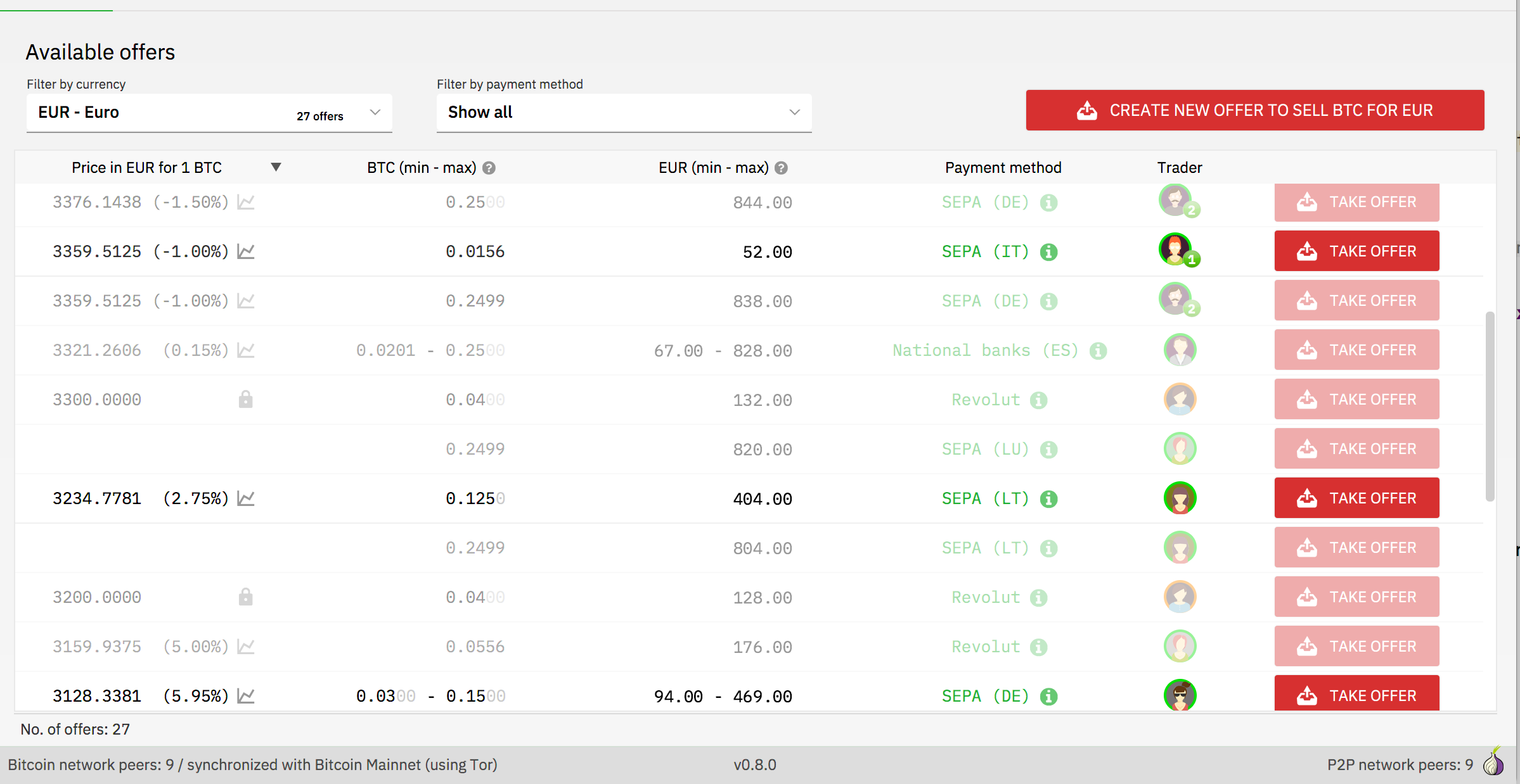
Scrolling through offers shows some fields blank. Prob. a incorrect cell update.
ManfredKarrer
on 25 Nov 2018
https://github.com/bisq-network/bisq/pull/1973 addresses all issues (except the render bug)
ripcurlx
on 26 Nov 2018
Most popups have the info style. They come now with the i icon which might be confusing as a user would expect a rollover or the like. Many such popups like password input does not even have any text for info... I would suggest to not show the i icon.
ManfredKarrer
on 26 Nov 2018
Red icons are a bit too low:
ManfredKarrer
on 26 Nov 2018
When you are in the fund screen in create offer and switch tabs and come back the focus is set to amount field. Should be no focus set if in funding screen.
ManfredKarrer
on 26 Nov 2018
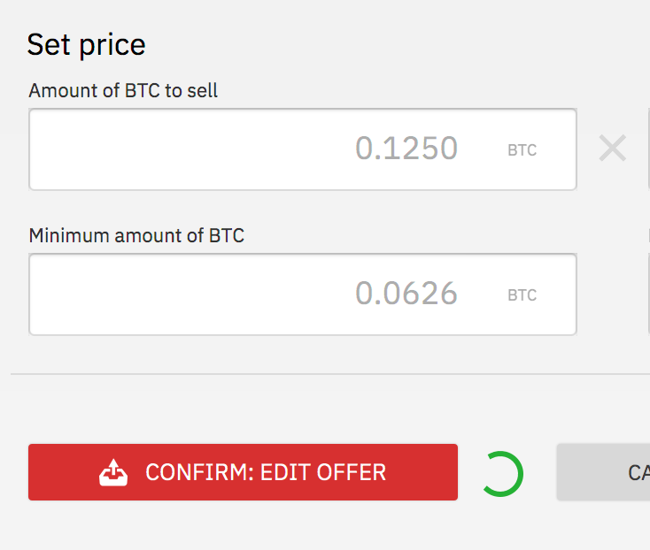
At edit offer the spinner is animated but not clear what it means. As its a CPU killer maybe best to remove it.
ManfredKarrer
on 26 Nov 2018
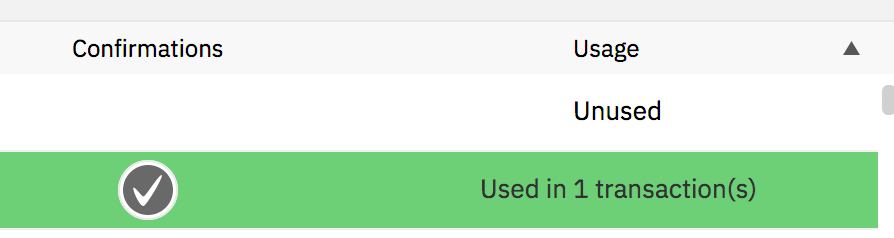
Confirmation icon in fund screen is too big.
ManfredKarrer
on 26 Nov 2018
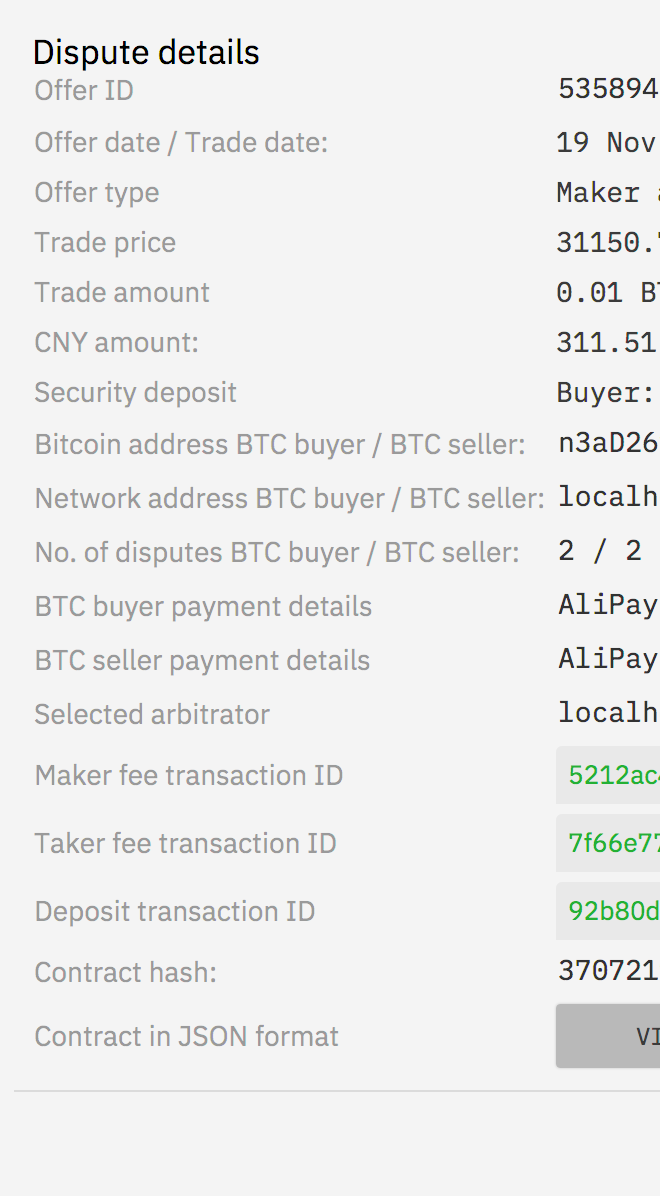
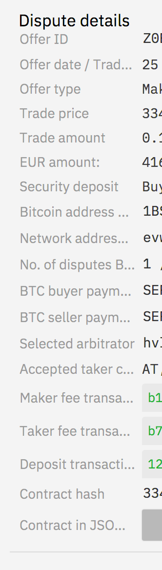
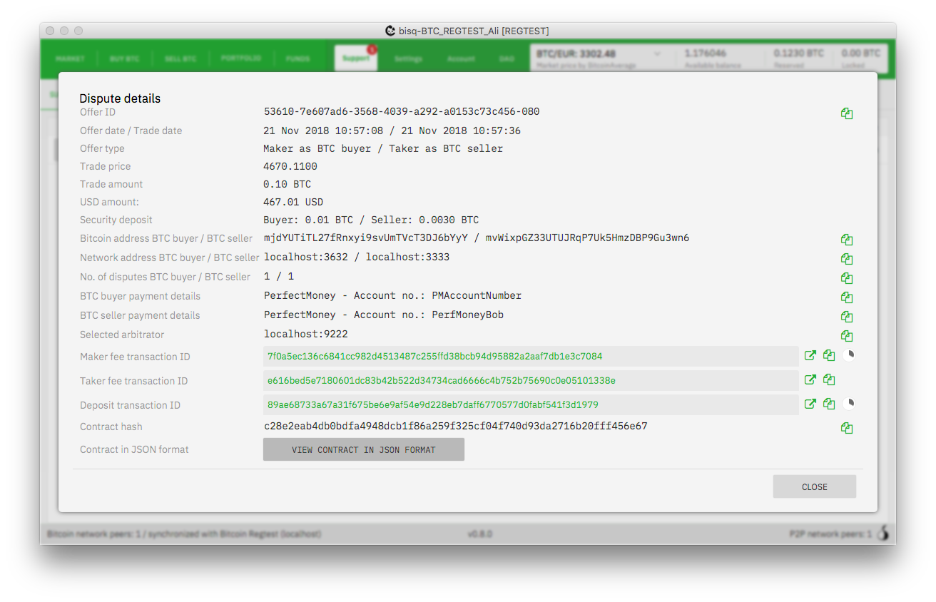
Dispute detail window labels are too short and headline need more space.
ManfredKarrer
on 26 Nov 2018
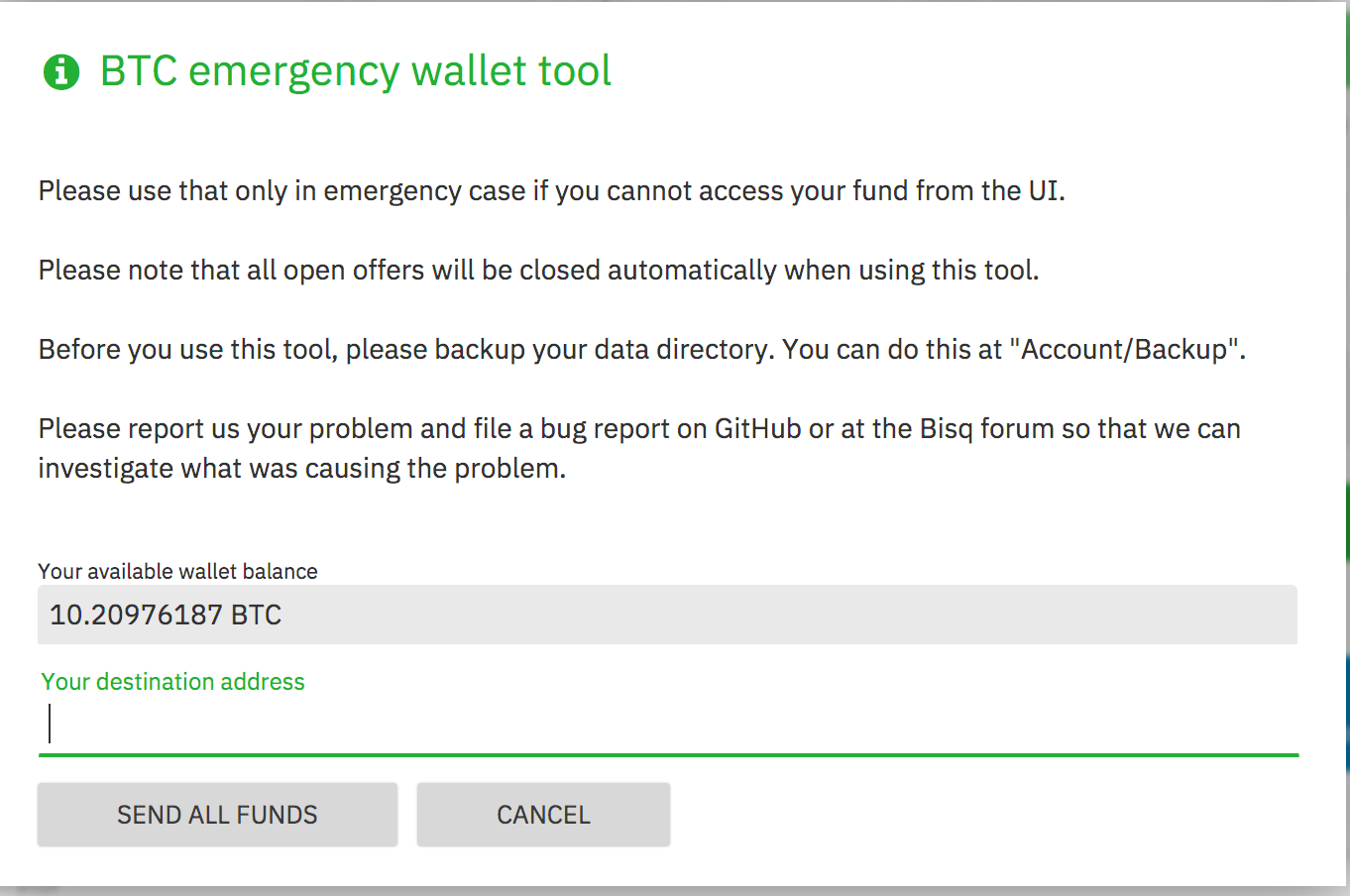
Emergency window title has too much space:
ManfredKarrer
on 26 Nov 2018
When you are in the fund screen in create offer and switch tabs and come back the focus is set to amount field. Should be no focus set if in funding screen.
That's kind of weird. I'm not even able to select/focus this field as it is set to MouseTransparent=true and FocusTraversable=false. Can you reproduce this every time?
ripcurlx
on 27 Nov 2018
At edit offer the spinner is animated but not clear what it means. As its a CPU killer maybe best to remove it.
There was a bug that the progress indicator it wasn't stopped after your first edit. So it showed up on all edits afterwards already spinning.
ripcurlx
on 27 Nov 2018
Dispute detail window labels are too short and headline need more space.
Did you resize the window before you opened the dialoge? I don't see this issue, besides the needed padding for the title.
ripcurlx
on 27 Nov 2018
@ripcurlx do u want to keep that open?
ManfredKarrer
on 18 Jan 2019
I'll split the remaining tasks into separate issues and close this one afterwards.
ripcurlx
on 18 Jan 2019
Closing as complete. All open tasks have been moved into separate issues.
ripcurlx
on 18 Jan 2019
Related issues
 wiz
·
6Comments
wiz
·
6Comments
 pazza83
·
4Comments
pazza83
·
4Comments
 userzer0x
·
4Comments
wiz
·
3Comments
userzer0x
·
4Comments
wiz
·
3Comments
 ShaunHoyes
·
6Comments
ShaunHoyes
·
6Comments