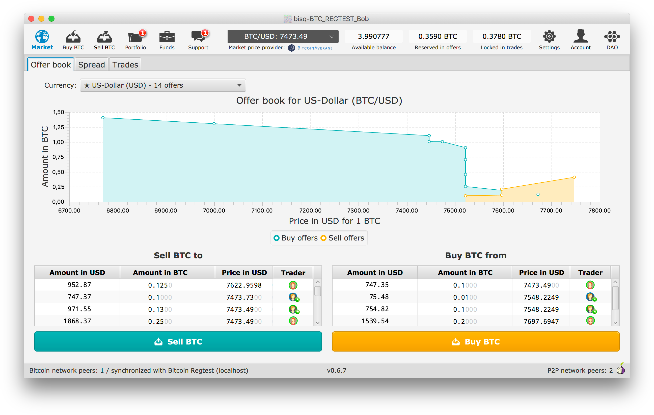
After a recent discussion with @cbeams it became clear to me that we still have something to improve in the new offer book screen. It's still not 100% clear that you're buying from real people and now with the changed title the chart on top is lacking a legend.
Current state on master

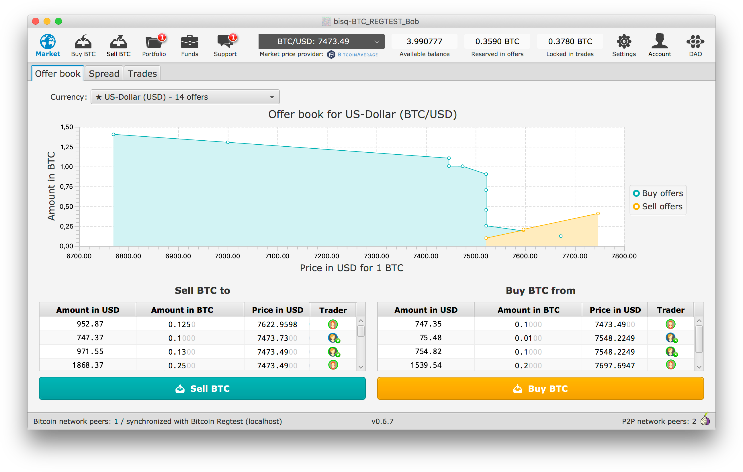
Suggested first changes

I'll have a look if I can add a legend to the chart above in an easy way and will update this issue asap.
 ripcurlx
All 6 comments
A quick solution could be to add a legend. I'll have a look if I can change the position easily.
ripcurlx
on 29 Mar 2018
I think putting it on the right is the better way to go. What do you (@cbeams) think?
ripcurlx
on 29 Mar 2018
Hm, having it right breaks the symmetry somehow for me. I would prefer the version where its below.
 ManfredKarrer
on 30 Mar 2018
ManfredKarrer
on 30 Mar 2018
"an offer to buy" "an offer to sell" might be easier for noobs.
 dorkmo
on 30 Mar 2018
dorkmo
on 30 Mar 2018
@dorkmo Thats exaclty the problematic part here. Its the opposit, its an offer of a user who wants to buy, thus an offer for you if u want to sell. That mirrored perspective is a bit tricky to get right in the UI to not confuse users. We always act from the users perspective. So the "Buy offers" as in the screen violates that and adds confusion again.
I think easiest is to avoid that and not give them labels. The colors and placements with the table should guide a bit and at the end it is not relevant for the user. He simple wants to know where to click if he wants to buy or sell and that is achieved as it is.
ManfredKarrer
on 30 Mar 2018
After letting it rest for some while I also think that adding a legend just makes it more confusing again for new users. I'll prepare a PR with the Trader icons only.
ripcurlx
on 6 Apr 2018
Related issues
 viperperidot
·
6Comments
viperperidot
·
6Comments
 21isenough
·
5Comments
21isenough
·
5Comments
 wiz
·
3Comments
wiz
·
3Comments
 svpi11
·
6Comments
svpi11
·
6Comments
 ShaunHoyes
·
6Comments
ShaunHoyes
·
6Comments
Most helpful comment
After letting it rest for some while I also think that adding a legend just makes it more confusing again for new users. I'll prepare a PR with the Trader icons only.