Billboard.js: Negative values in gauge
Description
Hello,
Is it possible to use a negative value in a gauge ? For example a negative minimum
Steps to check or reproduce
var chart = bb.generate({
  data: {
    json: {
        value: [25]
    },
    type: "gauge"
  },
  gauge: {
    min: -100,
    max: 100
  },
  size: {
    height: 180
  },
  bindto: "#gaugeChart"
});

Here a link to a fiddle : https://jsfiddle.net/vcz3ru2a/
Thank you for your help and your work !
Victor
 pvictor
All 13 comments
Hi @pvictor, basically gauge type works for positive values.
I'm not sure the use of negative in gauge type is commonly required.
 netil
on 9 Sep 2019
netil
on 9 Sep 2019
Hi @netil , I think this can be a nice feature but I agree that this may not be common.
pvictor
on 9 Sep 2019
I have the same issue. When measuring customer satisfaction measures ranging from -100 to 100 are rather common starting with the most prominent Net Promotor Score and all similarly calculated aggregated scores (for example net effort score etc.). Gauges in other libraries C3 and justGage do not have this issue, but come with other drawbacks.
 TimTeaFan
on 10 Sep 2019
TimTeaFan
on 10 Sep 2019
@pvictor, @TimTeaFan I drew some possible cases for:
How negative/positive values could be represented for negative minimum?
There're cases that was in your mind?
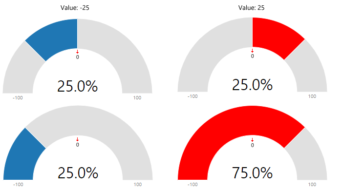
Ambiguity
The representation of negative value seems to be ambiguous.
Maybe every graph could be understood "as is", according the different perspective user has, but none of these are giving a "clear visualization" intuitively.
Personally, the graphs above on both negative/positive representation reflects the "real data".
What are your opinions?
netil
on 11 Sep 2019
@netil: Thanks for the follow up. From my perspective (Net Promoter Score ranging from -100 many unsatisfied consumers to 100 many satisfied consumers) only the second row of gauges makes sense. C3 and JustGage also use this kind of representation. I admit, the first row of gauges might make sense in some cases, I'm just not able to come up with an example. My personal preference (bias) is with the second representation.
TimTeaFan
on 11 Sep 2019
Thanks for the follow-up.
Second row is more natural for me too, but I think this represents gauges for values of -50 and 50 respectively, as we are halfway between -100 and 0, and 0 and 100.
For me these parameters should generate same visual aspect (except labels and value) :
- value: 25, min: 0, max: 100
- value: -50, min: -100, max: 100
Because if we rescale -50 from a range of [-100, 100] to a range of [0, 100], we got 25 :
x = -50;
from = [-100, 100];
to = [0, 100];

(x - from[0])/(from[1] - from[0]) * (to[1] - to[0]) + to[0]
I don't know if I'm clear....
pvictor
on 11 Sep 2019
@pvictor: Same opinion here. -100 and 100 was just an example. Same representation should hold for -50 / 50 etc.
TimTeaFan
on 11 Sep 2019
Thanks @pvictor, @TimTeaFan for the opinions, but how about for multiple dataset representation?
For positive(the current implementation) values, these given values will be representing the portion each takes in gauge surface.
    columns: [
    ["data1", 30],
    ["data2", 20],
    ["data3", 50],
    ],
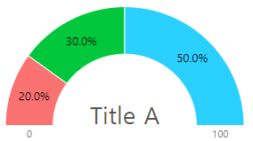
I agree at some point, that the second representation of the my previous comment make sense for negative. But just for one dataset value only. If you try show multiple negative values, in that case the first will be more adequate.
IMO to work on this, should make a simple constraint rule.
The representation of negative value, only works for a single dataset
Feel free to leave any comments :)
netil
on 17 Sep 2019
There will be no way to represent multiple dataset negative values in a gauge.
To fulfill this, a new stacking gauge visualization like below screenshot is needed.

netil
on 19 Sep 2019
Hello @netil ,
Thank you for the proposals. I agree with you for the constraint of having a single dataset in case of negative values.
The multiple arc gauge will be a very neat addition !
Victor
pvictor
on 19 Sep 2019
@netil: Thank you for putting so much effort in this issue. I too think, that we are talking about two different representations here. Similar to different types of bar charts "stacked", "doged" "filled" etc. different types of gauges should be differentiated. A simple one-metric gauge (row two of your initial post) or a multi-metric stacked gauge (as in your latest post). The representation with three categories adding up to 100%, however, does not seem like a gauge to me. I would rather consider it to be more a half-donat chart. I would see the essential difference between those two in the point that a gauge usually has a lower and an upper bound (either on one or multiple metrics). A gauge shows something about performance. More is usually (not always) better. The half donat chart however is more or less a pie chart in a different look, telling us something about the classes / categories an entity is composed of (like a stacked and filled bar chart).
TimTeaFan
on 19 Sep 2019
Thanks @pvictor @TimTeaFan both for the thoughtful comments.
I agree on providing A simple one-metric gauge. Hence adding or supporting different data variation visualization in a gauge isn't a good idea.
I'll be considering to implement as different type for the last visualization that I mentioned(https://github.com/naver/billboard.js/issues/1071#issuecomment-532993699).
netil
on 23 Sep 2019
:tada: This issue has been resolved in version 1.12.0 :tada:
The release is available on:
Your semantic-release bot :package::rocket:
netil
on 20 Mar 2020
Related issues
 stevenmusumeche
·
3Comments
stevenmusumeche
·
3Comments
 elielr01
·
3Comments
elielr01
·
3Comments
 creage
·
4Comments
creage
·
4Comments
 serzhiio
·
4Comments
serzhiio
·
4Comments
 imbyungjun
·
5Comments
imbyungjun
·
5Comments