Berry: [Bug] website front-end need responsive improvements
- [x] I'd be willing to implement a fix
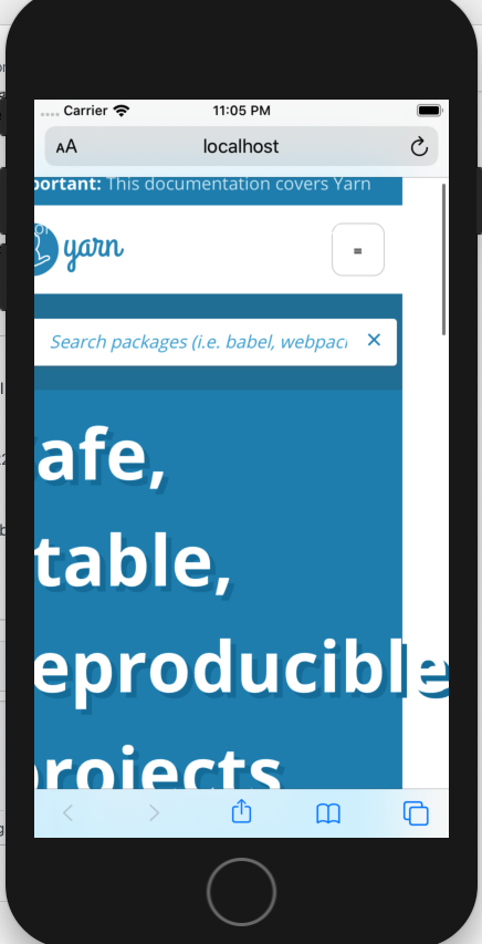
Describe the bug
Home hero does not fit in the screen
To Reproduce
Use iPhone 8 (😊) or some mobile device with small/medium screen
Screenshots
Environment if relevant (please complete the following information):
- OS: iOS, Android (Honor X8)
Additional context
There is some values for responsive at packages/gatsby/src/components/responsive.js
export const ifMobile = () => `@media (max-width: 760px)`;
export const ifDesktop = () => `@media (min-width: 761px)`;
I wonder whether this can be improved in order to work with multiple sizes. I was taking a look and this might need re-work, any insights is also welcome.
 juanpicado
All 4 comments
Yep the mobile home (and navigation menu) are not my the frontend work I'm the most proud of 😅
 arcanis
on 27 Jan 2020
arcanis
on 27 Jan 2020
:) I am open to take it, almost never do front on open source.
juanpicado
on 27 Jan 2020
That would be awesome 🙏
arcanis
on 27 Jan 2020
I'll close this one as there's been a lot of improvements here and it should already be a much better experience 👍
arcanis
on 4 Feb 2020
Related issues
 IanVS
·
4Comments
IanVS
·
4Comments
 Santas
·
3Comments
Santas
·
3Comments
 GaoxinHuang
·
3Comments
GaoxinHuang
·
3Comments
 joshmeads
·
4Comments
joshmeads
·
4Comments
 bradleyayers
·
3Comments
bradleyayers
·
3Comments
Most helpful comment
That would be awesome 🙏