Hello felow!
A logo I'm contributing to project beets, I think I've solved a problem for designing a logo for technological and modern times and a logo with a professional visual.
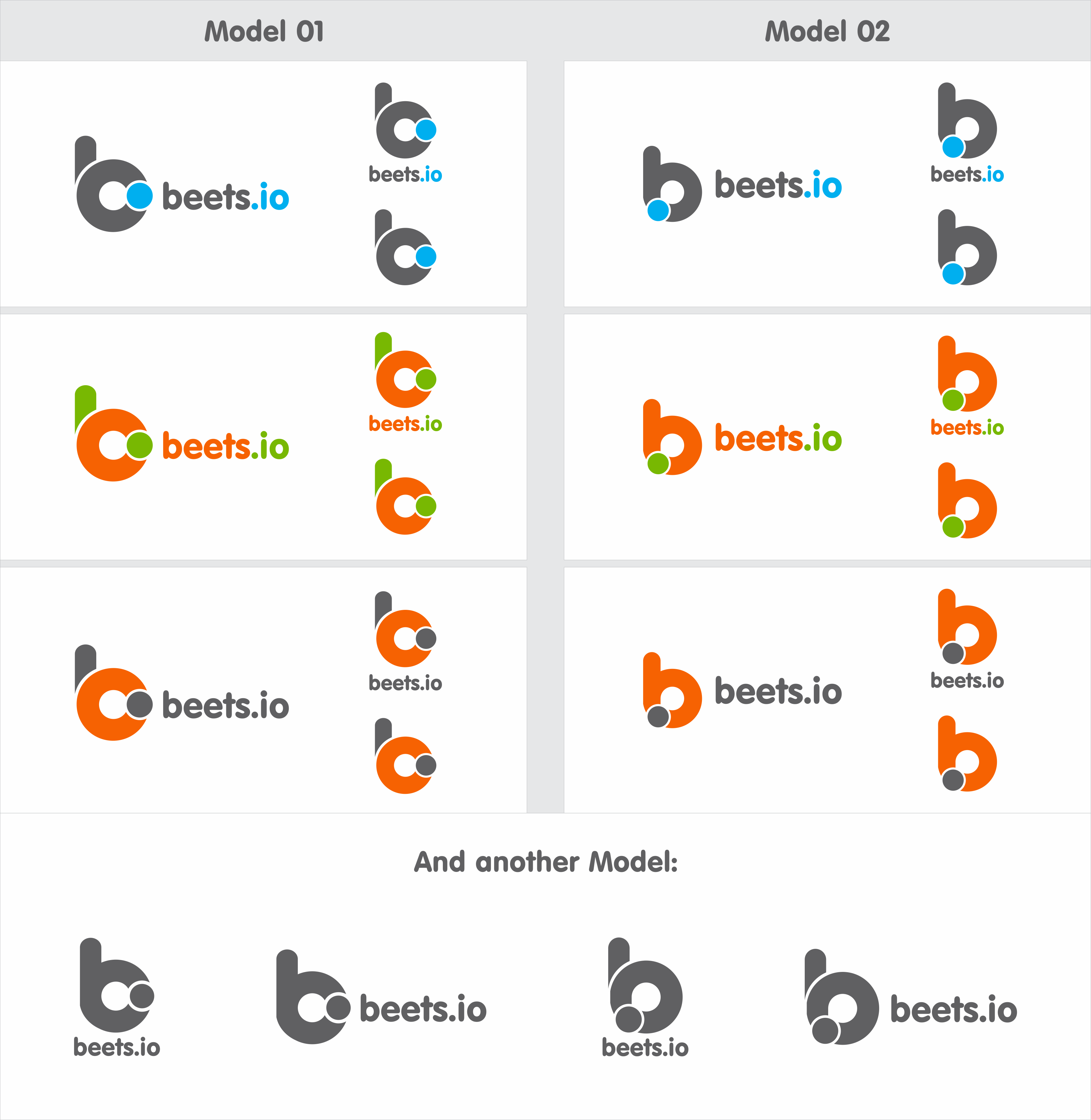
Concept
A work I made, certainly has a special concept rather than a project. Here:
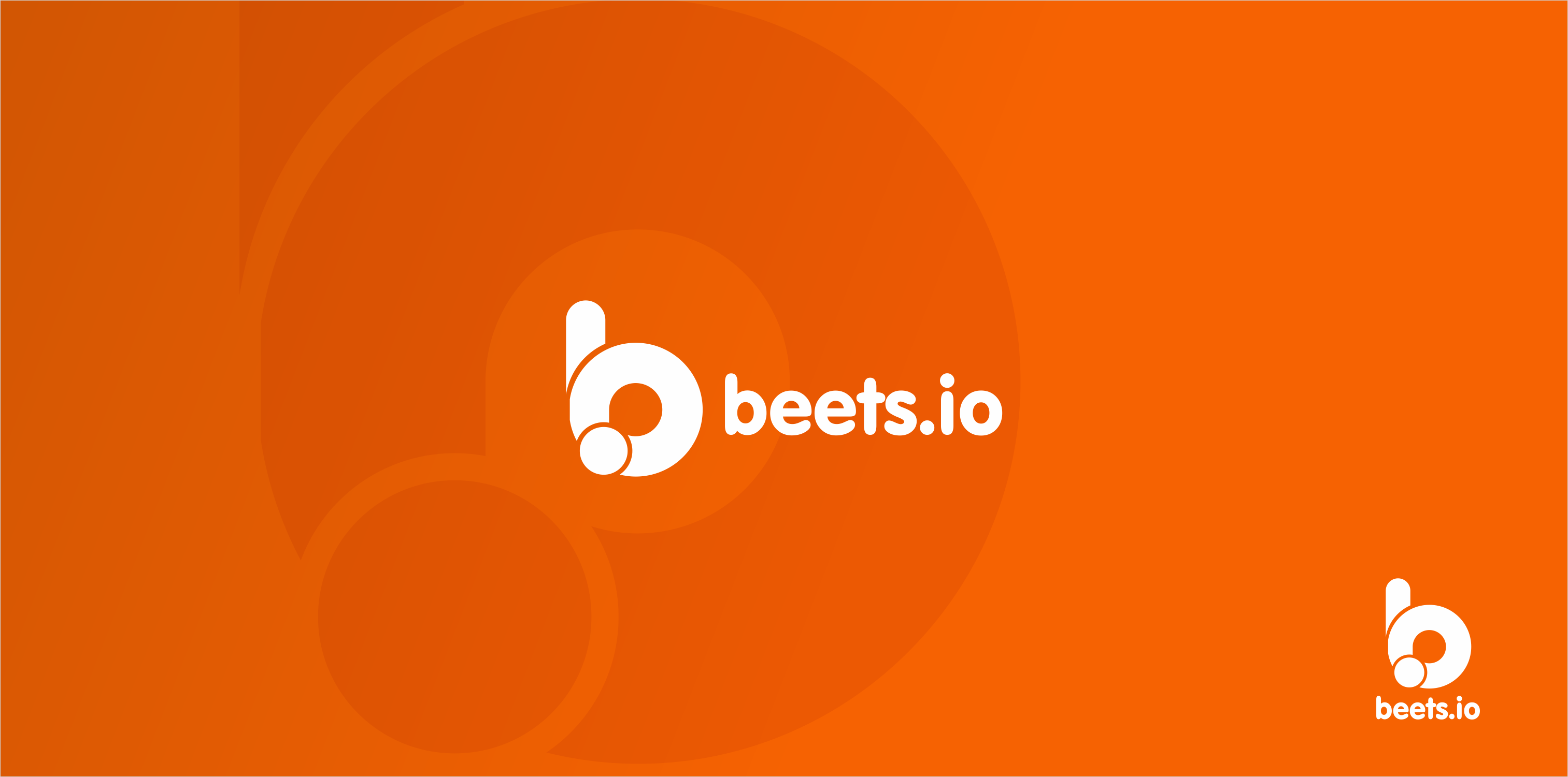
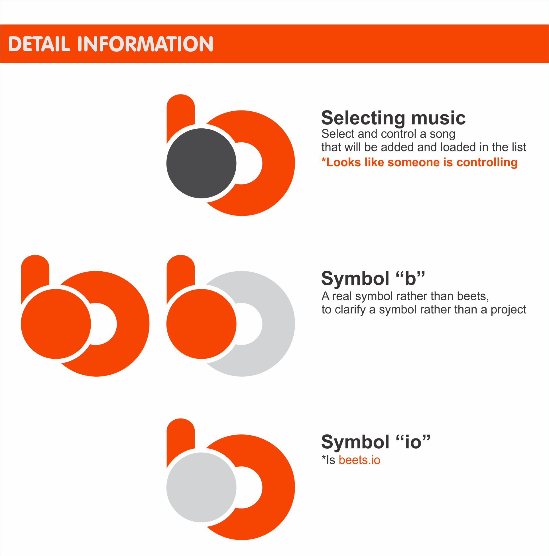
A concept of a background rather than a project, namely "beets.io". This is the prefix idea when I design the logo for beets.
I use a letter "b" that is spelled rather than "beets" and also takes characters rather than "io".
In color I also associate the basic colors of the logo beets, which are oren colors which are a color based instead of carrot vegetables.
Final version of design
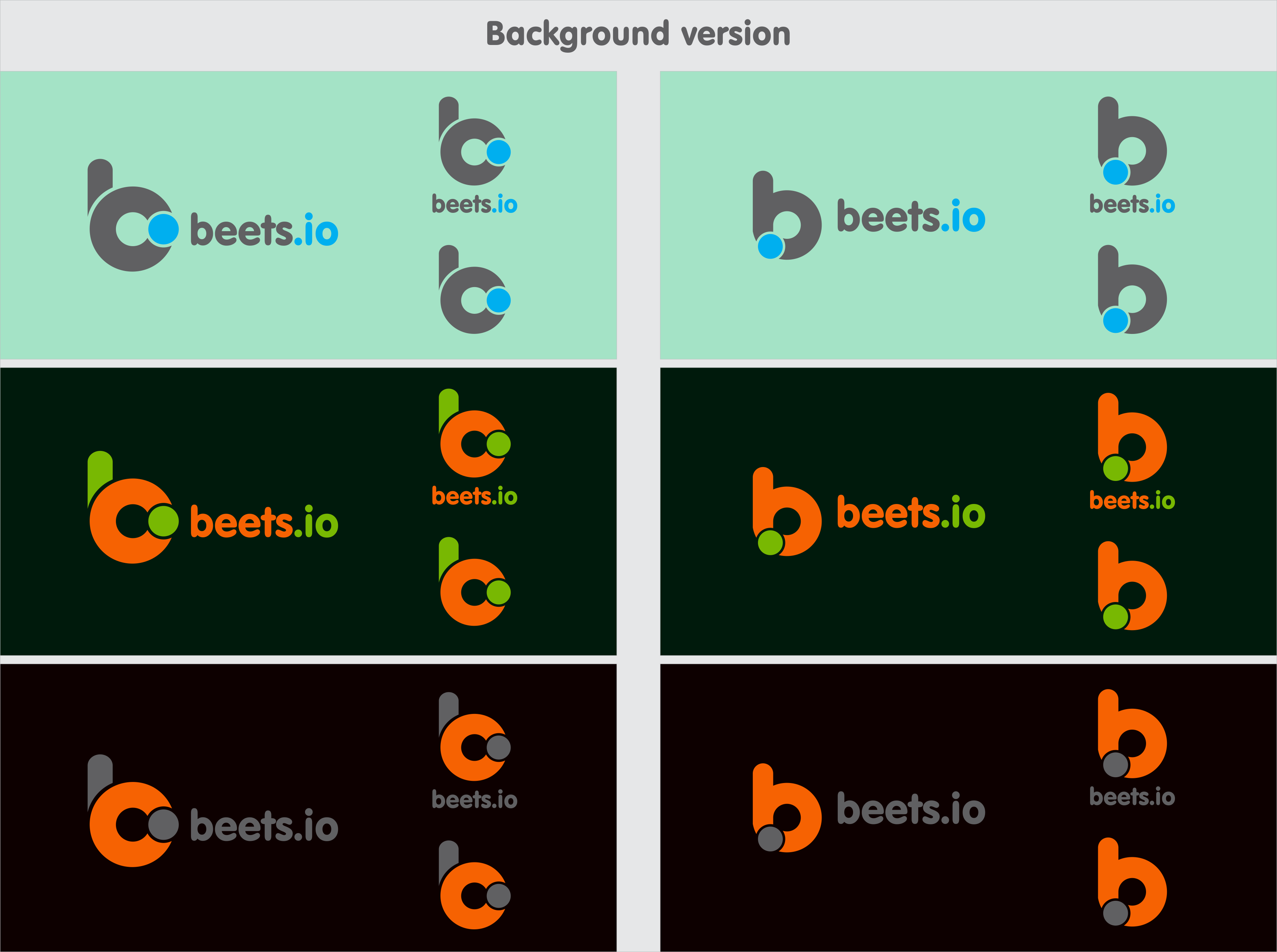
And the following is a version with a background:
That's my contribution to @beetbox , hopefully this becomes an input and appeals to all. How do you like @sampsyo ?
 foways
All 5 comments
Hello! Thanks for your interest in helping out.
First, have you seen the related thread in #2865?
Also, while I’m intrigued by your design, I’m also a little concerned about the similarity the logo for Beats (i.e., by Dre):
![]()
Because both use a rounded, lower-case “b” that incorporate a perfect circle, I’m slightly concerned that this would exacerbate the confusion between the two names.
(Fun fact: Beets and Beats are about the same age—they started within months of each other.)
 sampsyo
on 10 May 2018
sampsyo
on 10 May 2018
Hello @sampsyo!
I agree with you, I also believe that your project is something big. I think I lost the "bit" project-related imformation by Dre. But I think I have solved the problem, but I am still designing on the basic concept rather than "beets.io". Here is the result of the revelation, I am waiting for feedback rather than you.
foways
on 10 May 2018
I don't know if it's just me, but this orange/white colors and circles in the 1st example reminds me of Ubuntu palette. I would suggest to try to color maybe something close to a beetroot, to have another option
 GuilhermeHideki
on 11 May 2018
GuilhermeHideki
on 11 May 2018
No @GuilhermeHideki, that's just an example of color. I use orange color just following the basic logo of beets.
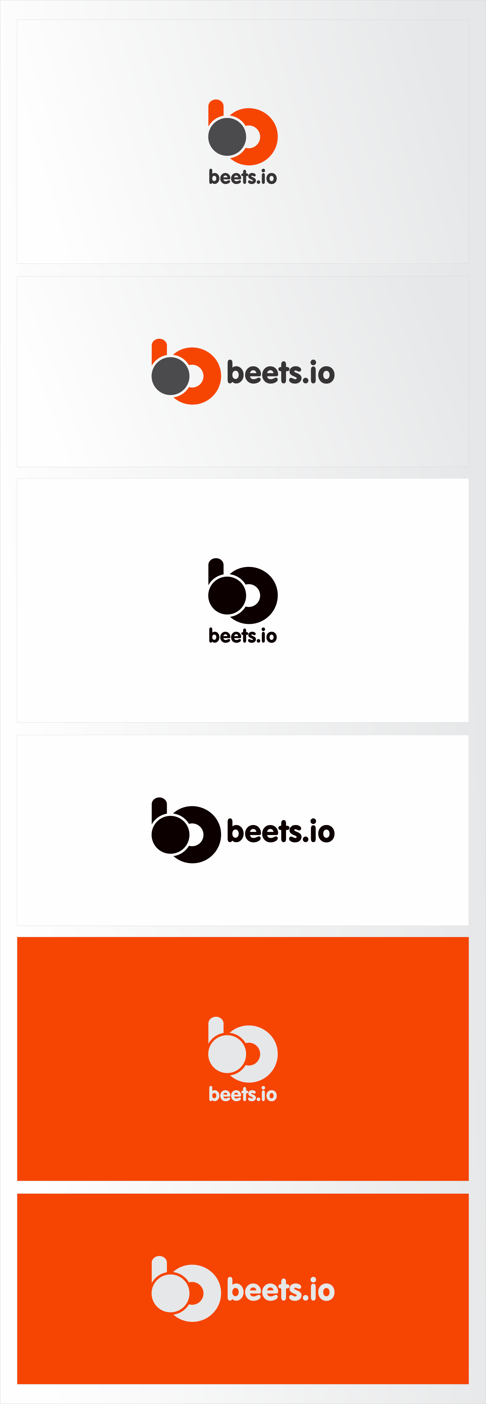
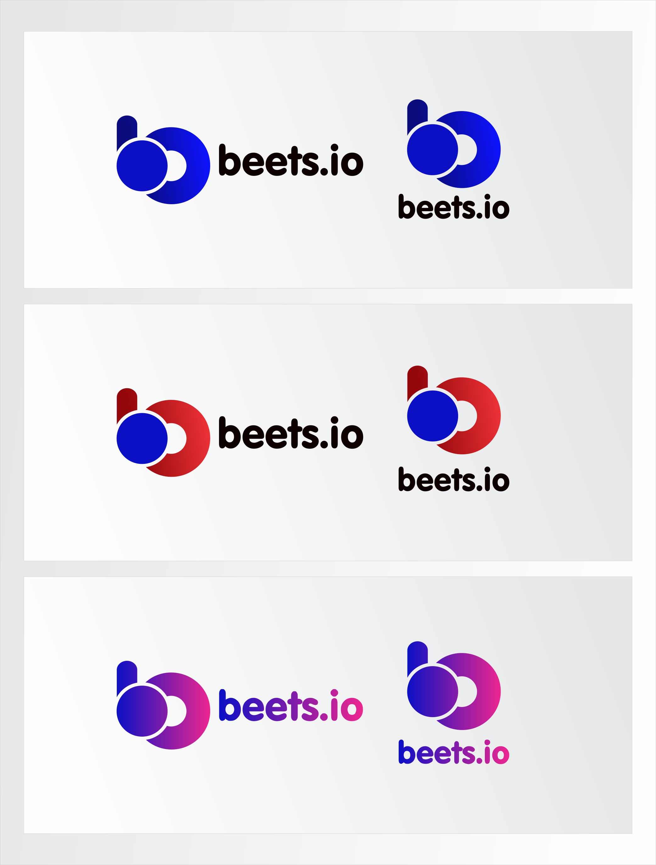
But I am also grateful for your suggestion..! what about the color version below?
foways
on 11 May 2018
@k-syusteem I really liked the 3rd option, with one gradient
GuilhermeHideki
on 11 May 2018
Related issues
 udiboy1209
·
3Comments
udiboy1209
·
3Comments
 Stunner
·
3Comments
Stunner
·
3Comments
 bammerlaan
·
4Comments
bammerlaan
·
4Comments
 myfreeweb
·
4Comments
myfreeweb
·
4Comments
 ctrueden
·
3Comments
ctrueden
·
3Comments
Most helpful comment
@k-syusteem I really liked the 3rd option, with one gradient