Bedrock: Epic: Iterate on navigation content
Description
We need to iterate on the content of the navigation menu, to be sure it is optimal for UX and discoverability.
The output of this work should be:
- A new list of top-level nav items, with final copy and icons and their destination
- A list of pages that need subnav, with final copy and links that should be in subnav
- Coded nav including those changes
Success Criteria
- [x] Navigation includes the most critical items identified by UX and SEO specialties
- [ ] Proposed changes are reviewed by project advisor
- [ ] Navigation is launched on production website
 hoosteeno
All 9 comments
We had a meeting today and decided to explore the following:
- In the main nav we add in the Dropdown for Browsers and Products another item to get to /browsers/ and /products/
- On Desktop we will use the existing Subnav to link to pages that need to be linked
2.1. Here is a WIP of pages that need a subnav: https://docs.google.com/spreadsheets/d/1GBLl1q69YEpK2i-BPXefaFVE8DYVNH_n9dsASsm4Iig/edit#gid=0 - On Mobile we add in the main nav a secondary dropdown for the main pages to add the subnav items
Open question: How do we handle subnavs on pages that aren't in the main nav on mobile. On /compare/ for example the subnav is pushing the content 30% down the screen, but there is currently no place in the main nav to add the subnav.
 rraue
on 26 Oct 2020
rraue
on 26 Oct 2020
On Mobile we add in the main nav a secondary dropdown for the main pages to add the subnav items
I've spent some time thinking through this from a ux perspective and built a static prototype of how this would look and behave (viewport size below is 480 to 320, LTR):
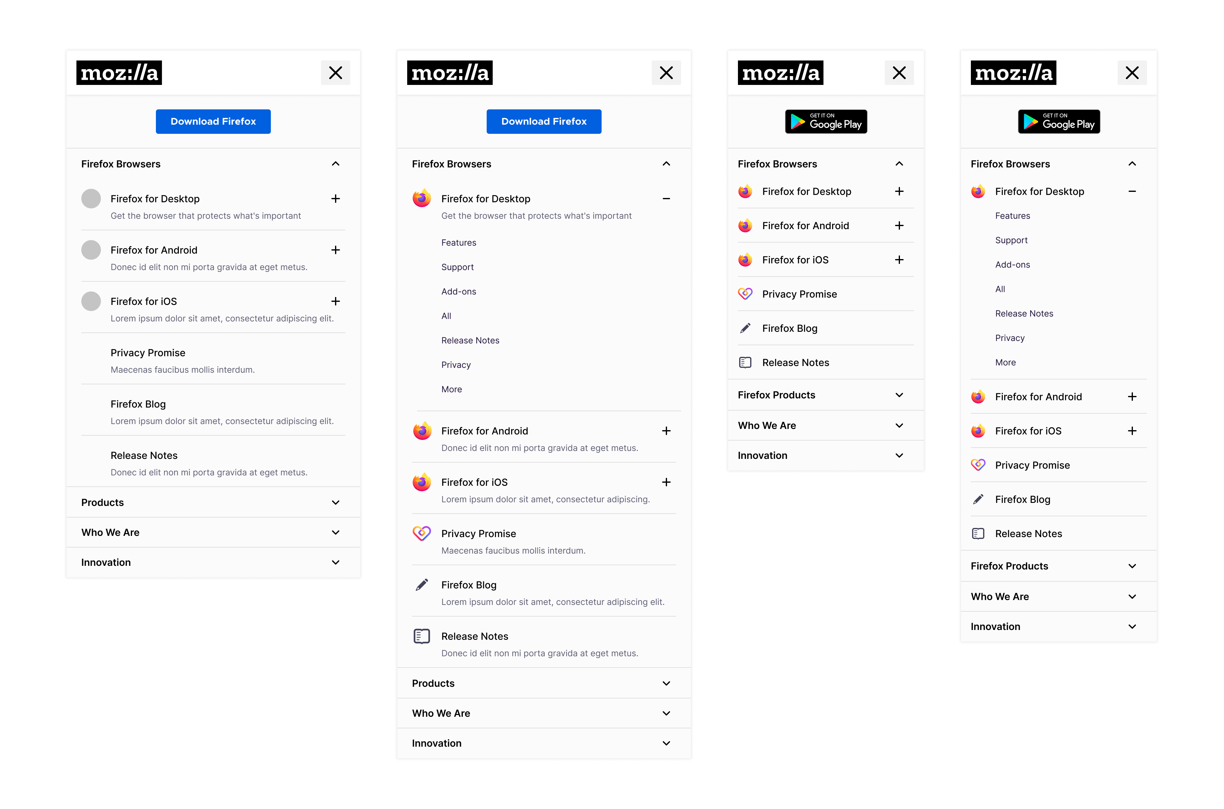
Placing the sub-nav inside of the primary navigation's drop-down on mobile feels a bit forced (imo) and is asking too much of the user. We'd be asking them to drill down too many layers to get to content (the sub nav items) that would better serve them as on-page sub-nav at their desired destination. I spoke with @slightlyoffbeat to provide a gut-check and he confirmed what I was struggling with: that this approach would be prioritizing seo over ux. For this experience, I'd like to focus on user needs first. My recommendation is that we stick with the sub-nav framework that has already been designed as part of the global nav initiative, but use your recommendations for sub-nav items to inform the content. I spoke with @craigcook about the technical feasibility of the above, and it would be quite complicated.
Below is that I think would be an ideal compromise (speaking through the lens of ux):
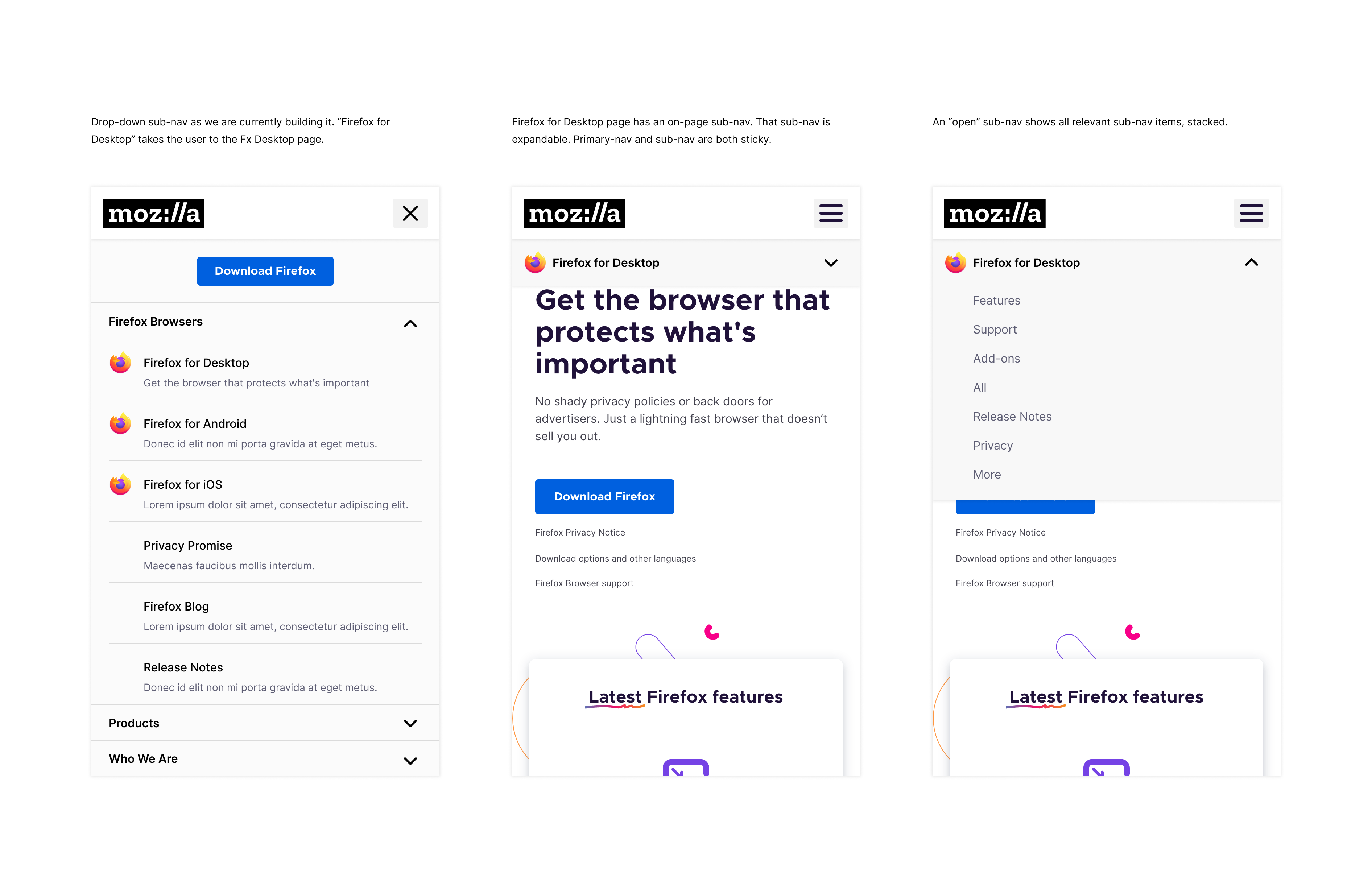
You can interact with a clickable prototype here.
/cc @hoosteeno
 justinkropp
on 27 Oct 2020
justinkropp
on 27 Oct 2020
I'd like to argue about the seo vs ux statements, but I think your solution is very solid and a good way to solve our problem.
My argument is the following: users gave up on navigation because they can search. But search works only with a good internal link/nav structure. So users outsourced nav ux already to google (not much interaction on our nav) and thats why laying out pages that belong to each other in a nav is good seo leading to good ux because user then find the right content.
So I do not disagree but building a non-distracting system for non-interacting users is not solving any ux problem. But we can take this into slack, if you both disagree with my conclusions here 😄
rraue
on 27 Oct 2020
Only thing left to mention: the list on every page should be editable quite easy, when we code the system so we can add and delete items fast. Especially if we move vpn here that will take a lot of work off our shoulders changing, testing, iterating.
I am pretty excited about this new nav system.
rraue
on 27 Oct 2020
This looks good to me. @craigcook how do you like this?
hoosteeno
on 28 Oct 2020
@rraue @justinkropp Is the content for subnavs final? If not, what needs to happen to make it final?
hoosteeno
on 28 Oct 2020
It's now final: https://docs.google.com/spreadsheets/d/1GBLl1q69YEpK2i-BPXefaFVE8DYVNH_n9dsASsm4Iig/edit
rraue
on 28 Oct 2020
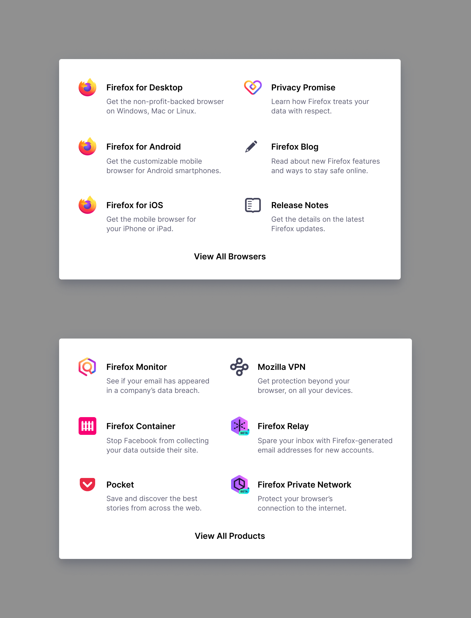
Following up on a conversation with @craigcook and @rraue, I looking at affording users an easy way to visit parent pages like /browsers, /products, etc. Given that the main-nav parent items are clickable, we opted to put this "View All..." link in the drop-down menus. See below for reference.
justinkropp
on 2 Nov 2020
Great @justinkropp 👍
rraue
on 2 Nov 2020
Related issues
 alexgibson
·
8Comments
alexgibson
·
14Comments
alexgibson
·
8Comments
alexgibson
·
14Comments
 ValentinaPC
·
4Comments
alexgibson
·
9Comments
ValentinaPC
·
4Comments
alexgibson
·
9Comments
 pmac
·
13Comments
pmac
·
13Comments