Bedrock: Code - /firefox/privacy/ - Privacy Hub page
Description
Coding tasks, including team lead, stakeholder and code review, for the new Firefox privacy hub page
:yellow_heart: Success Criteria :yellow_heart:
- [ ] Is live, simultaneously, as /firefox/privacy/products
- [ ] Is live prior to/at Skyline on Oct 22
:heavy_exclamation_mark: Risks :heavy_exclamation_mark:
- [x] Completion of /firefox/privacy/products #7643
Tasks
- [x] Code the page
- [ ] Team Lead reviews on Demo
- [ ] Stakeholder reviews on Demo
~- [ ] Arrange Code Review by another developer #7765~
 ejregithub
All 17 comments
 alexgibson
on 24 Sep 2019
alexgibson
on 24 Sep 2019
alexgibson
on 24 Sep 2019
alexgibson
on 24 Sep 2019
@alexgibson - when you can, please apply an Estimate to size this work.
ejregithub
on 24 Sep 2019
/privacy is approved by me. Recognize we're waiting on two final images, but very pleased with the page UX, functionality, and aesthetics.
 MKS-moz
on 27 Sep 2019
MKS-moz
on 27 Sep 2019
This is now awaiting final design assets.
alexgibson
on 30 Sep 2019
@alexgibson Design feedback below
Sub Nav
- Can we underline or bold which section the user is on? For example, if a user is on the "our promise" page can we indicate that in the sub nab?
" Why trust Firefox" and "Your privacy, by the product" CTAs
- can those both be metropolis bold
Images/Assets
- images should be coming your way tomorrow/wednesday
Breakpoint 1056
Hero Section
- Is there any way to extend the text and move the image to the right so we don't have so much blank space above the image

Breakpoint 768
Hero Section
- Make headline text next size or maybe two sizes down
- Make hero image smaller (80%) so it gives more space for text to extend
Sections below hero
- Please see sketch file 768 artboard for reference... can this be done (lead with larger images - img on right)?
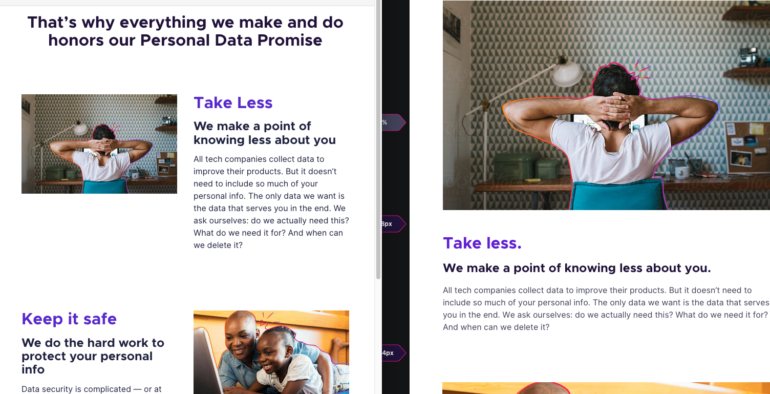
Breakpoint 768
Hero Section
- Left align text
- No need for image of two people on mobile screen size
Spacing
- Spaceing between sections feels too tight. Hard to tell where one starts/ends
@alexgibson please let me know if you have questions or want to jump on zoom to talk over any of this. Also, great work as always.
 dzingeek
on 1 Oct 2019
dzingeek
on 1 Oct 2019
Sub Nav
Can we underline or bold which section the user is on? For example, if a user is on the "our promise" page can we indicate that in the sub nab?
Done - I went for underlines, since I feel like bold conflicts visually with the main navigation links.
" Why trust Firefox" and "Your privacy, by the product" CTAs can those both be metropolis bold
Done
Hero Section
Is there any way to extend the text and move the image to the right so we don't have so much blank space above the image
Make headline text next size or maybe two sizes down
Make hero image smaller (80%) so it gives more space for text to extend
Left align text
No need for image of two people on mobile screen size
I've tried to accomodate most of these asks the best I can with some page-specific hacks. These are all really changes to the standard Protocol Hero component. It would be great if you could channel this type of feedback into a component change request, so that we're not just tweaking things on a page by page basis. Thanks
Sections below hero
Please see sketch file 768 artboard for reference... can this be done (lead with larger images - img on right)?
The feature cards on this page use the same standard layout classes that already exist in Protocol. Rather than start to tweak this on a page-by-page basis, it would be great if you could file a component change request so that we can make sure all pages behave in a uniform way. I'm going to say no to doing this one on a one-off basis, since it deals with layout.
Spacing
Spaceing between sections feels too tight. Hard to tell where one starts/ends
Done, thanks
alexgibson
on 1 Oct 2019
@alexgibson here are a few images that have been missing. I should have the lifestyle images to you by eod Wednesday (still waiting on financial approval). Also GREAT WORK, these pages are looking great!
_Side Note:_ Thanks for the call out for protocol things. Justin k. and I are working on a list of things to start to address in the github issues. This helps me prioritize some of them and know what needs to be talked about.
dzingeek
on 2 Oct 2019
Updated images, thanks.
alexgibson
on 2 Oct 2019
@alexgibson here are the updated/final lifestyle images...sorry for the delay.
imgs-lifestyle.zip
dzingeek
on 3 Oct 2019
@alexgibson here are the updated hero images...sorry I made a mistake on the zap and needed to extend it to the bottom of the image. Thanks again!


dzingeek
on 3 Oct 2019
This is my review and feedback of the coded page, @alexgibson. With the below comments, and those suggested by other reviewers, I'm happy with this page.
- The section below is missing a "." at the end, which is present in copy doc:

 hoosteeno
on 3 Oct 2019
hoosteeno
on 3 Oct 2019
The section below is missing a "." at the end, which is present in copy doc:
Copy was approved in-page over a week ago. I don't think it's worth breaking strings for a trailing "." at this time.
alexgibson
on 4 Oct 2019
@dzingeek for the sub navigation, I've applied the suggested styling in the mockup to the page. I can't help but find it confusing still though. When you look at this screenshot, which thing is a link, and which isn't?

Because all the main navigation links are bold, I would assume "Our Promise" is a link, but it's the opposite. Things only start to make sense once you hover over them.
Then also consider I'm a touch user on a mobile device. Which thing should I try and tap?

Is there a simple change we could apply to make this less confusing that the brand team would be happy with?
Perhaps we could make all links bold, but make the active one a different color?
Edit: the sub nav is on demo: https://www-demo1.allizom.org/en-US/firefox/privacy/
alexgibson
on 4 Oct 2019
@alexgibson I thought you suggested we go with the underline for the sub nav. I think for now that is fine. We need to look at how the sub nav and main nav work together but that is for another time...I don't think we need to solve for that here.
How does that sound for you (use the underline for sub nav)?
dzingeek
on 4 Oct 2019
@dzingeek In code review @stephaniehobson said she felt that what's in the design files was clearer, so I went with that. It's coded now, so I think we'll just leave it as per the design file. It would be great to solve properly though, as I don't think either solution really works as nicely as it could.
alexgibson
on 4 Oct 2019
K thanks for update @alexgibson and totally agree it could be better. It's on my list for v2 of the nav system...I will see if I can come up with a solution sooner though.
dzingeek
on 4 Oct 2019
Related issues
alexgibson
·
7Comments
 dholbert
·
7Comments
alexgibson
·
9Comments
ejregithub
·
10Comments
alexgibson
·
8Comments
dholbert
·
7Comments
alexgibson
·
9Comments
ejregithub
·
10Comments
alexgibson
·
8Comments