Authenticator: Improved user experience for long list of codes
As of today I am up to 31 codes in the app. This poses user experience challenges when looking for a specific code as I this is almost 5 pages of codes. I know I can manually rearrange the codes, but it'd be nice to have some other out of box or usability enhancements.
Some ideas:
- A search box/option - Allow a user to quickly locate a specific code by filtering them
- Sort options - Allow a user to sort the codes, without manually rearrange them.
I'm open to other ideas, such as #257 and #249 which would help in different ways.
 adamcstephens
All 7 comments
You can filter the codes using the search field in the title bar. Perhaps its double-duty as the title bar makes it less obvious that it's also a text entry field:
 beaucollins
on 14 Mar 2019
beaucollins
on 14 Mar 2019
@mattrubin I suppose it might make sense to adopt the now standard search field UI pattern that exists in apps like _Contacts_. Originally I was trying to duplicate how _Mobile Safari_ worked.
Or even change it to say "Search" since saying "Authenticator" isn't really all that useful.
beaucollins
on 14 Mar 2019
@beaucollins Both good suggestions for improving discoverability. I actually have an old branch that switches to the standard navigation bar search field, but I had shelved because of a UIKit bug. I'll revisit and see if it would work.
 mattrubin
on 14 Mar 2019
mattrubin
on 14 Mar 2019
Ha. I never even realized that was a search input, and I’ve used it for years. Improving discoverability would have helped me for sure.
That really solves my issue.
adamcstephens
on 14 Mar 2019
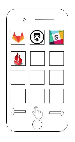
To have a seamless UX integration with mobile, I would propose a grid matrix app.
I would like to add custom logo in every Token/App and a scroll left/right page, instead of folders.
_Disclaimer_ I am not a UX person but I do have a lot of 2fa apps that now I have to scroll through my phone.
 ebal
on 5 Aug 2019
ebal
on 5 Aug 2019
How about a toggle between the current row style and a more compact one showing the same info but more compact.
A collection view could work too. But I think it is a good feature to actually show the number since not all 2FA interactions allow for copy paste.
 jeroenleenarts
on 5 Oct 2019
jeroenleenarts
on 5 Oct 2019
Closing this because the pointer to the search box helped me with what I needed.
adamcstephens
on 7 Jun 2020
Related issues
 ghost
·
3Comments
jeroenleenarts
·
3Comments
ghost
·
3Comments
jeroenleenarts
·
3Comments
 anthonycastelli
·
10Comments
mattrubin
·
11Comments
anthonycastelli
·
10Comments
mattrubin
·
11Comments
 njosephg
·
17Comments
njosephg
·
17Comments
Most helpful comment
You can filter the codes using the search field in the title bar. Perhaps its double-duty as the title bar makes it less obvious that it's also a text entry field: