Atom-ide-ui: Misplaced gutter icons
Description
Gutter icons from the diagnostics module pop up to the left of line numbers. In fact, while no icons are visible it looks fine, as soon as a warning pops up, the whole line number row is moved to the right to make space for the icons. Not super important, but I find the way the linter package does it to be way more pleasant to the eye.
Expected Behavior
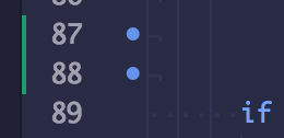
Actual Behavior
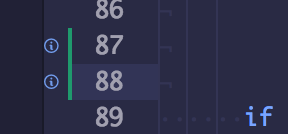
Versions
- Atom: 1.21.1
- Client OS: macOS High Sierra 10.13
- atom-ide-ui: 0.5.3
 TeeSeal
All 5 comments
Just to note, the side of the line numbers that the linter-ui-default shows the indicators on is configurable.
 Arcanemagus
on 31 Oct 2017
Arcanemagus
on 31 Oct 2017
Yup, seems like a great configuration option / PR candidate! We've made this the default to play nicely with Nuclide's debugger functionality, which also puts breakpoints on the left - but I definitely see how the right side could be better for you. The gutters are created on https://github.com/facebook-atom/atom-ide-ui/blob/master/modules/atom-ide-ui/pkg/atom-ide-diagnostics-ui/lib/gutter.js#L83.
 hansonw
on 31 Oct 2017
hansonw
on 31 Oct 2017
Well, yeah linter-ui-default can be configured to place the icons on the left, but space for those icons is reserved from the get go, so they just appear in the reserved space.
With diagnostics however there is no space reserved from the beginning, and when it is needed it just changes the UI to make space, which weirds me out.
Even if that is fixed, it would still be nice to have an option to put the icons on the right.
TeeSeal
on 31 Oct 2017
With diagnostics however there is no space reserved from the beginning, and when it is needed it just changes the UI to make space, which weirds me out.
Ah, yea that's something that was fixed pretty early in linter-ui-default's development. A _lot_ of people don't like their UI jumping around on them 😛.
Arcanemagus
on 1 Nov 2017
I changed the default behavior using custom style:
.gutter[gutter-name=diagnostics-gutter] {
  order: 1;
}
 phaux
on 27 Dec 2017
phaux
on 27 Dec 2017
Related issues
 ghost
·
3Comments
ghost
·
3Comments
 gregorygenova
·
3Comments
gregorygenova
·
3Comments
 mehcode
·
5Comments
mehcode
·
5Comments
 fenric
·
3Comments
fenric
·
3Comments
 tiagonervis
·
4Comments
tiagonervis
·
4Comments
Most helpful comment
Just to note, the side of the line numbers that the
linter-ui-defaultshows the indicators on is configurable.