Arviz: Plot visualizing quantiles in time series
It would be great to have a nice, generic version of this:

See https://github.com/mwaskom/seaborn/issues/450 for discussion.
The suggested matplotlib recipes are wanting by comparison, I think (http://matplotlib.org/users/recipes.html).
 ariddell
All 9 comments
+1
 twiecki
on 27 Aug 2015
twiecki
on 27 Aug 2015
I'd settle for something simpler too, maybe something with a point at the center of a line, like this:
p + geom_pointrange(aes(ymin = lower, ymax = upper))
from
http://ggplot2.tidyverse.org/reference/geom_linerange.html
Looks like plotnine has this.
ariddell
on 22 Jun 2017
We could do this with np.percentile + for loop with fill_between.
Do we want make this smooth? Then kde / spline method could be used, but not sure if it's appropriate to interpolate with smooth function.
 ahartikainen
on 22 Jun 2017
ahartikainen
on 22 Jun 2017
That's a good idea.
(I'm not sure this particular plot is high-priority, it's just something I find myself making often with Stan output.)
ariddell
on 22 Jun 2017
Here is a sketch for tsplot. I don't know how much options we should add.
import numpy as np
import matplotlib.pyplot as plt
plt.style.use('ggplot') # this was just used for the examples

# data
t = np.linspace(0,100,100)
y = 5 * np.sin(t/10) + 4*np.random.randn(100*150).reshape(150, 100)
y_ = 5 * np.sin(t/10) + 4*np.random.randn(100*4000).reshape(4000, 100)

t__ = np.linspace(0,100,6)
y__ = 5 * np.sin(t__/10) + 4*np.random.randn(6*4000).reshape(4000, 6)

def tsplot(x, y, n=20, percentile_min=1, percentile_max=99, color='r', plot_mean=True, plot_median=False, line_color='k', **kwargs):
    # calculate the lower and upper percentile groups, skipping 50 percentile
    perc1 = np.percentile(y, np.linspace(percentile_min, 50, num=n, endpoint=False), axis=0)
    perc2 = np.percentile(y, np.linspace(50, percentile_max, num=n+1)[1:], axis=0)

    if 'alpha' in kwargs:
        alpha = kwargs.pop('alpha')
    else:
        alpha = 1/n
    # fill lower and upper percentile groups
    for p1, p2 in zip(perc1, perc2):
        plt.fill_between(x, p1, p2, alpha=alpha, color=color, edgecolor=None)


    if plot_mean:
        plt.plot(x, np.mean(y, axis=0), color=line_color)


    if plot_median:
        plt.plot(x, np.median(y, axis=0), color=line_color)

    return plt.gca()
Then can be called either in one go:
tsplot(t, y, n=100, percentile_min=2.5, percentile_max=97.5, plot_median=True, plot_mean=False, color='g', line_color='navy')
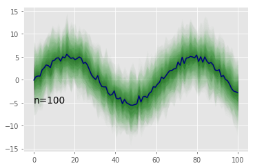
tsplot(t, y, n=20, percentile_min=2.5, percentile_max=97.5, plot_median=True, plot_mean=False, color='g', line_color='navy')

tsplot(t, y, n=5, percentile_min=2.5, percentile_max=97.5, plot_median=True, plot_mean=False, color='g', line_color='navy')
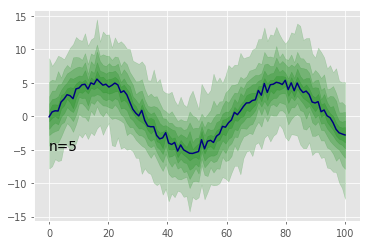
tsplot(t, y, n=2, percentile_min=2.5, percentile_max=97.5, plot_median=True, plot_mean=False, color='g', line_color='navy')
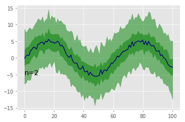
tsplot(t, y_, n=100, percentile_min=2.5, percentile_max=97.5, plot_median=True, plot_mean=False, color='g', line_color='navy')
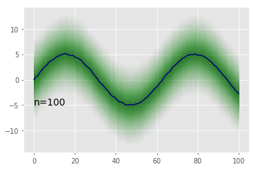
or multiple times
# IQR
tsplot(t, y_, n=1, percentile_min=25, percentile_max=75, plot_median=False, plot_mean=False, color='g', line_color='navy', alpha=0.3)
#  90% interval
tsplot(t, y_, n=1, percentile_min=5, percentile_max=95, plot_median=True, plot_mean=False, color='g', line_color='navy', alpha=0.3)

tsplot(t__, y__, n=1, percentile_min=25, percentile_max=75, plot_median=False, plot_mean=False, color='g', line_color='navy', alpha=0.3)
tsplot(t__, y__, n=1, percentile_min=5, percentile_max=95, plot_median=True, plot_mean=False, color='g', line_color='navy', alpha=0.3)
plt.text(0, -5, "n=2", fontsize=14)

ahartikainen
on 22 Jun 2017
These look great!
I'm inclined to do something very simple like have the posterior mean and single 90% band. This seems to be what is used in Bayesian Data Analysis (e.g., chp 21).
ariddell
on 26 Jun 2017
 ariddell
on 15 Nov 2017
ariddell
on 15 Nov 2017
helpful !
 ChampionZP
on 20 Apr 2019
ChampionZP
on 20 Apr 2019
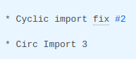
I'm leaving this closed as out of date, but feel free to reopen if there is interest in taking it up.
Also of interest, it closed because of
:joy:
 ColCarroll
on 4 Jul 2019
ColCarroll
on 4 Jul 2019
Related issues
 fonnesbeck
·
5Comments
fonnesbeck
·
5Comments
 teddygroves
·
4Comments
teddygroves
·
4Comments
 oscarbranson
·
6Comments
oscarbranson
·
6Comments
 canyon289
·
6Comments
canyon289
·
6Comments
 lucianopaz
·
6Comments
lucianopaz
·
6Comments
Most helpful comment
Here is a sketch for
tsplot. I don't know how much options we should add.Then can be called either in one go:
or multiple times
plt.text(0, -5, "n=2", fontsize=14)