Arctos: SpecimenDetail: Parts Table Placement
Ref: https://github.com/ArctosDB/arctos/issues/1460
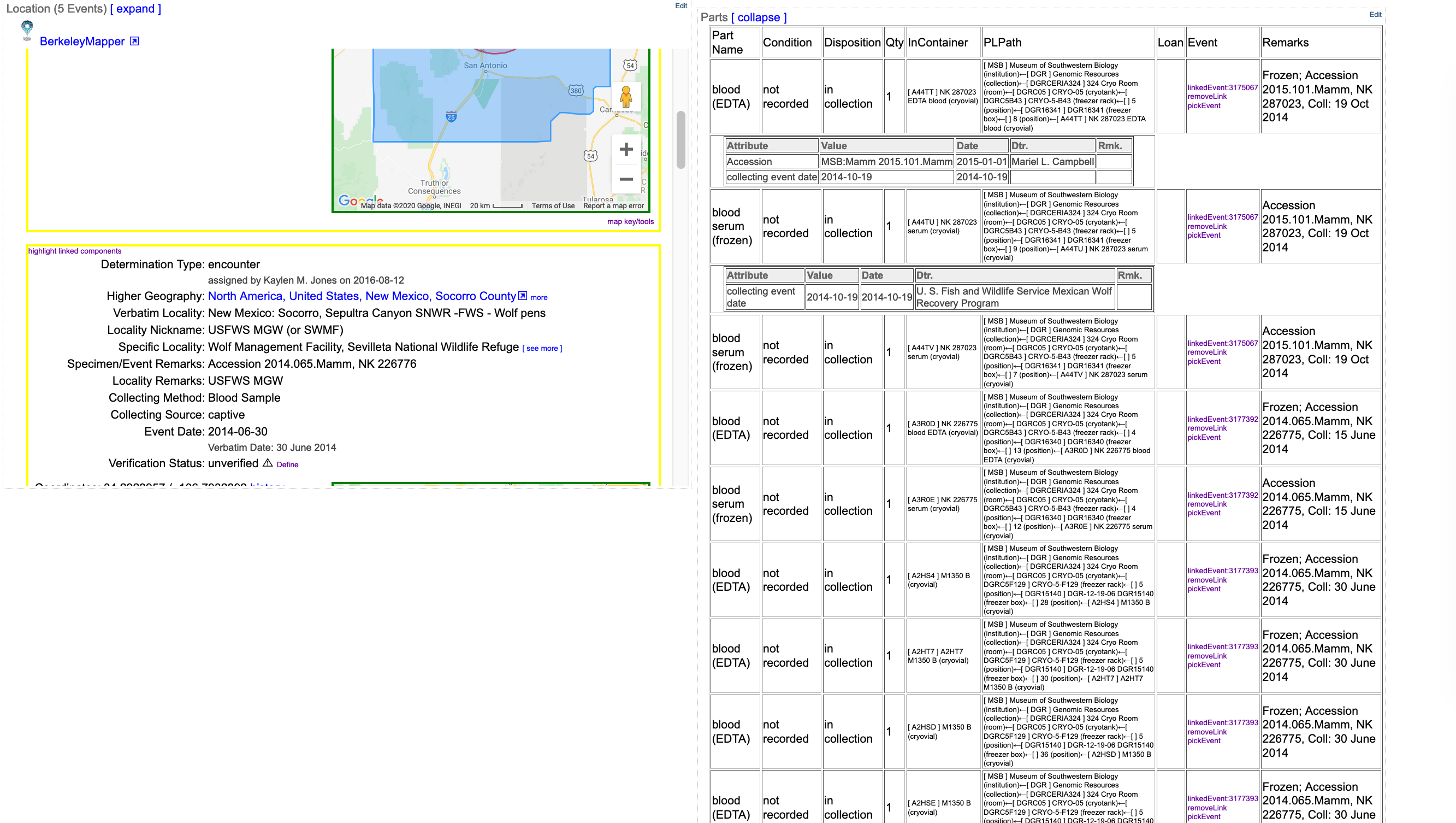
Problem: There's a lot of information in the parts grid on the catalog record view, and we're adding more as we normalize parts by pushing information such as preservation to part attributes.
Proposed solution: Hide things by default, require users to click a button to view "full" information.
Problem: various users find various things important at various times. I don't think we can hide anything without adding a lot of angry clicking, people making poor decisions because they couldn't see important information, etc.
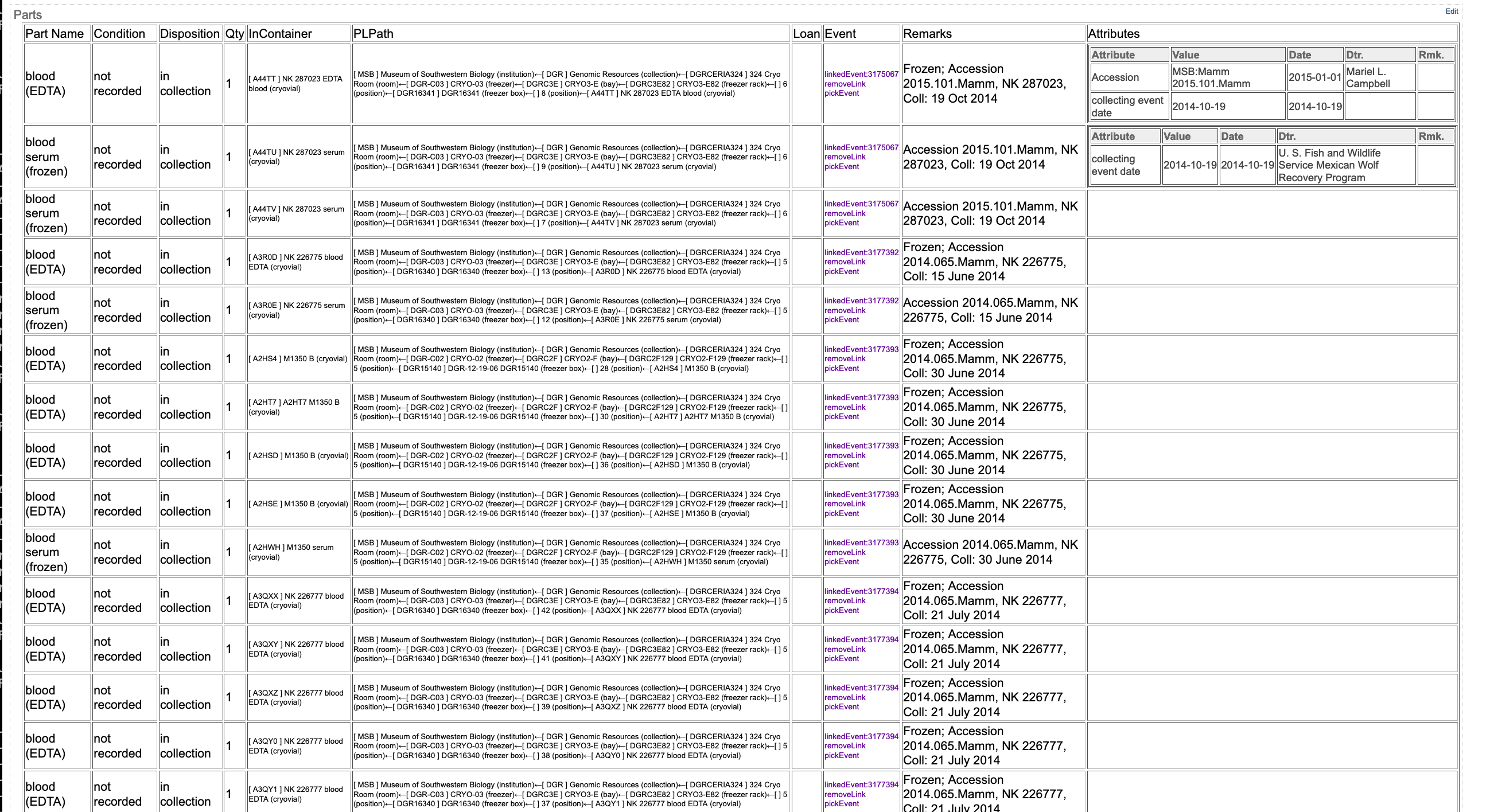
Alternative Proposal: Move the parts grid to the bottom, let it span columns. Move Attributes into a column, rather than row. The top of the page will look more uniform. Parts is always "expanded" - even for a record with hundreds of parts each having hundreds of attributes, all of the information is available via scrolling, available to search, etc.
Problem: ????? The page layout is slightly different, I like it....
Possible Improvement: Make Attributes even more compact in some way, perhaps by hiding metadata, if we can find a solution that's acceptable to everyone.
Full-width screenshot of https://arctos.database.museum/guid/MSB:Mamm:292063:
Full-width screenshot of http://test.arctos.database.museum/guid/MSB:Mamm:292063:
This is running at test now. I'll leave it like this unless someone asks to swap back before ~Monday, when the next release will go out.
Adding some priority - display seems to be an important factor in moving forward with normalizing parts.
 dustymc
All 13 comments
Can we spread out the attributes horizontally too? Order them in some way and have them line up? I know that is asking A LOT, and would potentially mean a lot of left/right scrolling so maybe it's a bad idea, but the method you suggest will still mean that some part rows are 50 lines tall....
 Jegelewicz
on 30 Oct 2020
Jegelewicz
on 30 Oct 2020
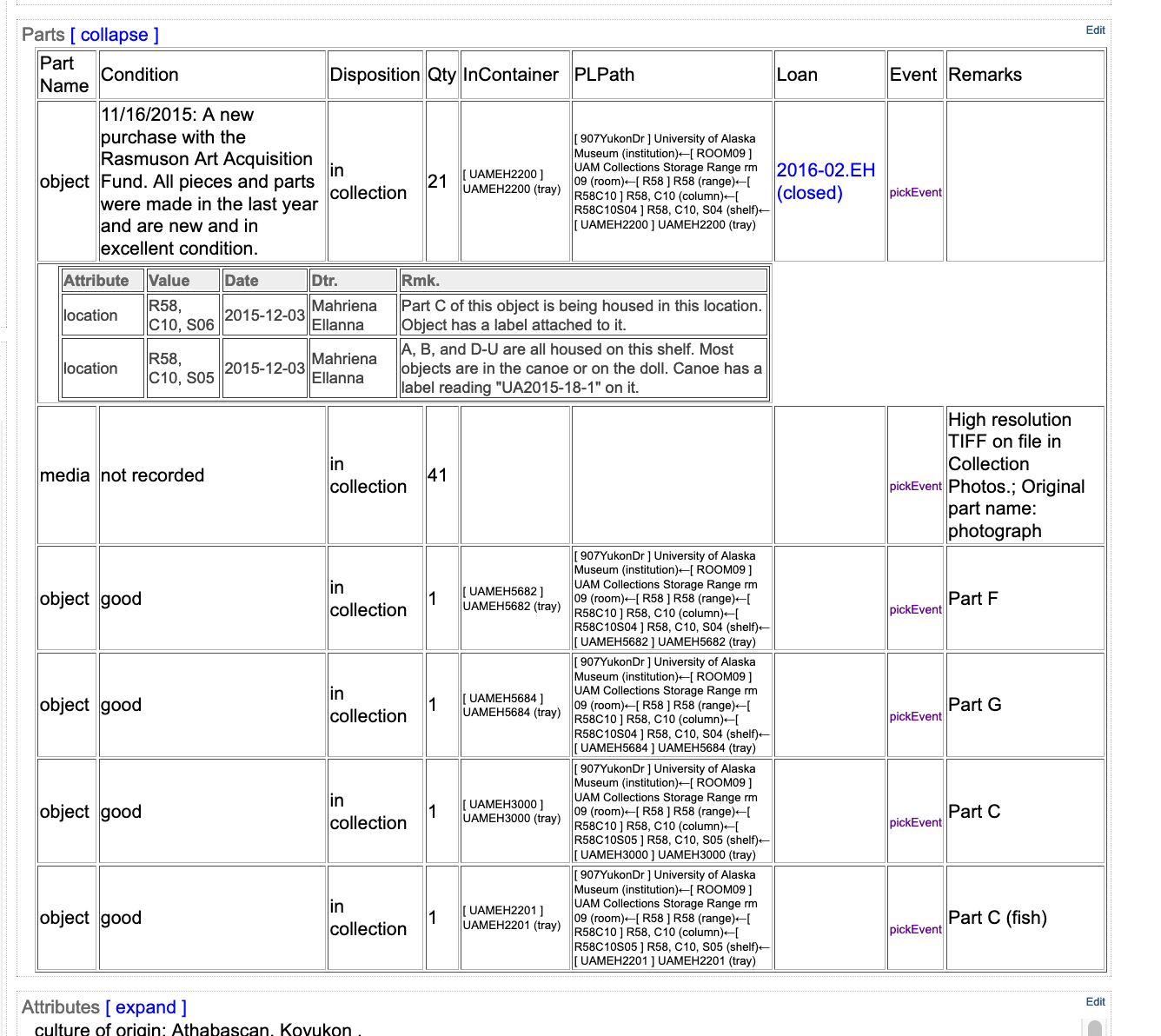
My only concern/need is that our attributes (we're talking about regular attributes now, yes? Not part attributes?) contain the Description field, which is where we describe what the object physically looks like. For complicated items that have many elements that are each described individually, this field can be loooong.
See for example: https://arctos.database.museum/guid/UAM:EH:UA2015-018-0001AU
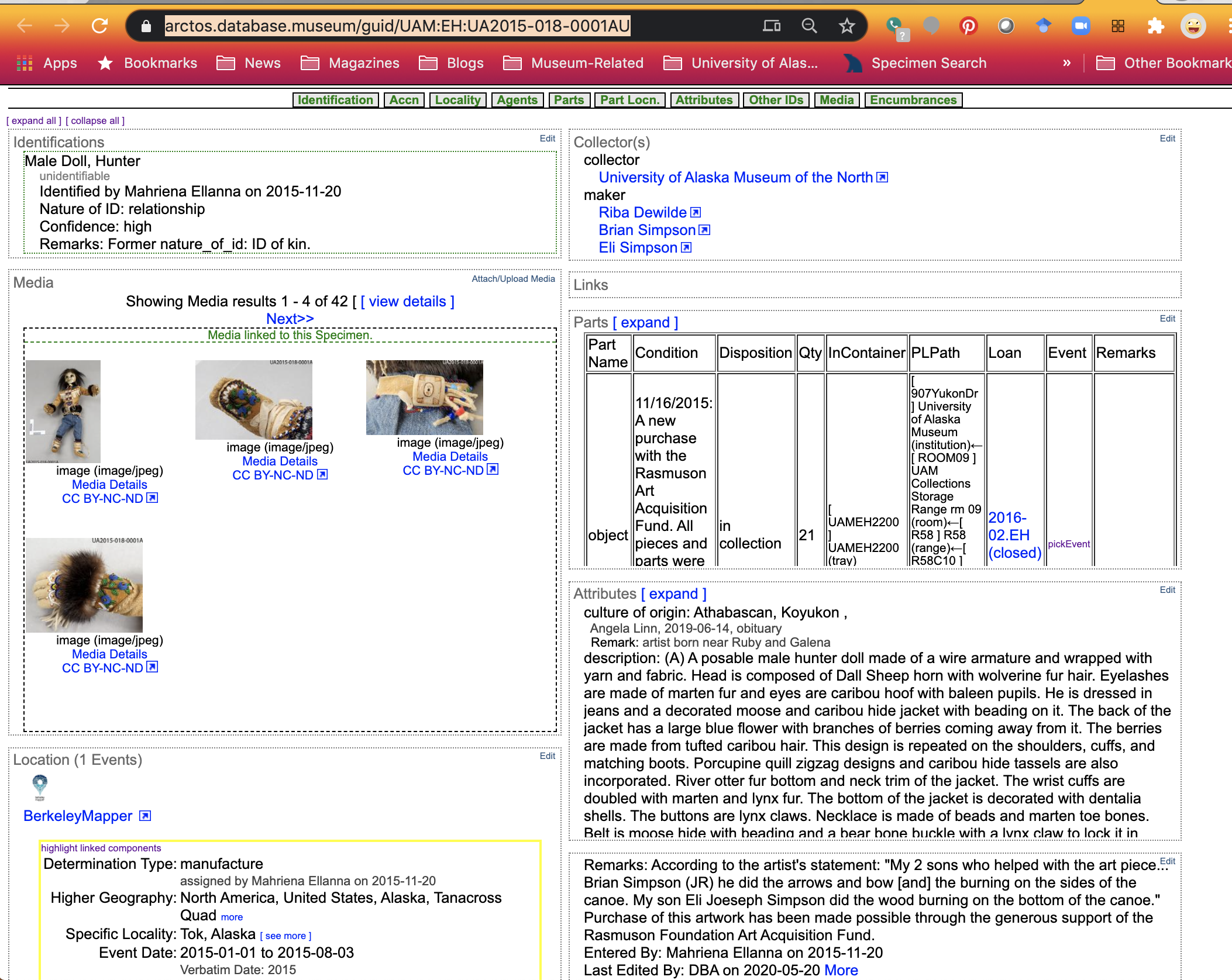
Converting that into a table view where the other columns will have little content might make it really challenging to view our records in a comfortable way for our users.
Changing the parts so they span the full width is possibly better for us, assuming the column widths are responsive to a degree and our condition fields get more breathing room for equally long descriptions. I see the PL path as not being necessary for such a wide column when the content is stacked and easier to read in a narrow view.
 AJLinn
on 30 Oct 2020
AJLinn
on 30 Oct 2020
spread out the attributes horizontally too?
As in, 50 (or 50K...) more columns? I think I hate it, but that's probably-maybe not entirely "no" either.
50 lines tall.
I can set max-height overflow scroll on the attributes cell, which would limit the height of any row and put the scrolling in the expected direction. I did that and added enough attributes to activate it on http://test.arctos.database.museum/guid/MSB:Para:27057
Instead of the "preservation" column that was suggested (and would take screen but add no value for many collections) perhaps we could come up with a "attribute summary" of some sort, that might at least contain enough information to let you know if you should scroll or not?? Just throwing out crazy ideas; in any case we have enough room to play with that sort of thing with this arrangement.
@AJLinn this is parts (and part attributes), not "record attributes." (Naming stuff is HARD!) You can see it at http://test.arctos.database.museum/guid/UAM:EH:UA2015-018-0001AU, which in part looks like....
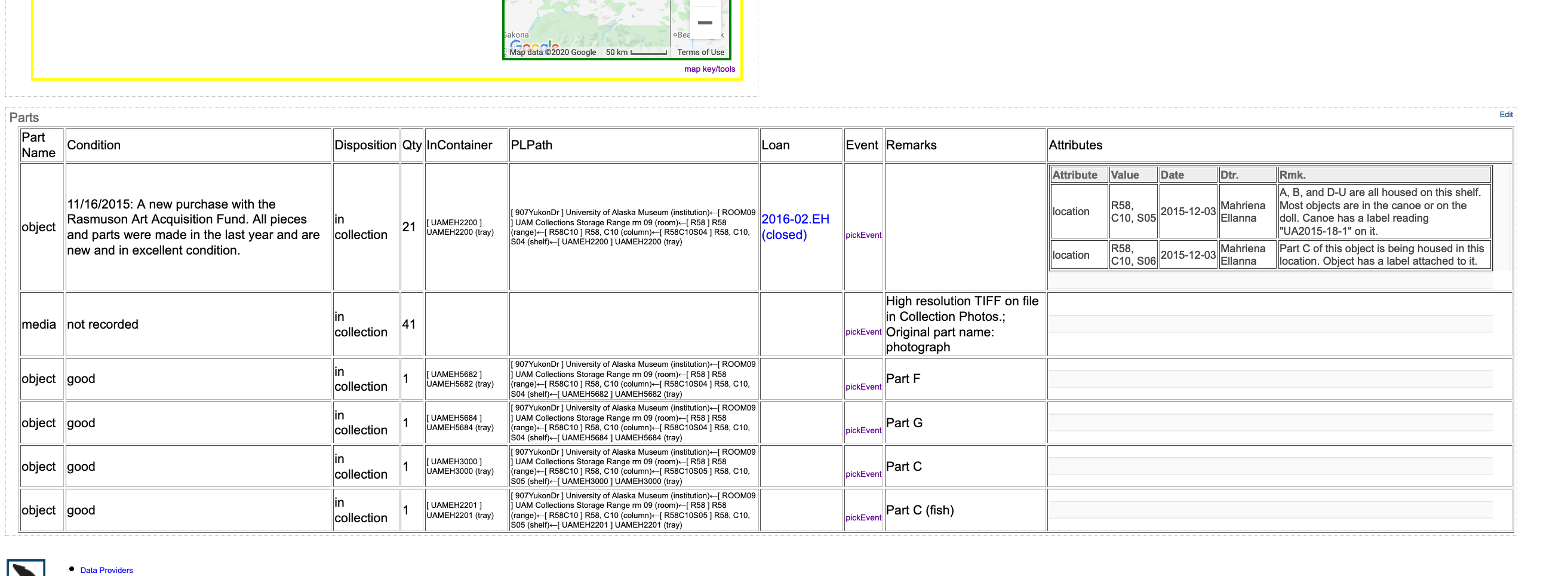
... rather than...
dustymc
on 30 Oct 2020
I like having the parts at the bottom of the page, I think that will be really nice. I'm not so sure about having the attributes all squished into a colunmn.
Possible Improvement: Make Attributes even more compact in some way, perhaps by hiding metadata, if we can find a solution that's acceptable to everyone.
seems like a good solution. Or just having the attributes as rows like they are now?
I don't have strong feelings about it though. I can live with attributes in a column.
 Nicole-Ridgwell-NMMNHS
on 30 Oct 2020
Nicole-Ridgwell-NMMNHS
on 30 Oct 2020
There's a quick-n-dirty attempt at "more compact in some way" on http://test.arctos.database.museum/guid/MSB:Para:27057
The "whole organism" part has lots of attributes, some "specimen data" and some more administrative.
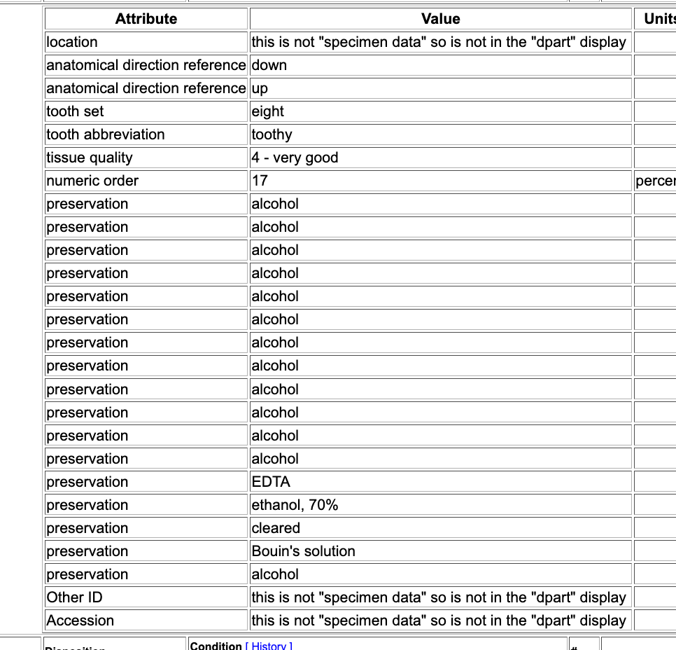
I grabbed the "specimen" attributes, ignored the "admin," grabbed unique values for each of them, and squished it all into parentheses, resulting in
whole organism (anatomical direction reference=down; up|numeric order=17|preservation=alcohol; Bouin's solution; cleared; EDTA; ethanol, 70%; formalin|tissue quality=4 - very good|tooth abbreviation=toothy|tooth set=eight)
The current formatting needs help, we'll have to talk about what's "administrative" if we chase this, etc., but it's a potential way to get a bunch of information into a compact and familiar format. Might be useful for "us," would provide a pathway to (more or less) sharing this information with eg GBIF (who can deal with only a single string).
dustymc
on 30 Oct 2020
FWIW I very much like the parts/part attributes along the bottom, spanning the width of the record view.
AJLinn
on 30 Oct 2020
Can we separate out the preservation attributes into a preservation field
next to part name as requested earlier? It is too confusing mixed in like
this. Also, how will this download?
On Fri, Oct 30, 2020, 4:34 PM Angela Linn notifications@github.com wrote:
- [EXTERNAL]*
FWIW I very much like the parts/part attributes along the bottom, spanning
the width of the record view.—
You are receiving this because you are subscribed to this thread.
Reply to this email directly, view it on GitHub
https://github.com/ArctosDB/arctos/issues/3180#issuecomment-719829509,
or unsubscribe
https://github.com/notifications/unsubscribe-auth/ADQ7JBGH45K6OSNOCBYSFO3SNM5PNANCNFSM4TFFO3MA
.
 campmlc
on 31 Oct 2020
campmlc
on 31 Oct 2020
separate
https://github.com/ArctosDB/arctos/issues/3180#issuecomment-719725830
download
No changes; there's nothing new here or in any linked issue, just display and "shortcuts."
dustymc
on 31 Oct 2020
Collections that use preservation need this info to determine fit for use
for loans. If we separate part from preservation, and preservation history
is jumbled in a random mix of attributes, we have a net loss of clarity and
useability, negating the point of the whole exercise. In our previous
discussions there was unanimous support for including a preservation field,
and this matches the new data entry. If this is a problem for some
collections, then let the results display be customizable in the same way
the data entry page is customizable.
On Fri, Oct 30, 2020, 6:36 PM dustymc notifications@github.com wrote:
- [EXTERNAL]*
separate
3180 (comment)
https://github.com/ArctosDB/arctos/issues/3180#issuecomment-719725830
download
No changes; there's nothing new here or in any linked issue, just display
and "shortcuts."—
You are receiving this because you commented.
Reply to this email directly, view it on GitHub
https://github.com/ArctosDB/arctos/issues/3180#issuecomment-719857361,
or unsubscribe
https://github.com/notifications/unsubscribe-auth/ADQ7JBBXJHSVUHIXCMYQYVDSNNLZHANCNFSM4TFFO3MA
.
campmlc
on 31 Oct 2020
spread out the attributes horizontally too?As in, 50 (or 50K...) more columns? I think I hate it, but that's probably-maybe not entirely "no" either.
Only as many columns as there are attributes? With multiple attributes of the same type concatenated together?
Jegelewicz
on 2 Nov 2020
The display is back to the old information, but horizontally at the bottom. It seems like that's an improvement we can all mostly agree on, it'll be in the next release.
Seems reasonable to talk about what's in that table here as well, so....
negating the point of the whole exercise
It does not. Do not confound data organization with display. Splitting "preservation" (and whatever else we've got in those parentheses) out from the part name makes the data capable of answering more questions more accurately, no matter what the UI might look like. The worst case I can see here is the UI ends up carrying as much information as it does now (and some extra in the little table that you can ignore).
unanimous support
I don't think we've had adequate representation. I'm just trying to move forward as a community, as quickly as possible. I'm very open to other ideas, but I'd like to not make this less usable for anyone in the process.
many columns as there are attributes? With multiple attributes of the same type concatenated together?
That won't perform or scale - it's going to be terribly expensive, you'll potentially see a different table every time the page loads (which would drive me crazy), and it's going to be NUTS if we end up really buying in to this model and the average part ends up carrying dozens of attributes (therefore dozens more columns). That said, this page doesn't have to perform very well (it's only processing one record) and I don't think anyone has much variety of attributes yet (we have 14 in total). I think this also addresses @campmlc 's concerns above. Let's give it a go, but please keep looking for a better way. I'll hope to have something to look after the next release, and we can go from there.
customizable
I generally dislike that - shared screens lead to common viewpoints which lead to more input which leads to better shared screens - but I'm going to have to redo what I'm doing to build the parts table and there's no reason not to make that modular, which does open up the possibility of swapping in different parts tables under different conditions. I'd still very much prefer to find a UI which works for us all, and which we can all work on improving together.
dustymc
on 2 Nov 2020
I'm happy for the underlying data structure to be improved. But there is no
reason we can't do that and simultaneously have a better UI. As I have said
repeatedly in the past, there is no reason that the UI has to match the
underlying data structure. The function of the UI is to make it possible
for human users to use it.
On Mon, Nov 2, 2020 at 1:57 PM dustymc notifications@github.com wrote:
- [EXTERNAL]*
The display is back to the old information, but horizontally at the
bottom. It seems like that's an improvement we can all mostly agree on,
it'll be in the next release.Seems reasonable to talk about what's in that table here as well, so....
negating the point of the whole exercise
It does not. Do not confound data organization with display. Splitting
"preservation" (and whatever else we've got in those parentheses) out from
the part name makes the data capable of answering more questions more
accurately, no matter what the UI might look like. The worst case I can see
here is the UI ends up carrying as much information as it does now (and
some extra in the little table that you can ignore).unanimous support
I don't think we've had adequate representation. I'm just trying to move
forward as a community, as quickly as possible. I'm very open to other
ideas, but I'd like to not make this less usable for anyone in the process.many columns as there are attributes? With multiple attributes of the same
type concatenated together?That won't perform or scale - it's going to be terribly expensive, you'll
potentially see a different table every time the page loads (which would
drive me crazy), and it's going to be NUTS if we end up really buying in to
this model and the average part ends up carrying dozens of attributes
(therefore dozens more columns). That said, this page doesn't have to
perform very well (it's only processing one record) and I don't think
anyone has much variety of attributes yet (we have 14 in total). I think
this also addresses @campmlc https://github.com/campmlc 's concerns
above. Let's give it a go, but please keep looking for a better way. I'll
hope to have something to look after the next release, and we can go from
there.customizable
I generally dislike that - shared screens lead to common viewpoints which
lead to more input which leads to better shared screens - but I'm going to
have to redo what I'm doing to build the parts table and there's no reason
not to make that modular, which does open up the possibility of swapping in
different parts tables under different conditions. I'd still very much
prefer to find a UI which works for us all, and which we can all work on
improving together.—
You are receiving this because you were mentioned.
Reply to this email directly, view it on GitHub
https://github.com/ArctosDB/arctos/issues/3180#issuecomment-720720064,
or unsubscribe
https://github.com/notifications/unsubscribe-auth/ADQ7JBEJ7UERBS3WYRDBWS3SN4MK7ANCNFSM4TFFO3MA
.
campmlc
on 2 Nov 2020
Something new just went to production - closing....
dustymc
on 4 Nov 2020
Related issues
dustymc
·
4Comments
 ebraker
·
8Comments
AJLinn
·
3Comments
Jegelewicz
·
5Comments
ebraker
·
8Comments
AJLinn
·
3Comments
Jegelewicz
·
5Comments
 acdoll
·
4Comments
acdoll
·
4Comments