Arctos: Loan adds is cumbersome - from PG testing
This is a lot of real estate. Some of us had asked to be able to see the remark field for tissues, but this is too much in my opinion.
 Jegelewicz
All 39 comments
Agreed, I was doing a bunch of these this week and it makes for a LOT of scrolling. Previously, we didn't get all that specimen data to the right, is that needed? Could those part tables be arranged to display side-by-side? Something like this:
 acdoll
on 5 Jun 2020
acdoll
on 5 Jun 2020
Or perhaps turn the tables themselves to display horizontally rather than
vertically, so more records can fit per page? I agree we don't need all the
stuff to the right except catnum, preferred ID, taxon name, maybe spec loc
- all this can be found by clicking the guid link
On Fri, Jun 5, 2020 at 1:33 PM Andrew Doll notifications@github.com wrote:
- [EXTERNAL]*
Agreed, I was doing a bunch of these this week and it makes for a LOT of
scrolling. Previously, we didn't get all that specimen data to the right,
is that needed? Could those part tables be arranged to display
side-by-side? Something like this:
[image: Loan Part Add]
https://user-images.githubusercontent.com/12507297/83915745-170a2b80-a731-11ea-9a03-8f741e7cdd05.jpg—
You are receiving this because you are subscribed to this thread.
Reply to this email directly, view it on GitHub
https://github.com/ArctosDB/arctos/issues/2741#issuecomment-639746623,
or unsubscribe
https://github.com/notifications/unsubscribe-auth/ADQ7JBH6DWBXCTY4A2NKD3TRVFCBLANCNFSM4NS7XMTA
.
 campmlc
on 5 Jun 2020
campmlc
on 5 Jun 2020
Could those part tables be arranged to display side-by-side?
Yes
display horizontally
Probably "yes" but I'm not sure what you mean.
don't need all the stuff
Everything you see is there because someone's asked for it.
individual collection option
allowing collections to customize
Not impossible, but "impractical" may not quite be emphatic enough.
 dustymc
on 24 Jun 2020
dustymc
on 24 Jun 2020
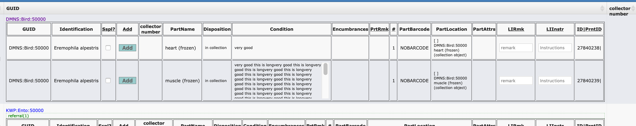
My problem is slightly different, but related... can these fields wrap text instead of making it reaaaaaaaaaaaaaaaally wide?
In particular, the part condition field can hold a lot of text for our collection and when I'm picking items for loan, I can't even see the actual object I'm looking for when working on my laptop...
I hope this is an easy fix?
 AJLinn
on 27 Aug 2020
AJLinn
on 27 Aug 2020
This should be prioritized and discussed. Making changes shouldn't be particularly difficult, but I'm getting a lot of conflicting information and I don't think I can change anything without making something (maybe everything!) worse for someone (everyone?!) else.
dustymc
on 27 Aug 2020
I agree we don't need all the
stuff to the right except catnum, preferred ID, taxon name, maybe spec loc
- all this can be found by clicking the guid link
Bare minimum: cultural collections must be able to see media and Identified As in "that stuff to the right". We're trying to increase our efficiency, yes? So fewer clicks to see important data is the priority, I would assume?
AJLinn
on 27 Aug 2020
Any way to get the display fields to show horizontally rather than
vertically?
On Wed, Aug 26, 2020 at 4:51 PM Angela Linn notifications@github.com
wrote:
- [EXTERNAL]*
I agree we don't need all the
stuff to the right except catnum, preferred ID, taxon name, maybe spec loc
- all this can be found by clicking the guid link
Bare minimum: cultural collections must be able to see media and Identified
As in "that stuff to the right". We're trying to increase our
efficiency, yes? So fewer clicks to see important data is the priority, I
would assume?—
You are receiving this because you commented.
Reply to this email directly, view it on GitHub
https://github.com/ArctosDB/arctos/issues/2741#issuecomment-681163583,
or unsubscribe
https://github.com/notifications/unsubscribe-auth/ADQ7JBHXDHZYCOKNFOT2RE3SCWGWTANCNFSM4NS7XMTA
.
campmlc
on 27 Aug 2020
Reviving this - discussed at code table meeting 11-19-20. Plan is to create mock up of how we wish this to look and behave.
@ccicero
campmlc
on 20 Nov 2020
Thanks @campmlc
I tried to find this issue but failed.
Let's prioritize this at the Issues meeting since it really makes adding objects to loans difficult, especially if there are many parts per record.
 ccicero
on 21 Nov 2020
ccicero
on 21 Nov 2020
See https://github.com/ArctosDB/arctos/issues/2741#issuecomment-639751726 and https://github.com/ArctosDB/arctos/issues/2741#issuecomment-681168790
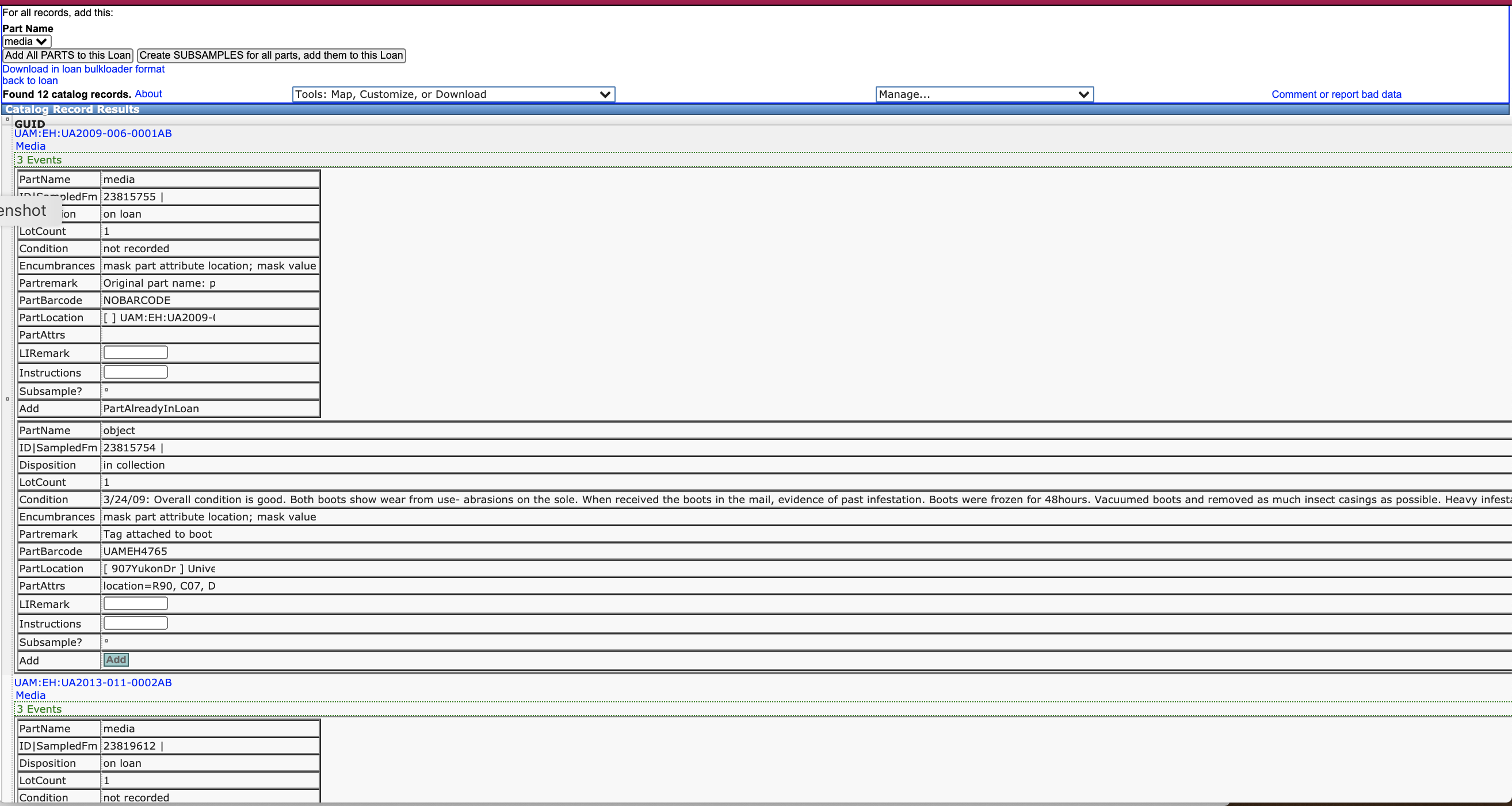
@campmlc @ewommack and I discussed this afternoon and we really think just doing this would be a good step forward here.
So instead of this
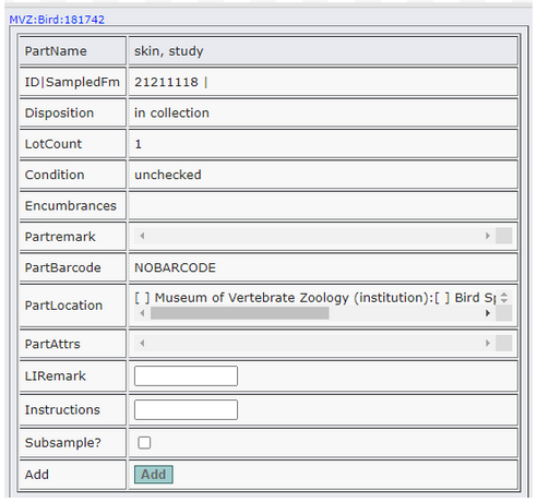
You get this
MVZ:Bird:181742

BTW "stuff to the right" could be on the line with "MVZ:Bird:181742 - right?
After that we can talk about the order of the columns and eventually how to display the preservation attribute....
Jegelewicz
on 24 Nov 2020
@Jegelewicz that seems to conflict with https://github.com/ArctosDB/arctos/issues/2741#issuecomment-681156492 - @AJLinn care to chime in?
dustymc
on 24 Nov 2020
Yeah, that wide screen is awful for our collection. Our parts are mostly all the same (object or media). As I said in the #2741 (comment) I really need to be able to see the Media and Identified as columns (at minimum the Identified as). The proposed super wide column with more stuff to the right (with the condition in the middle) will make my interface nearly impossible on anything less than a 27" desktop screen. Is there any way to expand these columns horizontally like we expand / contract sections in the catalog record pages?
Here's the "stuff to the right" that I need to be able to see:
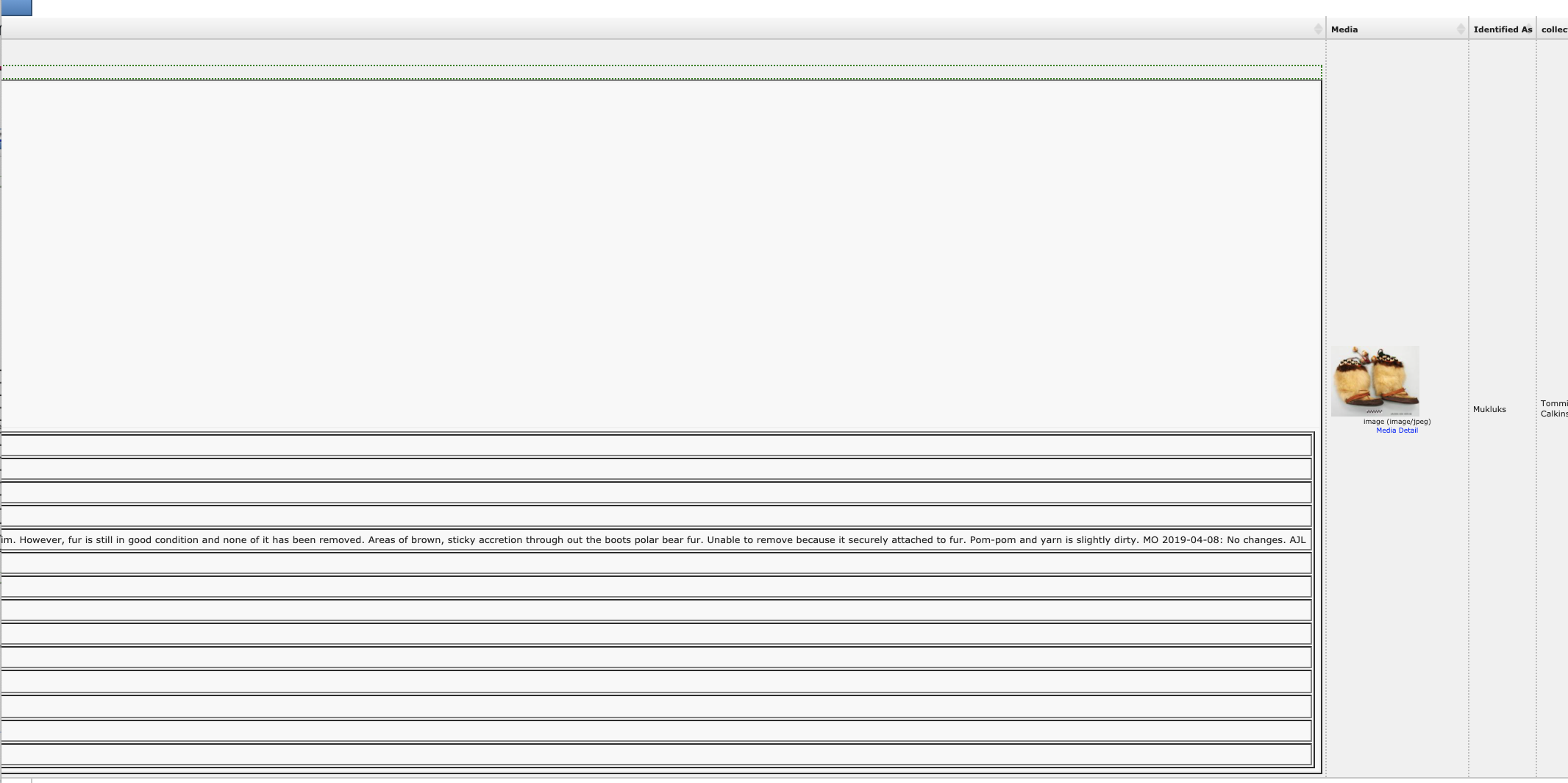
Can you see my problem? That "condition" field contains hundreds of characters for some records and making my two required fields farther away from the line that says "add" makes this nearly unworkable. I'm not sure how to make this work for everyone...
AJLinn
on 25 Nov 2020
lets set up special call for this asap. please respond if interested
campmlc
on 3 Dec 2020
@campmlc @ccicero @atrox10 @AJLinn @KyndallH @acdoll @Jegelewicz @dustymc
campmlc
on 3 Dec 2020
I'll come if I can!
Jegelewicz
on 3 Dec 2020
Yes, I can - when are you thinking? I'm in Isobank workshop
today/tomorrow, and am gone next Monday/Tuesday. I could potentially meet
this afternoon (workshop should end soon-ish, then I need to eat lunch so
after 2-2:30 Pacific?).
On Thu, Dec 3, 2020 at 12:11 PM Teresa Mayfield-Meyer <
[email protected]> wrote:
I'll come if I can!
—
You are receiving this because you were mentioned.
Reply to this email directly, view it on GitHub
https://github.com/ArctosDB/arctos/issues/2741#issuecomment-738279847,
or unsubscribe
https://github.com/notifications/unsubscribe-auth/AAHME2YVAMDTSIXTWURZFITSS7WG7ANCNFSM4NS7XMTA
.
--
Carla Cicero, Ph.D
Staff Curator of Birds
Museum of Vertebrate Zoology
3101 Valley Life Sciences Building
University of California
Berkeley, CA 94720-3160
TEL: (510) 642-7868
FAX: (510) 643-8238
http://mvz.berkeley.edu
https://carlacicero.net
http://vertnet.org
https://arctosdb.org
http://en.wikipedia.org/wiki/Bird_collections
http://americanornithology.org/ http://www.americanornithology.org/
ccicero
on 3 Dec 2020
Sent an email as well. @atrox10 maybe a when2meet?
 mkoo
on 3 Dec 2020
mkoo
on 3 Dec 2020
Sorry I'm in meetings this afternoon from 2:00-3:00 AkST (3-4 Pacific). I'd certainly like to be part of the chat.
AJLinn
on 3 Dec 2020
Next Wed?
On Thu, Dec 3, 2020, 3:04 PM Angela Linn notifications@github.com wrote:
- [EXTERNAL]*
Sorry I'm in meetings this afternoon from 2:00-3:00 AkST (3-4 Pacific).
I'd certainly like to be part of the chat.—
You are receiving this because you were mentioned.
Reply to this email directly, view it on GitHub
https://github.com/ArctosDB/arctos/issues/2741#issuecomment-738346708,
or unsubscribe
https://github.com/notifications/unsubscribe-auth/ADQ7JBHKGA3LS5VWTXJHHWDSTADNFANCNFSM4NS7XMTA
.
campmlc
on 3 Dec 2020
@KyndallH @amgunderson @DerekSikes
Who's still not invited?
https://www.when2meet.com/?10470524-VbXRY
select
  guid_prefix,
  count(*) c
from
  collection
  inner join cataloged_item on collection.collection_id=cataloged_item.collection_id
  inner join specimen_part on cataloged_item.collection_object_id=specimen_part.derived_from_cat_item
  inner join loan_item on specimen_part.collection_object_id=loan_item.collection_object_id
group by guid_prefix order by c desc;

 guid_prefix |   c
-------------+-------
 UAM:Ento    | 85908
 MSB:Mamm    | 38110
 UAM:Mamm    | 36199
 MVZ:Herp    | 29747
 MVZ:Mamm    | 19219
 UTEP:ES     | 18538
 MVZ:Bird    | 14519
 UMNH:Mamm   |  6607
 UAM:Herb    |  5802
 MSB:Bird    |  4598
 UAM:EH      |  4206
 DMNS:Mamm   |  2590
 UTEP:Mamm   |  2578
 MLZ:Bird    |  2365
 UAM:Arc     |  2343
 KNWR:Ento   |  1925
 UAM:ES      |  1852
 UCM:Mamm    |  1766
 MSB:Para    |  1260
 DMNS:Bird   |  1253
 CHAS:Inv    |  1234
 UAM:Fish    |  1191
 UCM:Herp    |  1191
 UAM:Art     |  1150
 NMU:Mamm    |   985
 UTEP:Ento   |   825
 UTEP:Herp   |   765
 UMNH:Bird   |   732
 UTEP:HerpOS |   629
 UWBM:Herp   |   524
 UCM:Fish    |   508
 MLZ:Mamm    |   445
 UMNH:Herp   |   427
 CHAS:Bird   |   383
 UTEP:Herb   |   373
 CHAS:Teach  |   363
 UTEP:Arc    |   361
 MVZ:Egg     |   252
 MSB:Herp    |   239
 NMMNH:Inv   |   228
 CHAS:Ento   |   214
 UAM:Inv     |   207
 KNWR:Herb   |   207
 UAMObs:Ento |   163
 ALMNH:ES    |   162
 UCM:Bird    |   152
 UTEP:Fish   |   143
 UAM:Herp    |   135
 UTEP:Teach  |   111
 UAMb:Herb   |   107
 NMMNH:Paleo |   102
 UTEP:Bird   |   101
 CHAS:Mamm   |    89
 MSB:Fish    |    86
 DGR:Mamm    |    76
 CHAS:EH     |    48
 UWYMV:Bird  |    46
 CHAS:Egg    |    44
 NMU:Bird    |    43
 KWP:Ento    |    38
 UTEP:Inv    |    37
 MVZ:Hild    |    35
 UNR:Mamm    |    31
 DMNS:Inv    |    24
 UWYMV:Mamm  |    24
 DMNS:Para   |    23
 NMU:Para    |    22
 DGR:Bird    |    22
 DMNS:Egg    |    16
 UAM:Bird    |    14
 NMMNH:Mamm  |     9
 UMNH:Teach  |     8
 NMMNH:Bird  |     6
 ALMNH:Bird  |     6
 CHAS:Herp   |     6
 DMNS:Herp   |     5
 CHAS:Herb   |     4
 KNWR:Inv    |     4
 UWBM:Mamm   |     3
 MSB:Host    |     3
 CHAS:Fish   |     2
 UCM:Egg     |     2
 NMMNH:Ento  |     1
 NMMNH:Herb  |     1
@campmlc you've said something about horizontal several times, I still don't know what you're talking about. Can you elaborate?
dustymc
on 4 Dec 2020
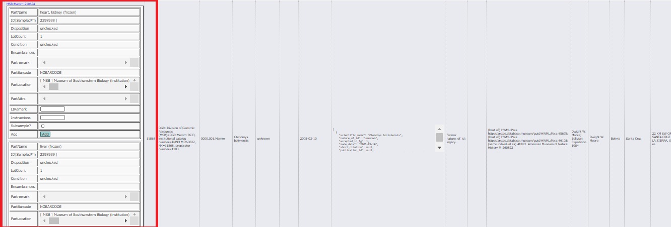
The previous loan form had parts in several rows, the options to subsample
or add instructions to the right of each part in a separate column. We
could see all the parts for multiple guids on a single page on my small
laptop screen. Now, because of the additional information, each part
takes up more space than the entire set of parts for a single guid formerly
occupied in the old form, and the selection options to subsample etc are
arranged vertically, below the part name, taking up most of my computer
screen. For a record that has multiple parts, seeing the entire set of
parts for a single guid to select which might or might not be added to a
loan requires scrolling down through multiple vertical pages worth of
information, only one of which even shows the guid or the other identifier,
so it is not even clear what record you are looking at as you scroll.
I suggest we arrange the parts horizontally in rows, with the additional
information added to the right of each part. My understanding is that
cultural collections have some very large fields that need to be expanded
vertically. Perhaps we can add an "expand vertically" option to each column
header?
On Fri, Dec 4, 2020 at 11:08 AM dustymc notifications@github.com wrote:
- [EXTERNAL]*
@campmlc https://github.com/campmlc you've said something about
horizontal several times, I still don't know what you're talking about. Can
you elaborate?—
You are receiving this because you were mentioned.
Reply to this email directly, view it on GitHub
https://github.com/ArctosDB/arctos/issues/2741#issuecomment-738934957,
or unsubscribe
https://github.com/notifications/unsubscribe-auth/ADQ7JBDQTR337AN7TQNNH33STEQTNANCNFSM4NS7XMTA
.
campmlc
on 4 Dec 2020
The previous version had an amount of data which didn't require structure. I think we've simply outgrown that.
selection options to subsample etc are arranged vertically, below the part name,
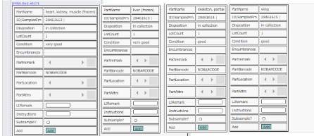
Right. I could add a column for controls, with the label above them, something like....
Or 2 columns for
For a record that has multiple parts, seeing the entire set of
parts for a single guid to select which might or might not be added to a
loan requires scrolling
Yes.
it is not even clear what record you are looking at as you scroll.
I might take that as a request to add GUID to each part's table, which would stretch something out in some direction....
arrange the parts horizontally in rows, with the additional information added to the right of each part.
See https://github.com/ArctosDB/arctos/issues/2741#issuecomment-733445116 - that would (greatly!) multiply a different problem.
cultural collections have some very large fields
Yes, but it's not a "cultural collection problem" - it's a "anyone who's using condition as it was built to be used" problem. It might not be a "tissues" problem, but I'd expect to encounter similar data with eg a skull that's been loaned a few times.
that need to be expanded vertically.
I could limit width, which will of course increase height. I could also make those fixed-size with scroll to see the overflow, but this is a place where I think most users need to see everything, so I'm not sure that's realistic despite being technically possible.
add an "expand vertically" option to each column
header?
This is a table of tables; that would probably be a lot of clicking and effective at hiding information. I can certainly manipulate things with mouseclicks, but I'm not yet understanding how that might look/work.
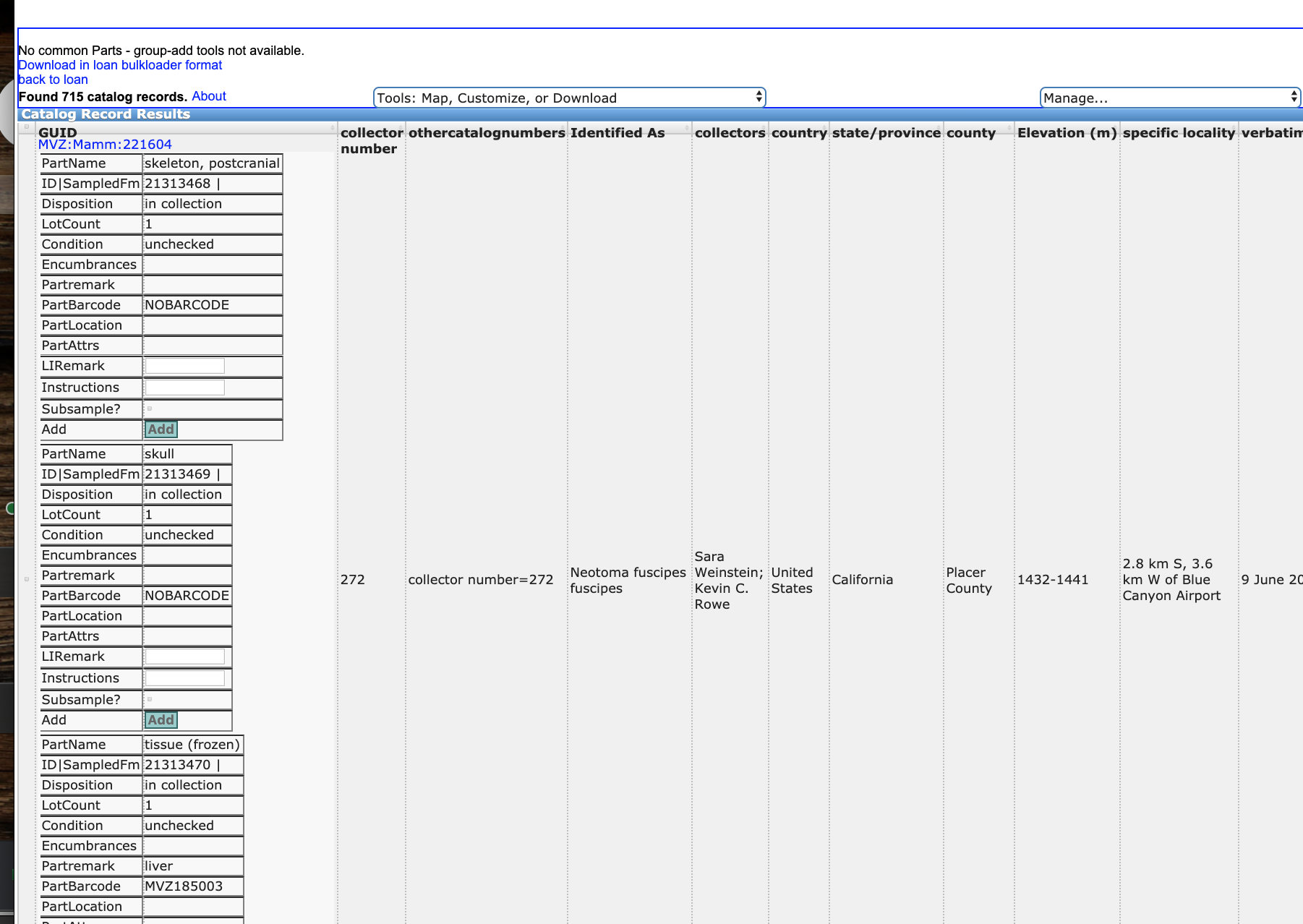
dustymc
on 4 Dec 2020
Here is the fundamental problem. All the information we need to add an item
to a loan is contained within a single vertical display column (red box)
extending for multiple pages. We have a lot of real estate in columns to
the right. Why do we display all the locality etc options that are not
necessary for adding an item to a loan? If I want to see this information
to confirm an object's locality, it is far easier for me to click the GUID
above the part name and go to the actual record than to scroll ten miles to
the right on this inadequate display. The only field besides other ID that
would be useful here is taxon name,so move that over to the third display
colum. I think we are unanimously in agreement that the single column
vertical display as shown below does not work. In the case here, there
are only two mammal parts, and even though I have minimized my screen to
the point I can just barely read content, it still cuts off the second
part. Many mammal records have far more than two parts. Why are we being
forced to constrain all content to a column which takes up 1/5 of my
screen? I need the info in red expanded to the right.
[image: image.png]
On Fri, Dec 4, 2020 at 12:03 PM dustymc notifications@github.com wrote:
- [EXTERNAL]*
The previous version had an amount of data which didn't require structure.
I think we've simply outgrown that.selection options to subsample etc are arranged vertically, below the part
name,[image: Screen Shot 2020-12-04 at 10 38 33 AM]
https://user-images.githubusercontent.com/5720791/101201620-e68e4600-361c-11eb-82b5-c93a03f42e44.pngRight. I could add a column for controls, with the label above them,
something like....[image: Screen Shot 2020-12-04 at 10 39 50 AM]
https://user-images.githubusercontent.com/5720791/101201759-176e7b00-361d-11eb-9b78-d0687f6d99de.pngOr 2 columns for
For a record that has multiple parts, seeing the entire set of
parts for a single guid to select which might or might not be added to a
loan requires scrollingYes.
it is not even clear what record you are looking at as you scroll.
I might take that as a request to add GUID to each part's table, which
would stretch something out in some direction....arrange the parts horizontally in rows, with the additional information
added to the right of each part.See #2741 (comment)
https://github.com/ArctosDB/arctos/issues/2741#issuecomment-733445116 -
that would (greatly!) multiply a different problem.cultural collections have some very large fields
Yes, but it's not a "cultural collection problem" - it's a "anyone who's
using condition as it was built to be used" problem. It might not be a
"tissues" problem, but I'd expect to encounter similar data with eg a skull
that's been loaned a few times.that need to be expanded vertically.
I could limit width, which will of course increase height. I could also
make those fixed-size with scroll to see the overflow, but this is a place
where I think most users need to see everything, so I'm not sure that's
realistic despite being technically possible.add an "expand vertically" option to each column
header?This is a table of tables; that would probably be a lot of clicking and
effective at hiding information. I can certainly manipulate things with
mouseclicks, but I'm not yet understanding how that might look/work.—
You are receiving this because you were mentioned.
Reply to this email directly, view it on GitHub
https://github.com/ArctosDB/arctos/issues/2741#issuecomment-738961123,
or unsubscribe
https://github.com/notifications/unsubscribe-auth/ADQ7JBHU6CICJMJOSV3TV63STEW67ANCNFSM4NS7XMTA
.
campmlc
on 4 Dec 2020
campmlc
on 4 Dec 2020
I sent the when2meet already in a different email
here it is, please fill out if you want to attend:
https://www.when2meet.com/?10470524-VbXRY
On Fri, Dec 4, 2020 at 11:48 AM Mariel Campbell notifications@github.com
wrote:
[image: Screenshot 2020-12-04 12 25 26]
https://user-images.githubusercontent.com/14808196/101208120-eac35f00-362e-11eb-8ed3-985c564ebcf8.png—
You are receiving this because you were mentioned.
Reply to this email directly, view it on GitHub
https://github.com/ArctosDB/arctos/issues/2741#issuecomment-738982839,
or unsubscribe
https://github.com/notifications/unsubscribe-auth/ABCJF4K2XS4OCZTLZPGUZIDSTE4HPANCNFSM4NS7XMTA
.
--
Carol L. Spencer, Ph.D.
Staff Curator of Herpetology & Researcher
Museum of Vertebrate Zoology
3101 Valley Life Sciences Building
University of California, Berkeley, CA, USA 94720-3160
[email protected]
[email protected]
TEL: 510-643-5778 /FAX: 510-643-8238
http://mvz.berkeley.edu/Herp_Collection.html
http://www.vertnet.org
 atrox10
on 4 Dec 2020
atrox10
on 4 Dec 2020
That "condition" field contains hundreds of characters for some records and making my two required fields farther away from the line that says "add" makes this nearly unworkable. I'm not sure how to make this work for everyone...
it's a "anyone who's using condition as it was built to be used" problem.
Suggest we start thinking hard about a condition report in place of or as a supplement to the "condition" field. See https://github.com/ArctosDB/arctos/issues/1908#issuecomment-739538102
Jegelewicz
on 6 Dec 2020
thinking hard about a condition report in place of or as a supplement to the "condition" field.
WHATEVER format that information might take, some collections will need it in selecting parts for loan.
dustymc
on 7 Dec 2020
Here is a new When2Meet for January for this issue, please come if you are
interested in this:
https://www.when2meet.com/?10497868-vPNde
On Mon, Dec 7, 2020 at 9:19 AM dustymc notifications@github.com wrote:
thinking hard about a condition report in place of or as a supplement to
the "condition" field.WHATEVER format that information might take, some collections will need it
in selecting parts for loan.—
You are receiving this because you were mentioned.
Reply to this email directly, view it on GitHub
https://github.com/ArctosDB/arctos/issues/2741#issuecomment-740058309,
or unsubscribe
https://github.com/notifications/unsubscribe-auth/ABCJF4M6AZSMQUZVMO2YCEDSTUFANANCNFSM4NS7XMTA
.
--
Carol L. Spencer, Ph.D.
Staff Curator of Herpetology & Researcher
Museum of Vertebrate Zoology
3101 Valley Life Sciences Building
University of California, Berkeley, CA, USA 94720-3160
[email protected]
[email protected]
TEL: 510-643-5778 /FAX: 510-643-8238
http://mvz.berkeley.edu/Herp_Collection.html
http://www.vertnet.org
atrox10
on 8 Dec 2020
Date to meet is January 7th 2-3 pm pst. See Arctos calendar! thanks
atrox10
on 15 Dec 2020
Sorry I can't make this meeting today. From my perspective we absolutely need to go back to the horizontal view and reduce number of fields, takes at least 3X as long for me to pick parts for a loan now. Additionally when there are lots of parts in a single record you can't even see the catalog number anymore so hard to be sure you are selecting the part for correct specimen. Perhaps just make it customizable, it worked great for my needs in the original form but others clearly wanted something else. Thanks, Jon
 jldunnum
on 7 Jan 2021
jldunnum
on 7 Jan 2021
Looks like we might have a short term solution - notes from meeting: https://docs.google.com/document/d/1XCedmJwlKoGL1hnQRCDdoA_dnv-agJyXddNf-FBT7S8/edit?usp=sharing
Are interested in getting a short term solution more similar to the Review Loan Items Table Invoice check page.
Further work for a long term solution will require possible work with updating libraries for search pages.
 ewommack
on 8 Jan 2021
ewommack
on 8 Jan 2021
It's different, test please.
dustymc
on 8 Jan 2021
@AJLinn I made condition (and some other stuff) scroll if it's over a certain size - let me know if that needs adjusted in some way, just doesn't work, whatever.
dustymc
on 8 Jan 2021
I just used this for the first time. The layout is much better - it works great for me! Thanks 👏
acdoll
on 14 Jan 2021
The screen shot looks great... I need to remember how to find/use test.
AJLinn
on 14 Jan 2021
Test is test.arctos.database.museum, but this went to production a few days ago so you can check it out there as well.
dustymc
on 14 Jan 2021
I just tried, this looks MUCH better and is much easier to find parts and add them. I say make it permanent! thank you!
atrox10
on 22 Jan 2021
Sounds fixed to me, closing.
dustymc
on 22 Jan 2021
Related issues
dustymc
·
4Comments
 mvzhuang
·
5Comments
dustymc
·
3Comments
mvzhuang
·
5Comments
dustymc
·
3Comments
 mgoliver
·
7Comments
mgoliver
·
7Comments
 alexkrohn
·
3Comments
alexkrohn
·
3Comments