(This only applies to the "next" branch)
This one is logged quite early, but does not need to be done early. Rather is gives the backdrop to how things operate.
As a general Substrate/Polkadot interface, the UI is _very_ dynamic and general "this always works like this and is fixed" rules doesn't neccesarily apply. A prime example is app-extrinsics - it is complely made up from dynamic data that the node runtime supplies. Before speaking to the Node, we UI does not know what to add or how things will look. Same with the chain state queries.
Additionally, some functionality may or may not be available (we don't as of yet cater for this, but it is moving up the list fast). For example - to manage contracts and app-contract application will be added. However this is only applicable to Substrate chains, Polkadot itself won't have contracts, although parachains might. So apps can be switched on/off depending on what the runtime indicates. (The same with apps such as transfer - do we have the balances module _with_ transfer, staking - do we have the module with endpoints, democracy - is the module available, etc.)
So the navigation layout needs to cater for this. Additionally, as is currently in next, this cannot actually be rendered before the runtime gave the metadata. (Some stuff like settings could be - as they should be generic enough and kept that way)
For a layout pov, more focus is given to the apps that should be there (functionality users use daily), functionality users can use to manage (e.g. addresses) and lastly the more technical focusses apps (such as extrinsics, which in itself can be switched off for "user-facing" interfaces, e.g. see settings in next with lighter mode)
Minimise clicks. Don't require the user to expand and click, things should be there. At the same time don't get them to scroll up, it should be there. Maximise space, ie. if screens are wider rather than taller, use that to the best effect possible. (Generally a sidebar layout is probably preferred, however with the correct topbar that does not clutter, get in the way and can adjust based on the apps, it _could_ be workable. ... and may be preferred for light mode via settings)
Anything goes - as long as it gets to the action, functionality above all.
 jacogr
All 11 comments
I thought about a generic user-flow this morning and came up with the following:
1) Show existing chain info
* Show the user the existing chains (i.e. Relay Chain, Parachains) that are running (both the overall quantity of them and their individual names).
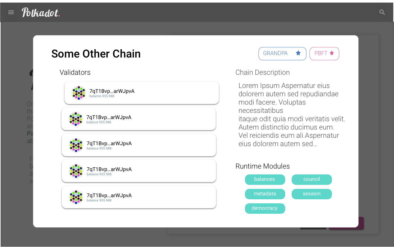
* Show the user information about each of the chains including the runtime modules they are using, the consensus algorithm(s) they are using for block production and finality, the list of validators/collators/etc
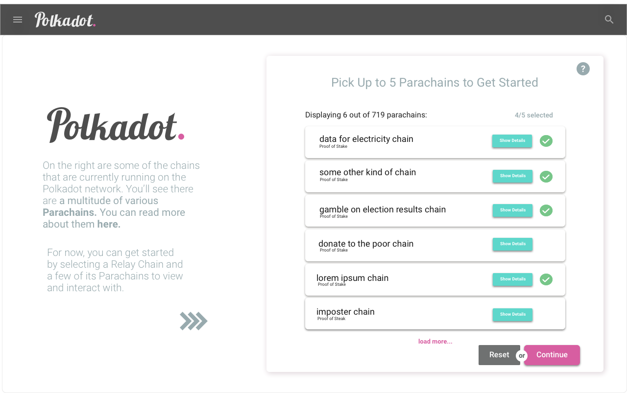
2) Prompt the user to choose a Primary chain and other chains to display in the UI.
Allow the user to later change their Primary chain
3) Load the chain info of all the chains that the user chooses
4) Display menu items, such as Block Explorer, Block Feed, Blockchain State Query (Chain State), Wallet & Address Book (Accounts, Addresses), etc
5) Display all the chains that the user chooses in the following Menu Items
* Feeds / Subscriptions
* Block Explorer - allow the user to filter the chains that are shown, change the layout (i.e. tile view, list view)
* Block Feed - allow the user to choose what queries to subscribe to and what events to listen to and display them in a feed associated with the respective chain
* Staking Feed - allow the user to choose what chains they are staking/nominating in, to subscribe to and show the accounts and whether their are staking/nominating, and the account balance of those accounts (with separate +/- indicators showing how much their account balance has changed over a period due to slashing and rewards), and notifying validators/users when one or more of their nodes have gone offline
* Transaction Queue Pool - show transaction queue for all the chains that the user selected
6) Display info (and allow mutation if applicable) only for the currently chosen Primary chain in the following Menu Items (only show Menu Items associated with modules that are currently active in the runtime of the chosen Primary chain)
* Blockchain Queries
* Chain State - so user can perform custom queries for specific chain information
* Wallet & Address Book (Balances)
* Accounts (uses Balances Module)
* Addresses
* Extrinsics
* Transfer - to transfer DOTs from between accounts.
* Note: If the Parachain has Governance Modules, and they cannot use their own token for voting on their Parachain, then they'll need be able to "Transfer" DOTs from the Relay Chain or some other Parachain to the destination account of their desired Parachain in the UI.
* Contract
* Extrinsics - allow user to perform extrinsics from the "contract" extrinsics section
* Governance
* Consensus & Session
* Extrinsics - allow user to perform extrinsics from the "consensus" and "session" extrinsics section
* Council Voting & Motions
* Extrinsics - allow user to perform extrinsics from the "council", "councilMotions", and "councilVoting" extrinsics section
* Public Voting, Proposals & Referendums (Democracy)
* Extrinsics - allow user to perform extrinsics from the "democracy" extrinsics section
* Staking
* Extrinsics - allow user to perform extrinsics from the "staking" extrinsics section
7) Display other Menu Items
* Settings - allow the user to change the Primary chain and other chains that they want to use in the UI
 ltfschoen
on 7 Nov 2018
ltfschoen
on 7 Nov 2018
@ltfschoen I'm slowly working on sketching out the flow you've outlined. I'll periodically post an iteration here for feedback. Something that needs further thought as I'm realizing gets really complicated in terms of UX is for a user to know which second-order relay chain or para chain is actually interesting/relevant. Of course there will be people that come knowing exactly what they want but for the layman, how do we feature or build some sort of discoverability of parachains, especially once there are 100+ parachains on the network. Some curation service for parachains could be a whole service in itself in the future.
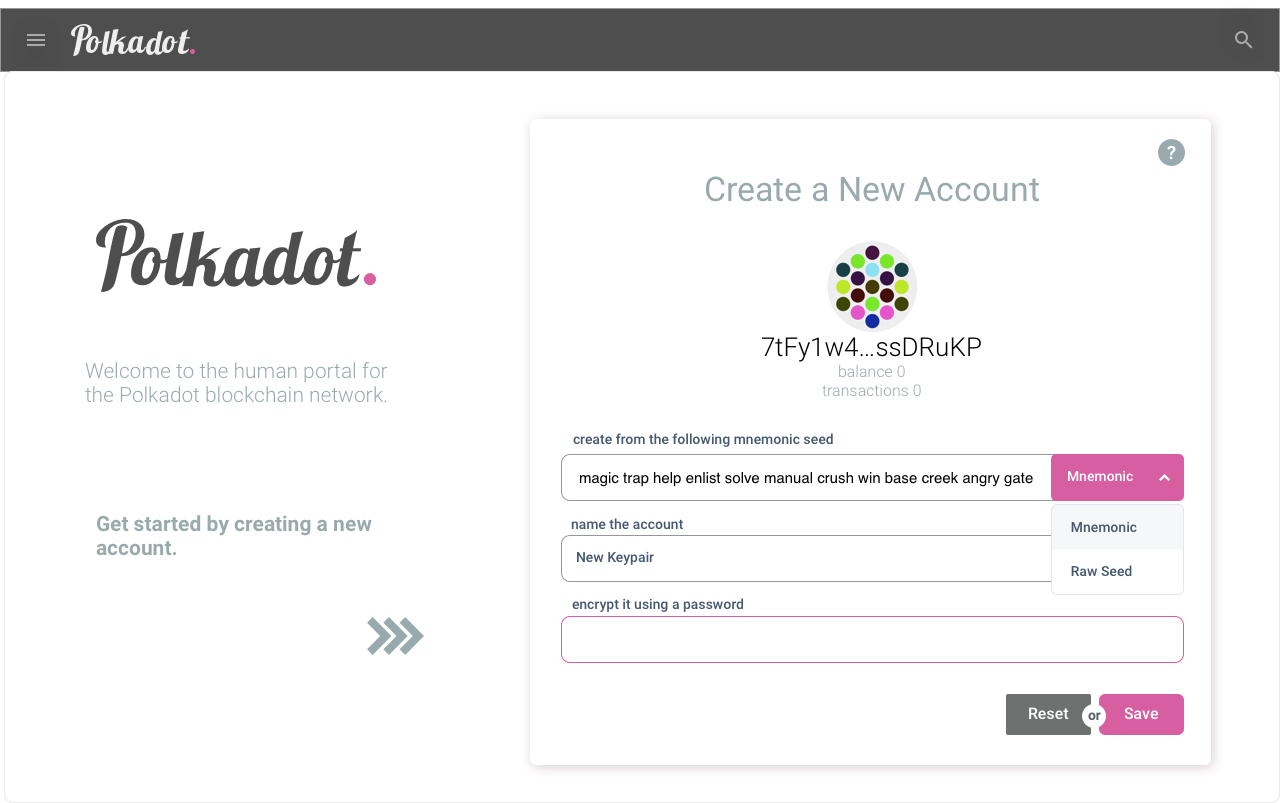
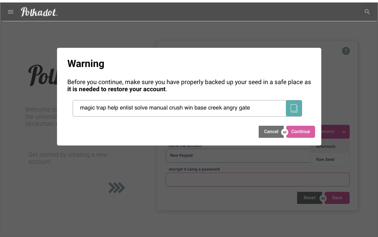
Onboarding Flow
1. Create Account
2. Backup Seed
3. Pick Parachains
4. View Details of a Particular Parachain Option
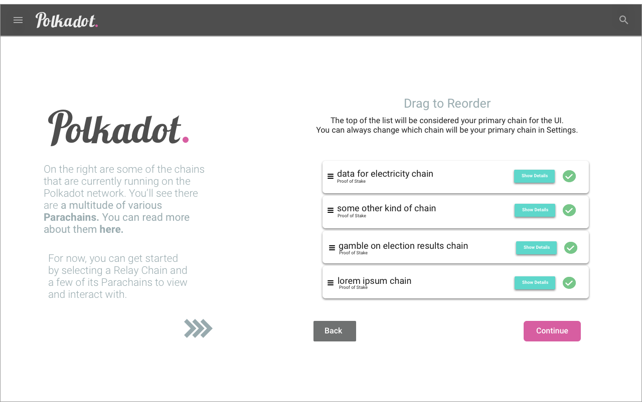
5. Reorder to Select Primary Chain
6. Loading Screen
 yjkimjunior
on 13 Nov 2018
yjkimjunior
on 13 Nov 2018
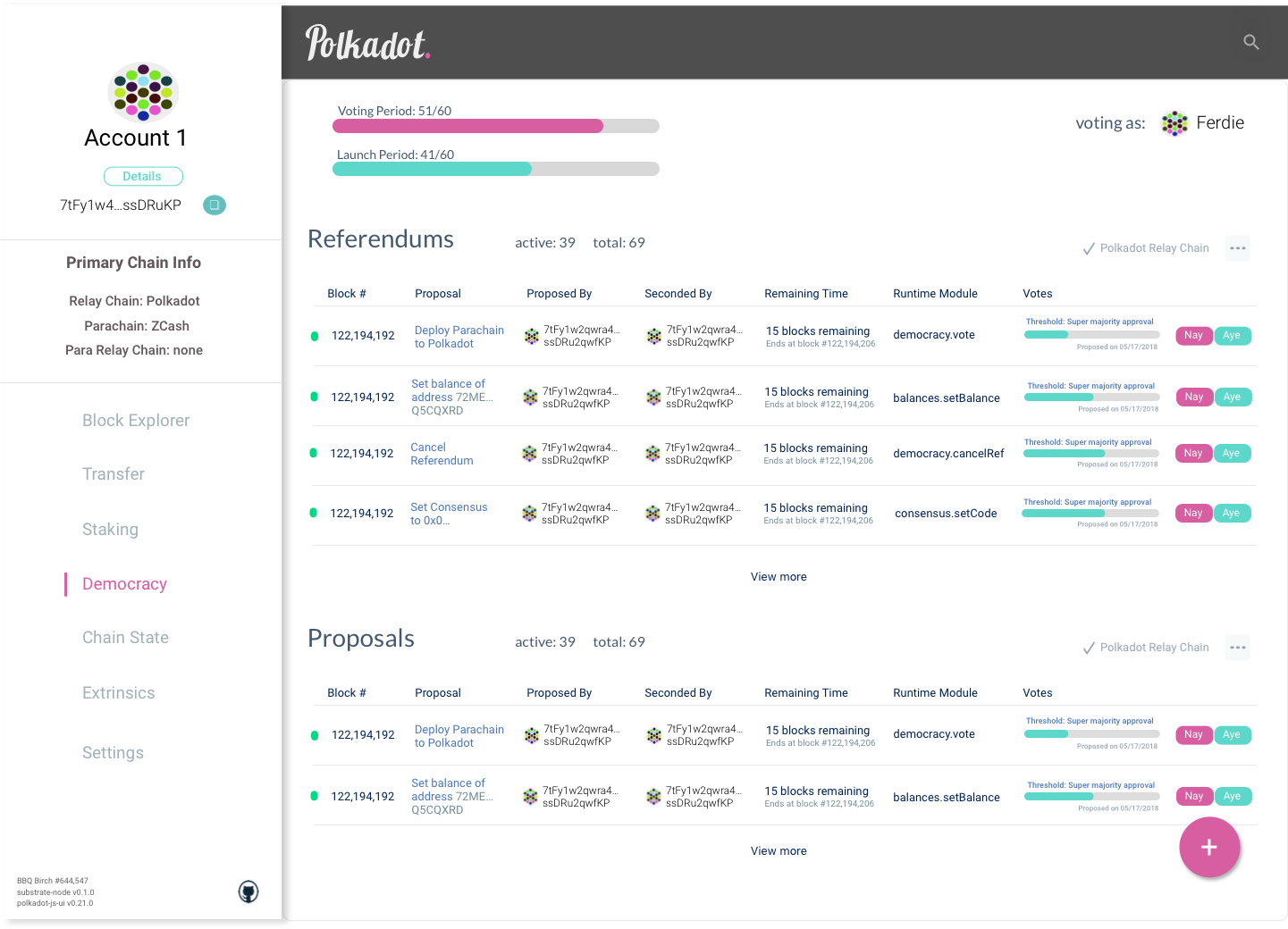
Democracy App
yjkimjunior
on 28 Nov 2018
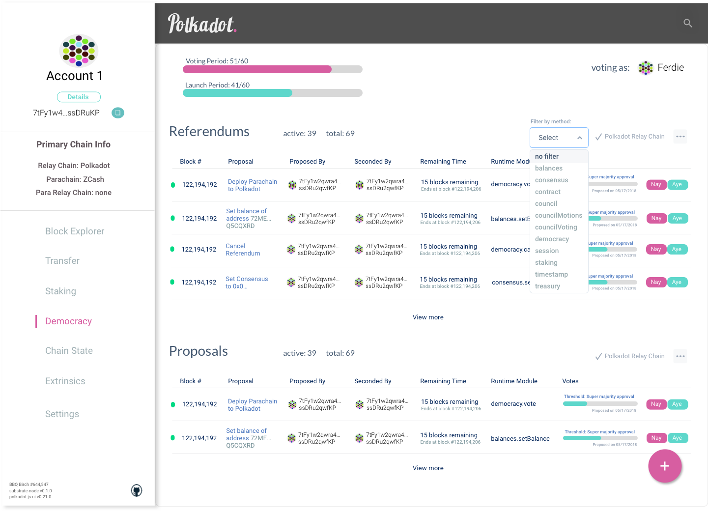
Democracy App (with filter dropdown open)
yjkimjunior
on 28 Nov 2018
Version B
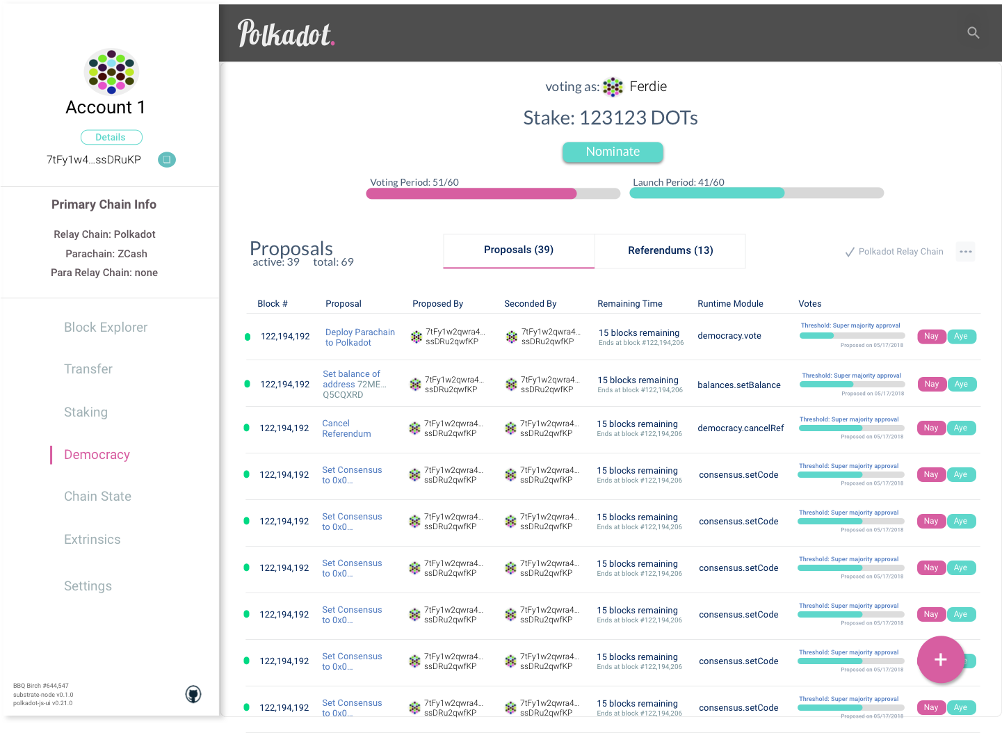
yjkimjunior
on 28 Nov 2018
Democracy Add Proposal
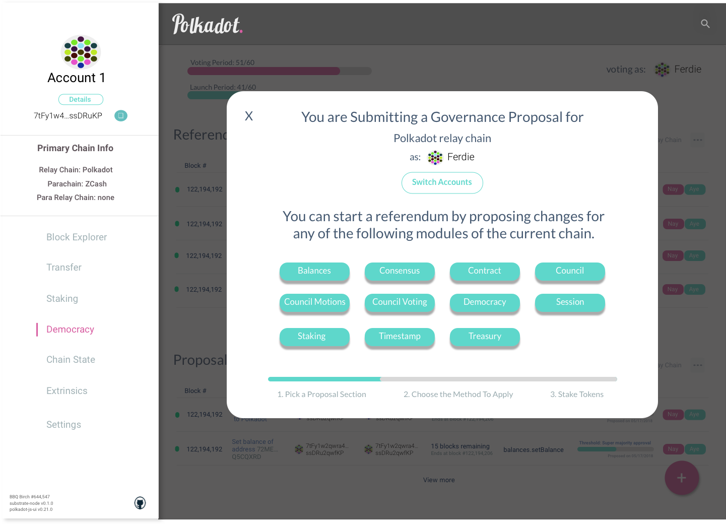
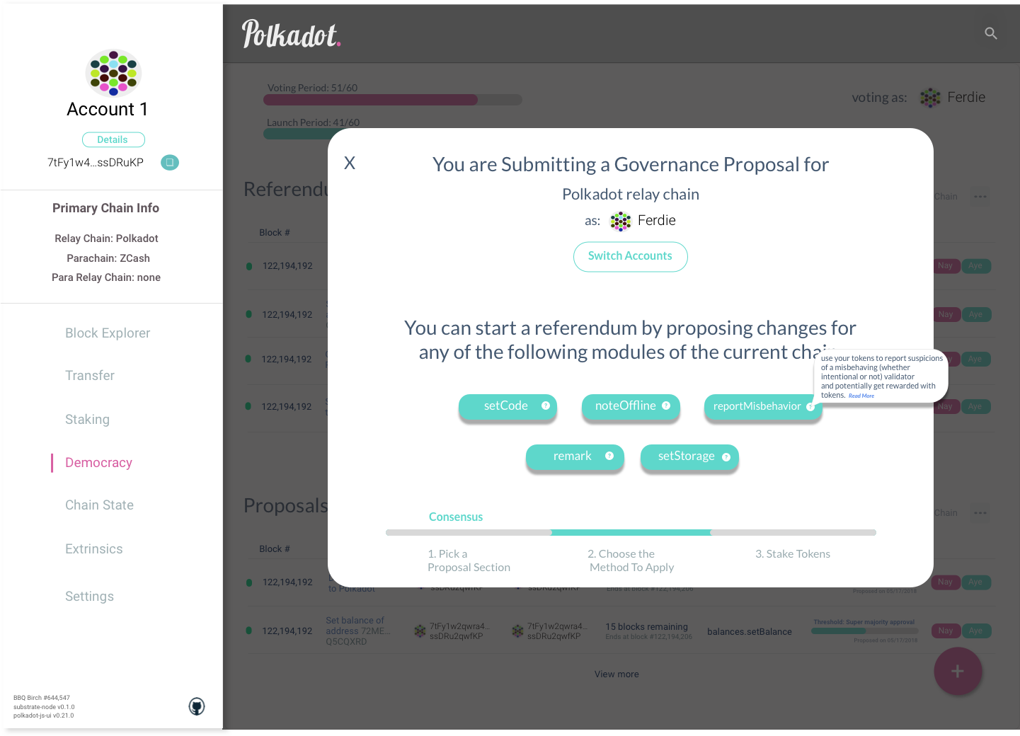
yjkimjunior
on 29 Nov 2018
@yjkimjunior they look well organised. have you posted them in the community chatrooms to get feedback?
ltfschoen
on 29 Nov 2018
Hey @yjkimjunior,
did you ever get feedback to your designs?
And would you have time & motivation to spend some hours on looking into this issue again? Your take on how to optimize the tab / sidebar navigation for mobile would also be highly appreciated!
 Stefie
on 17 Mar 2019
Stefie
on 17 Mar 2019
Hi @yjkimjunior, I checked out the proposed UI designs. Would like to provide feedback for the first screenshot:
Onboarding Flow
- Create Account
I feel splitting the app into 2 columns and having the top bar in place is not necessary:
- The Polkadot logo top and centre would more than suffice for branding the page
- User would not be interested in going anywhere from a menu bar from here
- Have a Close / Back button in place to exit from "Create Account" and return to the default view.
I am envisioning a full-screen design:
- header: logo top center, back / cross button top right to close view
- main content aligned and justified to the center
- Next / Submit (call to action) button bottom center
One of the apps that do this beautifully is https://business.revolut.com. Tasks like logging in and ordering a new card are very well presented; the design is very conservative, opting for 1 or 2 inputs on screen at one time, and having a step-by-step approach to completing forms.
I feel having this approach, providing separate steps (with ability to go backwards too) that take up the whole window would be more manageable and better presented, for example:
Step 1: Name of account
Step 2: Choose a mnemonic seed
Step 3: Choose a password
Step 4: Confirmation of account creation. Confirm to return to main interface.
Other advantages of this:
- Easier to adopt to smaller screens: 1 column instead of 2 columns.
- We could modularise each component and have entrance / exit transitions for them on a full screen basis
- More room to give adhoc feedback and UI. For example, in the case of the mnemonic, ability to backup the seed. (Could go the route of backing up to secure services like Google Drive / iCloud !! as Coinbase Wallet have done).
- The approach can be adopted for other "Step-by-step form processes" within the app. Perhaps sending a transaction as another user case.
Interested to hear more feedback on this. Could provide illustrations as further insight to visually communicate this too.
 rossbulat
on 21 Mar 2019
rossbulat
on 21 Mar 2019
Closing this. Not because rework is not needed, but rather since I would prefer something actionable. I still love the ideas in here, but also need to be realistic about getting stuff done.
jacogr
on 12 Sep 2019
This thread has been automatically locked since there has not been any recent activity after it was closed. Please open a new issue if you think you have a related problem or query.
 polkadot-js-bot
on 3 Jun 2021
polkadot-js-bot
on 3 Jun 2021
Related issues
 talfco
·
5Comments
talfco
·
5Comments
 soc1c
·
5Comments
soc1c
·
5Comments
 satyamakgec
·
4Comments
satyamakgec
·
4Comments
 illlefr4u
·
4Comments
illlefr4u
·
4Comments
 chevdor
·
3Comments
chevdor
·
3Comments