(This only applies to the "next" branch)
First up, the explorer - it is chosen at first since it is really quite stand-alone and can be explored without impacting anything. Some random thoughts on what goes where...
It has 2 sections - the main/summary view and the per-block view.
Main view -
- We need the ability to search on hash & block
- We want to display the block events in addition to the blocks
- We probably want (provided it is longer running or we keep some stats), display extra info, i.e. average time over the last blocks
- We can expand a bit, displaying things like tx count per block, etc.
Exploded view -
- It is basic atm, we really need to think about how to better display the extrinsics as decoded (this component can nicely feedback into others, i.e. it is shared)
- How do we best display justifications
- Logs are not displayed, it should be
- Events per block?
Basically, looking at how do we take the above, make it suable and pretty. It is functional atm. Anything goes, so any design is worth discussion, nothing is off the table.
 jacogr
All 10 comments
Mucked about with this a bit this weekend, it's got its pros and cons, definitely not a final design.
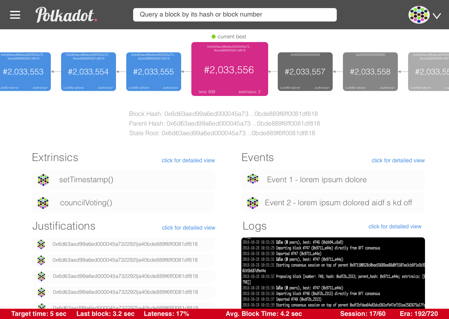
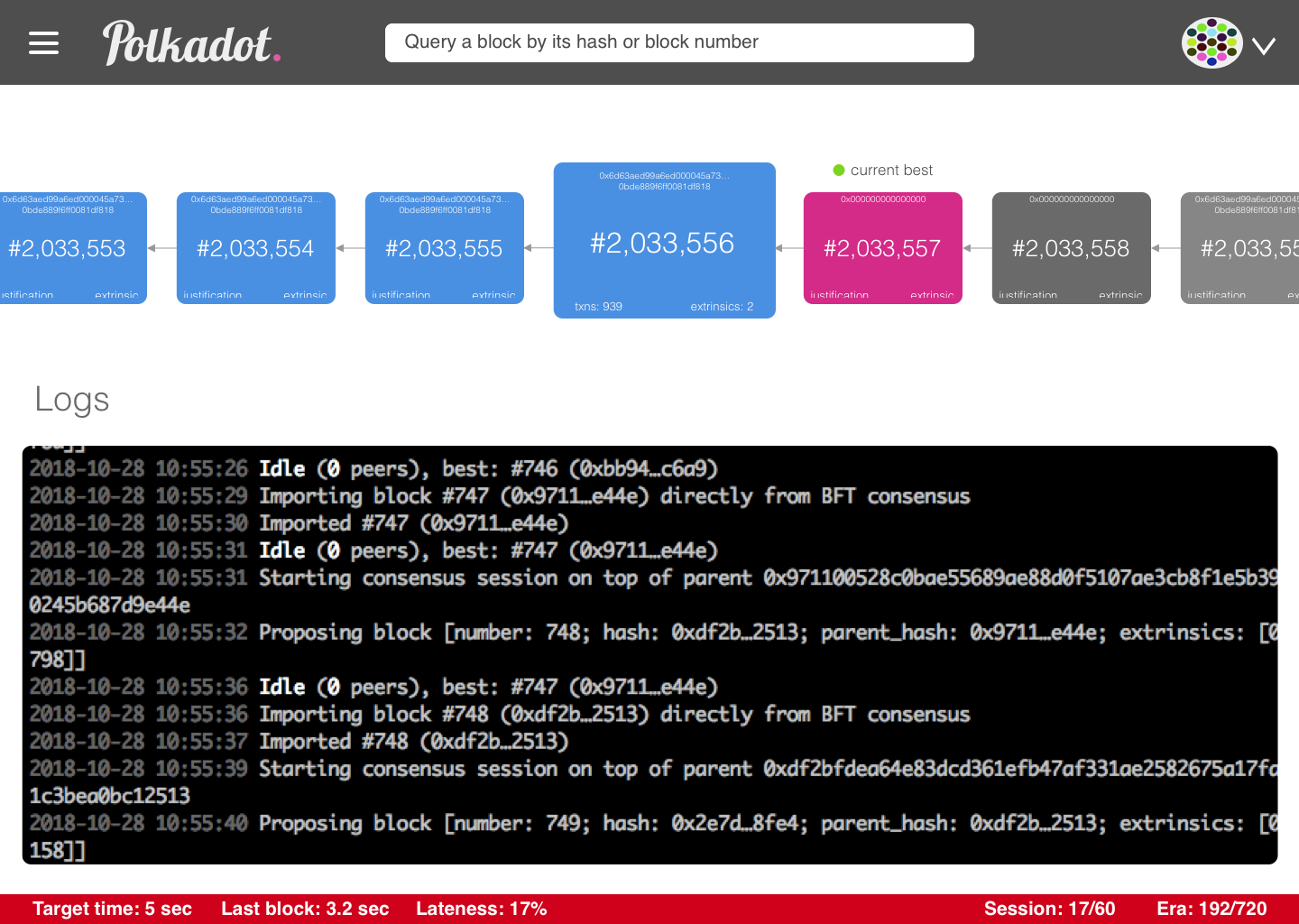
Pros:
- Easily see everything in one place
- Minimize clicks necessary to see an overview of both individual blocks as well as the most relevant blocks
- Always have the block explorer in sight throughout clicks for each of the detailed views
- This component can be reused beyond even just the explorer app, as appropriate
- Highly interactive explorer
- Actually looks like blocks, with clear pointers to each block’s parents,
Cons:
- There’s a lot going on and it does feel cluttered
- Possibly not so intuitive to know that the blocks are clickable to view expanded details below
- Block colors depicting the block statuses is hard to make intuitive, probably requires a legend
- But requiring a legend is usually indicative of suboptimal design anyway
- Can only see about 6 blocks at a time, not an infinite scroll view like people are mostly used to
 yjkimjunior
on 29 Oct 2018
yjkimjunior
on 29 Oct 2018
It looks much better :)
So some comments -
We don't really have an RPC for logs, so we can't display that. Even if we could, we probably won't in the explorer. I'm guessing there may be some confusion as to block logs and node logs - the former we need to show :) (And currently, don't - same with events, the data is there in the blocks but we don't render it)
I'm almost thinking we still need to split the summary view vs detailed view. On summary we can have a longer list of block, maybe even tabular, then when we click through the above view fits nicely. In the summary/overview we could display all events as it comes in, i.e. you can see a list of Transfer events for the last while.
Links from the hashes would still be nice.
On 2 above, don't really care either way. But I'm thinking (and we can address this in other ways), that it is nice just having it open and it shows whatever is the info for the current (and maybe historical) and then when you select something you only display that one and can navigate through.
Either way, the "show me the latest as it changes" vs "zoom in and keep to a specific" requires some thought. (And the toggling between)
jacogr
on 30 Oct 2018
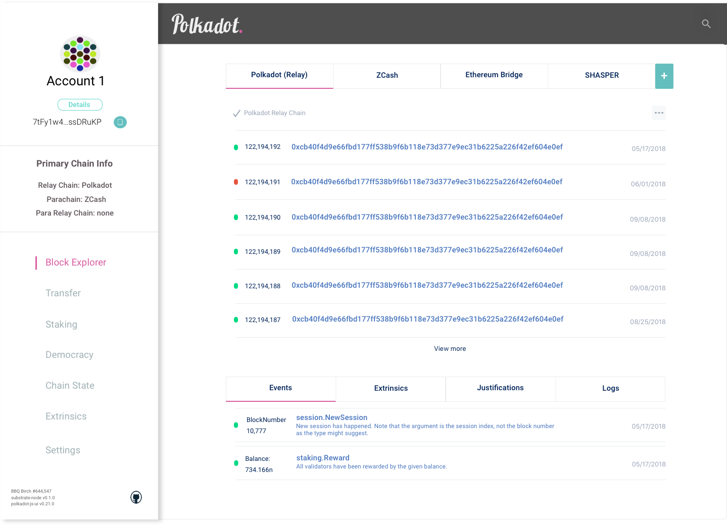
Update:
yjkimjunior
on 17 Nov 2018
I would like to have a tinker with this, I think the following may work well in regards to tidying up what is already there and laying down foundations for expanded views:-
Having the hash search bar at the top of the Explorer Chain Info section, hence removing the second tab. Have search results replace current content upon searching, and remove upon cancelling search.
Node Info to be streamed inside a header, viewable throughout the Explorer app.
Removal of top tabs.
Would like to demonstrate this with a PR shortly.
 rossbulat
on 1 Mar 2019
rossbulat
on 1 Mar 2019
We actually had exactly that. :)
The tabs was brought in when the explorer and node view was combined. So ended up like that for 2 reasons -
- consistency among apps
- less links on the sidebar (“alike” functionality together)
jacogr
on 1 Mar 2019
Understood, so tabs need to remain unless a global navigation change is introduced.
Perhaps there is scope to have the search bar shown in conjunction with tabs in some form. 🤔
rossbulat
on 1 Mar 2019
100%, that could work, in addition to block-by-number retrieval, i.e. making it actually usable. It certainly is nowhere close to perfect, I would give it (any app/view actually) around a 4/10 rating - lots of improvements remain UX-wise, but it is (mostly) functional.
Explorer was actually the last one to swap over - it was actually the odd-man out and, well, the discrepancy got to some people's OCD, including mine. (Only one breaking the mold at is app-js, I think that _may_ be ok)
jacogr
on 1 Mar 2019
Other enhancements - when clicking through to /hash (no hash specified), it grabs the latest block and displays hat as /hash/0x<blockhash>, so it is never empty. (Would not auto-update once here, but at least pull latest in)
(Obviously serach by hash or number (think the way etherscan does it), does wonders - /hash is probably /block/<hash> then, just more descriptive)
jacogr
on 1 Mar 2019
Closing this. Not because rework is not needed, but rather since I would prefer something actionable. I still love the ideas in here, but also need to be realistic about getting stuff done.
jacogr
on 12 Sep 2019
This thread has been automatically locked since there has not been any recent activity after it was closed. Please open a new issue if you think you have a related problem or query.
 polkadot-js-bot
on 3 Jun 2021
polkadot-js-bot
on 3 Jun 2021
Related issues
 satyamakgec
·
4Comments
satyamakgec
·
4Comments
 Web3Foundation
·
9Comments
jacogr
·
5Comments
jacogr
·
3Comments
Web3Foundation
·
9Comments
jacogr
·
5Comments
jacogr
·
3Comments
 Mathew1706
·
3Comments
Mathew1706
·
3Comments