Apps-android-commons: ReviewActivity is barely visible in Landscape Mode
Summary:
Elements of ReviewActivity is not visible to user in landscape. We should make a landscape layout for it.
Steps to reproduce:
- Go to ReviewActivity
- Turn on landscape Mode
What did you expect the app to do, and what did you see instead?
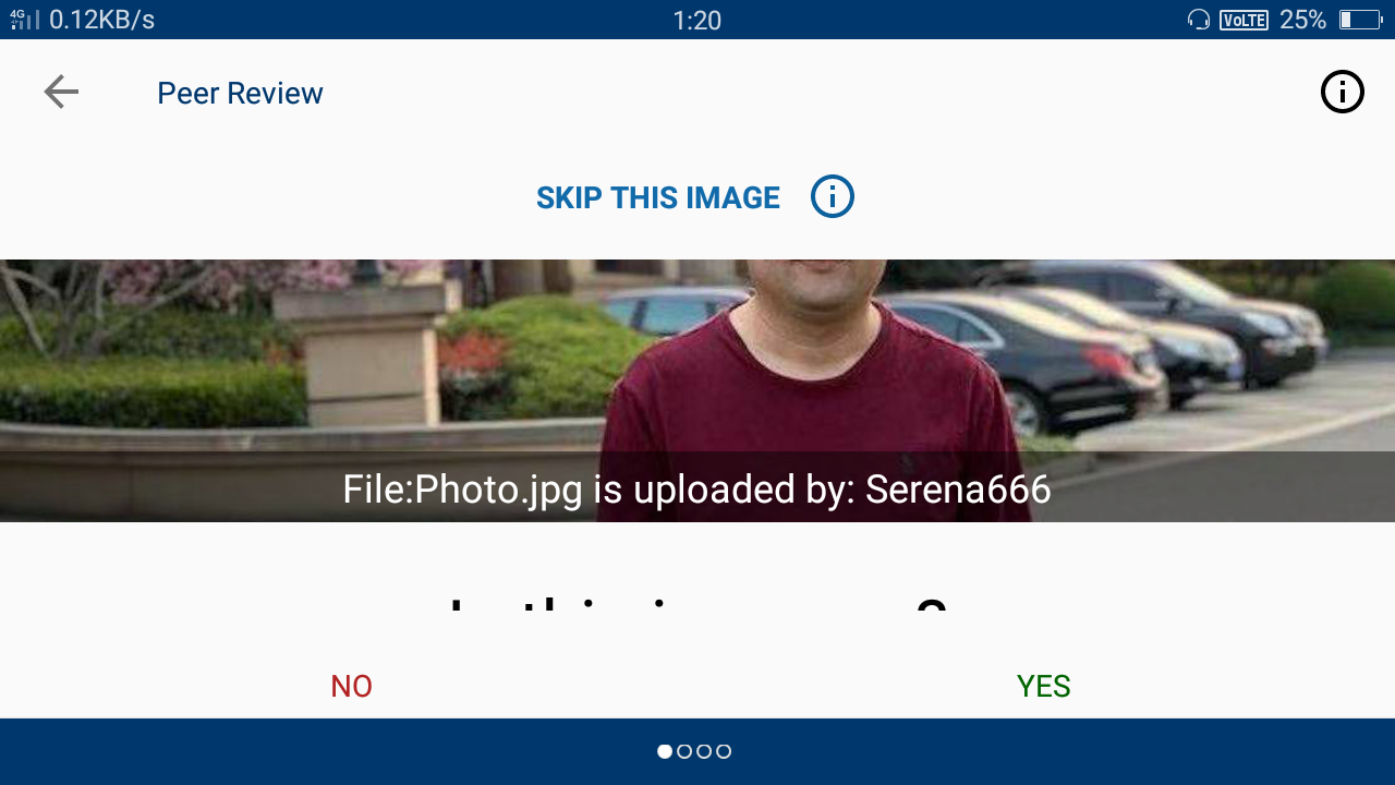
Image in ReviewActivity is not visible in Landscape Mode even the text also is not visible. ReviewActivity should visible properly in landscape mode also.
Device and Android version:
Pixel 4 API 27
Commons app version:
3.0.0 latest master
Screen-shots:
Would you like to work on the issue?
Yes
 Ayan-10
All 16 comments
@Ayan-10 I agree, we should have a different UI for landscape mode. Pinging @neslihanturan @nicolas-raoul @misaochan for their feedback on this :)
 madhurgupta10
on 28 Apr 2021
madhurgupta10
on 28 Apr 2021
I agree. Maybe picture on the left and text on the right?
 misaochan
on 28 Apr 2021
misaochan
on 28 Apr 2021
@madhurgupta10 @misaochan Can you once go through Nearby Activity in Landscape mode. I think the map view is becoming very tiny in landscape mode.
Ayan-10
on 28 Apr 2021
I agree. Maybe picture on the left and text on the right?
@madhurgupta10 @misaochan I did this for ReviewActivity. Please have a look.
Ayan-10
on 28 Apr 2021
@madhurgupta10 @misaochan Can you once go through Nearby Activity in Landscape mode. I think the map view is becoming very tiny in landscape mode.
You can make a separate issue for other Activities
madhurgupta10
on 29 Apr 2021
I agree. Maybe picture on the left and text on the right?
@madhurgupta10 @misaochan I did this for ReviewActivity. Please have a look.
Looks good to me! Let's wait for other's feedback
madhurgupta10
on 29 Apr 2021
LGTM as well. :)
misaochan
on 29 Apr 2021
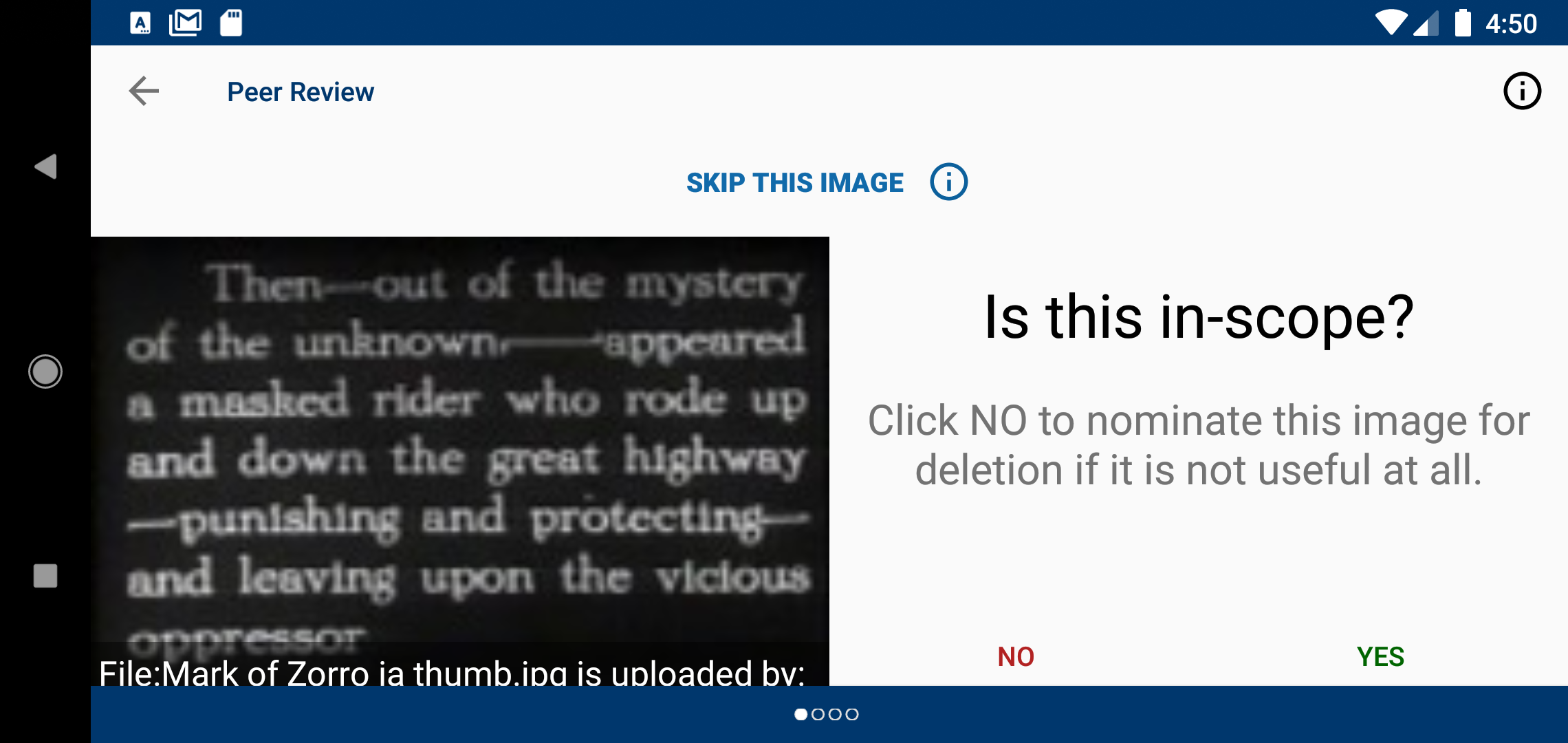
I am not sure how many people will do reviews in landscape mode, but if it's not too much work how about:
- Making the legend (the text that starts with
File:Mark of Zorro...) a bit higher. It is 2 lines and I believe that the blue bottom banner (with the 4 dots) is covering the second line. - Maybe putting the
Skip this imagepart on the right only? That will leave more space for the picture.
Thanks!
 nicolas-raoul
on 29 Apr 2021
nicolas-raoul
on 29 Apr 2021
@madhurgupta10 @nicolas-raoul can i work on this
 Prince-kushwaha
on 13 May 2021
Prince-kushwaha
on 13 May 2021
@madhurgupta10 @nicolas-raoul can i work on this
@Ayan-10 can you confirm if you are still interested to work on this? If not we can assign it to you @Prince-kushwaha
madhurgupta10
on 13 May 2021
@madhurgupta10 Yes, I am currently working on it. Actually, I am almost done with the UI changes as proposed by @nicolas-raoul . But I stuck a little at a point for making changes but I am trying my best to fix it. I will make PR as soon as possible.
Ayan-10
on 13 May 2021
@Ayan-10 Thanks for the update, feel free to ask if you need any help. @Prince-kushwaha you can work on other issues in that case.
madhurgupta10
on 13 May 2021
@madhurgupta10 can i create issue for this and work on it https://github.com/commons-app/apps-android-commons/issues/4343#issuecomment-828974126
Prince-kushwaha
on 13 May 2021
@madhurgupta10 can i create issue for this and work on it #4343 (comment)
Yes but before starting working on it, do discuss your approach and UI
madhurgupta10
on 13 May 2021
@Ayan-10 Thanks for the update, feel free to ask if you need any help. @Prince-kushwaha you can work on other issues in that case.
Thanks, @madhurgupta10 .
I solved the issue and this is the final UI. Please check out @madhurgupta10 @nicolas-raoul @misaochan .
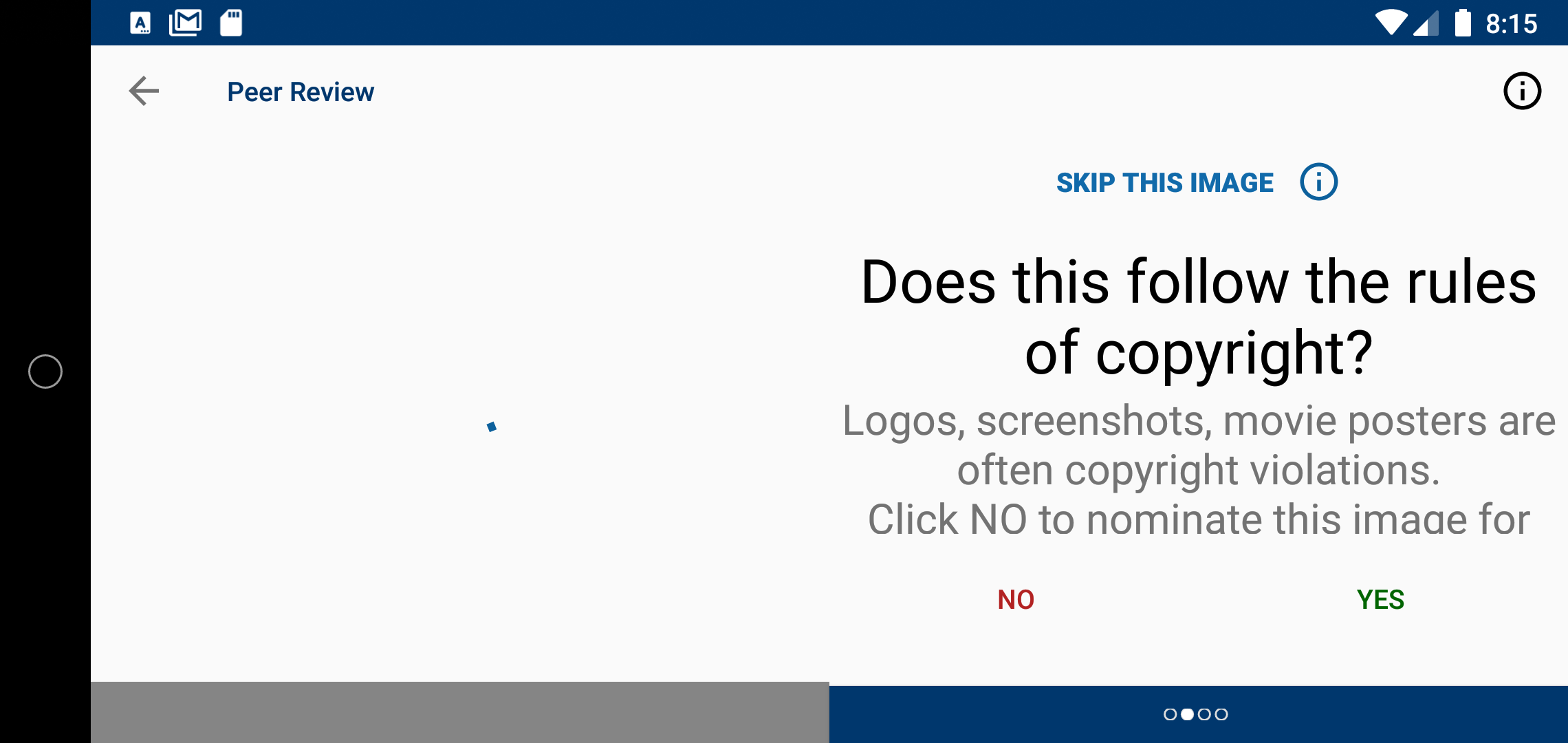
Should I make PR with this UI?
Ayan-10
on 13 May 2021
@Ayan-10 Thanks for the update, feel free to ask if you need any help. @Prince-kushwaha you can work on other issues in that case.
Thanks, @madhurgupta10 .
I solved the issue and this is the final UI. Please check out @madhurgupta10 @nicolas-raoul @misaochan .
Should I make PR with this UI?
Please make a PR, thanks!
madhurgupta10
on 14 May 2021
Related issues
 neslihanturan
·
3Comments
neslihanturan
·
3Comments
neslihanturan
·
3Comments
neslihanturan
·
3Comments
 maskaravivek
·
3Comments
nicolas-raoul
·
4Comments
madhurgupta10
·
3Comments
maskaravivek
·
3Comments
nicolas-raoul
·
4Comments
madhurgupta10
·
3Comments
Most helpful comment
I am not sure how many people will do reviews in landscape mode, but if it's not too much work how about:
File:Mark of Zorro...) a bit higher. It is 2 lines and I believe that the blue bottom banner (with the 4 dots) is covering the second line.Skip this imagepart on the right only? That will leave more space for the picture.Thanks!